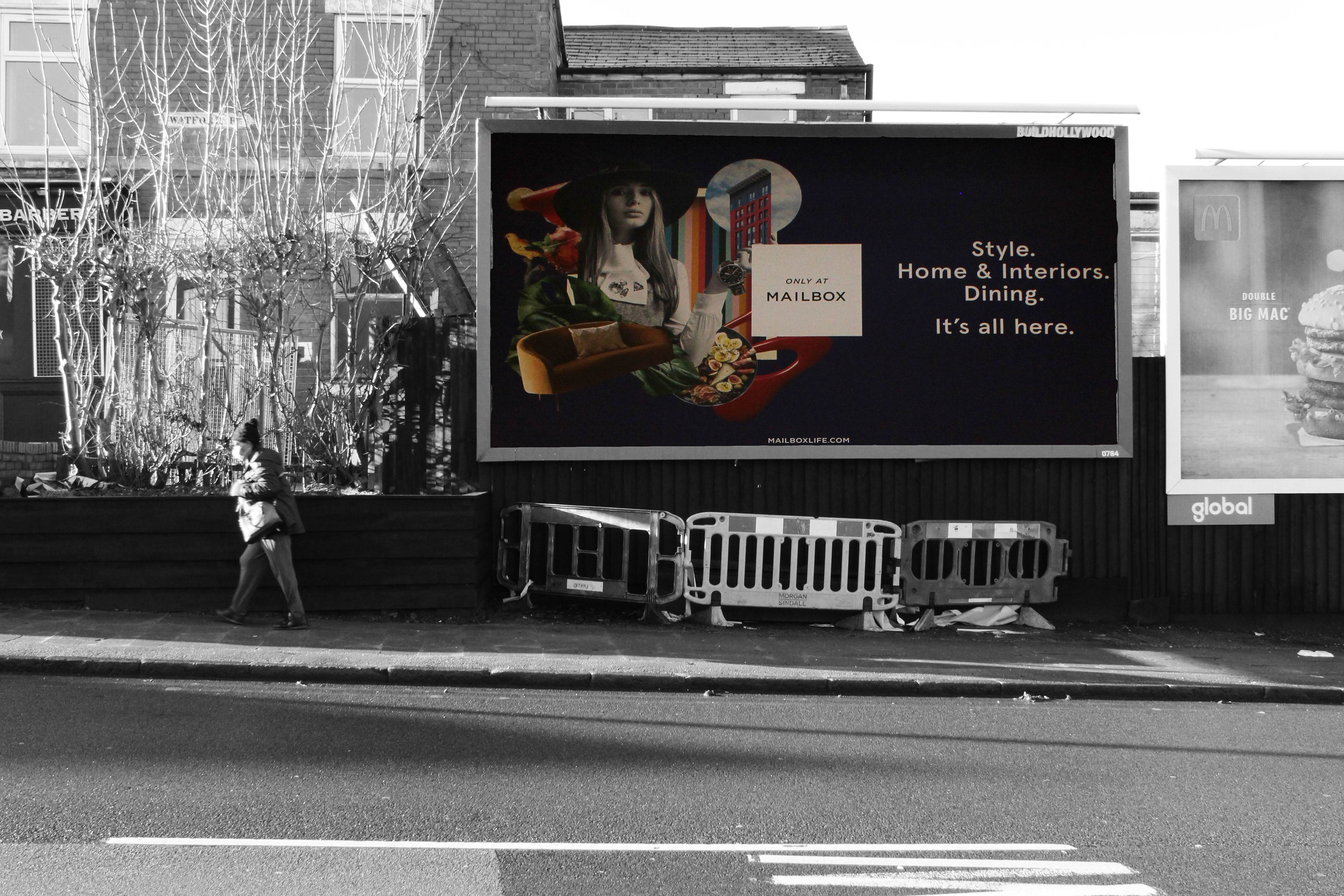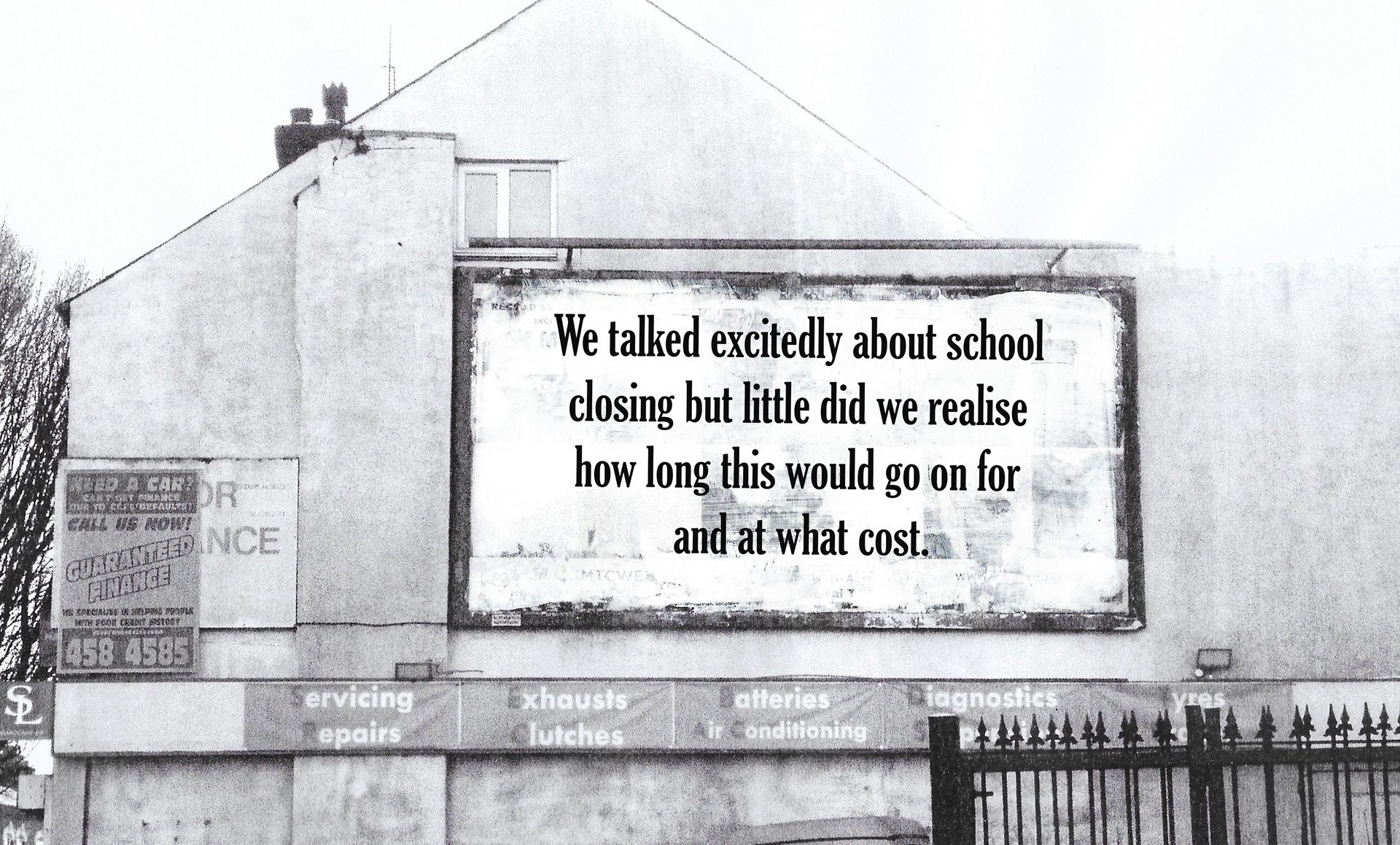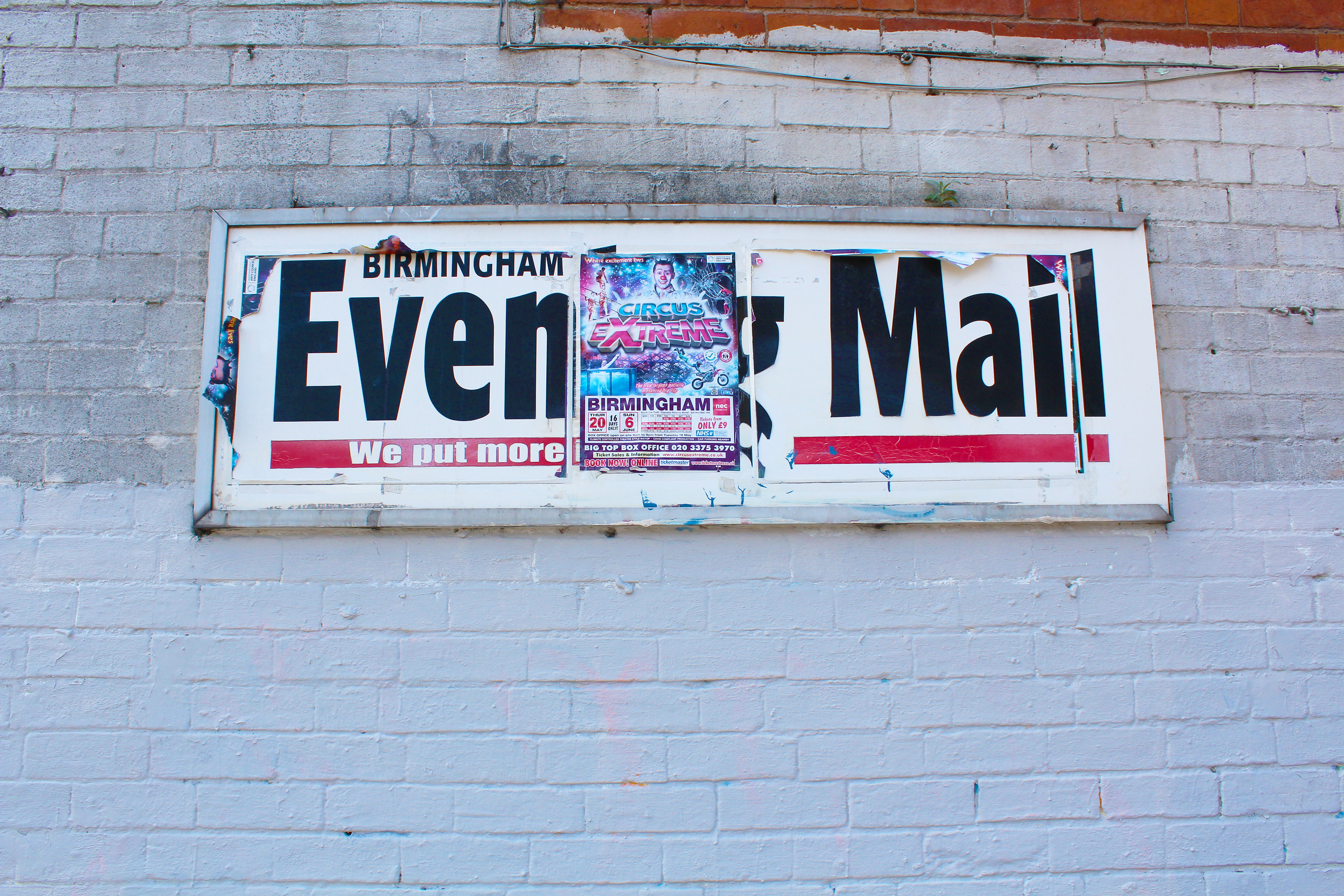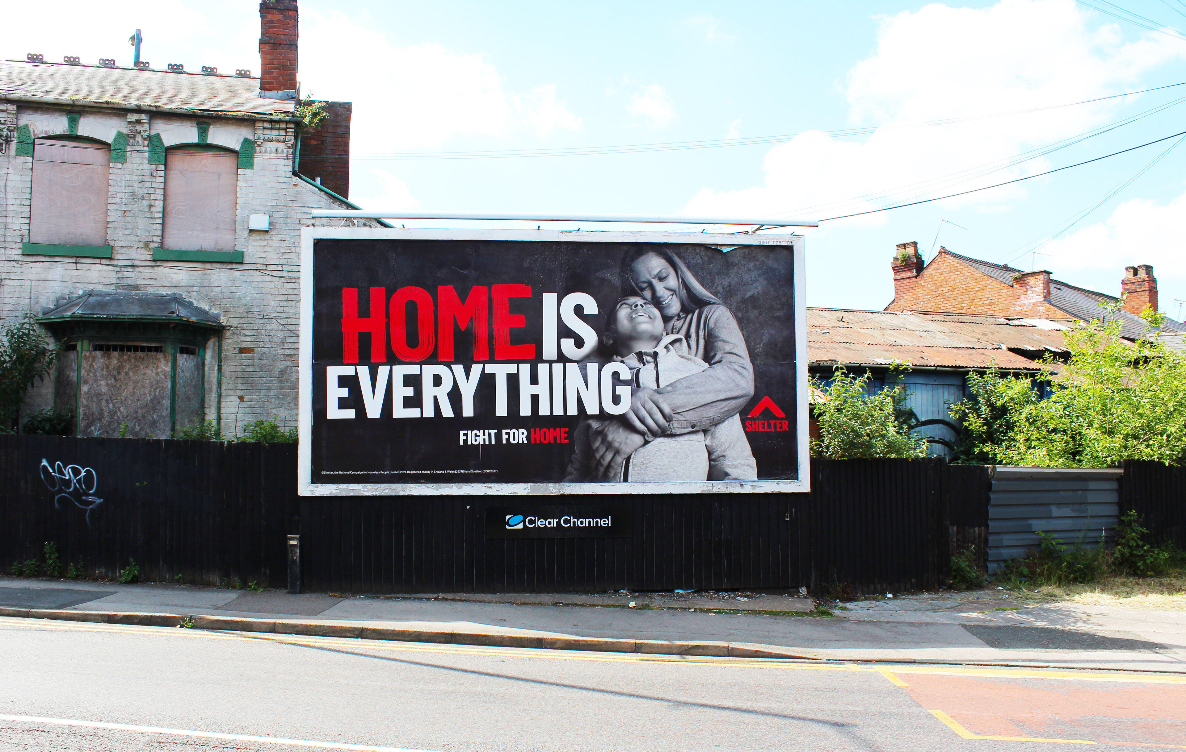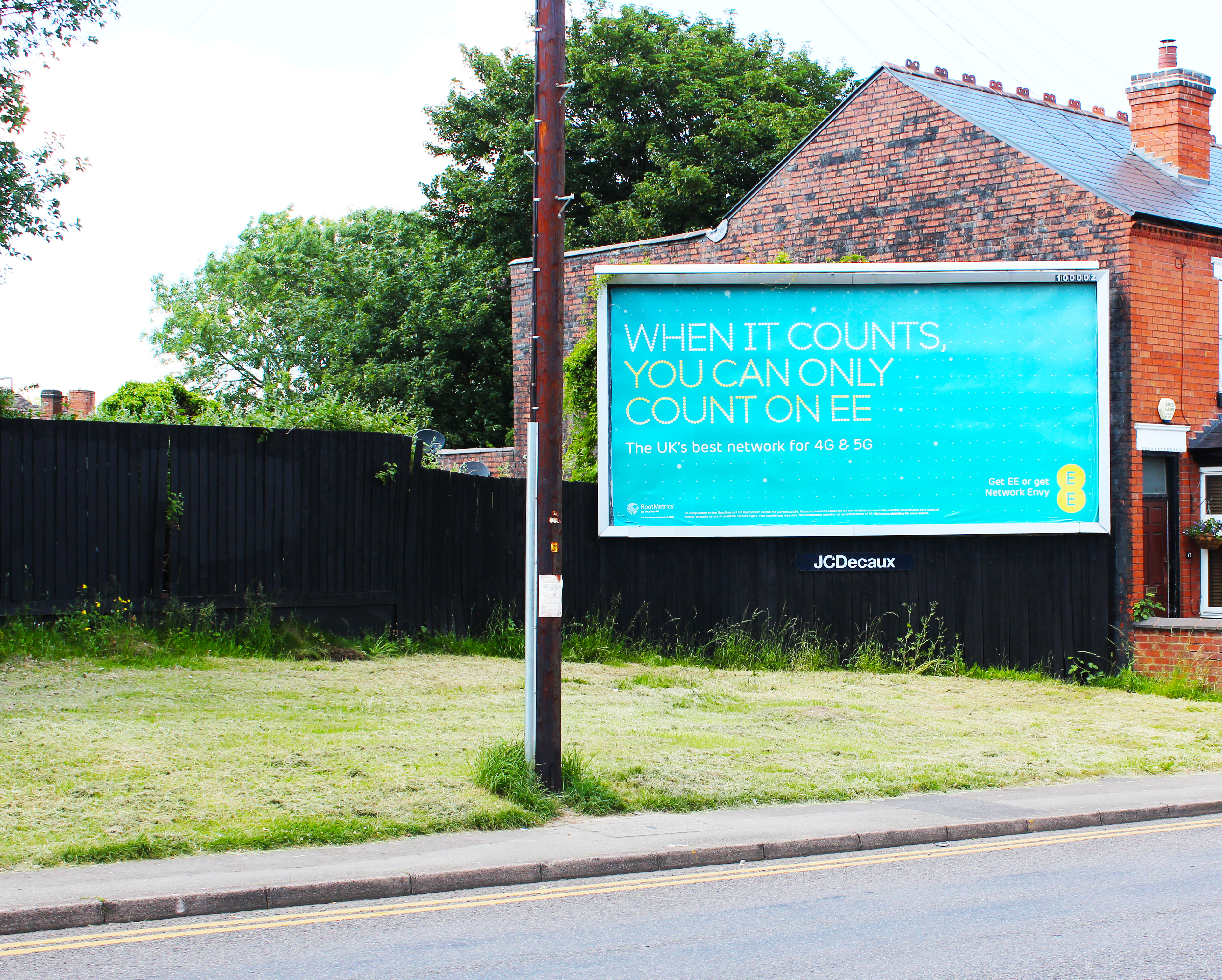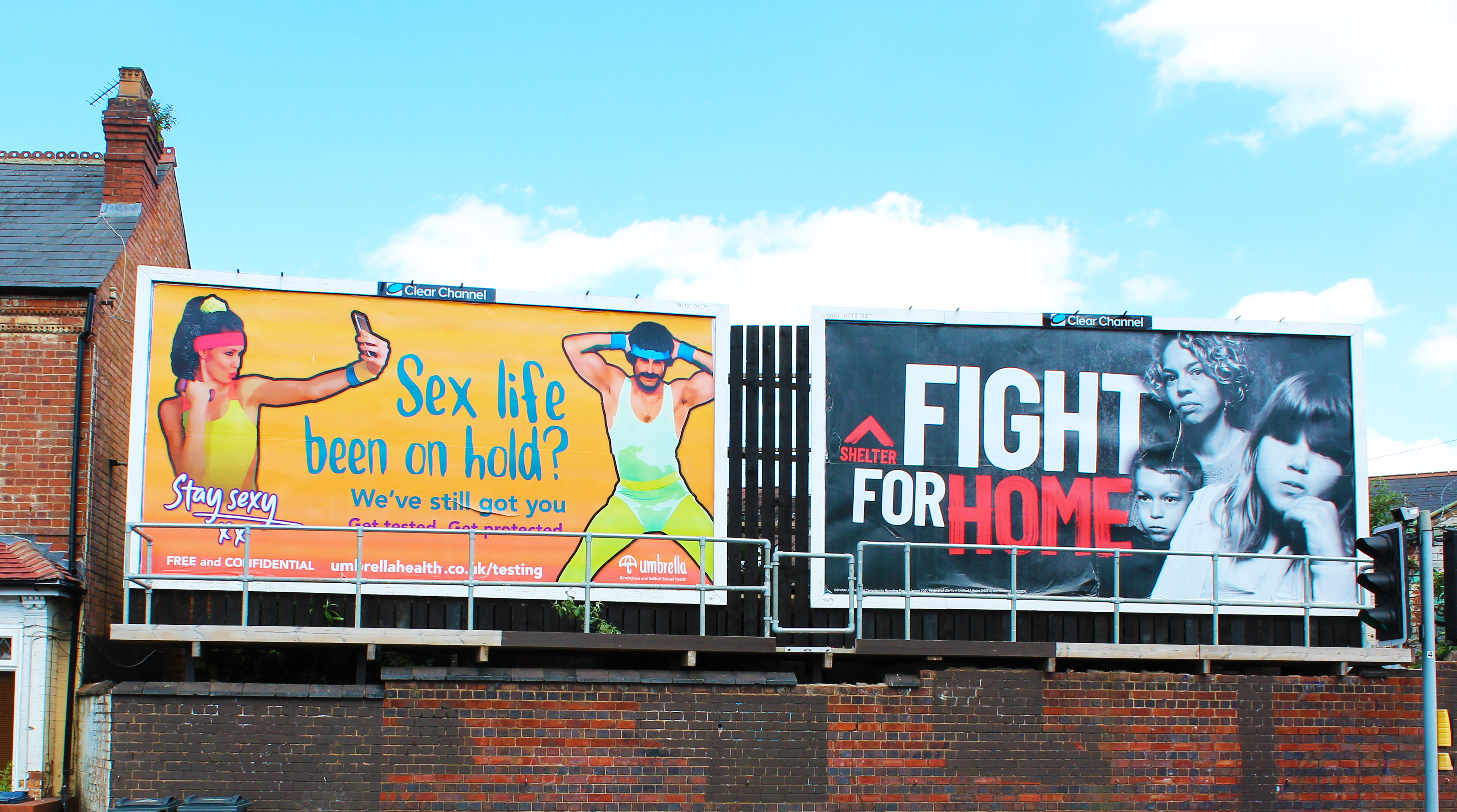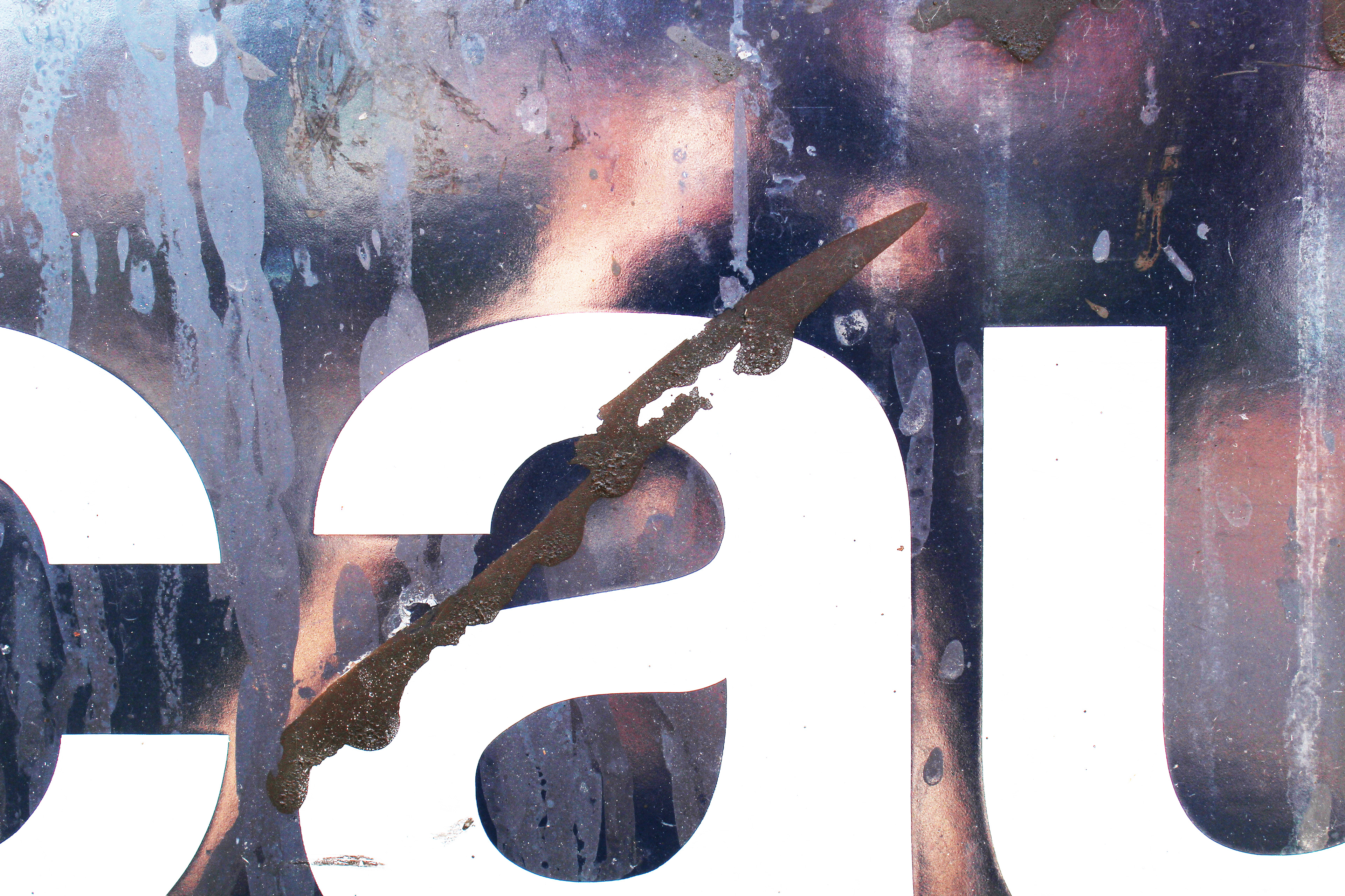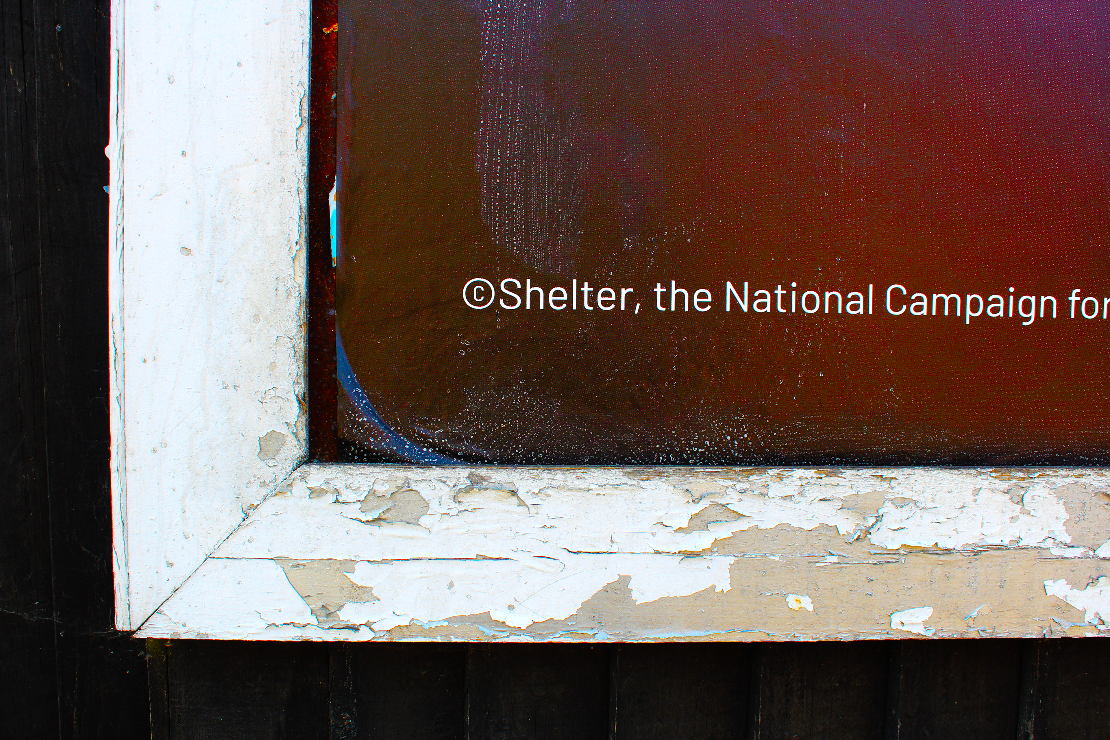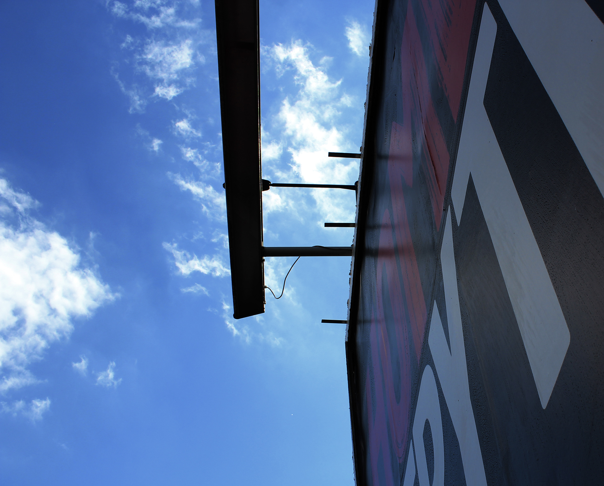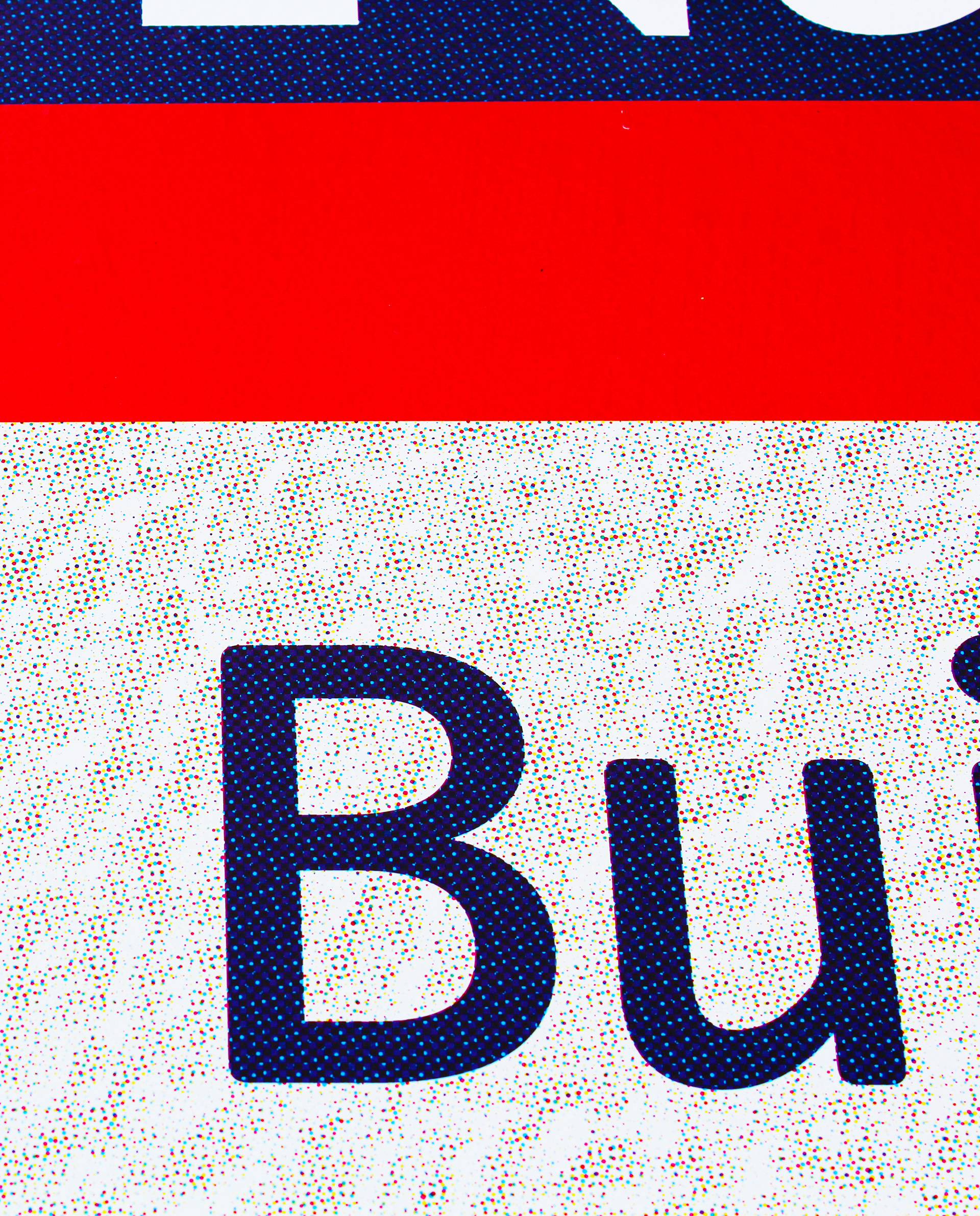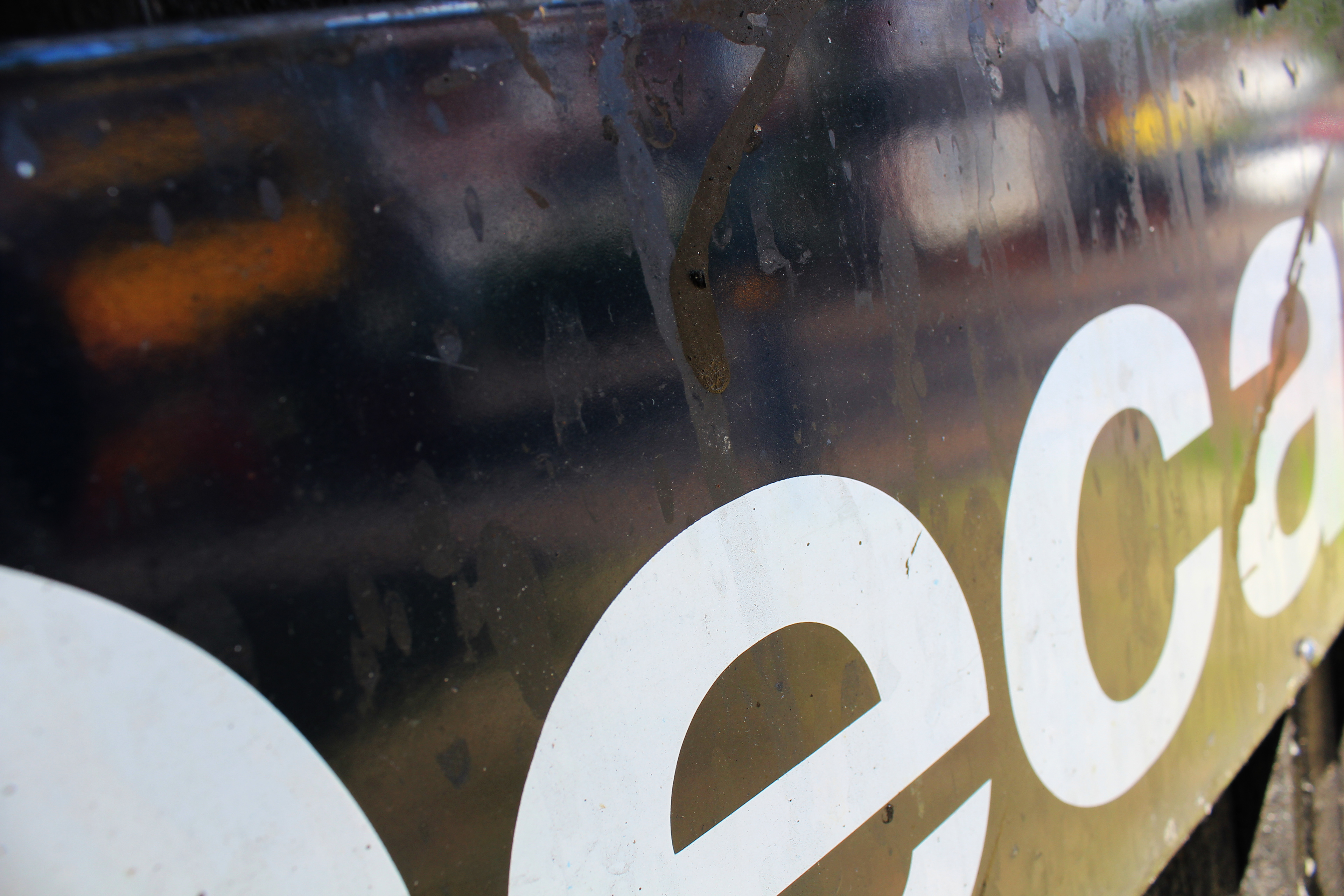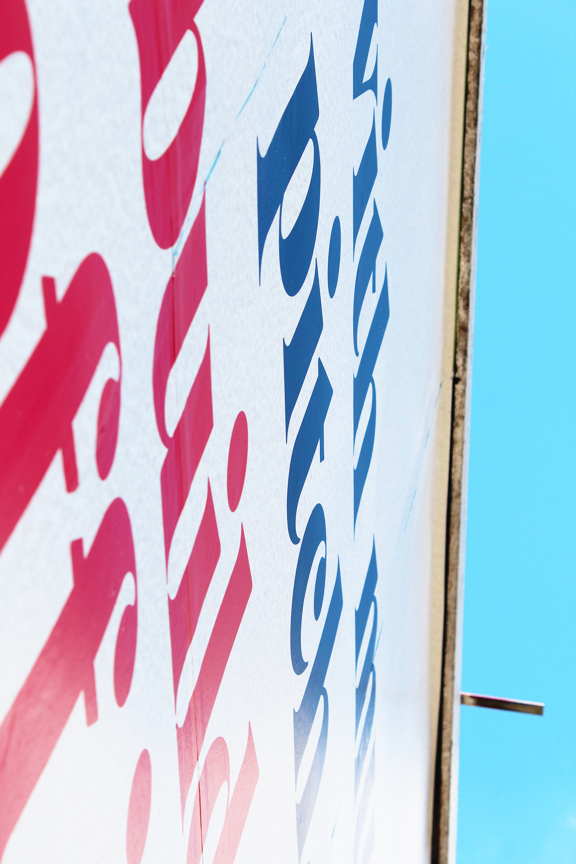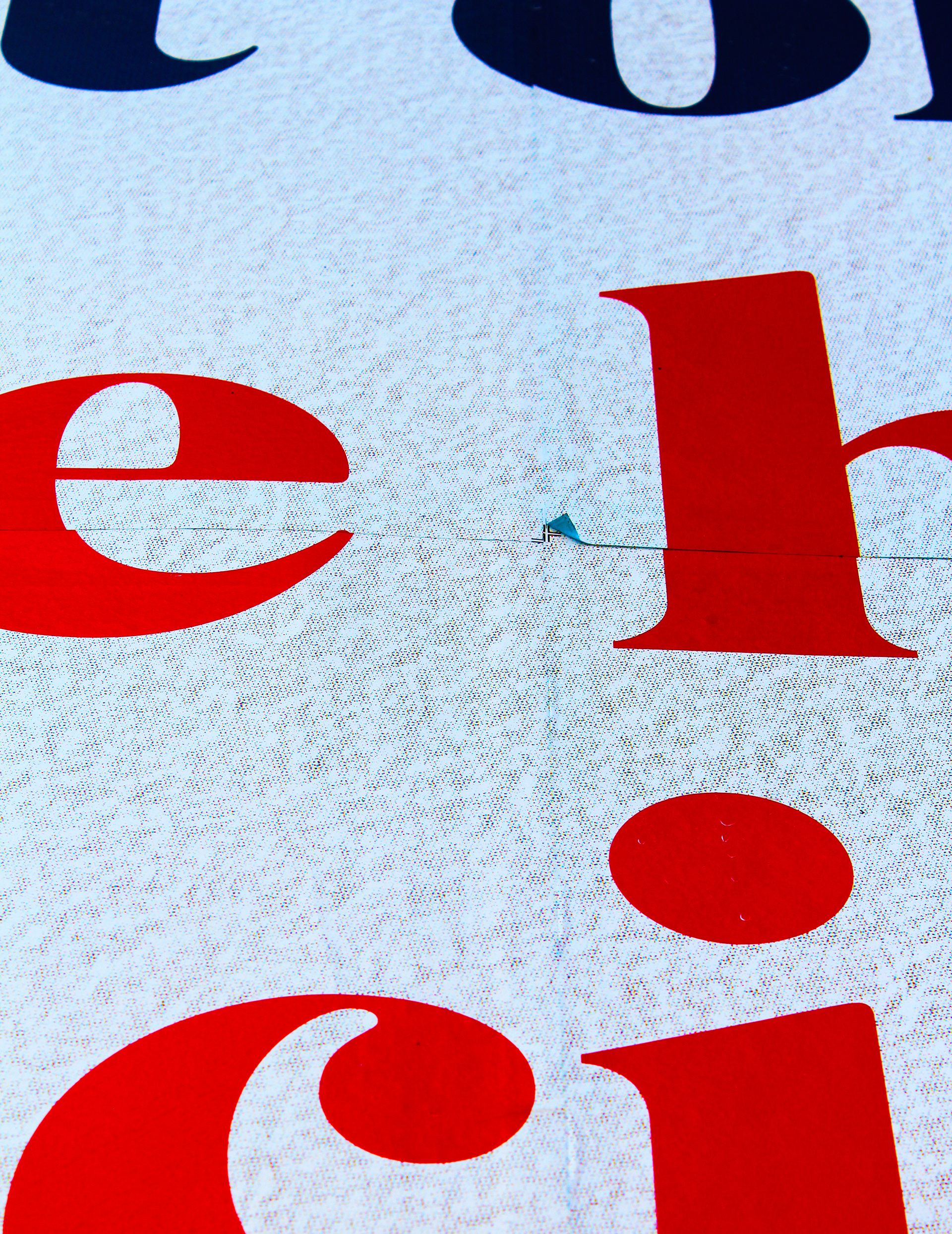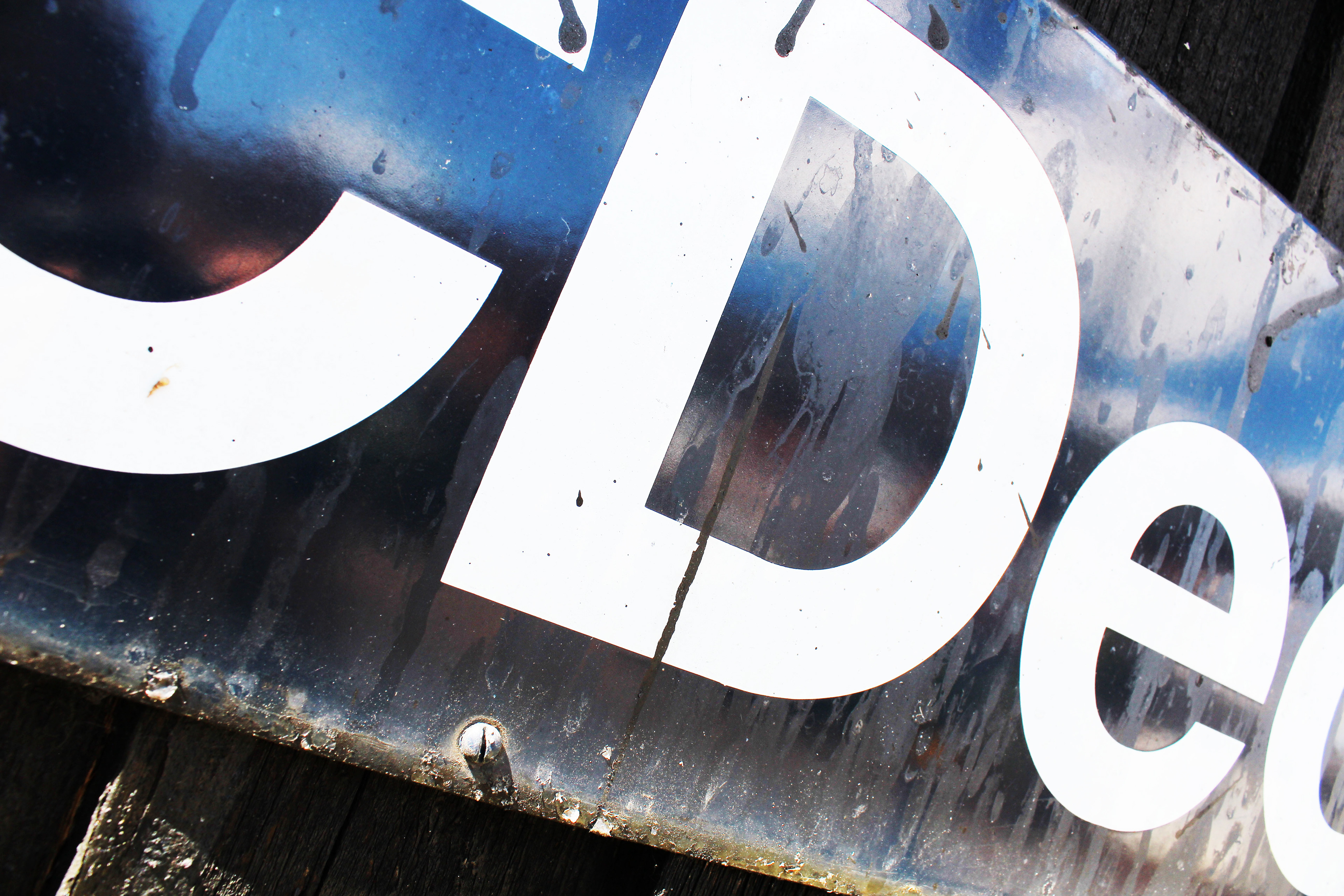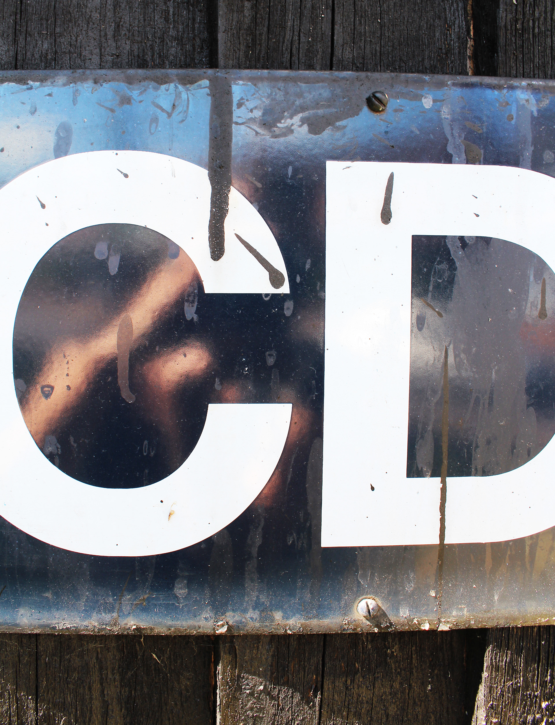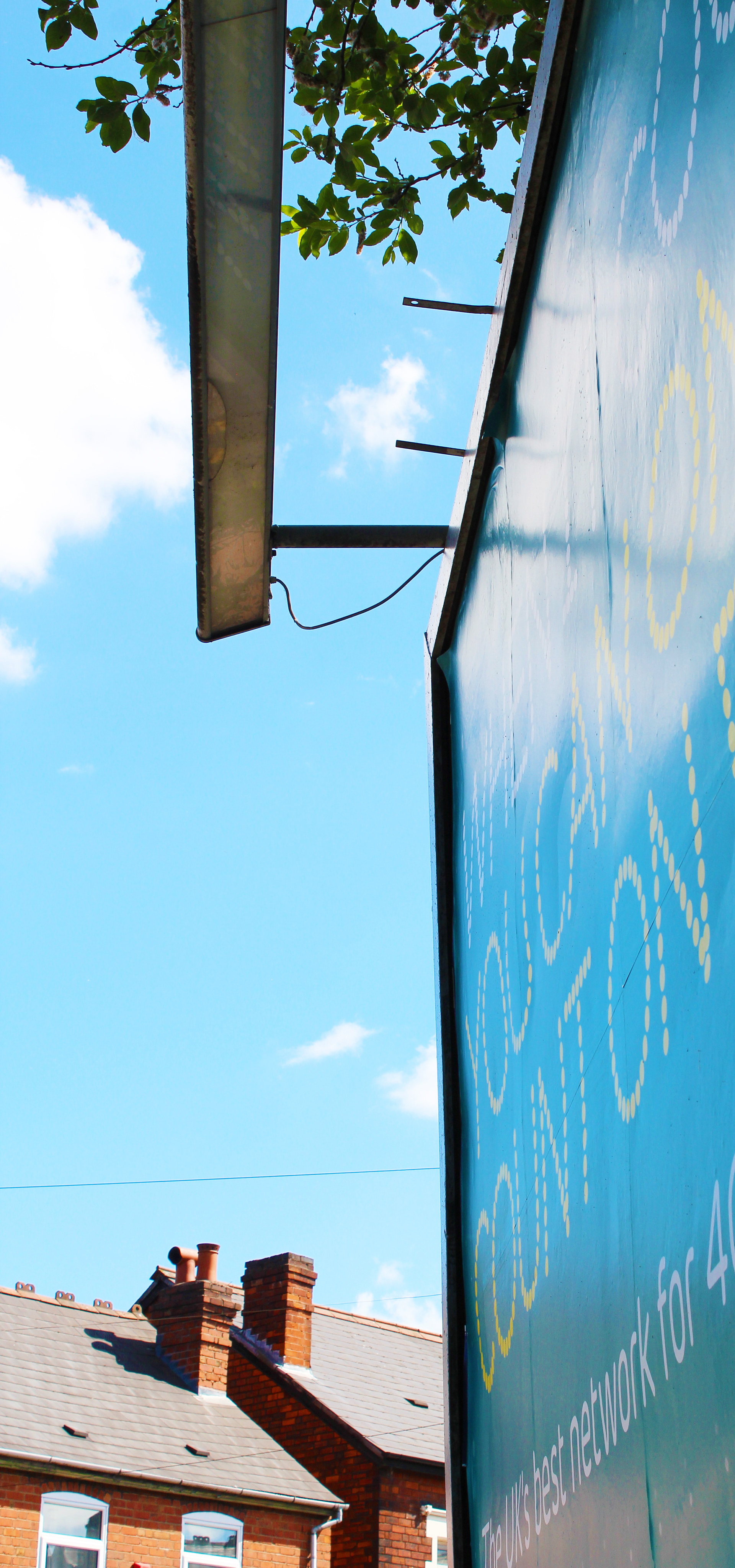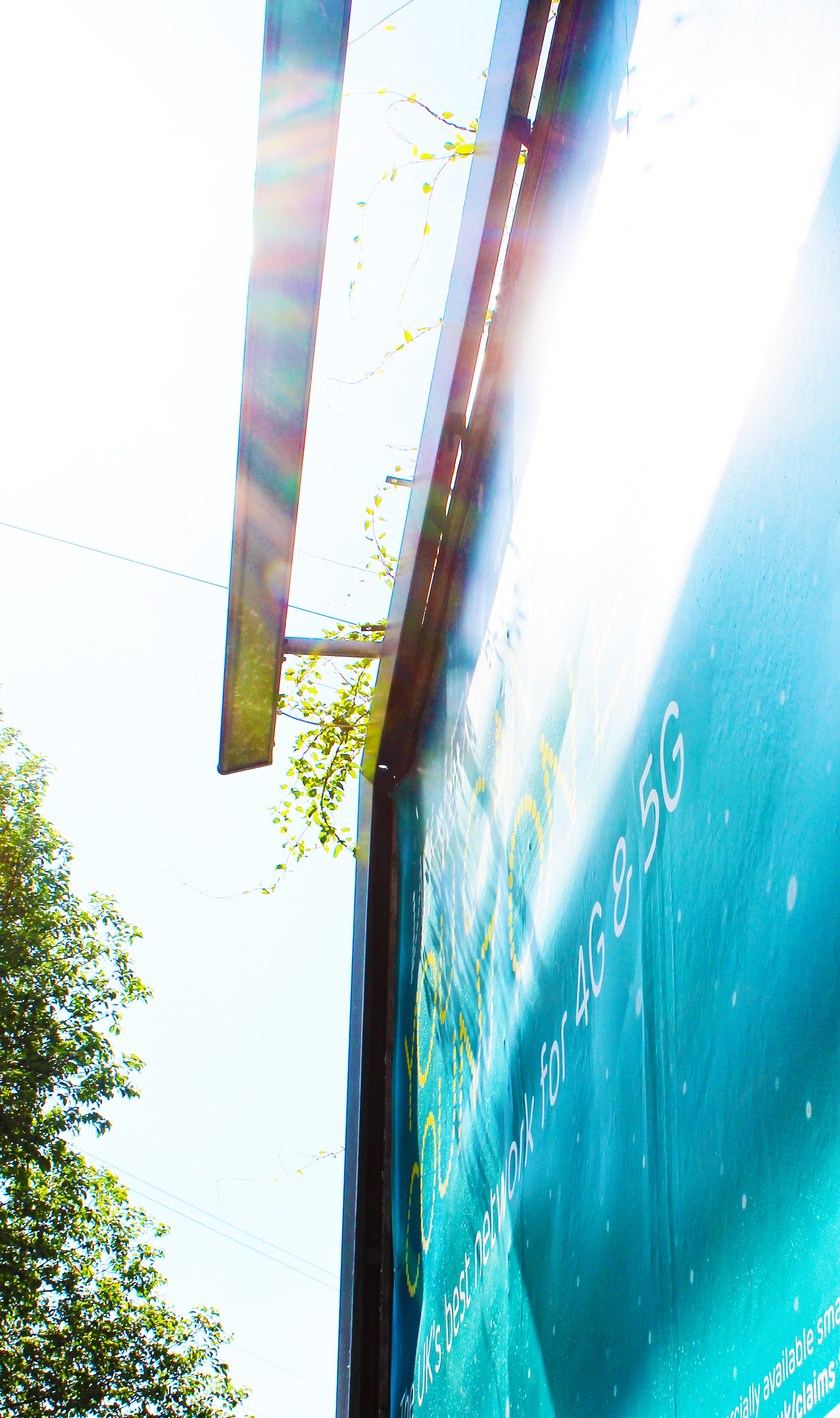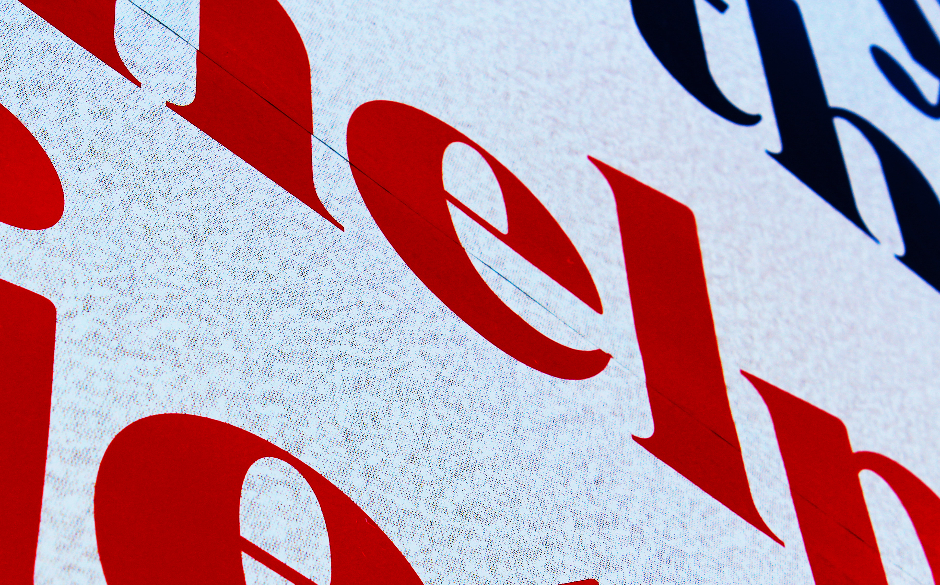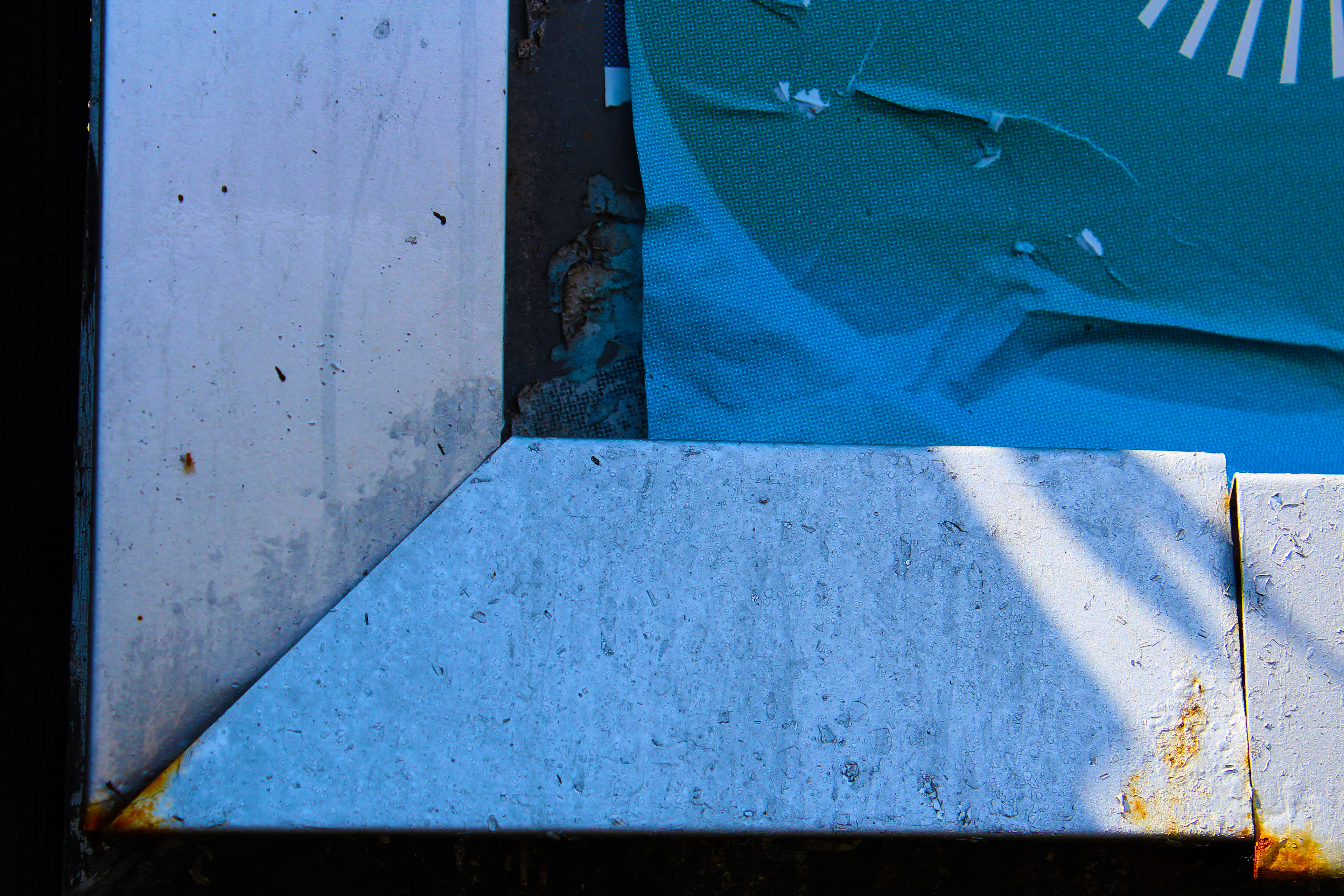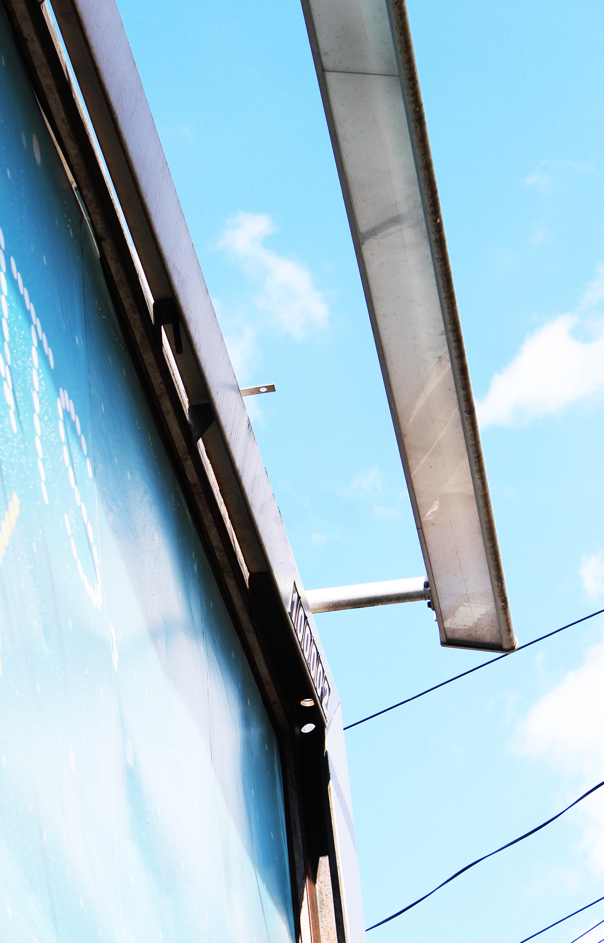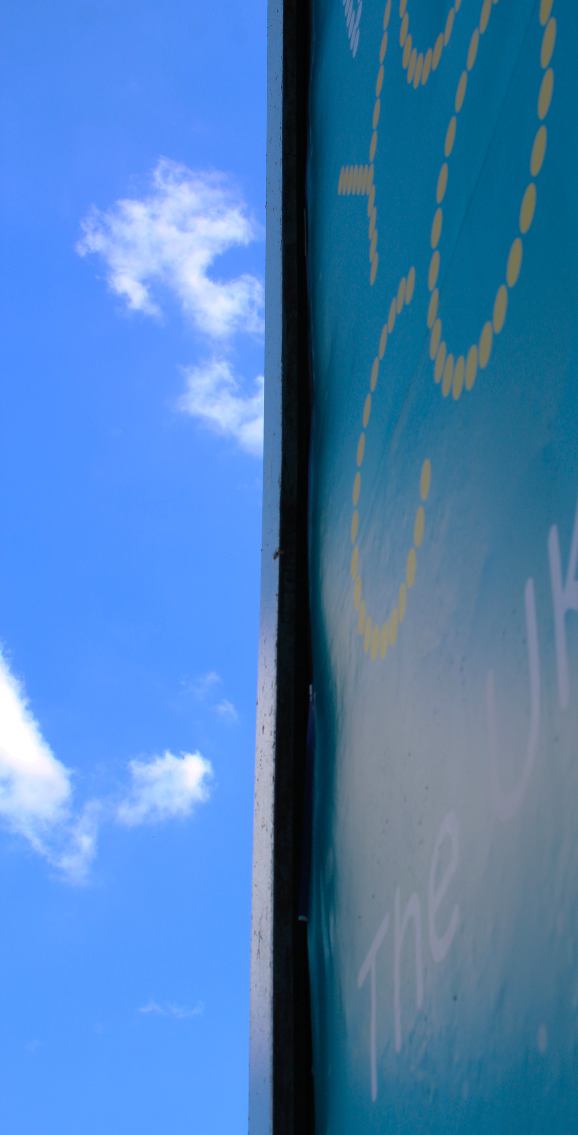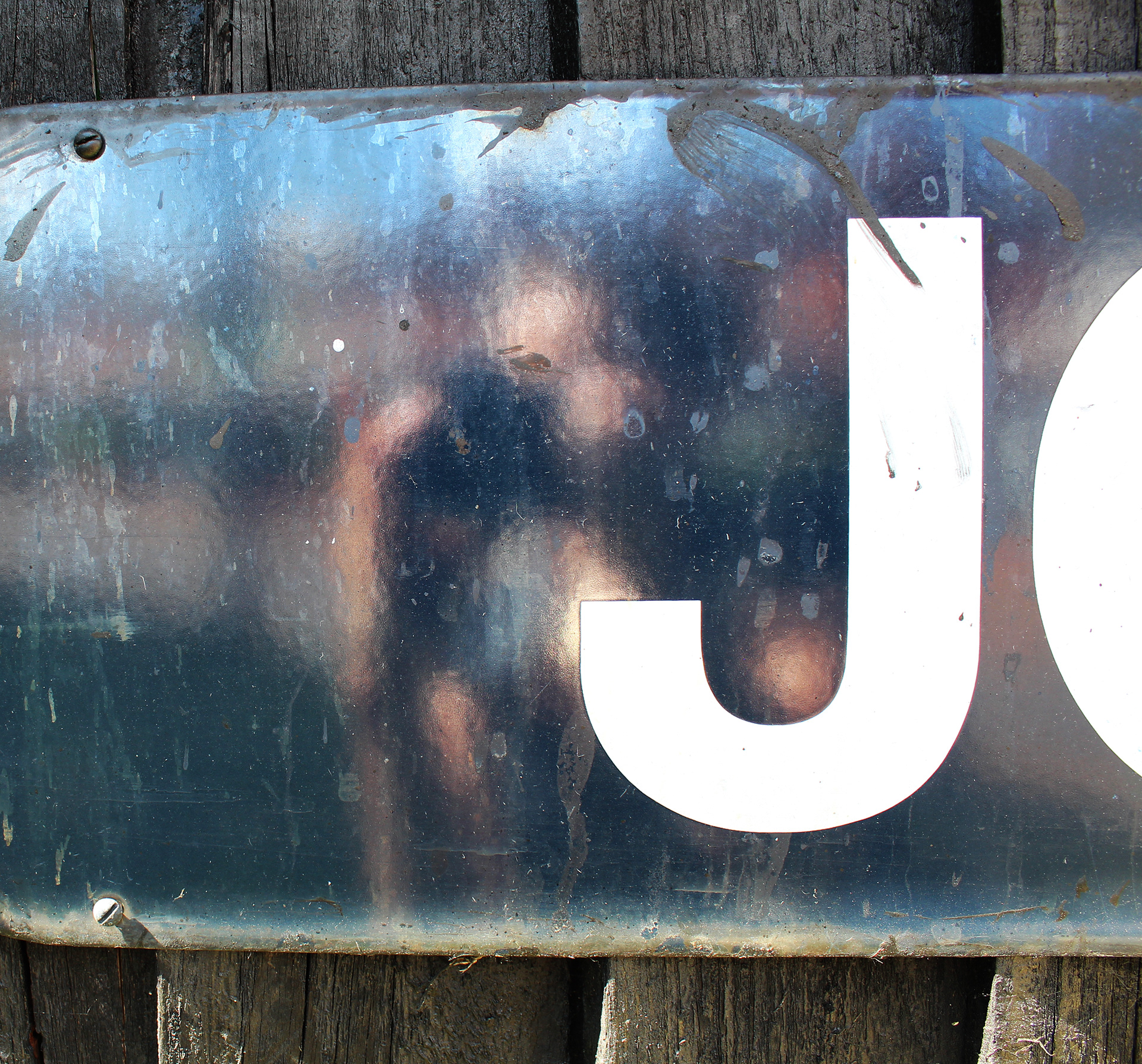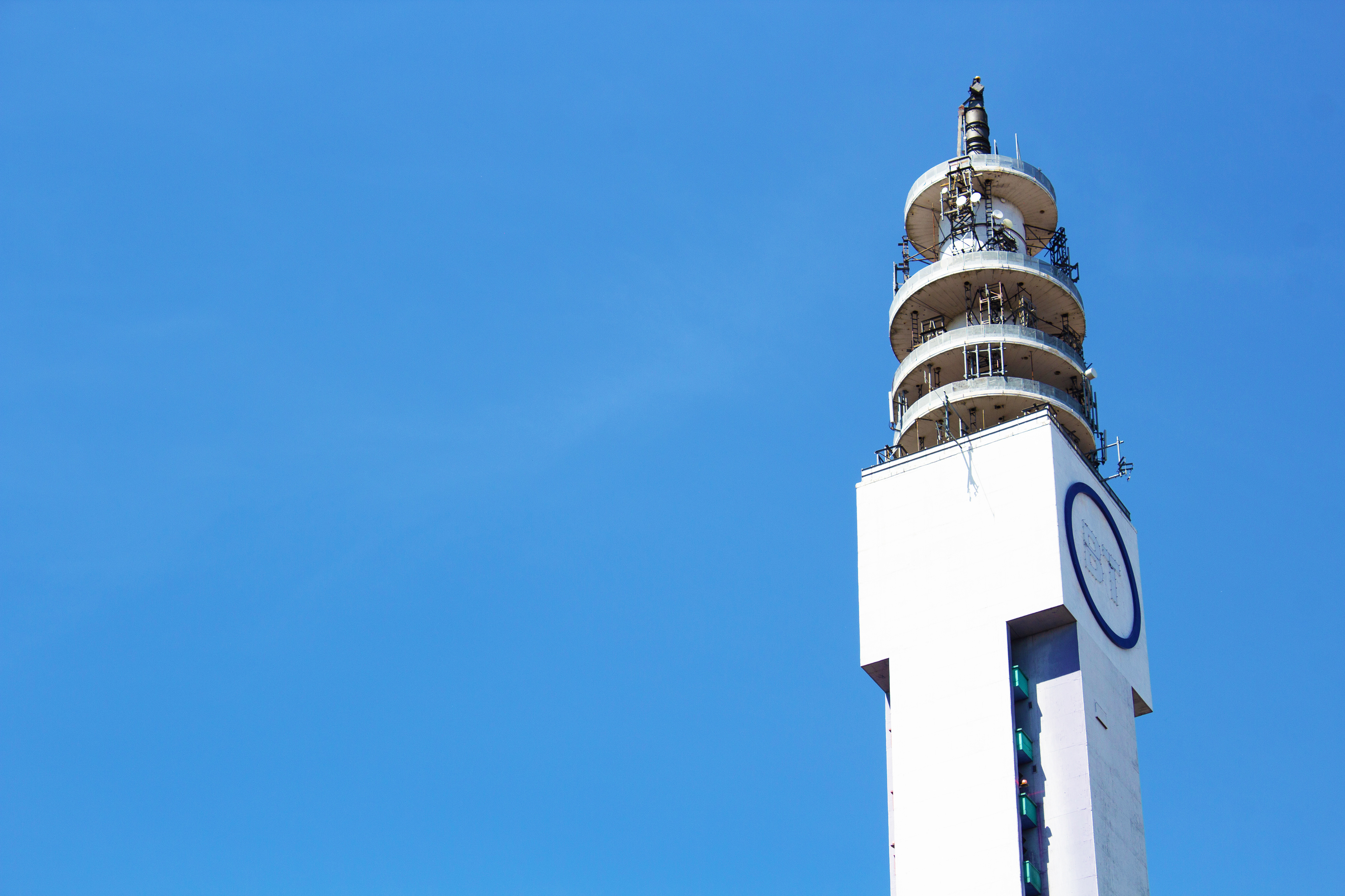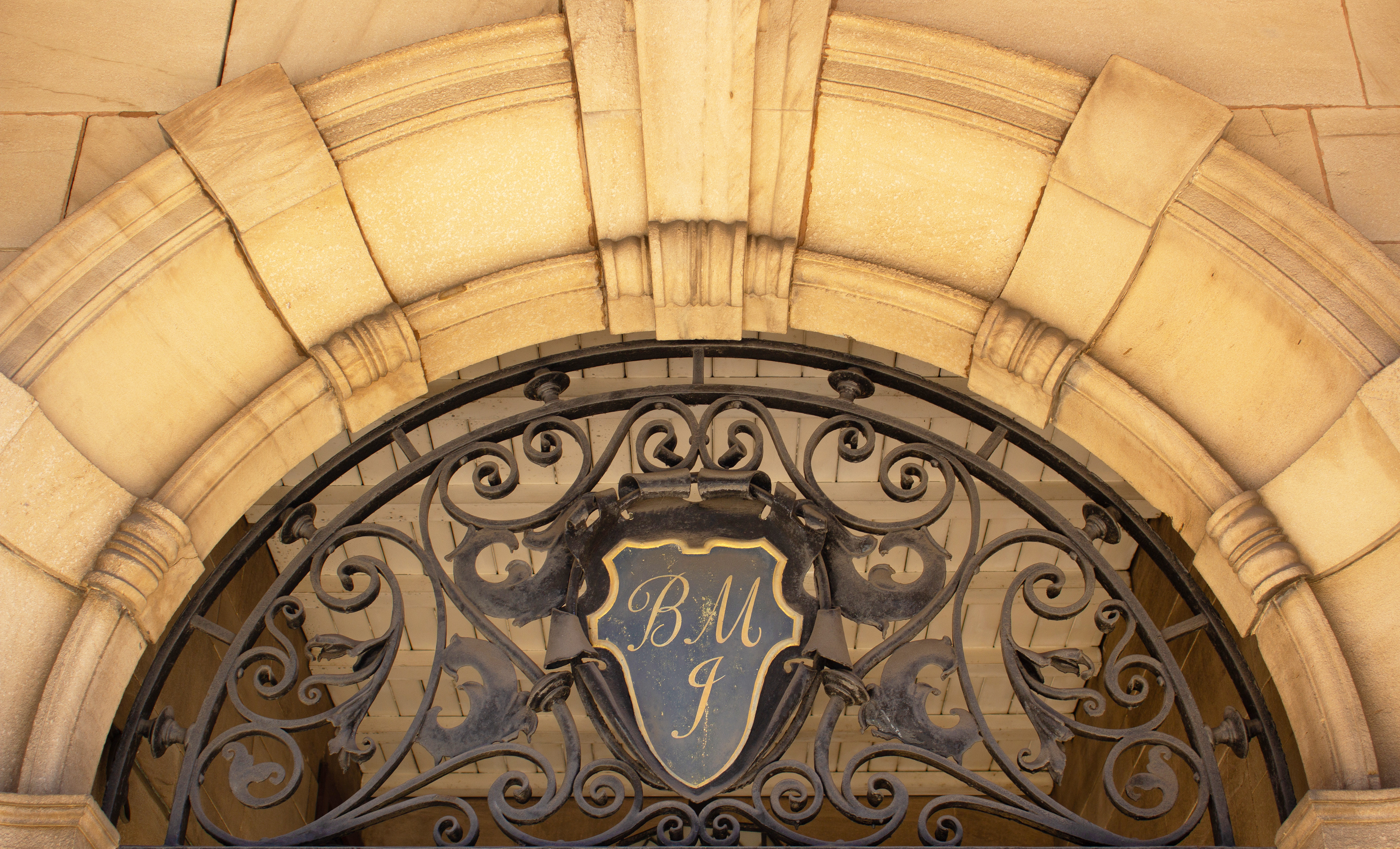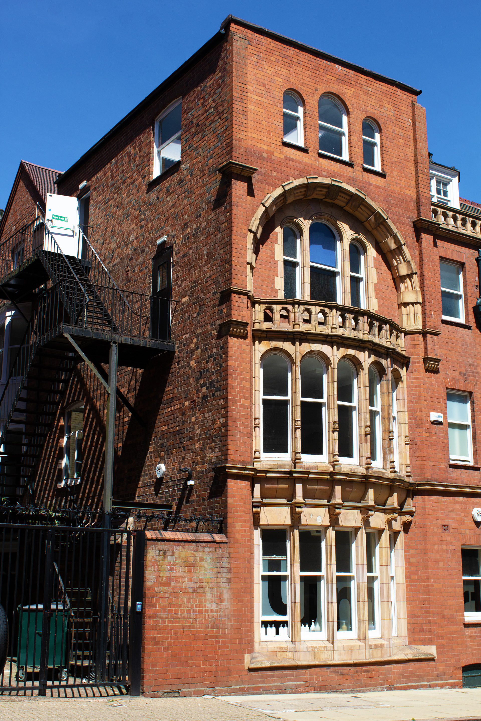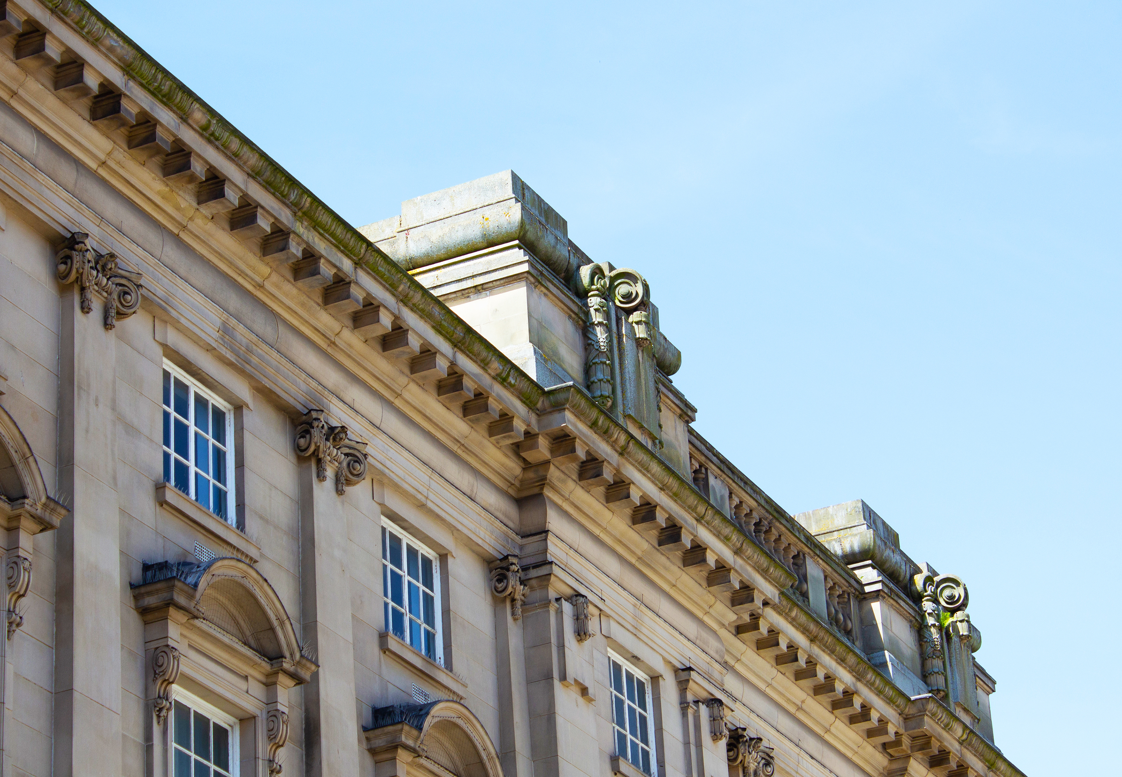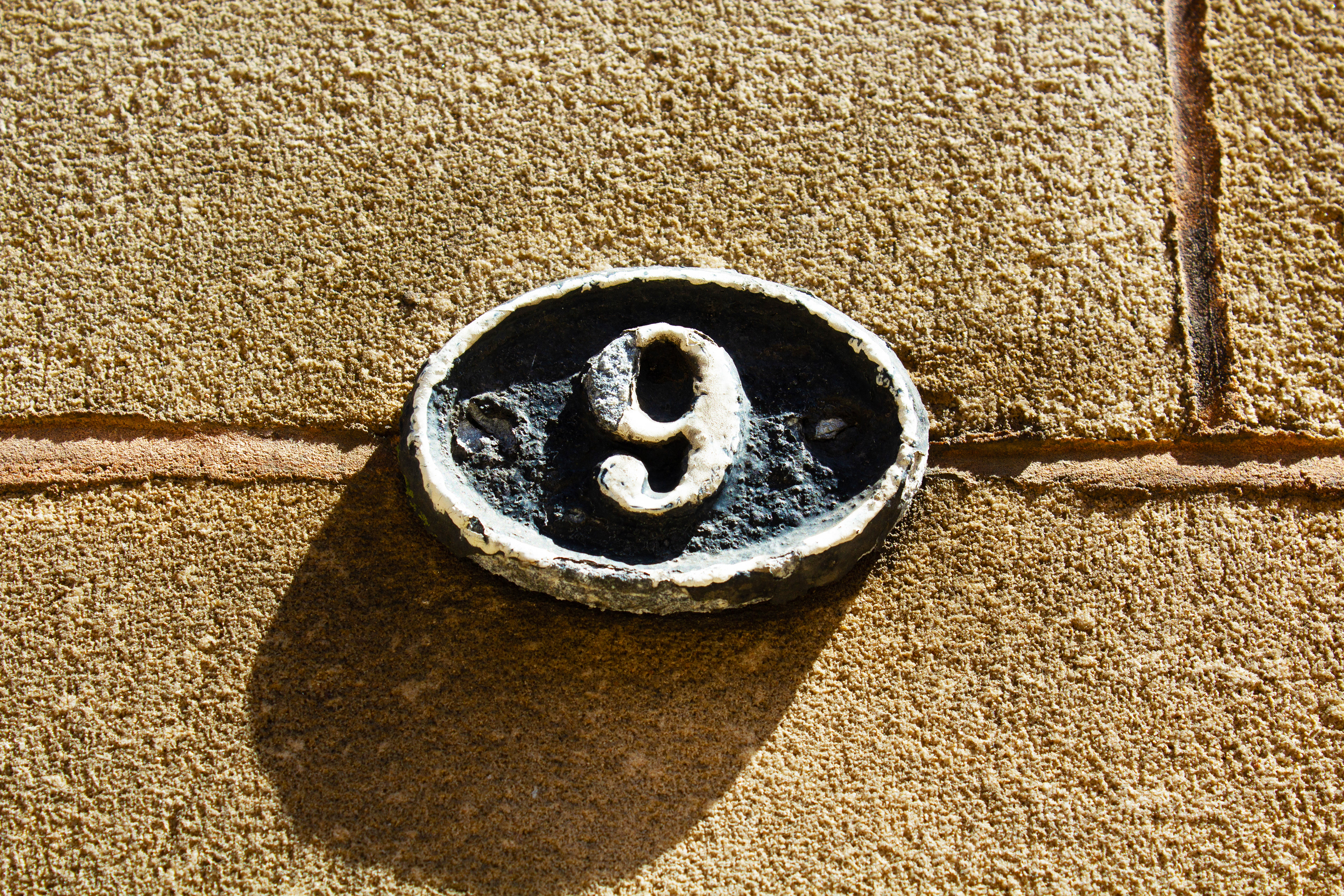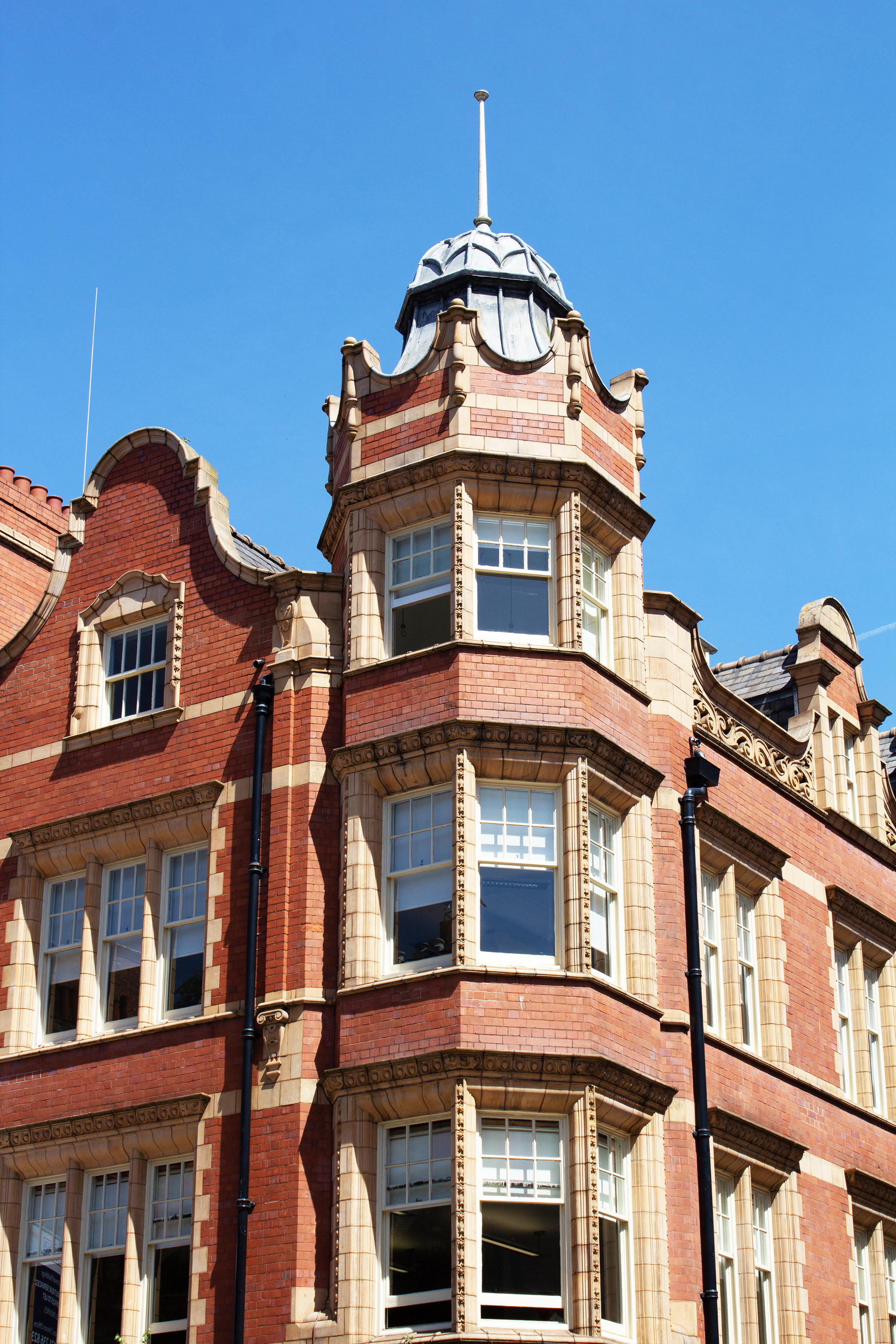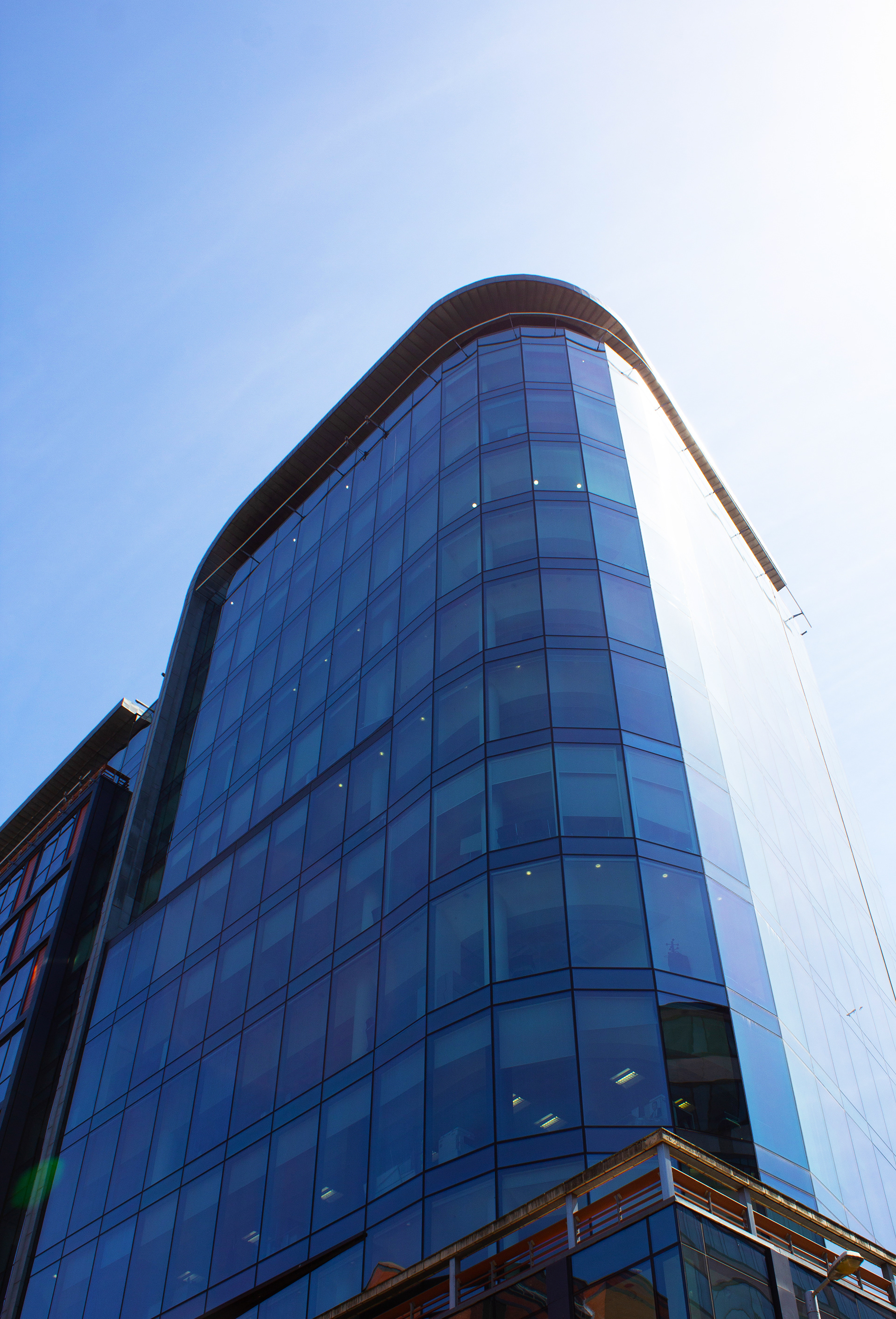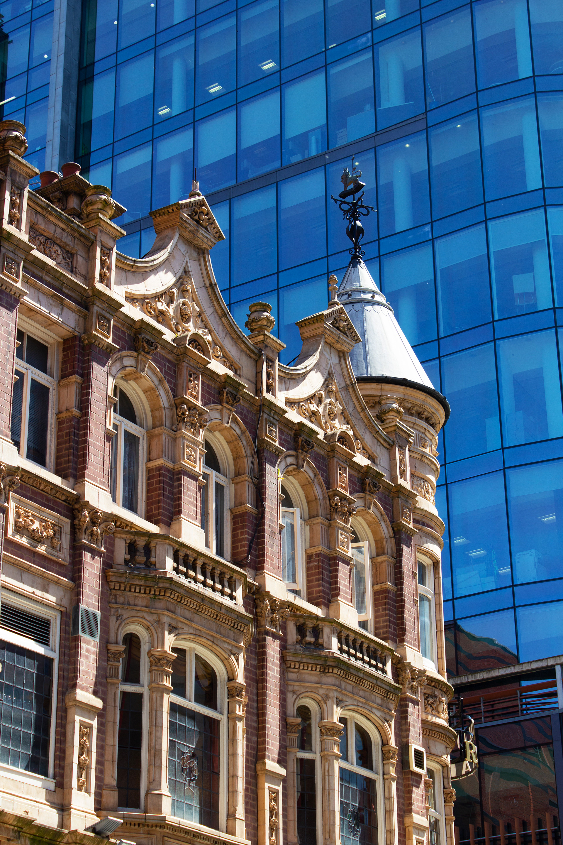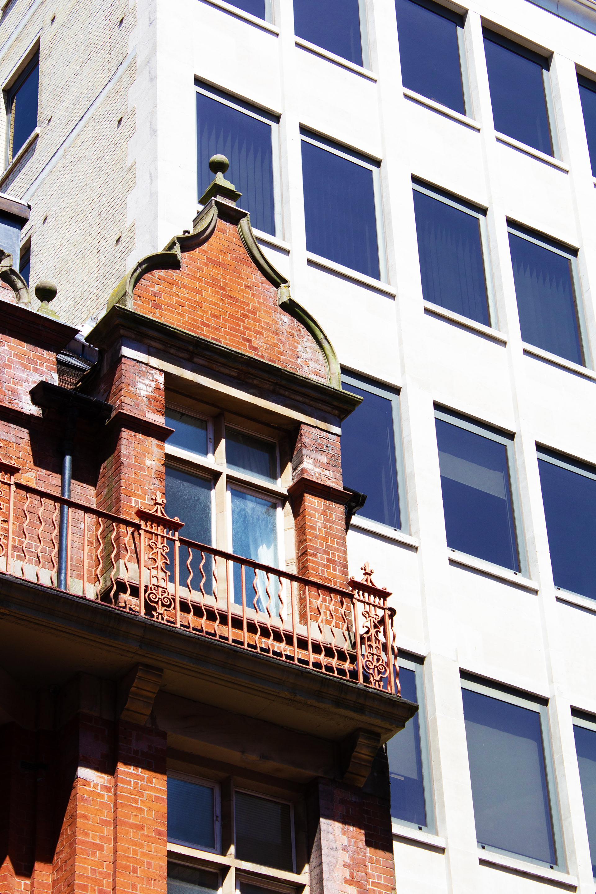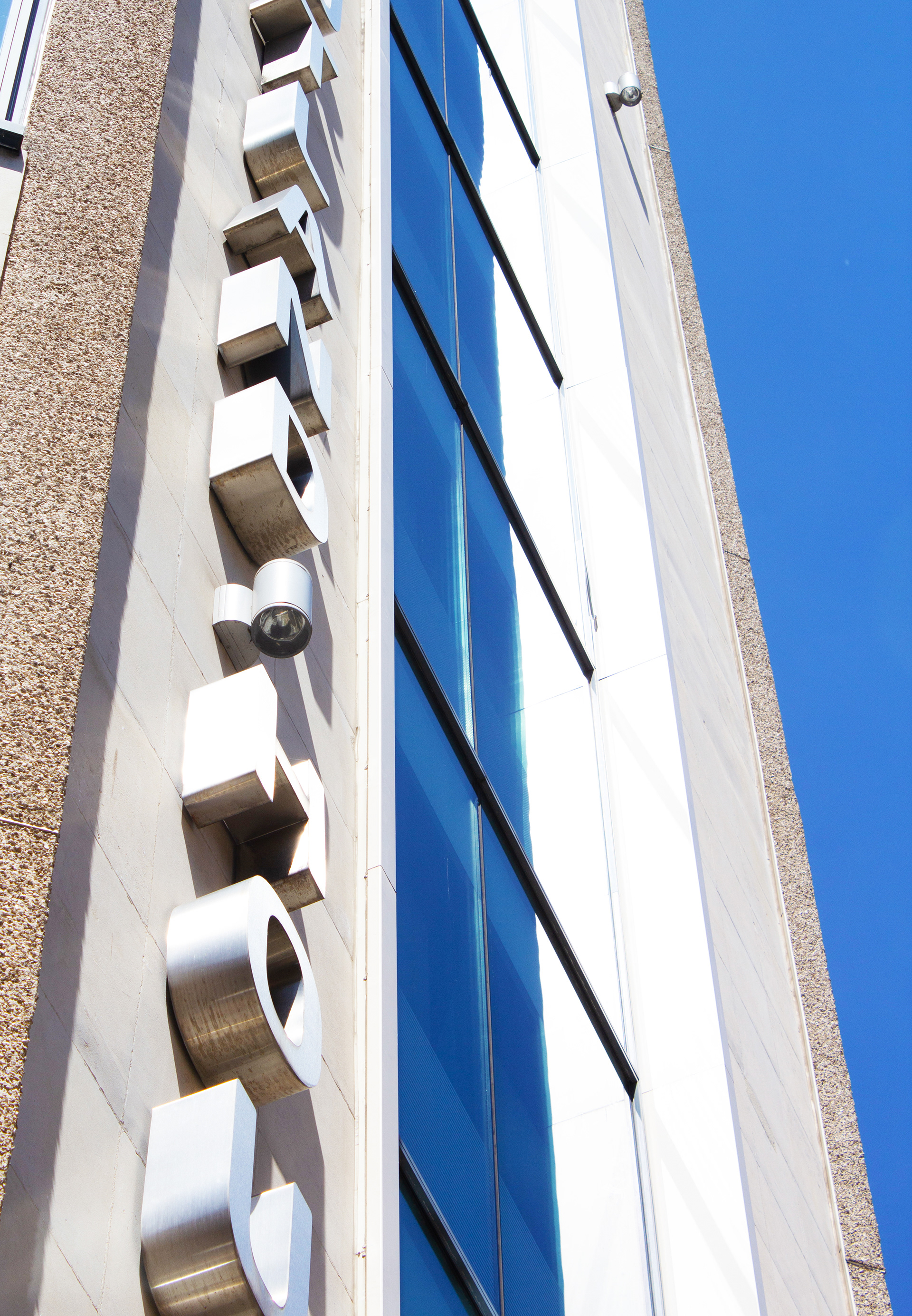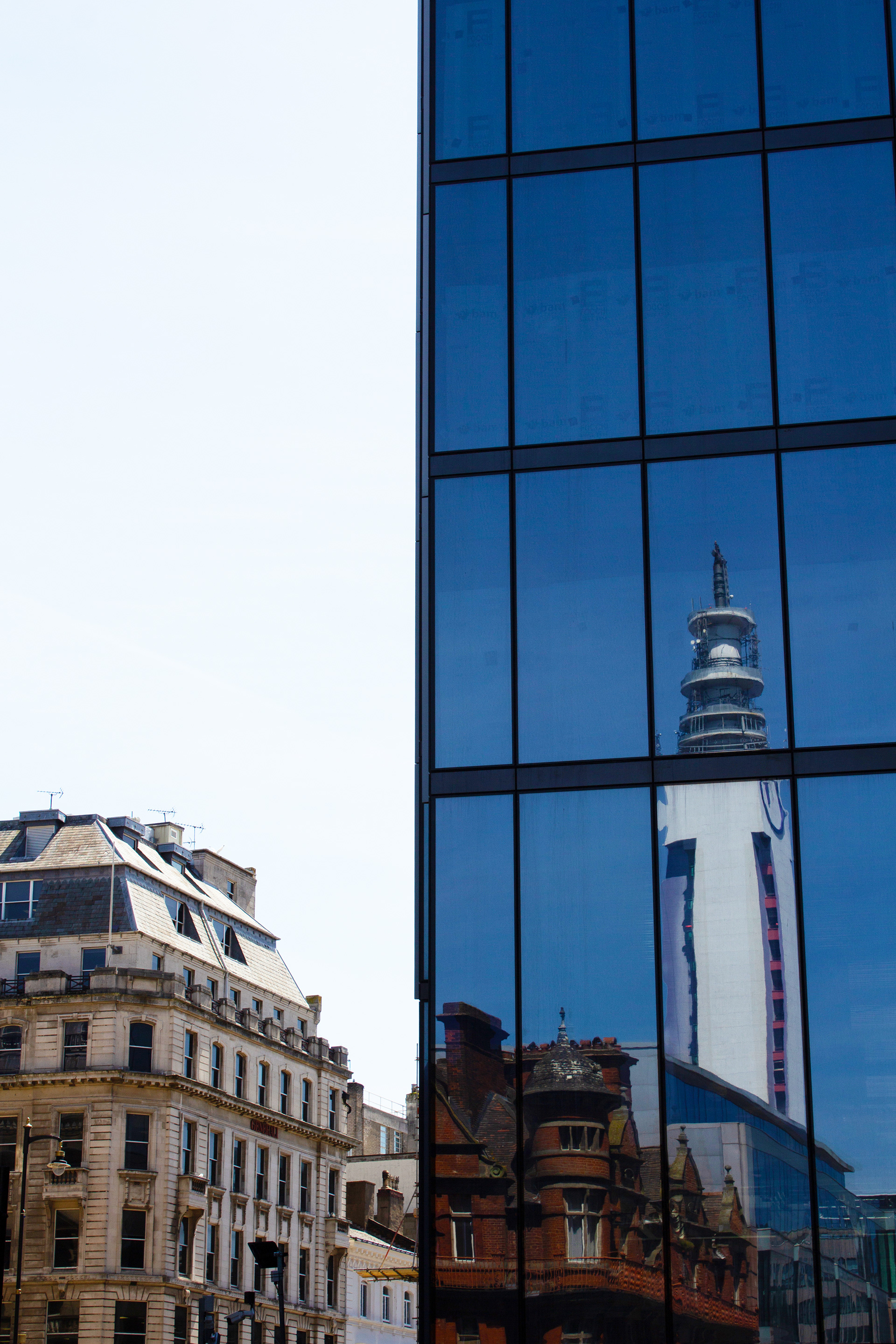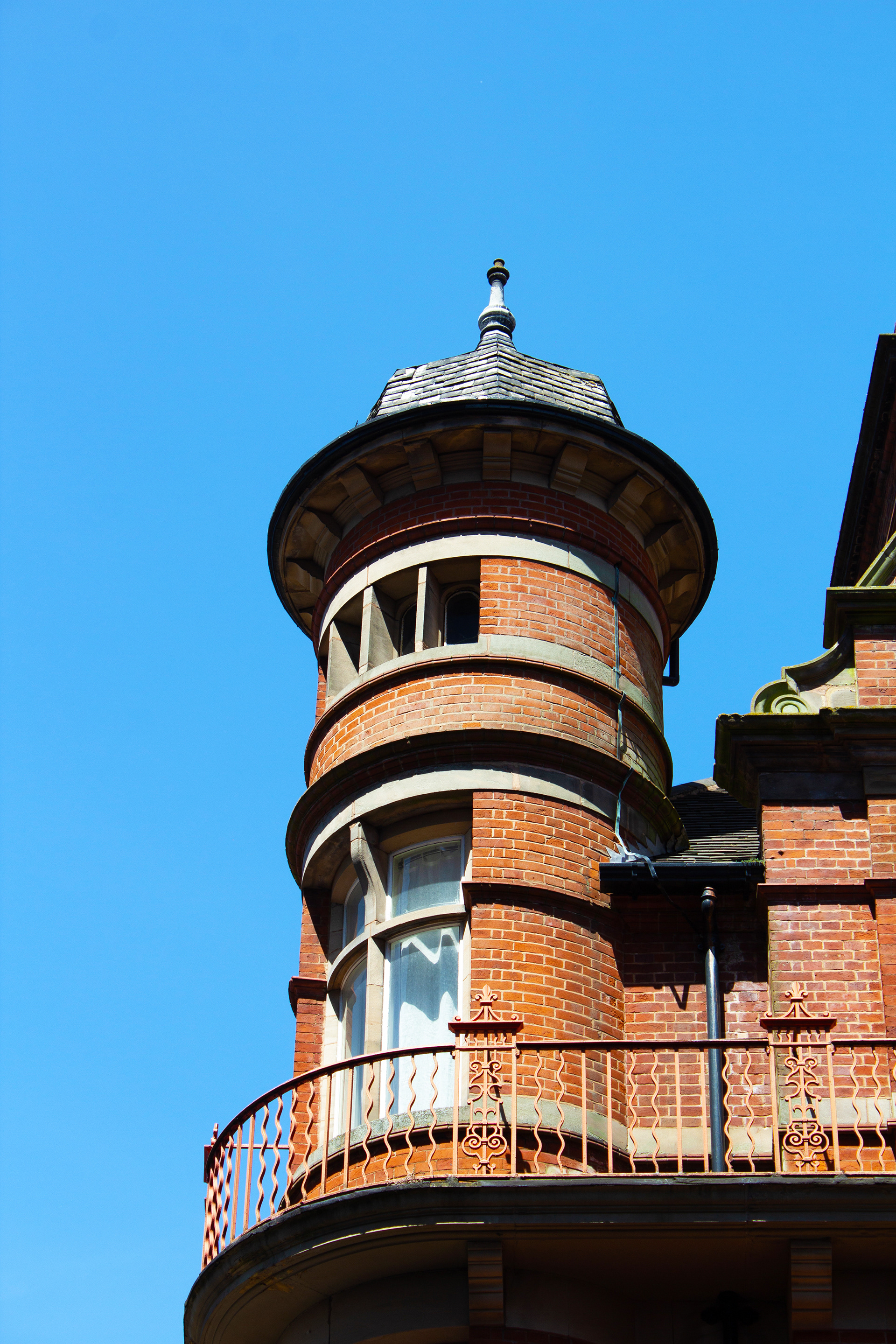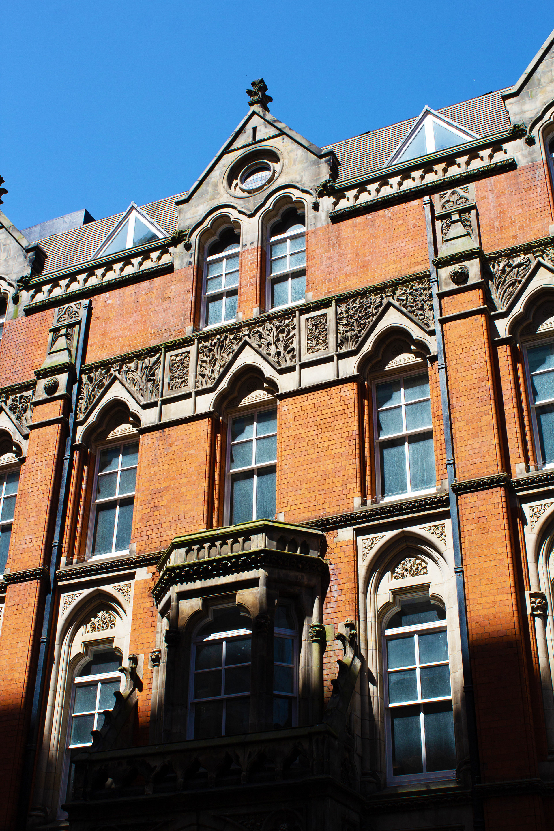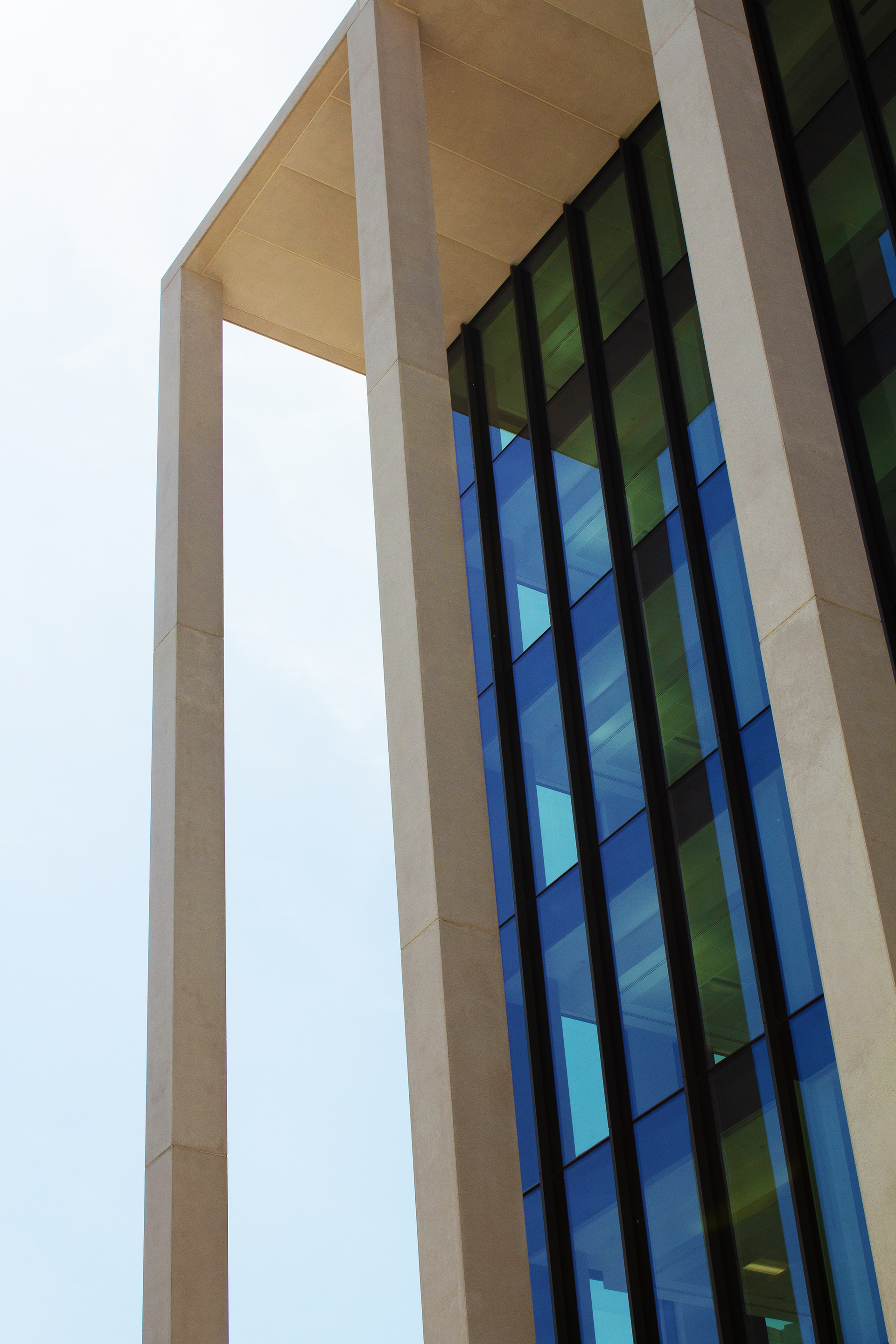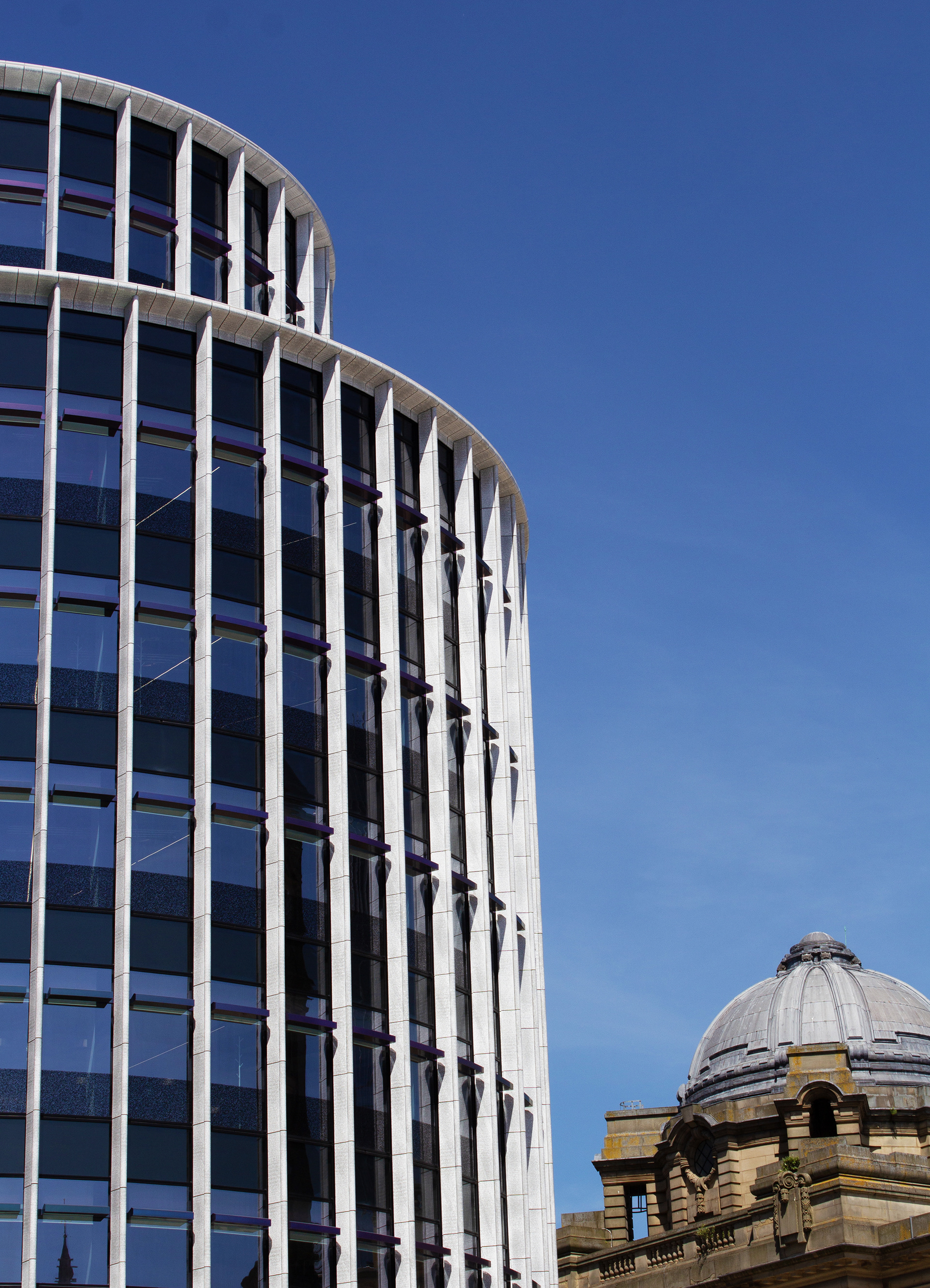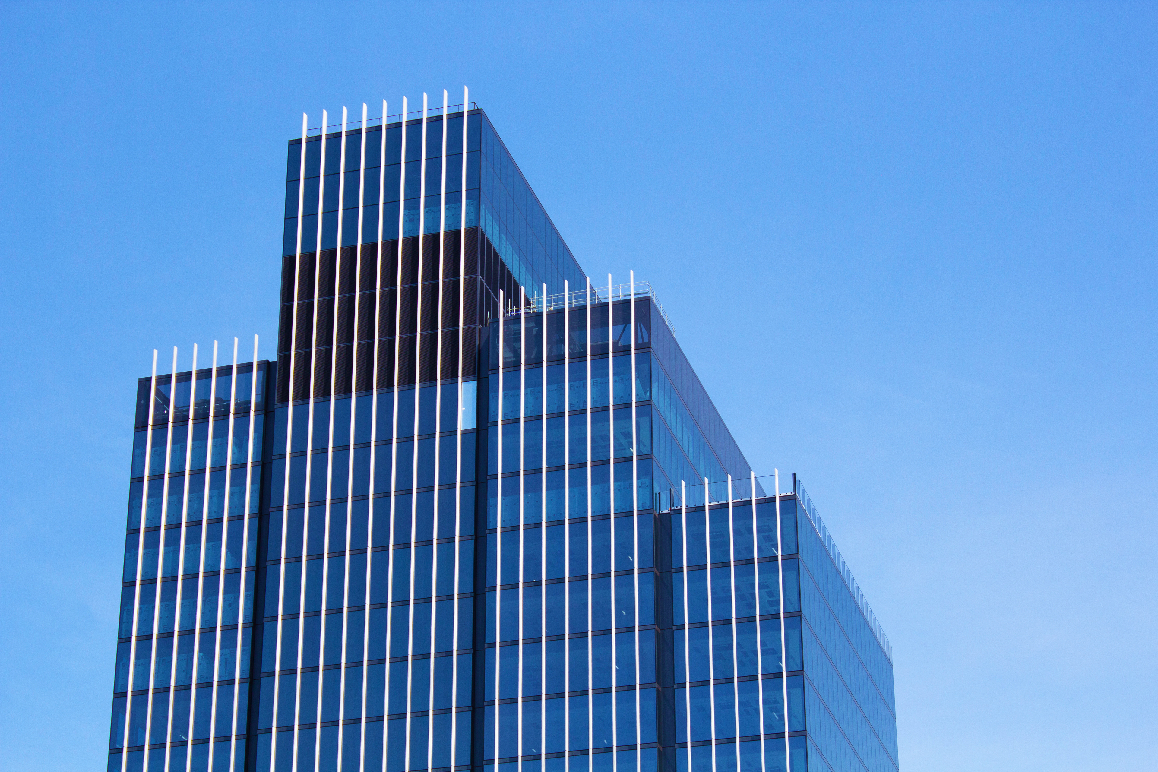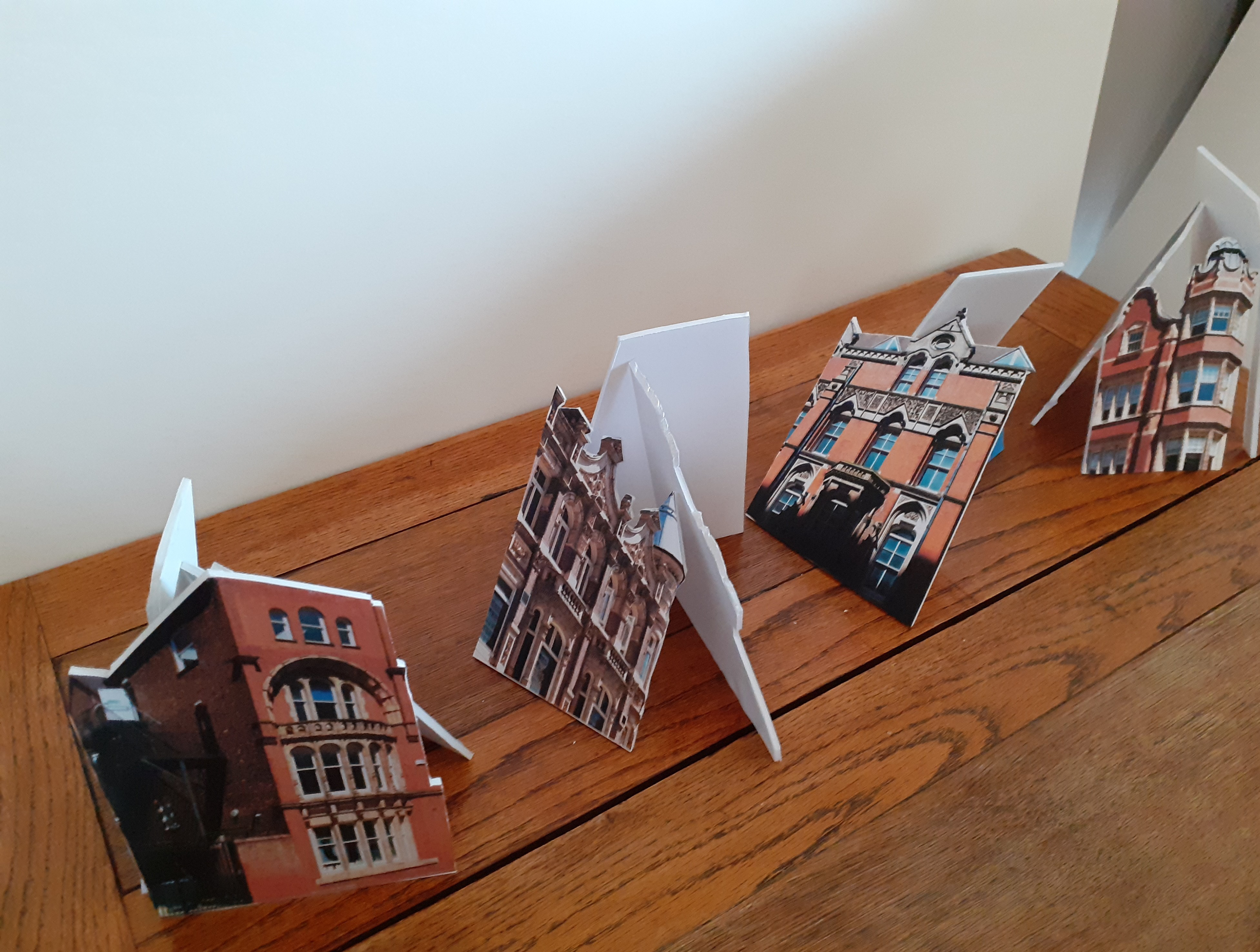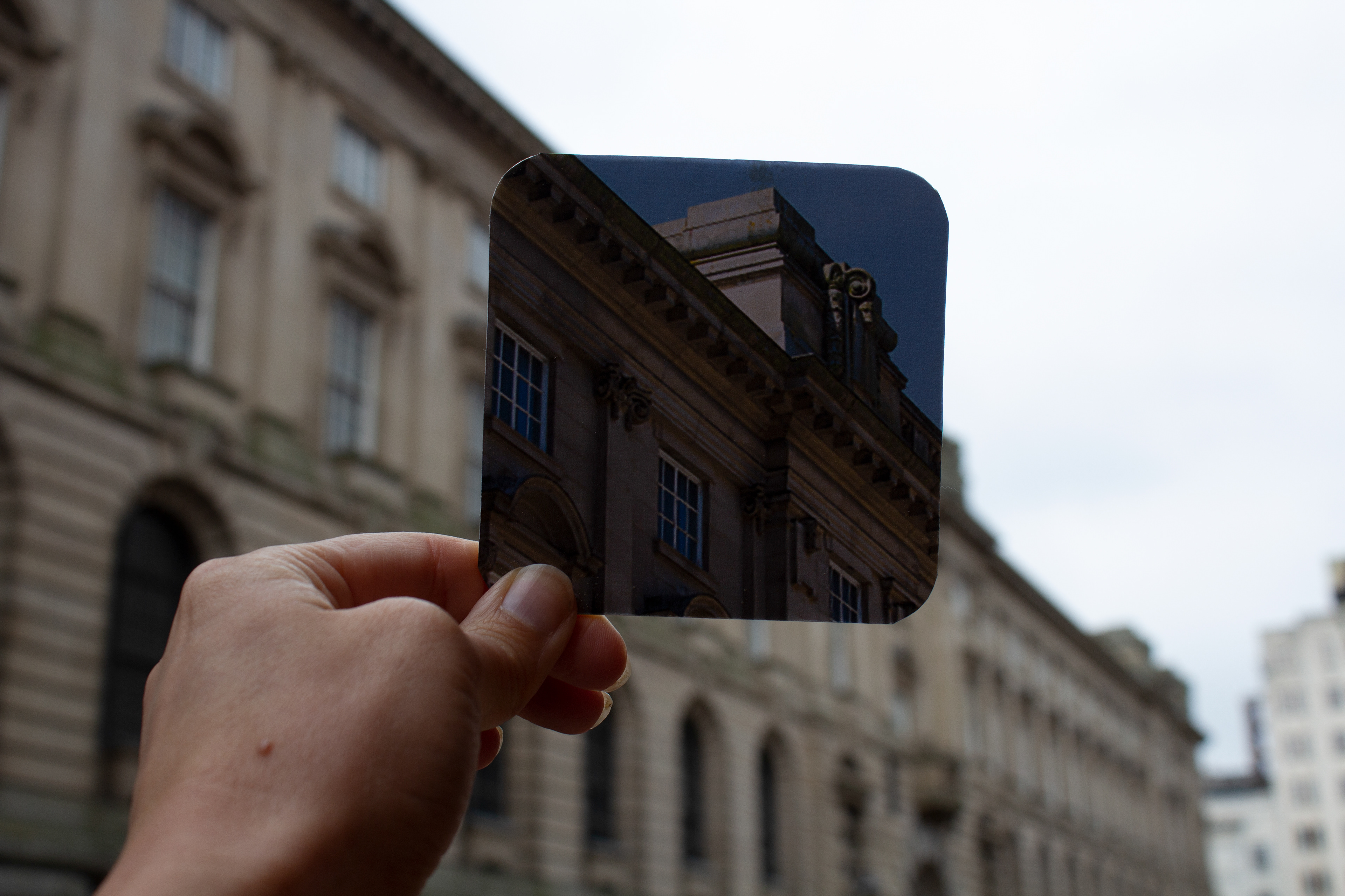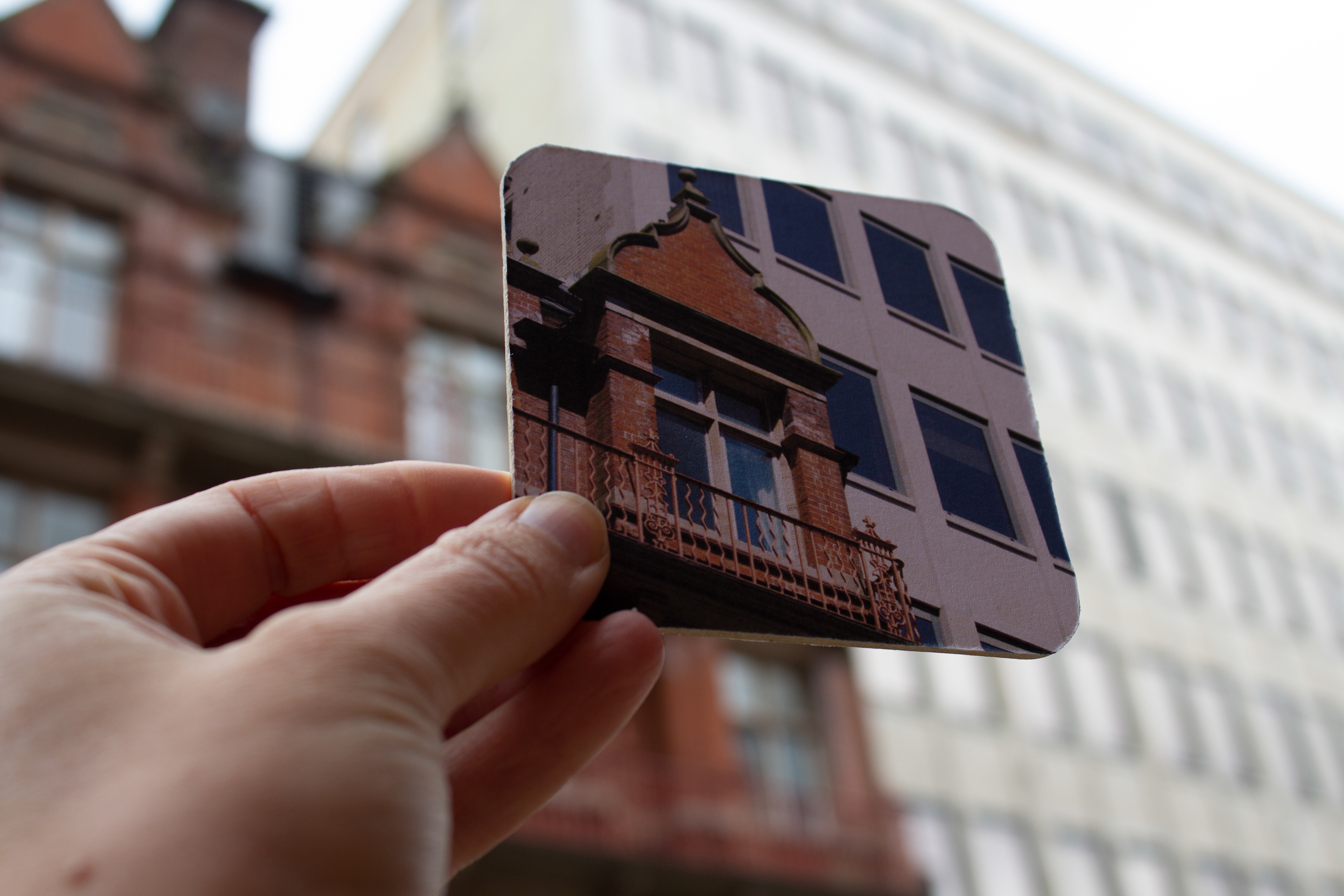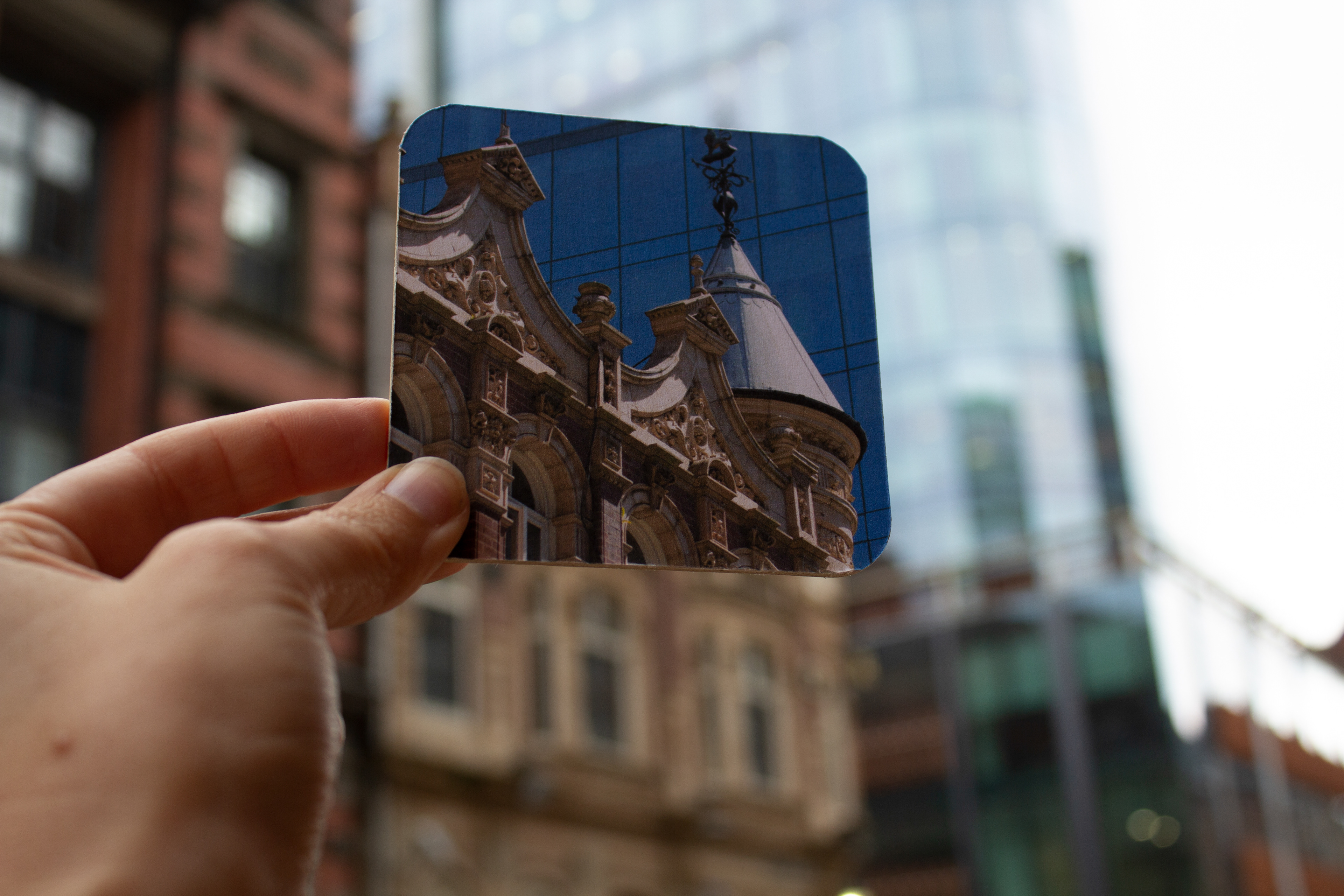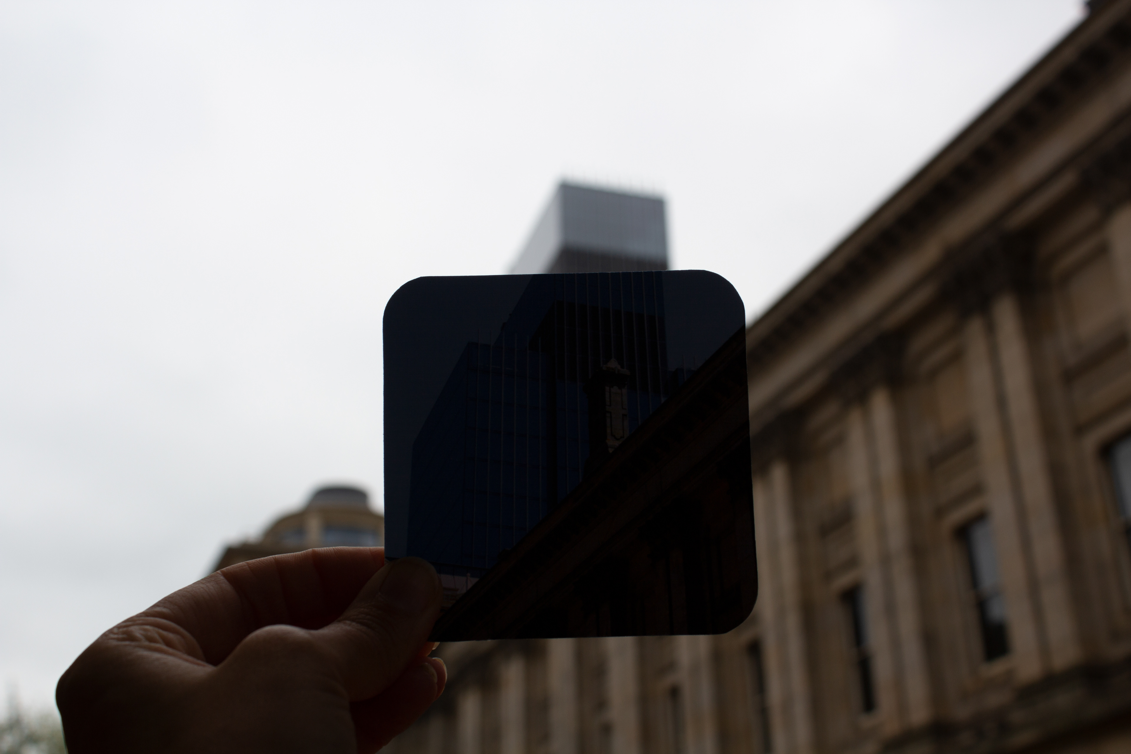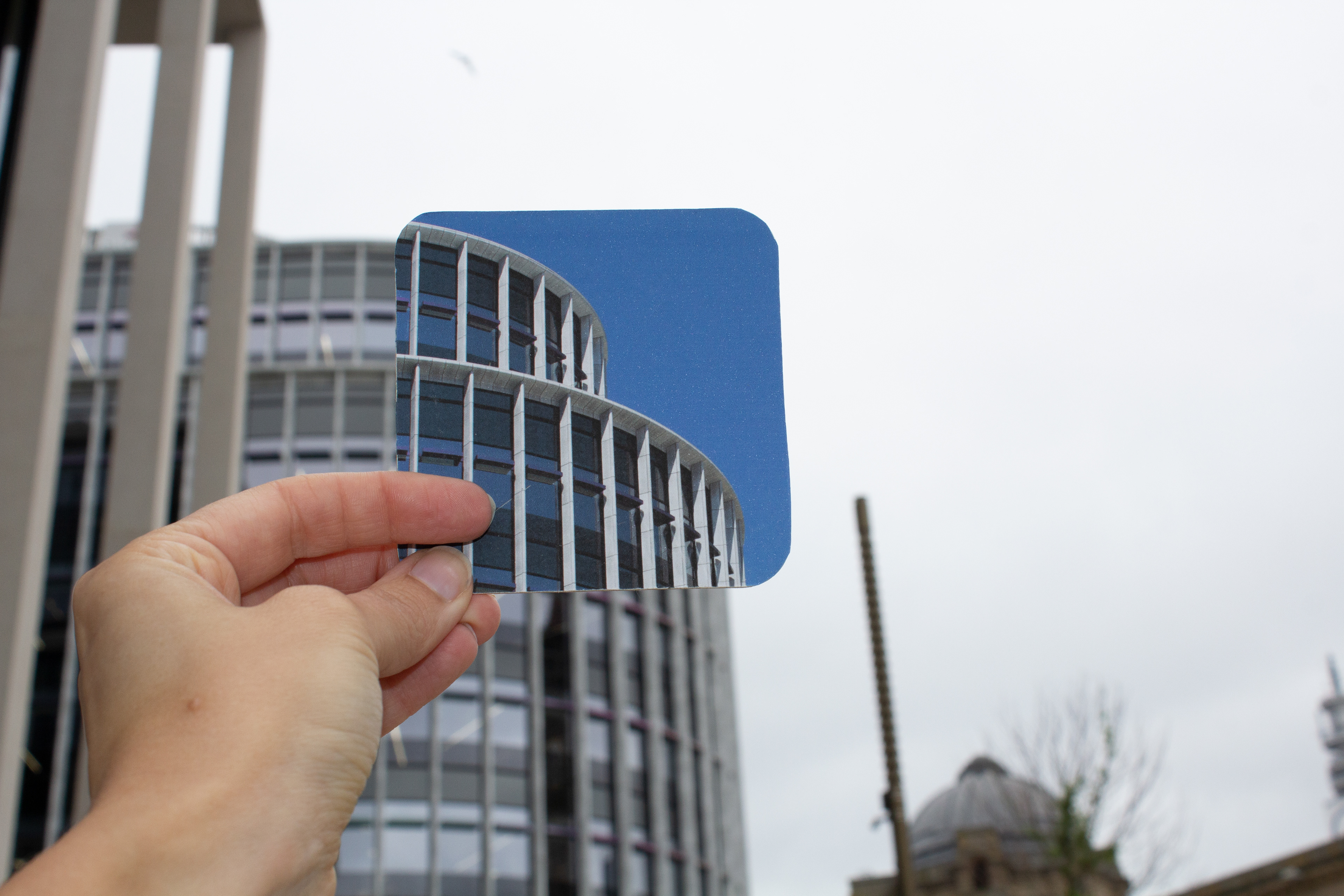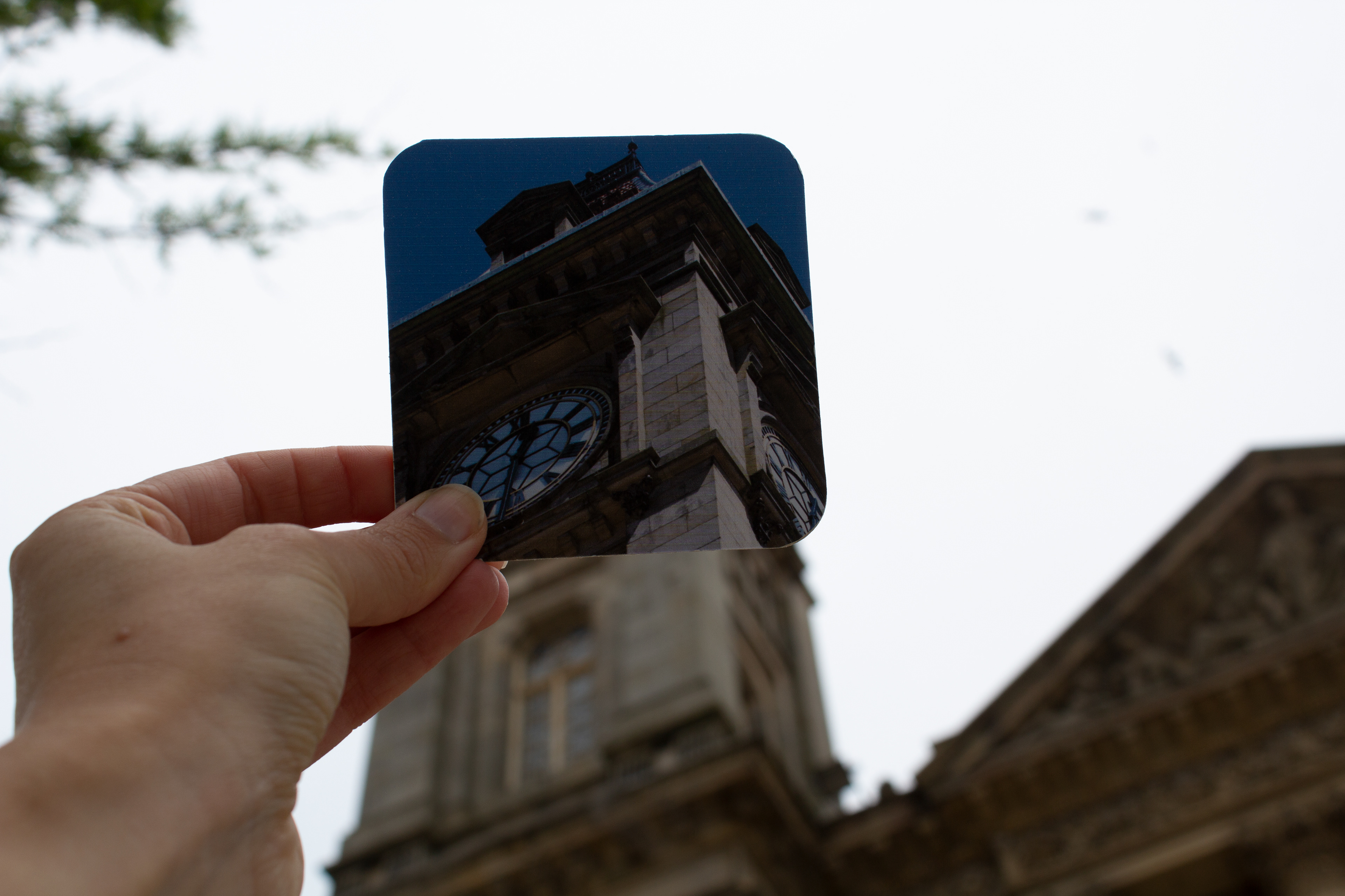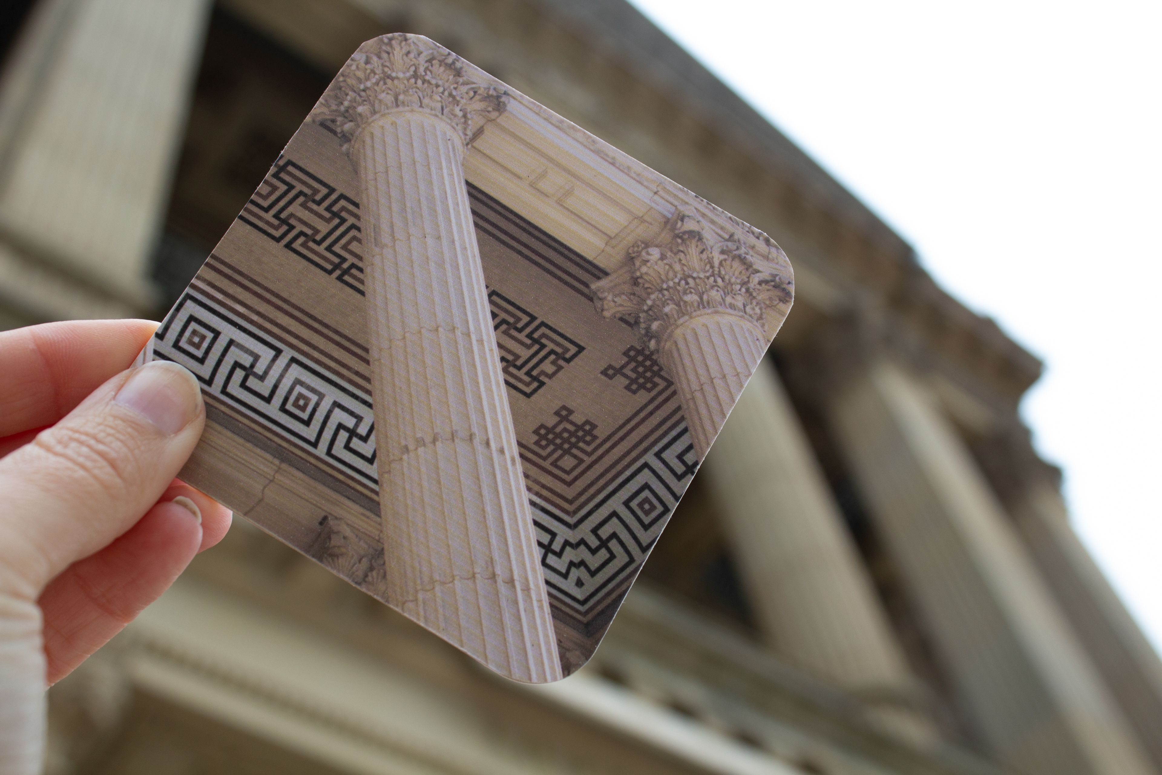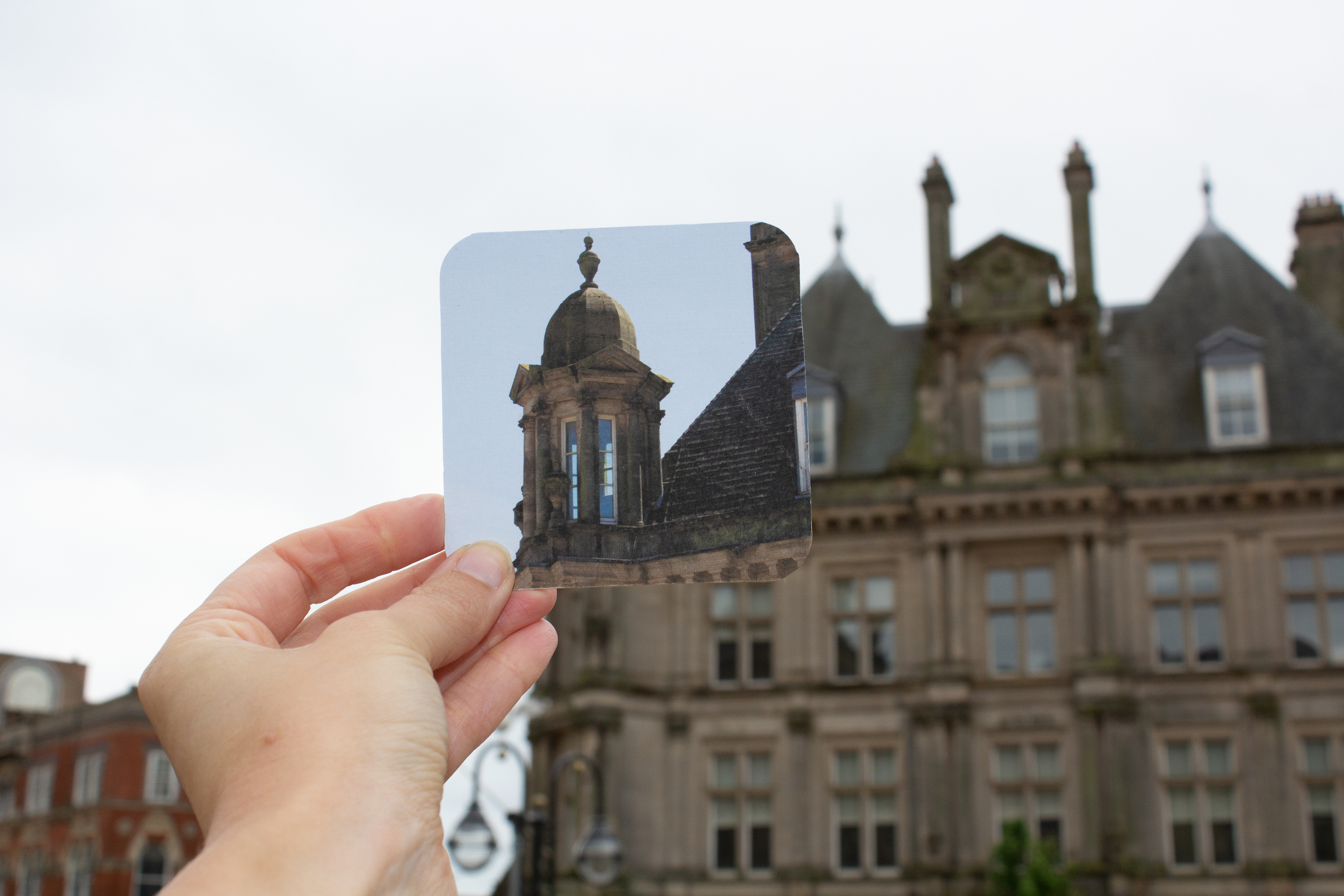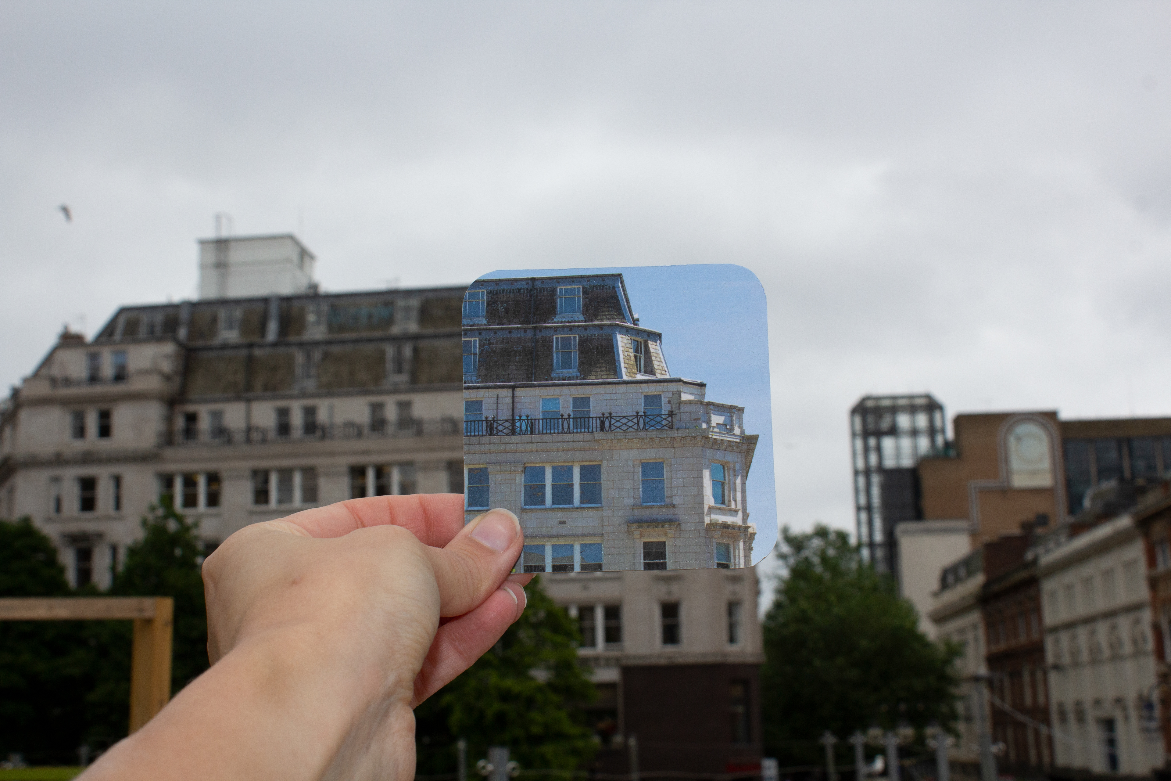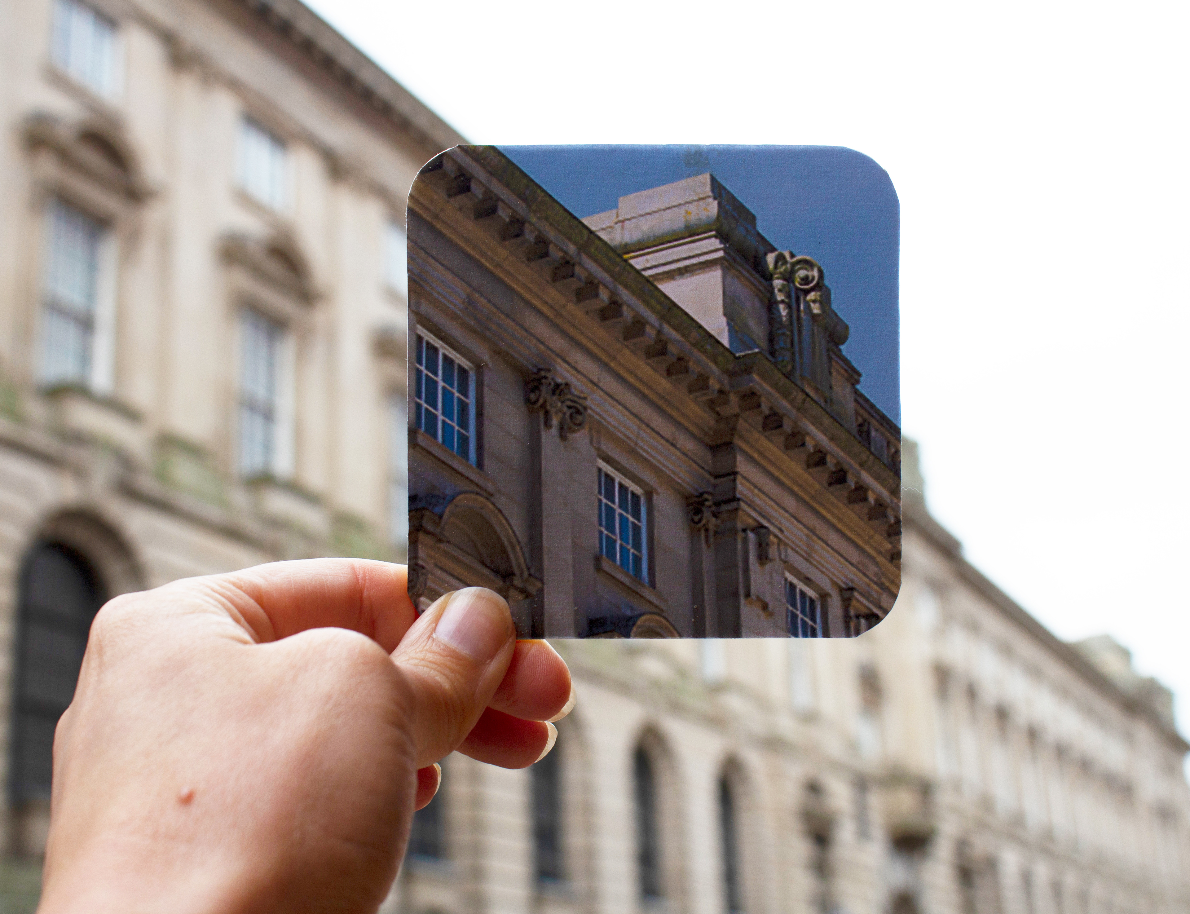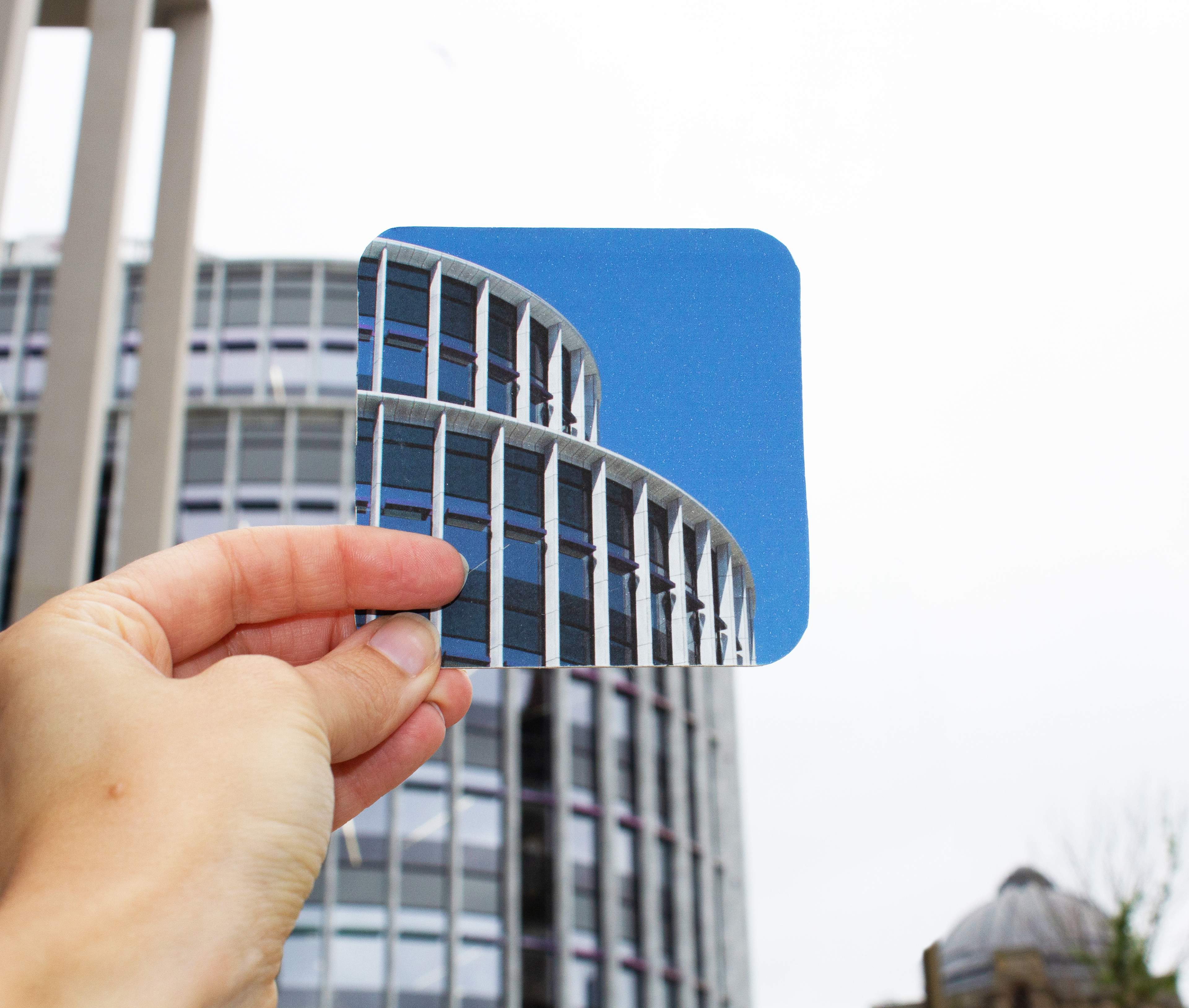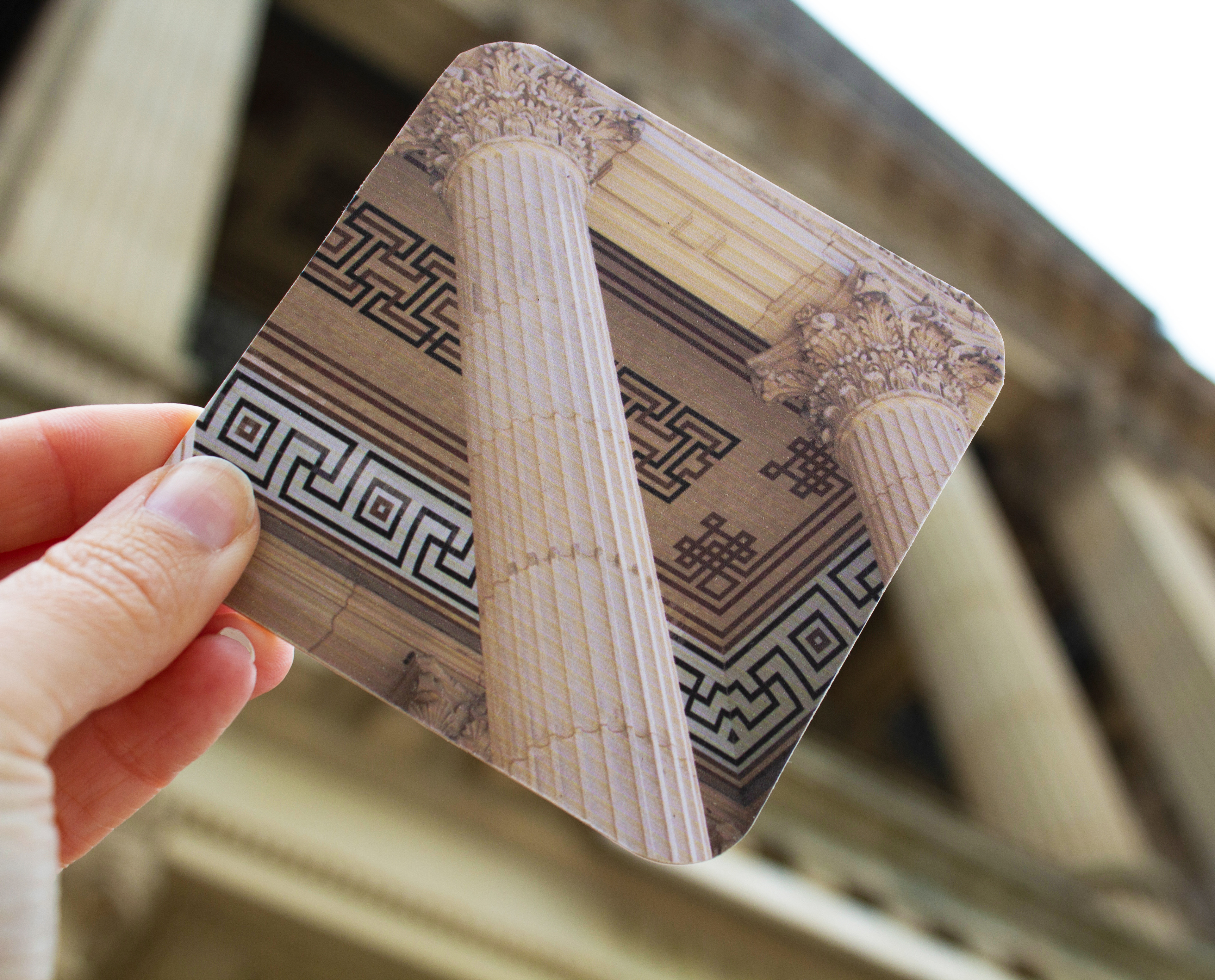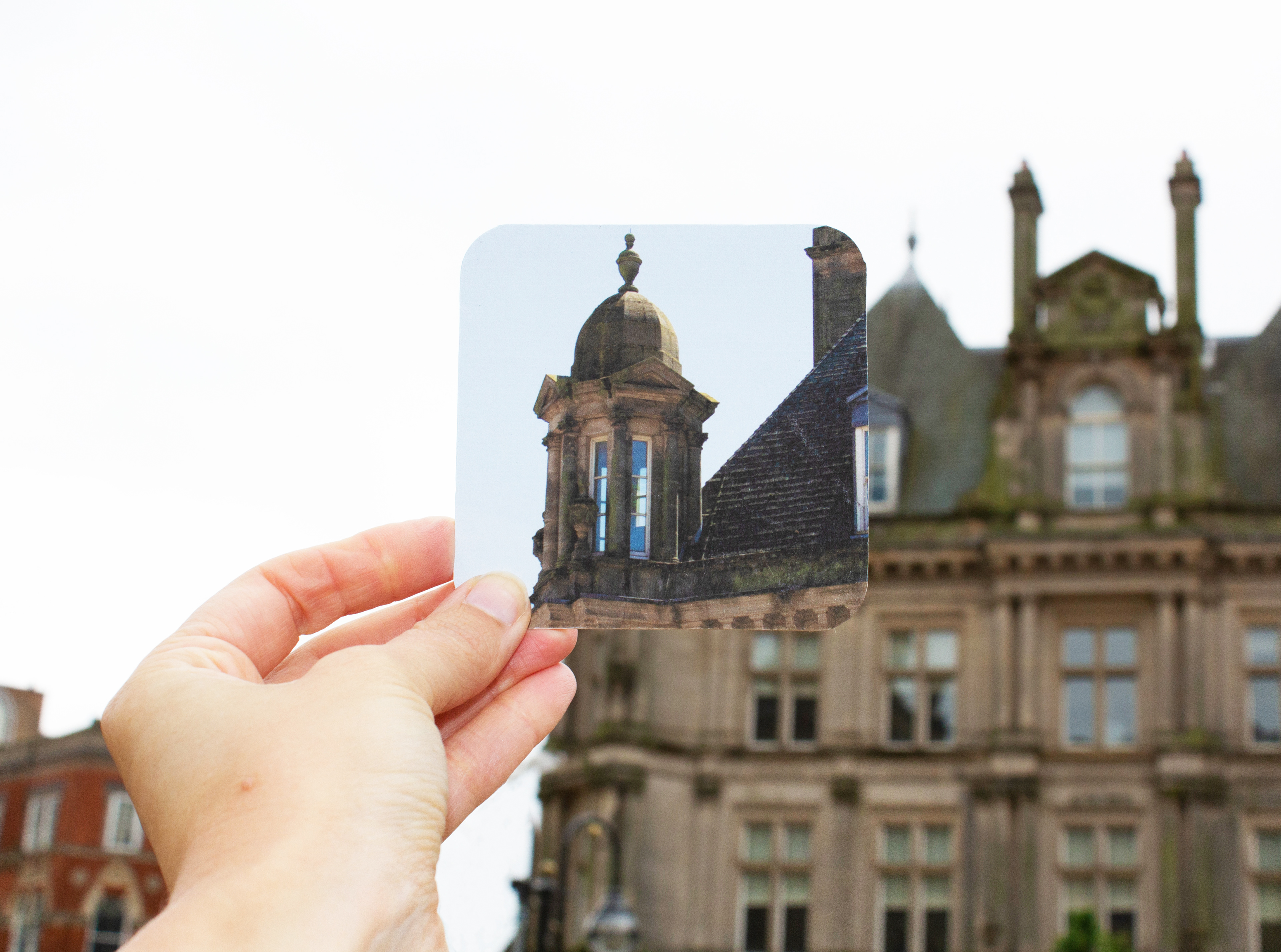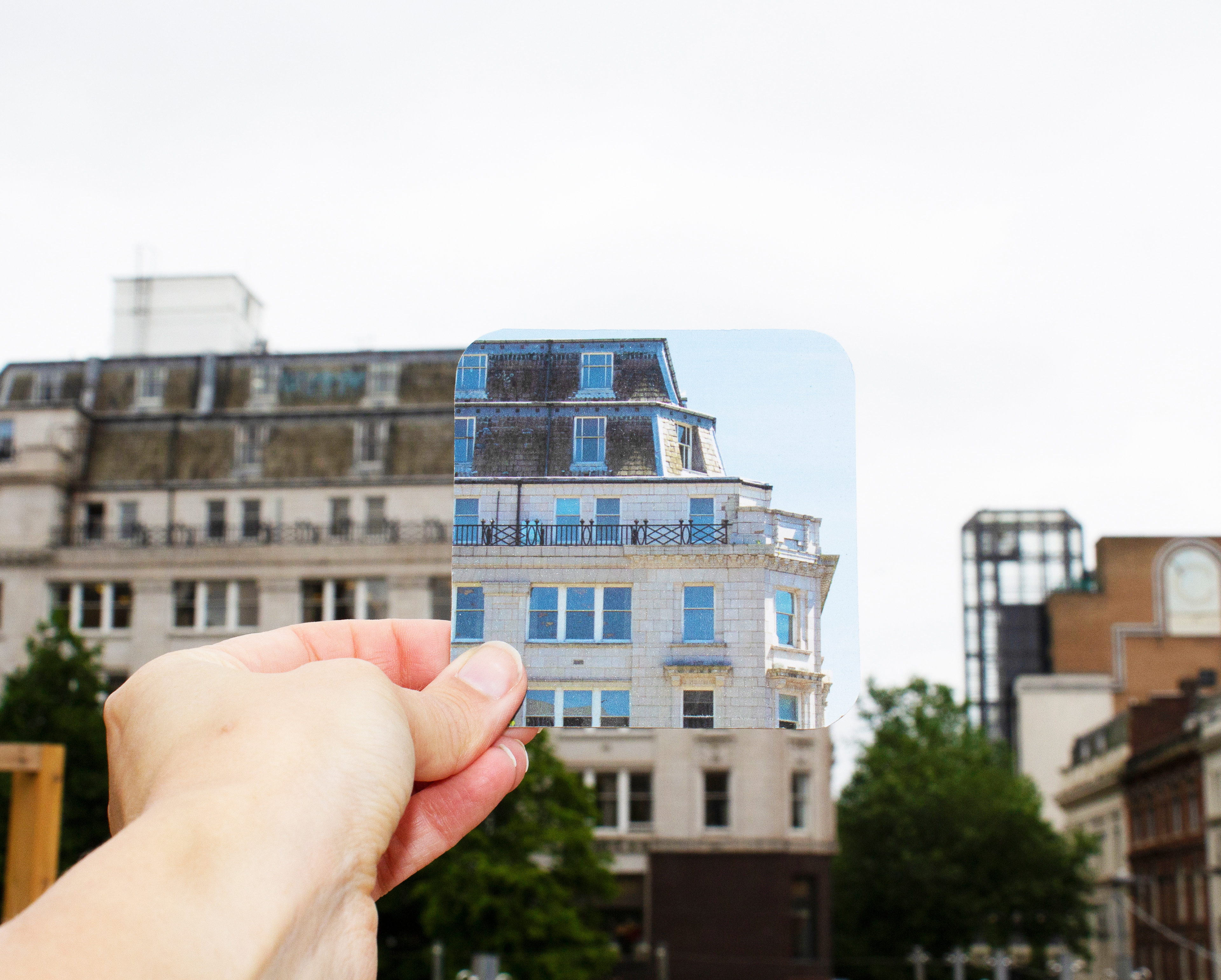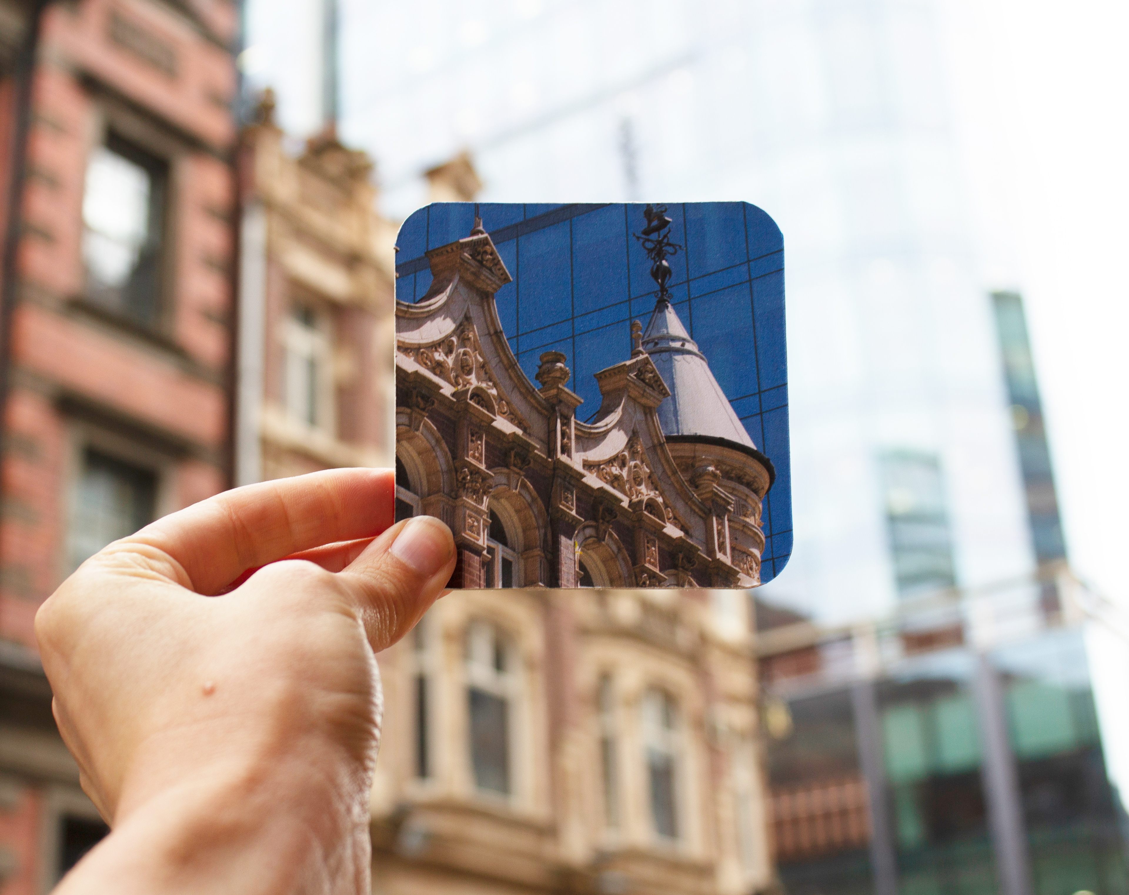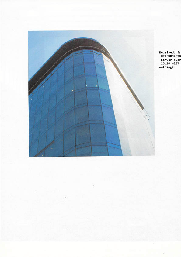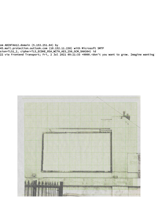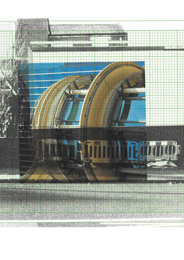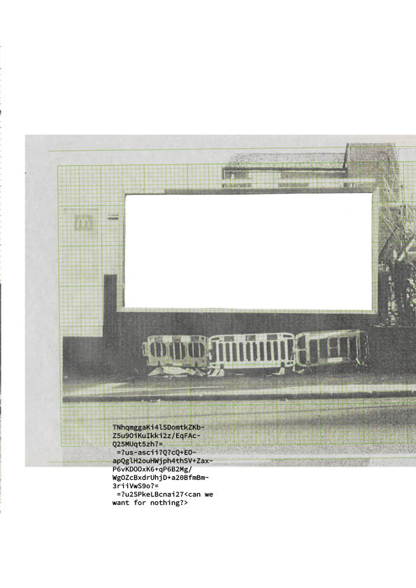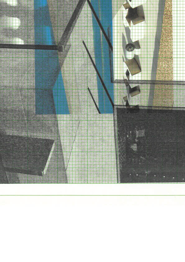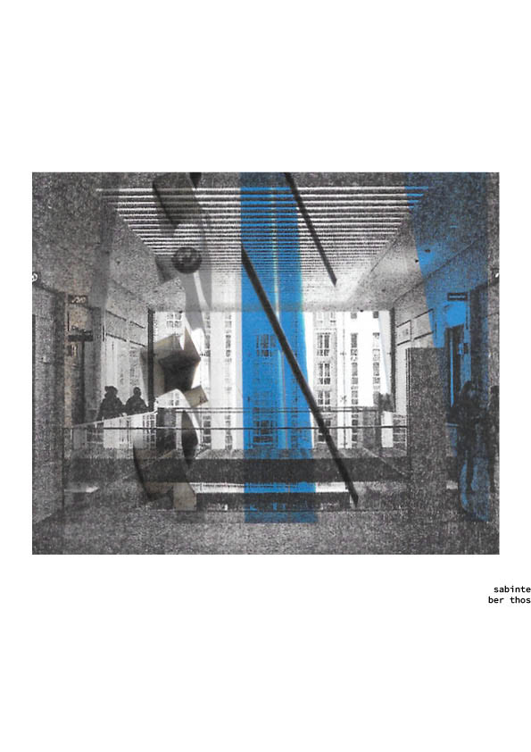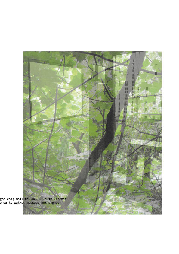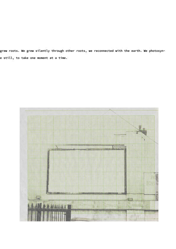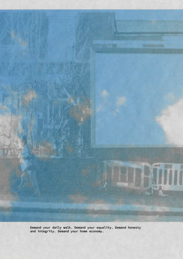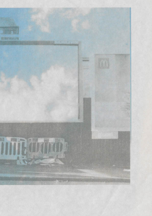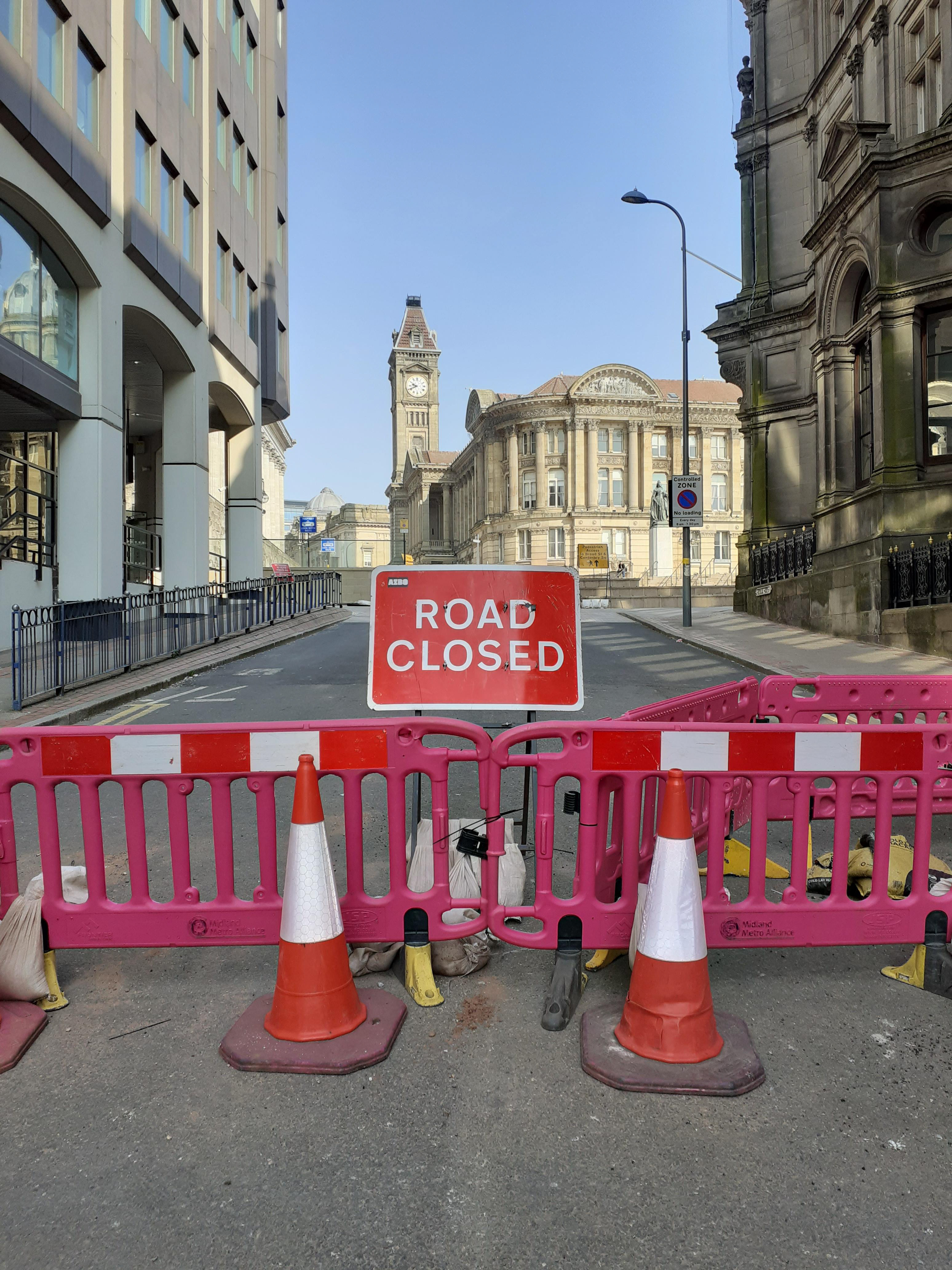
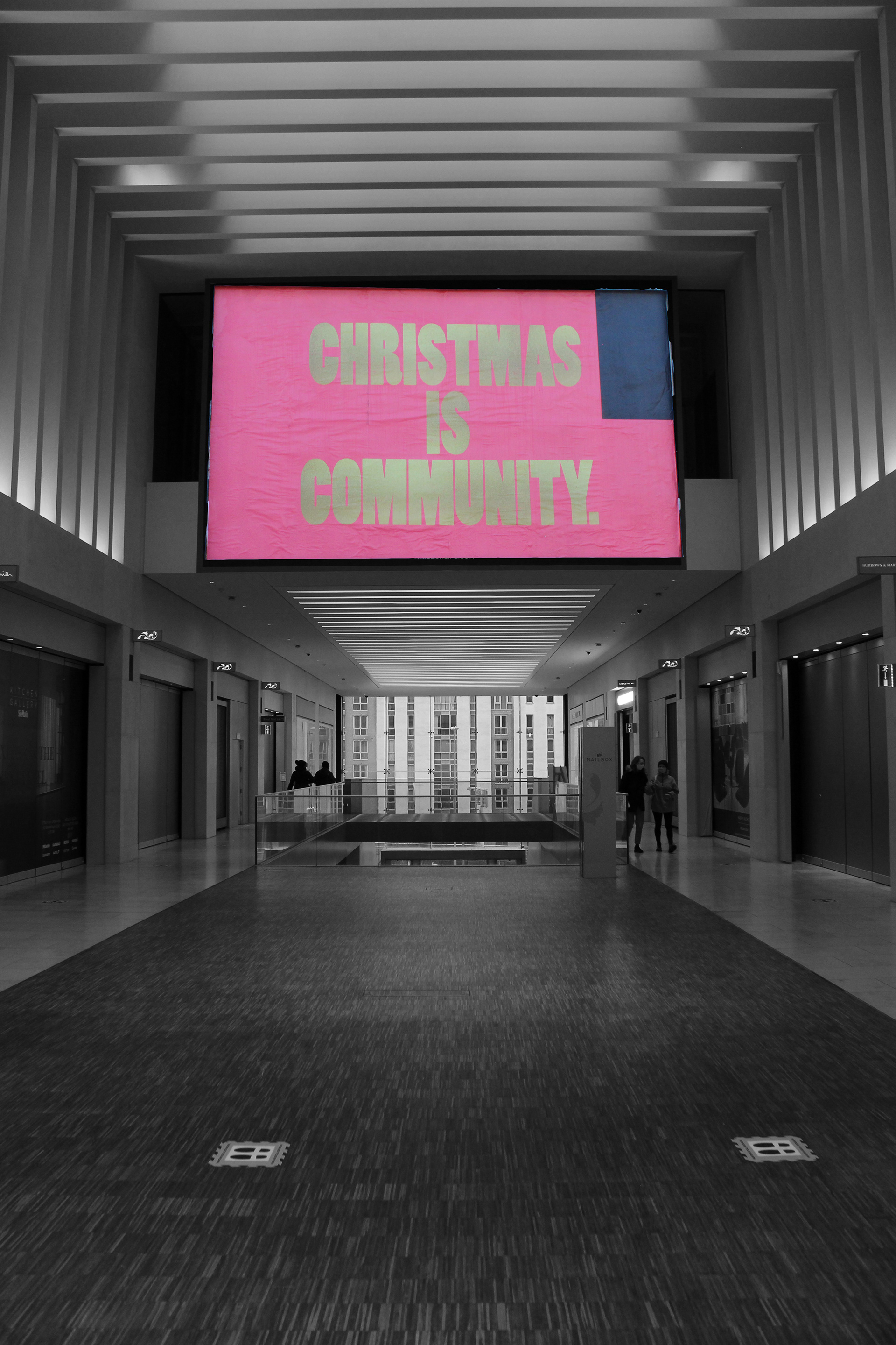
Figure 1: Collection of archival photographs taken in lockdown between 2020 and 2021.
The design brief for this module involves creating a publication. I initially really struggled with the idea of creating art in the form of a printed outcome and I felt it was difficult to think beyond an obvious outcome of a book or a magazine. I love to read and this is what I associate with printed media, I also love art, but the 2 processes for me feel quite separate and are used for different purposes. I read books to escape into a visually imagined world in my head, translating the words into personal visions that belong to me and can never be accurately depicted or shared with others. Artwork on the other hand, is assimilated in an almost oppositional way. A large part of my workings as an art educator or masters student involve discussing the images we share; the same visual element, and the words, stories and meanings we exchange are the individual element. I am not a huge consumer of art books; preferring an in person experience at a gallery, or books on artistic theory, history or practice, but nevertheless, covid has meant artists have used new ways to share their work, and online digital publication is a good starting point when all galleries are closed. After doing some research, I can see art books have moved on from being coffee table furniture to being a legitimate way of reaching audiences and creating a buzz about an artist, which I have not been aware of, as I have not really been engaged in this scene. I also like the idea of the immediacy of Zines as they are quick, accessible publications created by subcultures (as highlighted by projects like 'The Suss' and 'Dump it On Parliament') which enable the artist and audience quite an intimate, in depth exchange. The idea of the imaged world via words versus an imagined story via images may also provide an interesting area to explore as I have always enjoyed writing. 

Figure 2: Miro moodboard
In my initial brainstorm, I looked at a similar idea leading on from module 2; possibly playing around with surrealism or games, something with a playful nature. I then began to look at ditto and  k-i-o-s-k for inspiration as contemporary art publishing houses. Ideas explored by artists I liked included archival documentation of 90s rave culture through images and words from online forums, various comics about feminist warriors or witty simple visual jokes. Some books were just a documentation of a photographic subject such as Yugoslavian war graves and reflected surfaces. This way of using publications as a vehicle for images in their own right appealed to me. Over lockdown, I had tried to document some of the empty spaces I found myself in and how their occupation had changed. I felt this was important to document as an artist living through a pandemic. As Barthes argues in Camera Lucida, 'a photograph mechanically repeats what can never be repeated existentially'. I decided I wanted to create something completely different to my previous work as we emerge from lockdown for 2 reasons. I wanted to make the most of my time at University and experience a diverse range of media, and also I wanted to try and keep my work within a contemporary context. As my last project was under lockdown conditions and was very much centred on that experience. This time, I wanted to reflect on our time as we emerge as a society; what we may have learnt, where we might be heading in the future. I had photographed empty city centres, shopping malls and the school where I work during lockdown. I had also been to Cotteridge, a local high street to document it over the Christmas period during Covid, as there was a very depressing atmosphere. I thought the photographs I took might be an interesting starting point for the new direction I was going to take, in some form of reflective work on what we could take forwards as a society from the experience. What relationship can we have with a photograph which proved we were 'there'? A relationship explored deeply in Zoe Leonard's installation 'You See I Am Here After All'. The installation involves thousands of postcards of the same views of Niagara Falls. Does the repetition or familiarity of a view make it meaningless or unseen? Can I translate the experience of an over exposed view of Birmingham, such as a daily commute route, into something new, using the familiar to explore notions of time, place and in the words of Heidigger, 'being'?
Figure 3: Collection of initial trials using photocopies of my archival images
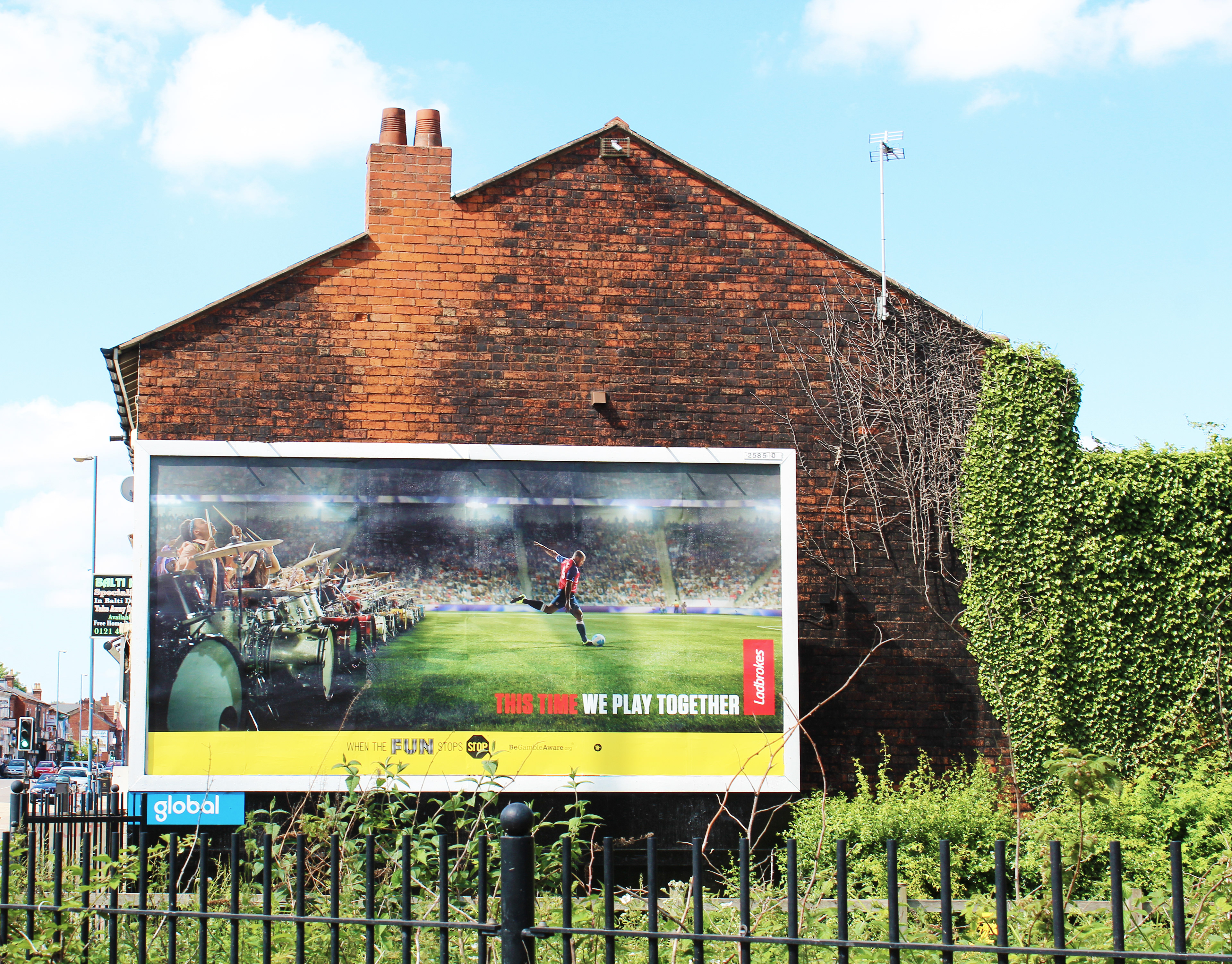
 I thought it was quite interesting to contrast my photographs of Cotteridge and the Mailbox as it visually showed the disparity between the inequalities exaggerated by Covid. The Mailbox was empty but clean and still had glamourous advertisement. In contrast, Cotteridge had bill boards which were strappy and empty of messages, there was deprivation too (the area has a foodbank in the local church which having followed online, I knew was desperate for donations). The messages that did appear in this location were for McDonald's or a message of hope for the community. I began to be drawn to these areas which appeared as frames; bill boards, posters, covid signs. These frames seemed to epitomize the capitalisation of public space synonymous with western modern culture. As Doreen Massey argues 'Spatial development can only be seen as part of the overall development of capitalism'. 
Figure 3 shows how I began experimenting by photocopying my original images to create some visual noise and cutting the frames out and swapping them around. How would the Mailbox look with a Mcdonald's poster? Or how out of place might a advert for style and interiors seem in Cotteridge? I was interested in what happens to the consumer message when it is misplaced. I also added ready made images from magazines that I felt created an emotive response; a skull, an audience staring at the viewer. I then filled the frames with white space digitally and also manually with a white wash of paint. I really like the 'white noise' of the paint. I had kept a diary during Covid, and wondered if I could begin to merge my quoted words with pictures, coming back to the idea of the visual versus the word. I wrote quotes up in pen on the whitewash as well as creating them graphically with Photoshop. 
With this playing with imagery, I was trying to depict the sense of the message being lost or wasted in the context of covid or a post covid world. Can we really be sold the idea of a shiny new kitchen interior, when we long for a genuine reconnect with others? Or crave fast food when we are more aware now of the effects of obesity on our health during a pandemic? I think the 2 strongest images are the two below. Figure 4 shows a scrappy, dirty, almost Rauschenberg like billboard; its juxta position in the Mailbox exaggerates the rough versus the neo liberal smooth clean lines. In figure 5, the image of the hug within the billboard suggests connection and something we longed for so much in lockdown. It is interesting to dissect and rearrange the familiar territory of consumer advertising into something more human and tangible when we look at these images.

Figure 4. Digital layered photographs

Figure 5. Paper collage using a photocopy and magazine image.

Figure 6. Scanned photocopy with digital image layered underneath.

The image above (figure 6) was a trial I did using an emotive, personal image to contrast with the usual commercial imagery on billboards. Connection, family and multi-generational relationships are symbolised here; subject matter which Covid had removed from our lives through restrictions and isolation. The shot is an everyday depiction which people could hopefully relate to. This type of tool is sometimes used by advertisers, for example, the John Lewis Christmas adverts are notorious for appealing to audience's emotional responses to sell goods.

Figure 7. Digital film featuring perspex and photocopy frame.

Having photographed the clean, new lines of the Mailbox, I thought perhaps I could frame something to do with nature/the outside world to contrast with those stark interiors. Nature had become such a bigger part of my life and the lives of my friends and family post covid as people connected with their local environments or grew produce for the first time in their gardens. Figure 7 shows a film through paper frames of images using a sheet of perspex to help support the structure. I really like the results as I feel they depict well the journey through and past consumerism and capitalism, towards an outer space of freedom and nature. I think the emotive language and devices the advertising world exploits could be highlighted through the positioning alongside nature. I also like the idea of combining the flatness of an image with the depth of film and focal length. Consumerism is becoming almost 2 dimensional in comparison to the 3 dimensional world of the awesome power of nature. Through serendipity, I recorded the birds twittering and calling in the garden and I think the power of this sound is really evocative over the image. I like the images without a figure in the foreground more as I feel this is a bit distracting. As viewers we begin to diverge towards the figure and who they might be, where they might be from, so I will probably leave figures out in future work if I pursue this avenue further. Also I love the idea of drifting through the frame into the green space as this kind of captures a sense we felt during Covid of wanting to be away from our screens and the virtual, and reconnected with something real and sensual. It also symbolises how our relationship with space is 'porous and open', again as Doreen Massey argues, our identities are 'multiple' and 'change over time' as we occupy spaces. Our occupation is fluid and ever changing with our environment.

Figure 8. Digital film using stills.

Figure 8 was created for an MA module task to make a photographic film montage inspired by La Jetee directed by Chris Marker and our current practice. In the film, my stills from lockdown locations, such as the Mailbox, are composed as though they are shots from a dystopian sci-fi. The music is taken from Dawn of the Dead by George Romero (a zombie film set within a shopping mall). I am really intrigued by the idea of non-fiction and fiction colliding. I have felt during the last 12 months of Covid that there are dystopian moments within my reality which have a eerie familiarity, and scenes or actions I have experienced echo that of people or places I have read about or seen in books or films of fiction. It is also very topical as the line between 'truth' and 'fiction' becomes ever more blurred in our lives of multiple news sources and media outlets. I am very pleased with the overall outcome, especially the narration which I wrote myself. I was trying to walk a fine edge between something really experienced and something imagined. I also tried to pace the images as slow in places of refuge, and fast in places of uncertainty. I toyed with the idea of making a joke ending but I actually felt in the end, there was a nice edge to the line, 'Why did we come here? What did we hope to find?' I felt it was quite a good metaphor for neo liberal consumerism and materiality which now feels slightly immoral and obsolete when we have experienced collectively such a health crisis. I also felt there was some ethical issues with parodying the crisis too. Although there is a mockable inconvenience the 'middle classes' have experienced (such as the typical consumers of an expensive shopping mall such as the Mailbox), every class has known suffering, sacrifice and death.

Figure 9: Digital text added to scanned collage (white paint and photocopy)

I have been intrigued by the idea of using text in my work as it is an area which could prove interesting in terms of exploring the fictional versus the non-fictional. I have always struggled to 'name' my own paintings as I feel it in some ways directs the viewer into 'one' interpretation when in fact their interpretation is as interesting to me as my own. In 'I see what you are saying' edited by Henry Rogers, I have been reassured that text does not have to play a 'restrictive' part in terms of the artist hemming in the viewer. One of the quotes in the book says how Paul Klee believed drawing was 'taking the line for a walk'. Sadie Plant asks in the book, is this not what the Poet does with words too? By including text in artwork, she argues, it is the writing which is deterritorialized, which both reduces and elevates the text to the status of that of a drawing. Just as an image can be decoded by an audience a number of ways, so too is our relationship with language. Language is an abstract constraint with which we communicate, however, there is inevitably an element of something being lost in translation, not only in our coding as we choose words, but in the receiving also by our audience. In contrast, in 'On not knowing how artists think', Rosalind Krauss argues art is the thing 'beyond or beneath words', the thinking we do 'outside of language'. Elizabeth Fisher explains art is "a place where things can happen rather than a thing in the world". Art is about thinking but not knowing; for knowing implies a relationship with knowledge, and as soon as knowledge is possessed, the thinking and creative elements have been in some way thwarted. I like the idea of art being a ethereal thing we do, which cannot be contained by words and which can get overbaked when we try to capture it in a written meaning. 
I recently attended a workshop with Caleb Femi and the University of Gothenberg. Femi's poetry was the starting point. I looked in particular at his poem called 'Because of the Times' individually and as a group with other students. The poem is incredibly moving and tragic. A performance of the poem can be watched below in figure 10. Below in figures 11 and 12 are my notes; pink annotations are thoughts from group discussions, yellow sections are original thoughts and words I had of my own.

Figure 10. BBC film of Femi's poem 'Because of the Times'

Figure 11 Annotation from workshop

Figure 12. Annotation from workshop

I feel there is a visual link between some of the sparse, manmade landscapes of Femi's formative years, and some of the cityscapes I have been capturing myself. The idea of a living space being created on top of and around a shopping mall also links to my work and there is an interesting contrast between the Peckham estate the poem is set in and the Mailbox; a shopping mall with living quarters above it. I have some words and lines I have created which I would like to somehow illustrate in the next stage of my practice. During the workshop, Femi was asked if there was something he felt the landscape he grew up in could have had, to benefit himself and his community. The idea of green space and light was mentioned. Something interestingly still lacking in the design of the Mailbox despite its affluence. Green space and natural light seem to time and time again, get plastered over and removed by developers of mass housing projects for the rich or poor. So superimposing elements of the outdoors and nature into some of the environments I have photographed would definitely be an appropriate avenue to continue down. This could make for an interesting imagined world, similar to one explored in Anna Tsing's book 'The Mushroom at the End of the World; On the Possibility of Life in Capitalist ruin'. In the book, Tsing explores the end of capitalism through the production and consumption of a particular breed of mushroom which thrives in disturbed forest environments.

Figure 13. Abramovic's Manifesto

I have been looking closely at manifestos also, as a means to get started writing as an artist. I have read several artist/art movement manifestos. I have been watching a lot of Marina Abramovic's performance art recently so her manifesto was one in particular I was drawn to (figure 13). I like the way she incorporates humour and also uses the form to reiterate meaning. There is a lot of repetition of her statements. I think this has an interesting effect, it redefines the message, helps you to listen more and also it is like a mantra to herself as being an artist takes lots of self discipline and sacrifice; reminding herself (as well as the audience) of why what she does is so important. Abramovic also uses the pronoun of 'him' and 'himself', which can seem a little odd as she is female, but I think this highlights the patriarchal world of art as well as elevating the artist to a God like status (as Gods are mainly referred to as Male), implying not so much that she is a God, but that art is a very powerful force in the world.

Figure 14: A first attempt at a manifesto

I have attempt to create my first manifesto in figure 14. I structured it around a sort of trilogy I have always felt art has for me personally. Art is the relationship between us, the work we make and how other people respond. I have also always felt art should be visual and do sometimes struggle to connect to art that is too conceptual or removed from the outcome of a visual object. I think this is why Abramovic has been a fascination for me recently; I have tried to show this tension through my description. I tried to show a shape of the manifesto through a form and I quite liked the idea of forming waves. As an artist, I feel the creative process can sometimes feel like waves; lots of ideas and making one week, then a dry spell of 'artist's block', quite often steeped by reading about others and research. It is often this quiet period which sometimes create the biggest after effects in the work when you come through it. I also wanted to highlight the economic complications of art. Artists need money to work, but money comes from how our work is perceived by others. Involving funding can compromise how we make our art for an audience, and change the power relationship in that triangle. I think that is an even more tricky question for our times as funding for the arts has been cut so severely.

Figure 15: Digital photograph of Grand Central, Birmingham.

Figure 16: Digital photograph of Grand Central, Birmingham.

Figure 17: Digital photograph of space opposite Grand Central entrance, Birmingham.

Figure 18: Digital photograph of space opposite Grand Central entrance, Birmingham.

Walking past the Grand Central entrance the other day, I was really struck by the reflection of the sky on the building (figures 15 and 16). It reminded me of my video trial of incorporating nature into the corporate image. I thought it was quite interesting as this is the outside of the building and tucked away, barely seen, often I would guess, an experience missed once one is inside shopping, as it requires you to look actively. It was then interesting to see the daylight that this building reflects onto the very dirty looking buildings opposite (figures 17 an 18). Again, this would require an act of looking but backwards, away from the glamourous mall front. In direct sun, lots of shards of light are reflected, creating quite a confusing effect, almost like these buildings are underwater, like the reflections one sees on the ceiling of a swimming pool. I like the idea of playing around with the eye shape on the building too, could I make an interesting video in that commercial space? What represents a consumerist message more than a giant eye filled with products for sale?

Figure 19: Digital sky film compilation; 0:00 stationary film, 1:48 car journey film, 3:50 car journey film.

I wanted to make some initial nature video trials for possibly incorporating into consumerist spaces but I wanted them to not be stereotypically of trees or flowers. I pushed the idea further by filming the sky (figure 19). The sky not only could represent outside, but it has always been of interest to artists from Turner to Yoko Ono, as it symbolises possibilities, regenerative thoughts of timelessness and placelessness. I set up a camera looking at the clouds. If I speeded the film up, it became quite interesting to gaze at; a relaxing morphing of shapes and tones reminiscent of something we all did as a child; staring at the sky to find familiar animals and objects in the clouds. I then took the idea a little further by filming out of the sunroof in my car whilst I was driving using a tripod. I thought the videos were really interesting as there was something much like an aeroplane window view but with random direction changes (when I was at roundabouts or junctions). Trees and telephone lines randomly interrupt as well as birds occasionally crossing the screen. I know 'gazing upward' at the sky is a basic mental health tip to deal with depression and anxiety; to look at the rooftops when outside. I liked the idea of this being 'sold' back to people via billboards and posters when it is a free commodity to all. I then edited the footage back onto my original images of billboards and shopping malls (figure 20). I included sound I had recorded from walks with my family during lockdown. The results are very pleasing to the eye and relaxing but also a little disorientating as the camera turns and twists. Also the footsteps from some of the sound are not in sync with the speed at which the camera is clearly moving which is confusing and also creates a queer experience of displacement, again a familiar feeling after lockdown. I need to think about ways in which these methodologies could be published as video would be difficult to translate into a printed media. Could I include links to videos via QR codes? Perhaps I could suggest places to watch my videos within the publication or simple things for people to try, for example, watching them lying in bed on their mobile phone; creating an experience that they would not have otherwise had.

Figure 20: digital film collage compilations.

Thinking back to the idea of a publication, I looked into zines further and attended a zine workshop with artist Sarah Taylor Silverwood. She showed us a very simple A4 sheet zine technique (with hidden poster). Initially, for the workshop, I used items special to me for my content (figure 21 and 22), but I then went on to make a further zine linking more to this project. I wanted to create a sort of 'mindful' zine and incorporated a sky image inside (figure 23). My second zine was a big improvement on the first as I began to learn what worked well visually at this scale and combining text with image. I really liked incorporating ready made images from newspapers and hand printing words too with handstamps or headlines. Colourful Promarkers also really helped with the design, rather than the watercolours I used in the original which I think are too 'painterly' for this project.

Figure 21: Zine 1 using collage, watercolours, graphite and ink.

Figure 22: Back view of Zine 1

Figure 23: Video of Zine 2, inside and outside view. Collage, Promarkers and hand stamps.

I also ordered some zines of my own from the internet (figure 24). One was a zine made during the 90s BritPop era called 'Fish tonic', another was a contemporary one from my home town Brighton, 'Stray 4 life' and one was about zine making by another zine artist called Marceline Smith. I found it really interesting to see the very different techniques in all 3. It was quite refreshing to see sub-cultures are still using zines as the 'Stray 4 life' zine had an article about an anti fox hunting group, 'huntsabs', and how they started, techniques they use to sabotage and also how they still operate now as hunts continue despite 2004 regulations. 

Figure 24: Zine research

I like the idea of playing around with a zine which encourages an interaction with the audience. Could it contain instructions for calming exercises or perhaps some thoughts on how we can all reset instead of returning to our pre-covid world and systems? I have also thought about contacting the local foodbank to provide some zines to their clients as a message of hope and solidarity. Perhaps I could deposit my zines somewhere to be discovered and kept, such as the early work of @smilerstreetart or @notestostrangers, where messages are left on trains or posted anonymously on lampposts for strangers to discover and interact with via social media.

Figure 25: Sky photographs projected on canvas.

I have now begun to experiment with images of the sky framed or placed within unusual settings. I began by projecting my sky images into the shop/billboard frames from earlier but I felt it wasn't as successful as my frame video trails in the garden. I loved the colour blue of the sky through the projector light; it had an almost ethereal quality to it so wanted to find a way of using that further. I made 3 video trials thinking about looking up and how that message could be subverted by placing the videos sideways or underneath objects. Figure 25 is a projection onto a canvas. I have done some research into the Sistine Chapel and how religious buildings often use decoration on the ceilings to tap into how we naturally feel positive when we look up and also that feeling we get of being a small mortal being when we do so. This is both a reassuring and humbling sensation. It is a sensation I would like to try and emulate too as we come out of lockdown. By projecting onto the canvas, I was hoping to highlight this experience at a more comfortable viewing angle and also to try to present the idea in a surreal way. This is not a sky, just as Magritte's painting was not a Pipe. If the image was used in a similar way but on a billboard, would it still be a sky or would the context make it seem as though it was a product? Would the viewer think it was linked to 'Sky' products for example? Could if ever be just appreciated for its natural beauty in this advertising context?

Figure 26: Digital film of projection through tracing paper frame.

In figure 26, I tried to capture a feeling of breaking free. I projected the sky through some tracing paper. I began to rip away the pieces, revealing the sky below. I think lockdown made people disengage with their capitalist culture and consumer goods, and re-engage them through their daily walks with their immediate surroundings. I was trying to symbolise that shift as a rediscovery of something free and accessible to all. I like the idea of ripping up old systems too, to start a fresh. It might be interesting to have a message or words on the first layer which are torn and discarded.

Figure 27: Digital film of tablet mounted under a chair.

In figure 27, I was playing around with the idea of looking up at images of the sky as you would naturally outside. I arranged a device to play one of my sky videos underneath a chair, so in order to view it you have to lie down and look up under the furniture. Looking up under a table is something I remember doing as a child and something we just never do in the adult world. I did try projecting the images but the space was too small. Although I liked the idea, I felt it wasn't as pleasing to watch as the ripping projection or the sky canvas.

Figure 28: Screenshot form live event; A TV to see the Sky


Yoko Ono's Sky TV has inspired an event by Tate called 'A TV to see the Sky', which I participated in during the week (figure 28). The event was a 'live' artwork which was adapted to a remote format and shown all over the world. Yoko Ono's original format for Sky TV (which has been duplicated several times) involves beaming a live broadcast from the gallery/venue's roof, into the gallery space on to a television set. In the Tate event, for 24 hours, galleries around the world beamed live signals from their rooftops into a zoom like meeting participants could log in and out of. It was really interesting seeing the variations of weather and daylight across the world in the boxes which are usually filled with faces. This links to the idea of the sky being a place free from capitalist control or material ownership too as anyone could watch for free from their homes, possibly comparing their own views out of the window; a universal experience. It also made me think about the virtual versus the real too. We have all become so accustomed to seeing people on zoom, but to see nature in the boxes somehow seemed more real. Perhaps our virtual image has become synonymous with social media and not truly 'being present' and therefore we experience zoom as being more virtual than it is. The image is live, but through our experiences with digital photography usually being virtual, we somehow objectify the experience and each other, and what is in 'real time' becomes a disembodying experience.

Figure 29: Digital sky film on bicycle.

Returning to playfulness, above is a video trial I made attaching my camera to the back of my bike. Unlike my car videos, it was not successful. The movement was surprisingly bumpy and uneven and this is not the effect I would want to work with. I can assure you it does not feel like this when I ride my bike! I suppose attaching to my bike rack must just emphasise any bumps as the suspension is in the saddle and main frame. It was quite fun and exciting to shot though.

Figure 30: B30 Foodbank website

Thinking back to where I could distribute my publication, I contacted my local foodbank to see if they might be interested in a zine to go out with donations. Unfortunately, due to covid restrictions, they were not interested but they did give me some contacts for other voluntary agencies. I am thinking of possibly developing a publication which could link to familiar locations around Birmingham. I have noticed on my way into University that there are many beautiful rooftops and facades if you look up. I hope to take some image of these next time I am in town as it would link to the idea of the sky, looking upward and noticing details connecting us to our city, which are themes I am interested in exploring. I think Covid lockdown and daily walks definitely enabled people to discover the area where they lived in more detail with a renewed appreciation.

Figure 31: Taken from Body Techniques by Carey Young, 2007

I investigated the work of Carey Young as a comparison to the neo liberal isolated locations I used in my original photographs. Figure 31 is an example of how Young, in her series Body Techniques, uses her body in these 'non places' to explore the relationship between imagined futures and the artist; a tiny, disconnected figure, clinging to the abstract forms yet to be occupied. I really like these images, they are powerful and resonate a feeling of hopelessness and despair at the soulless nature of these new 'global villages'. I have made a conscious decision not to use myself in this project though as I want there to be a universal nature to my images and I feel by using myself I would be involving a 'persona' which might distract from my message. I did, however, discover a publication Young had produced which I also found interesting and relevant. 

Figure 32. Donorcard, Carey Young, 2005

I loved the universality of the Donorcard (figure 32) and the idea of the audience being given a free piece of art that combines their signature and the artist's to create the work. I also like the clever nature of the work; it is to cease to exist as art after the participant and/or the Artist dies. This will obviously not be the case as the artwork will 'exist' as long as the card does, but it raises interesting questions about the value of the card and whether the laws Young has put into place mean the card cannot be sold as art after her death. It is like an act of rebellion against collectors and people who may try to manipulate the artwork's purpose into one of economics after the artist can no longer have a say. I also like the idea of creating one simple publication but in a large, multiple format that is easy to distribute, such as a postcard or a business card.

Figure 33. John Hinde, Butlin's postcard circa 1970.

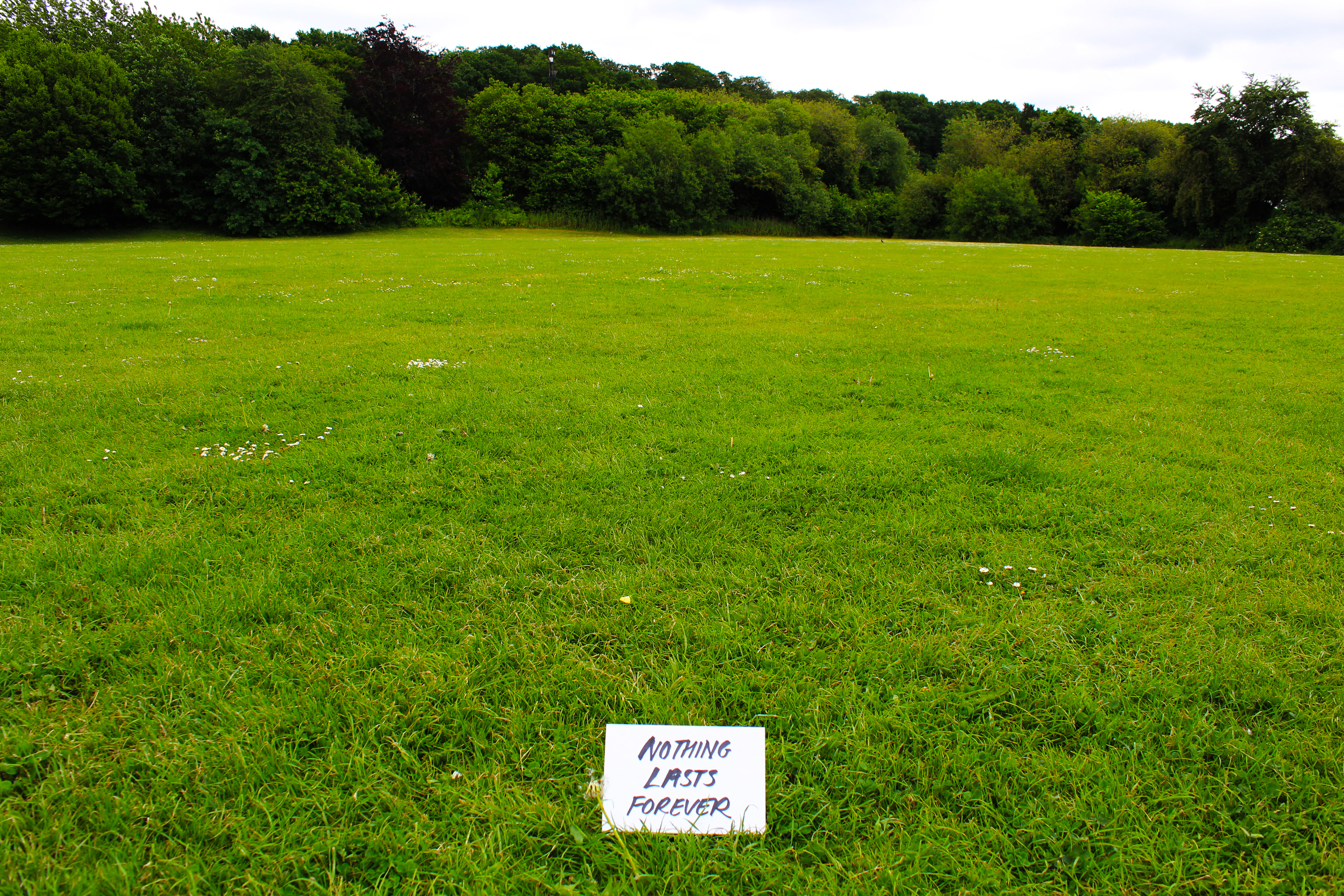
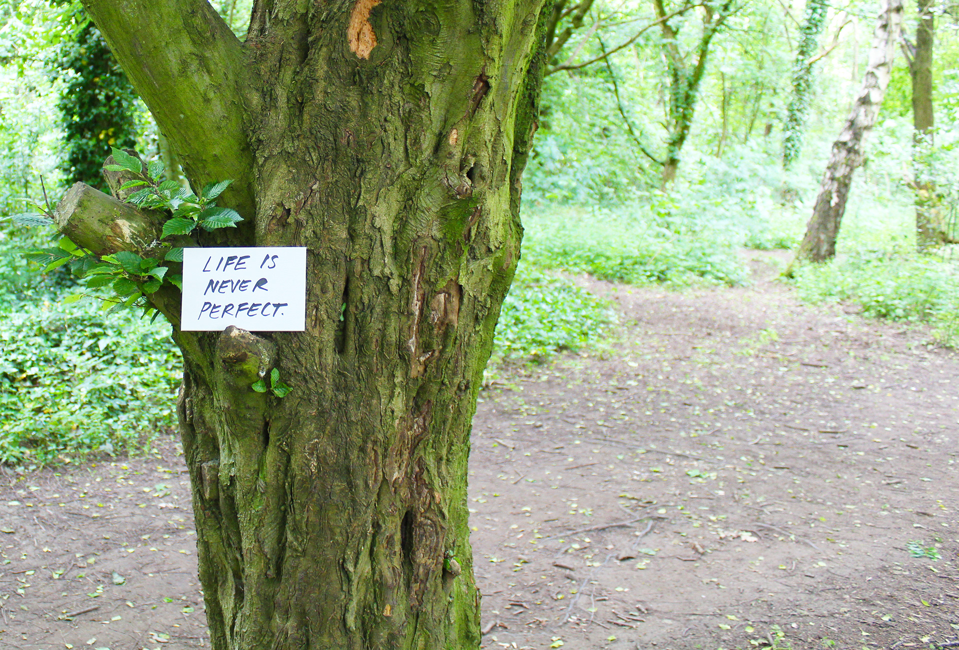
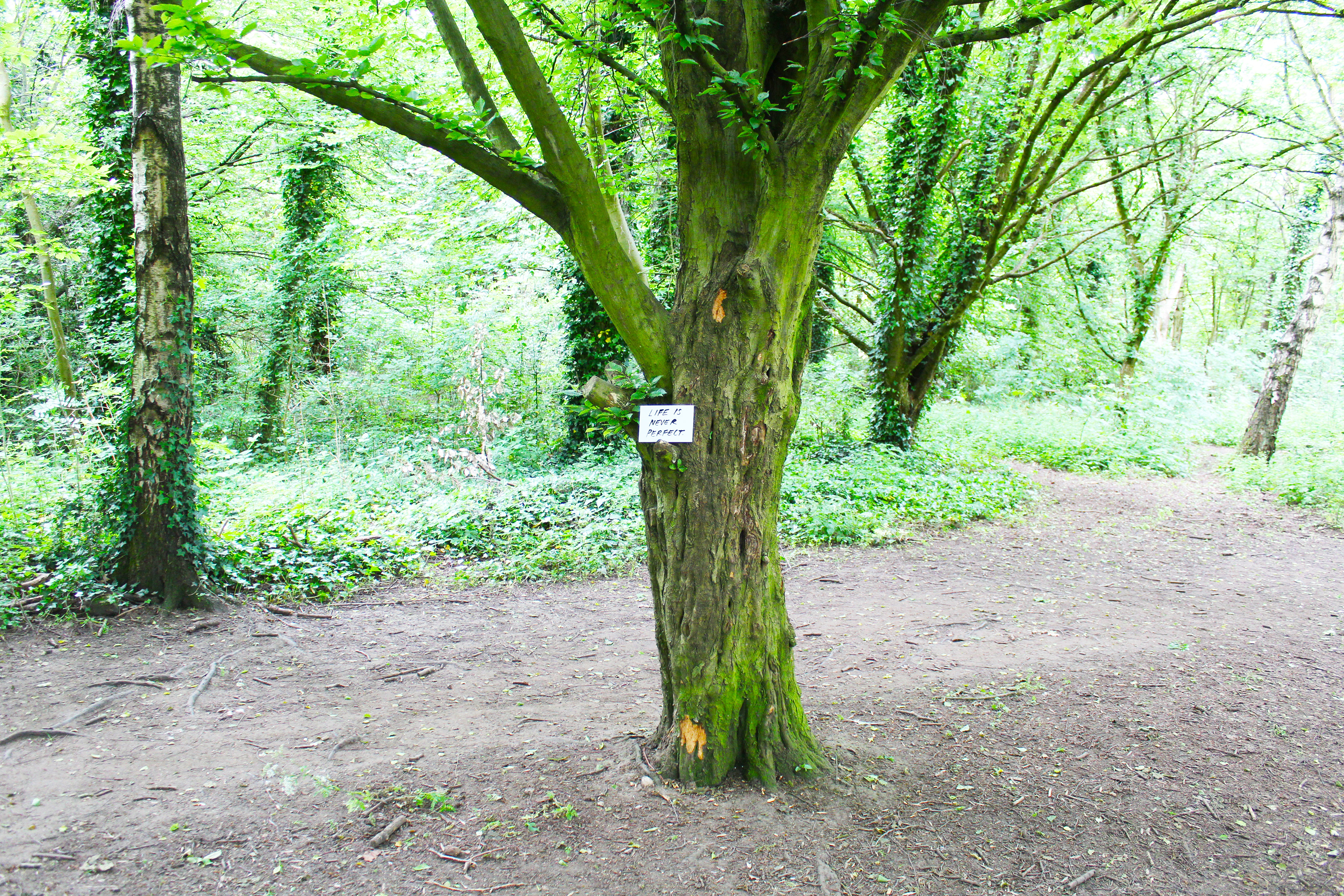
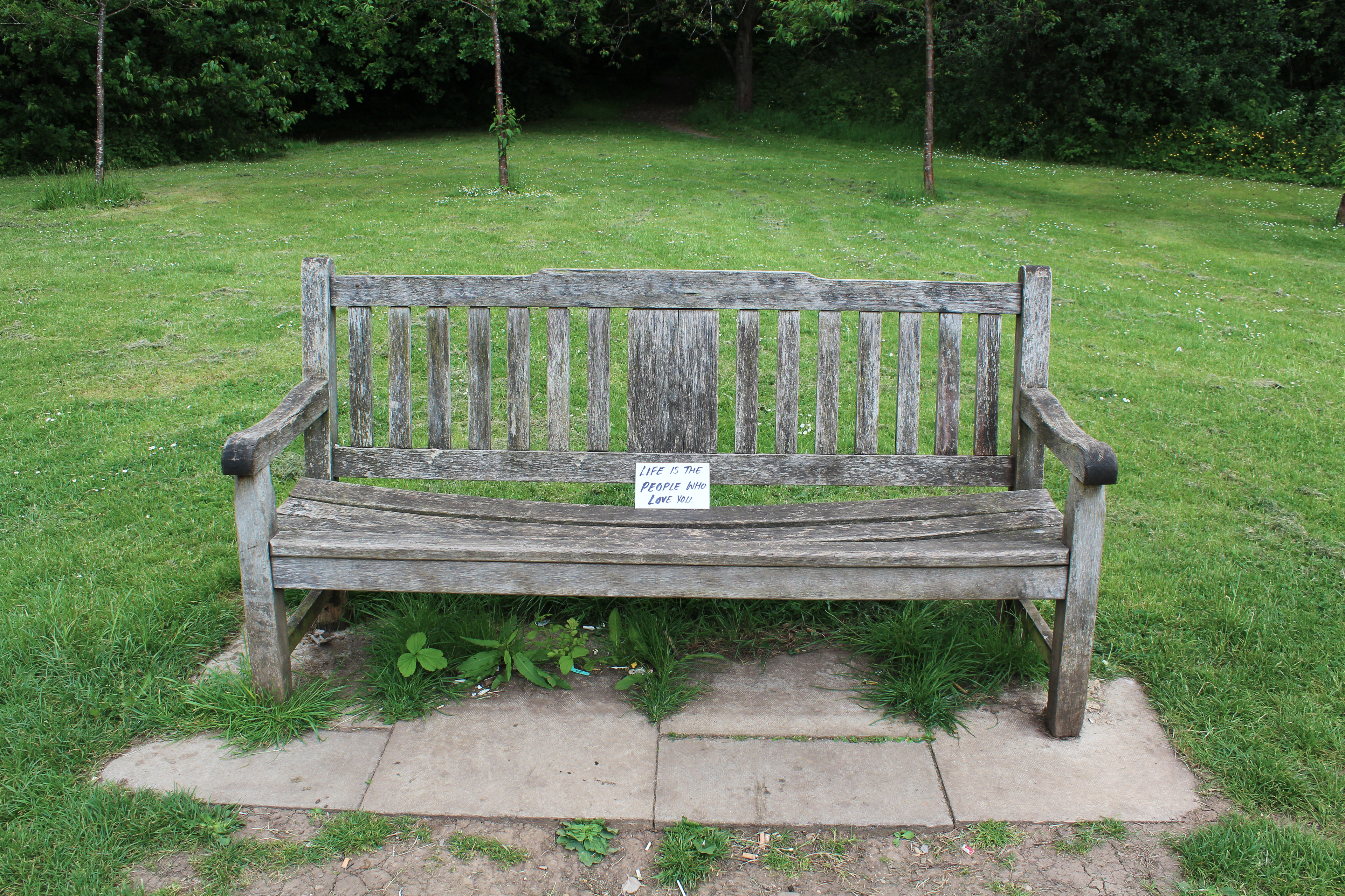
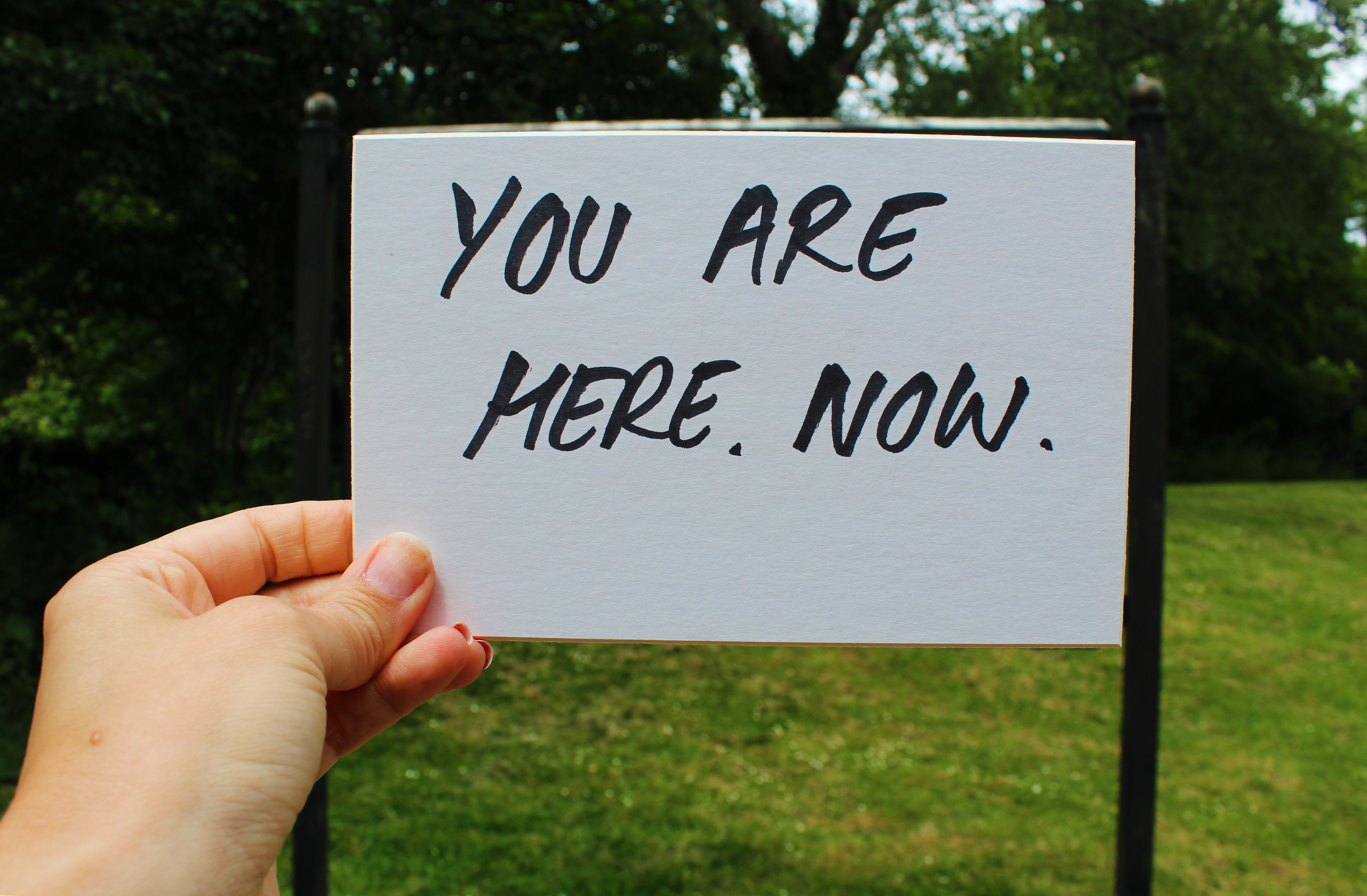
At work I found a pile of mountboard roughly cut into a postcard size. I had been thinking about postcards as I had read Universal Experience; Art, Life and the Tourist's Eye. In the book, there was an interesting section on John Hinde's photographic work in the 1960s capturing Butlin's holiday camps on postcards as a promotional tool (figure 33). The images sold the goal of using money earned to 'play' and not as it had been once been saved up for; 'for a rainy day'. The images were bright, colourful and displayed idyllic scenes of leisure. Martin Parr resurrected interest in the images as photographic work in its own right in 2002. In contrast, Parr in the mid 1980s, photographed the opposite of this ideal by capturing tourists at British holiday destinations in dismal conditions; swimming alongside garbage or queuing for hours whilst burning in the sun to get a 99 flake. The people in the images appear to have lost the sense of enjoyment of the holiday; as though it is a burden to be there, but you get the sense Parr may well be using the same demographic as Hinde did as subject matter, 20 years on, through a similar colourful lens. I liked the idea of the mountboard I found being used as a postcard but it is not a postcard; it is too heavy, the edges are cut on an angle and the quality of material is much richer. I then began to think of what I could put on the cards. As mentioned earlier, Leonard's postcards of Niagara falls make the actual location and experience of being in a place and time meaningless and repetitive, just as perhaps advertising and consumerism has become in a post-covid world. I wondered if postcards could remind us of meaning and 'being' or 'Dasein'. I had read 'Reasons to Stay Alive' by Matt Haig; it is a book about the turmoil of depression but it also contains some amazing life advice in general. It is a brilliant book with some powerful quotes and it came to mind as a sort of anti-neo liberal text. I remembered it had some short, powerful messages of hope for people who felt in a dark place, so I began to reread it and write up some of my favourite short quotes. I would like to use these quotes on the postcard and possibly billboards as an anti-consumerist message. The idea that it is a more 'substantial' cardboard, represents the message as being perhaps more than that delivered normally on a postcard, which might have connotations of 'you should be here, not where you are'.
A BEAUTIFUL VIEW
YOU ARE HERE, NOW.
WHILE TALK EXISTS, SO DOES HOPE.
LIFE IS HARD
NOTHING LASTS FOREVER
WE ARE ALL ESSENTIALLY ALONE
HAPPINESS IS NOT GOOD FOR ECONOMIC GROWTH
LIFE IS THE PEOPLE WHO LOVE YOU
TIMES HAVE BEEN BETTER BEFORE AND THEY WILL BE AGAIN
YOU MADE IT THIS FAR.
LIFE IS NEVER PERFECT
LOOK AT THE SKY AND ACCEPT YOUR SMALLNESS

Figure 34: Photograph of heavy weight 'postcard'
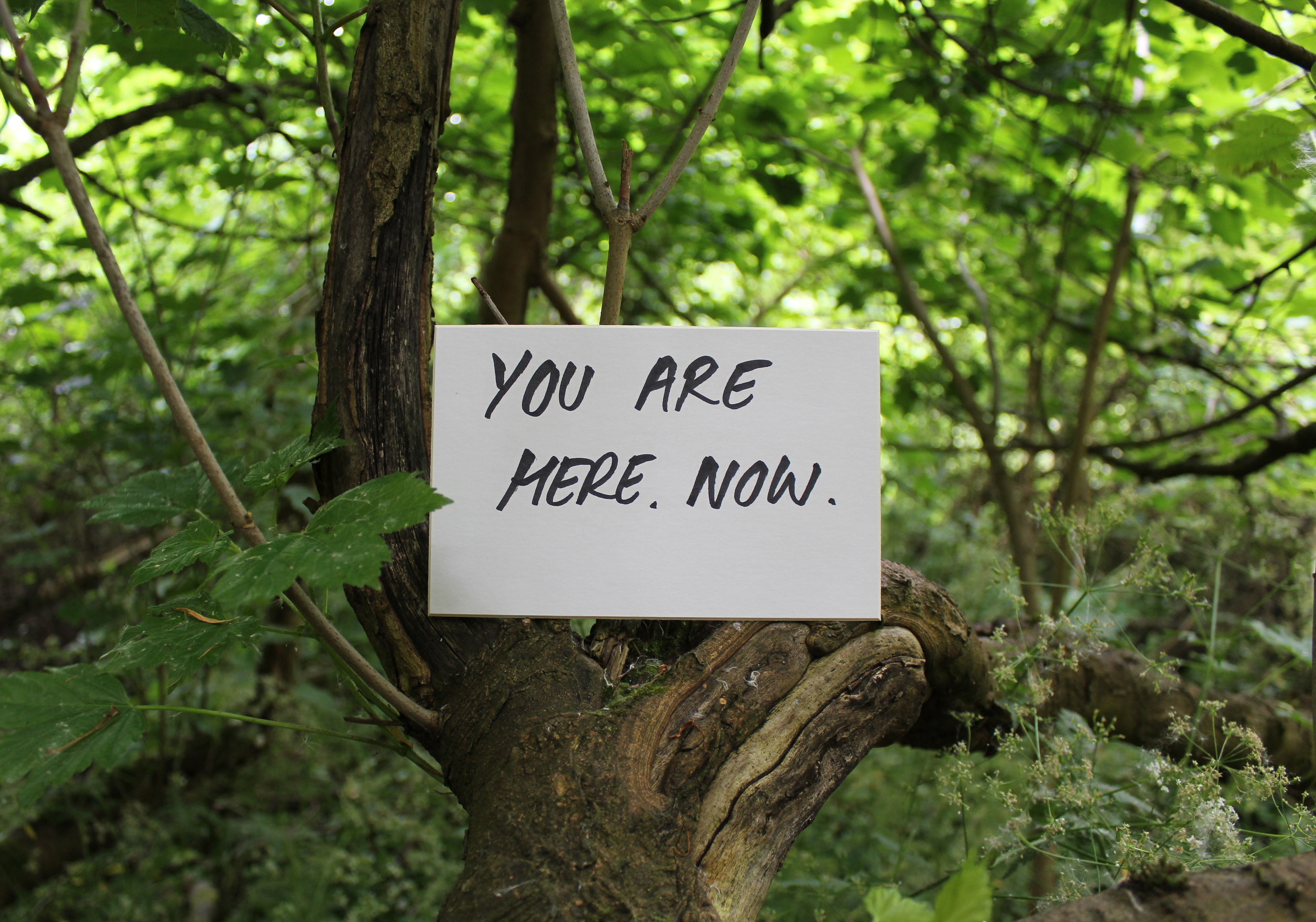
My next stage is to photograph the postcards held over billboards as alternative messages. I would also like to experiment with leaving them places and possibly having a means for audiences to relay back to me and each other as 'notes to strangers' has done online with social media. I also plan to contact Matt Haig, the author, to see if I can gain permission to use the quotes before creating anything final or mass produced.

Figure 35. Further experimentation of digital images of postcards.
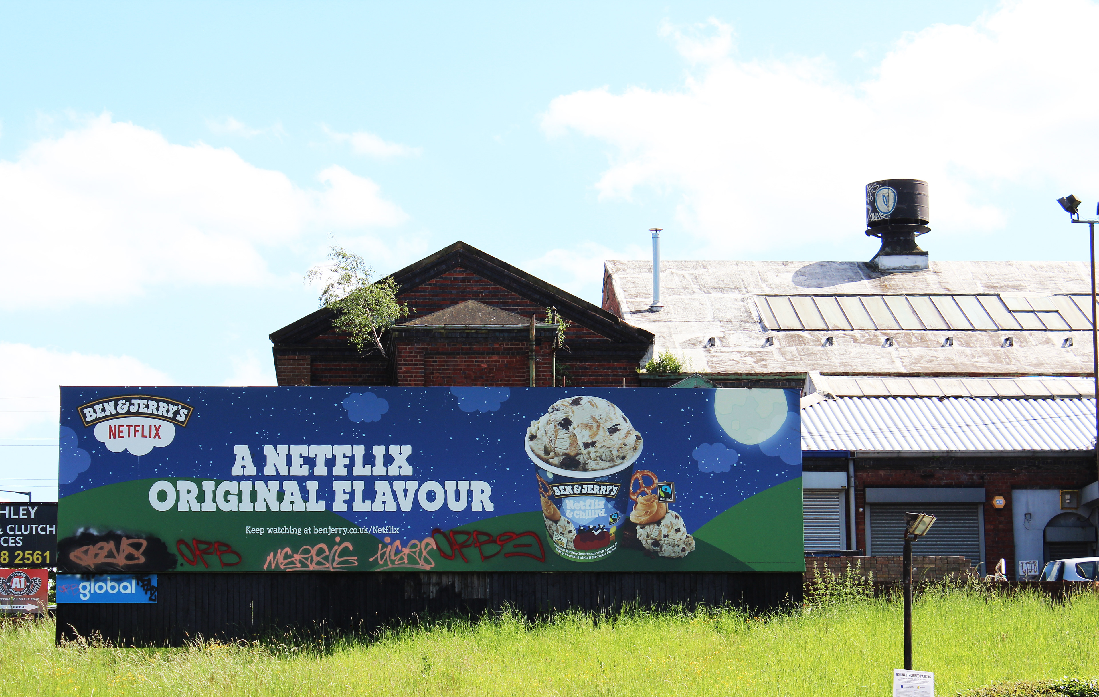
Figure 36: Stirchley billboards
These photographs show my latest experiments. I went to various locations, including the woods. I found a good location in Stirchley with plenty of billboards and went on a very sunny day as I liked the idea of using a blue sky with my images to offer a bright and positive message of hope and link to looking upwards. I found the billboards and postcards hard to coordinate together as my arm was only just long enough to capture the viewpoint I wanted, of the message sitting within the billboard frame. Also the lighting was very tricky to get right, as shown in figure 35. If the white balance was correct on the foreground (postcard), it was not necessarily right on the background (billboard and beyond). I did really find the billboards interesting in their own right, so have edited these images to improve them using Photoshop. Interestingly, the Stirchley billboards were definitely aimed at more charitable causes than the other locations I had scouted out which were very slanted towards consumer products. In 'Masters of Reality', Steve Rushton argues how spectacular media has an endpoint at the viewer, in other words, when the message reaches the viewer, in this case an advert, it intoxicates the viewer to go forth and consume. Art movements such as Ant Farm, a Californian art group who promoted counter culture, were interested in making the viewer visible to themselves. This would therefore create an economic shift away from the monopoly of 'corporate man' towards a counter culture, interested in alterative systems of industry and academia based on a cybernetic viewpoint of feedback and progression, rather than consumption. Thinking about this idea further, I began to look at how I could capture the materiality of the billboards through different angles; bringing their frames, textures and colours into focus, rather than the graphic media displayed on them. By zooming in on their materiality, their messaging is deterritorialised and lost.
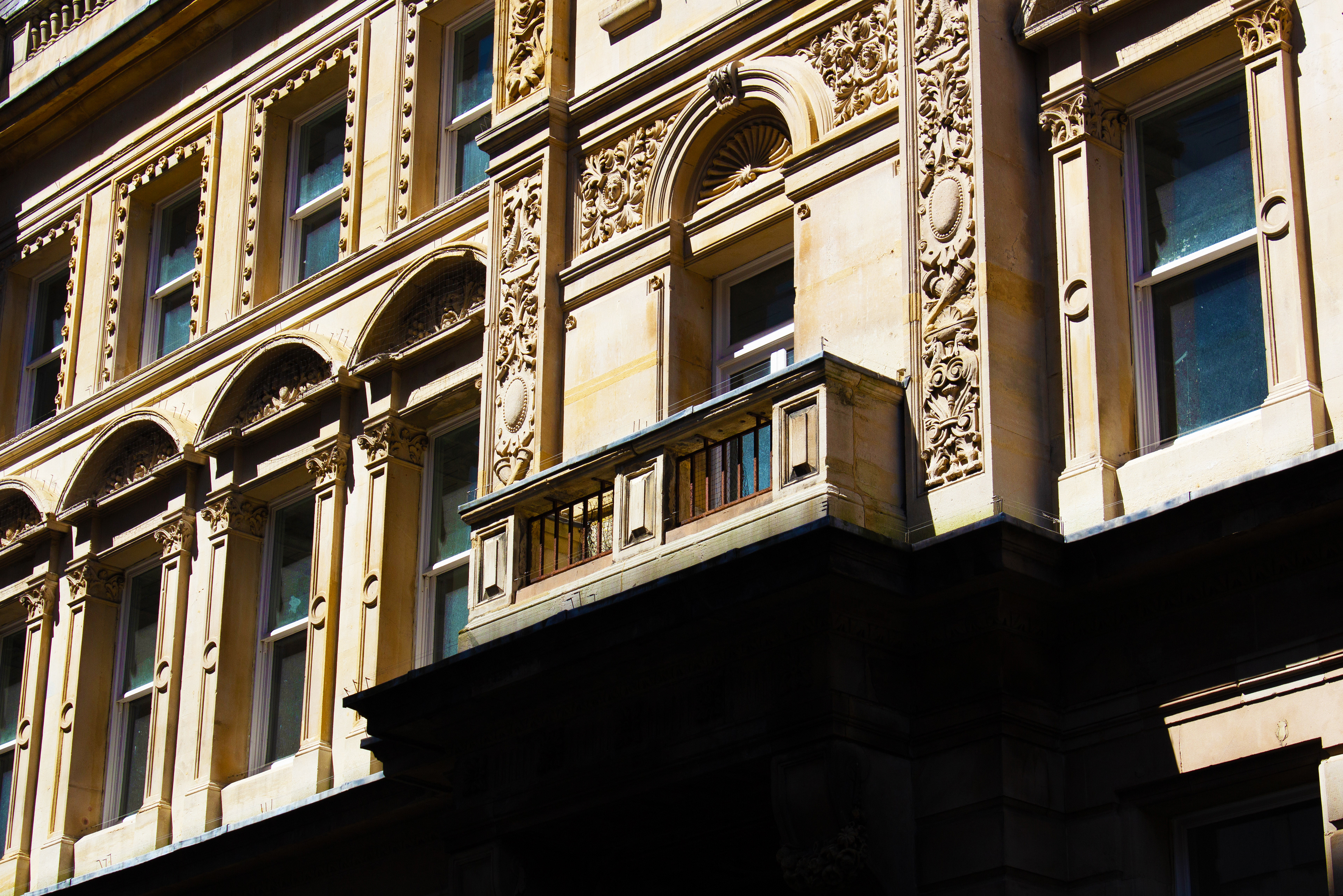
Figure 37: Close up images of billboards
I also liked the idea of looking past them, up and over them; like our modern context, can we ever look at capitalism in the same way post covid? What happens when we look at billboards with a different post covid narrative? I really like the way these images turned out. They were not very aesthetically pleasing when I uploaded them, but by adjusting the contrast and vibrancy I think they make great visual depictions, and elements of the images were revealed I had not noticed at first. For example, the lettering of the billboard brand at the bottom was filthy, but when I started to edit the dark areas, colours sprung from the black and I was able to emphasise the paint splodges and dripped glue textures. I like the way I have found something to look at that I think most viewers would have never noticed before. I also feel these imperfections contrast quite nicely with the 'clean' ideas billboards sell us; better wifi or banking services. Th images reveal the messy nature of our lives despite these products offering us a better or neater lifestyle.
Figure 38: Images of Birmingham architecture
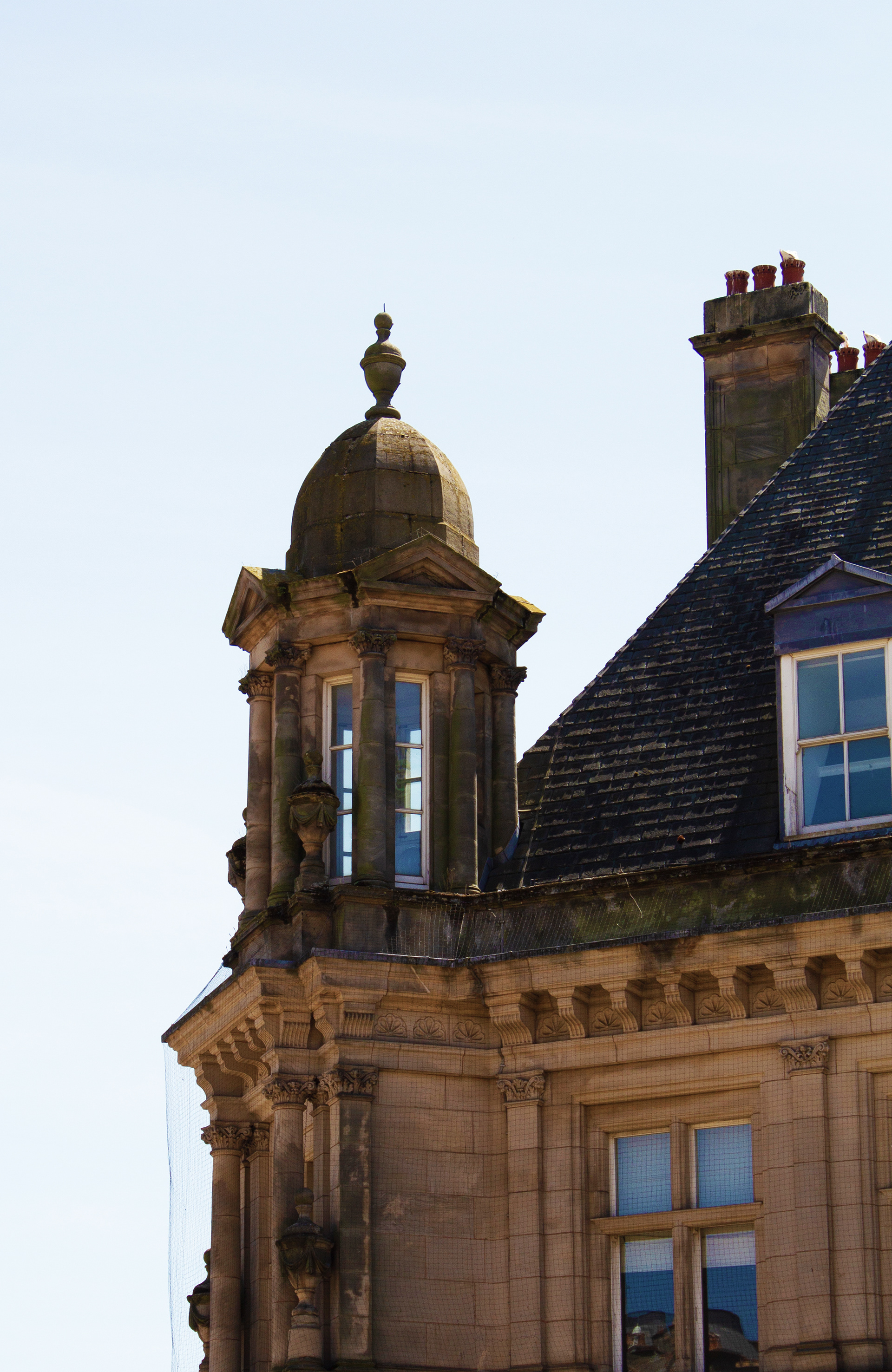
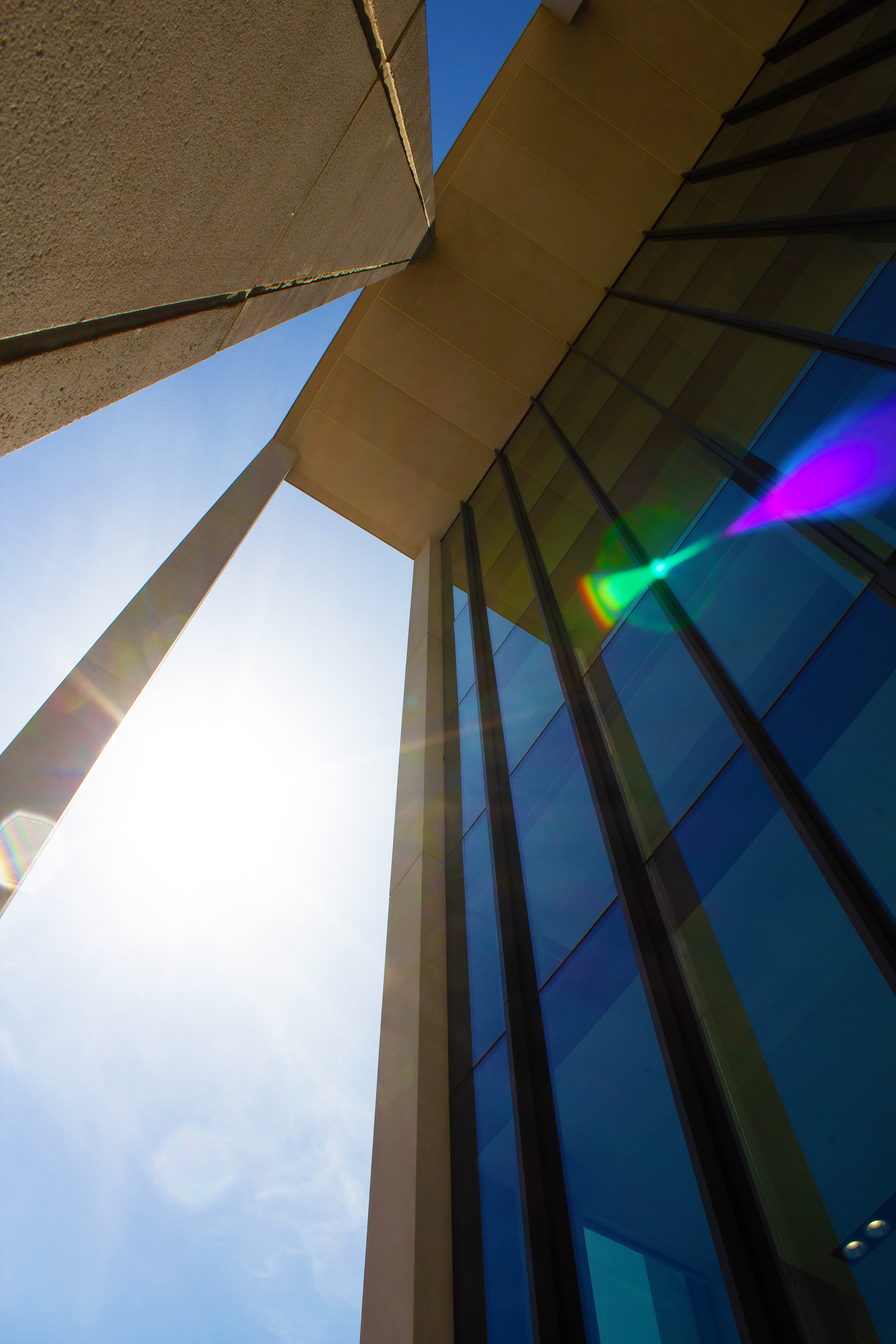
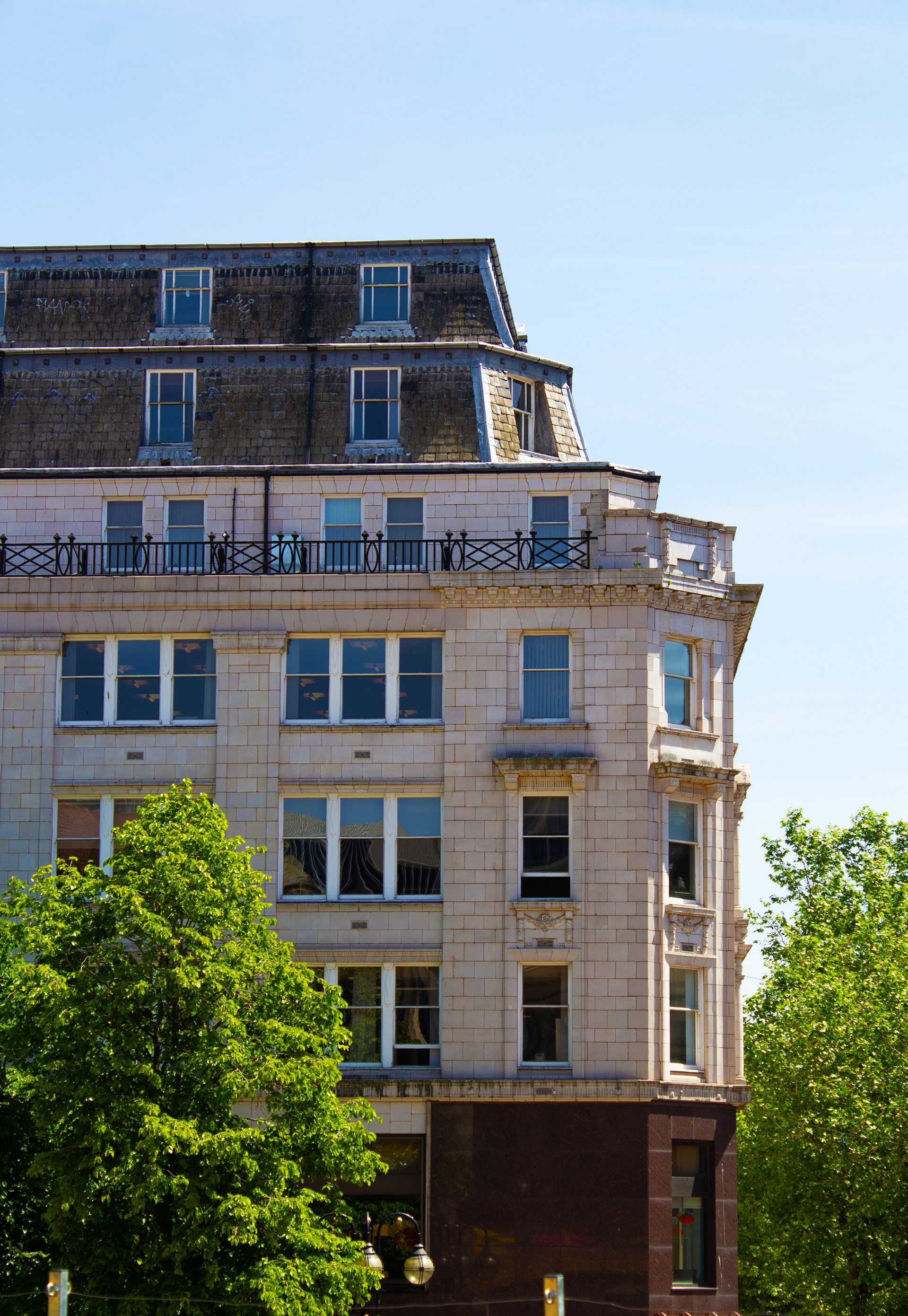
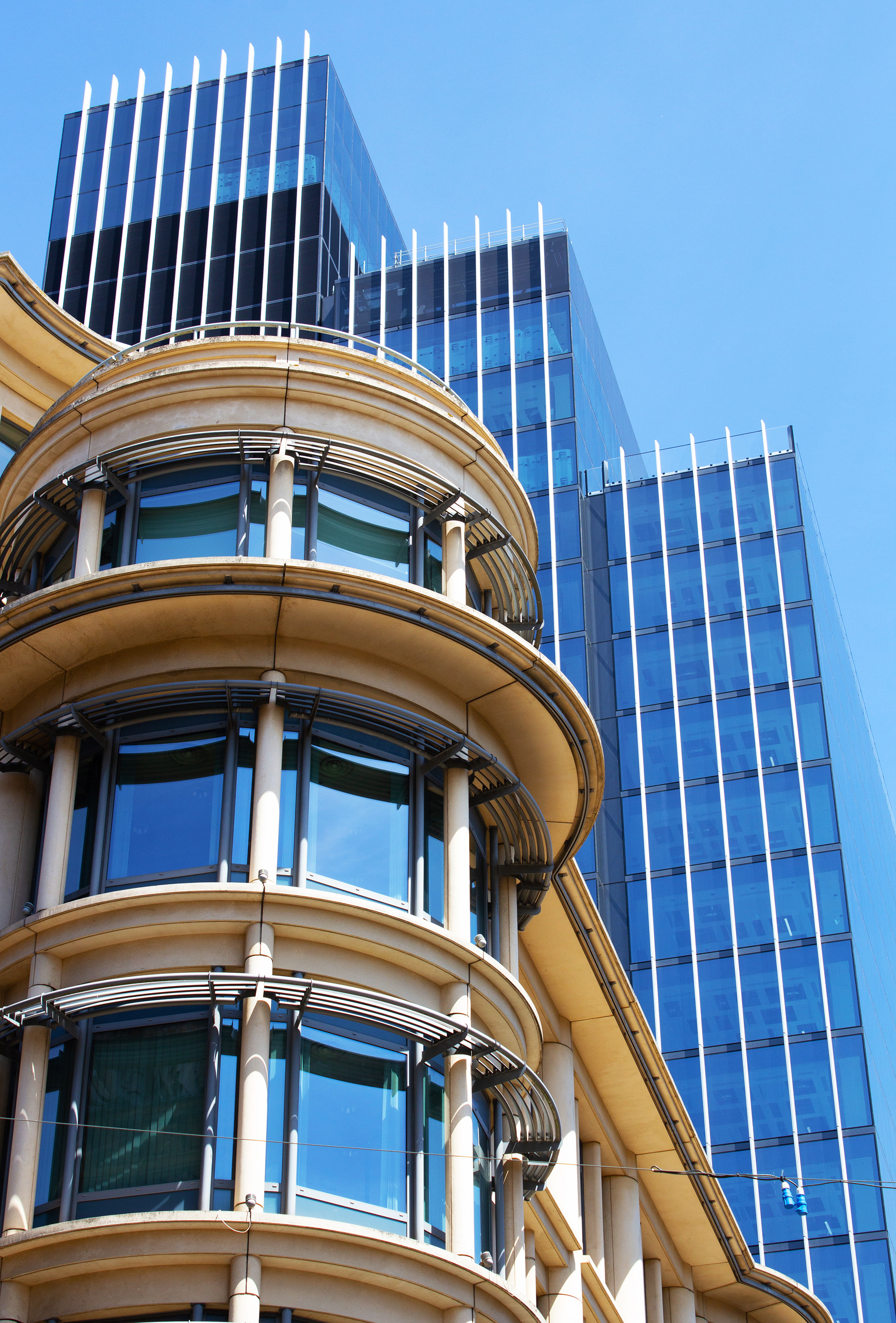
The above photographs were taken in Birmingham as I had noticed all the beautiful detail of buildings during my time in and out for university lectures and seminars. By looking up, I wondered how many people had actually noticed these details as we are so busy when we move through town. I have had the pleasure of walking the Highline in New York a few years ago and I think cityscapes are really interesting places at this level. There is an interesting mix of new and old textures and architectural styles. This level also removes the rubbish, traffic and noise associated with city living. It is a visually minimalist way of looking and I imagine these views did not change over covid or lockdown; they are consistent unlike at street level with populations and businesses opening and closing. The blue of the sky the day I took these was also really crucial I think in creating this bright, saturated palette. I have also always been fascinated by images of subject matter in direct sunlight; the textural detail it reveals as well as the harshness of the contrast; lights and shadows are crisp and clearly fragmented. 
I have begun to think carefully about my own practice as the course moves on. I read 'Plan and Play, Play and Plan' by Janwillem Schrofer and so have been trying to galvanise and define my practice. This has been really difficult for me as I feel I am quite fickle with my practice. I reflected on my last unit and thought perhaps I could bring back elements of play or humour. I have been going in a a more sombre direction partly because I have been thinking about COVID as a context and I know many people have suffered much. Using humour for me did not feel appropriate, however, I think in the right way, I can start to think about playfulness again. I have also noticed a repetition in my use of framing and collage, which I think would be great to bring back and focus on too to give me creative focus and direction.

Figure 39: A frame from Auckland Tourist Board's project 'Golden Frames'


I am now considering my past experience of surrealism and collage, as well as using small, framed compositions as I did with my last project (playing cards and pieces). I was thinking that I could make postcards of my images or beer mats for a location (as my publication element) and possibly put them out in the school of art, a cafe or a bar. The images on them could be paired with instructions encouraging participants to find the locations and tag them in social media? They could also interact with the location by taking a 'selfie' or aligning the image, encouraging them to actively look and engage with their local environment, rather than selling a product. A similar technique was incorporated in Auckland New Zealand by the tourist board by the erection of golden frames at key locations of beauty (figure. 39). These were to encourage visitors and locals to stop and engage with the environment. They did prove controversial as many visitors thought they detracted from the natural beauty, however, the scheme was excellent PR for the area as people hunted for the 'perfect' traveling selfie for their social media. This idea also reminds me of the 'metagaze' I created in my original videos; moving through the frame of a picture to a new picture beyond, creating a real and virtual framing.

Figure 40. Archisculpture 038, Beomski Won, 2014

Looking for interesting images I came across Beomski Won, a Korean Artist who creates surreal, impossible buildings in his ongoing series 'Archisculpture' (figure 40). In an interview he explains the work has a tension which he feels modern culture has, as these buildings lean in impossible ways or are weighed down by overloaded levels. I really love the composition of the pieces; they feel quite dystopian and there are elements of Hitchcock's 'Rear Window' or 'The Birds' with circling flocks superimposed onto them. I like the idea of a tension between young and old buildings, which is evident in cityscape architecture, and very much present in my last collection of photographs. I have created a collage of my own using Birmingham imagery to create a surreal cityscape (figure 41).

Figure 41. Digital collage using Photoshop

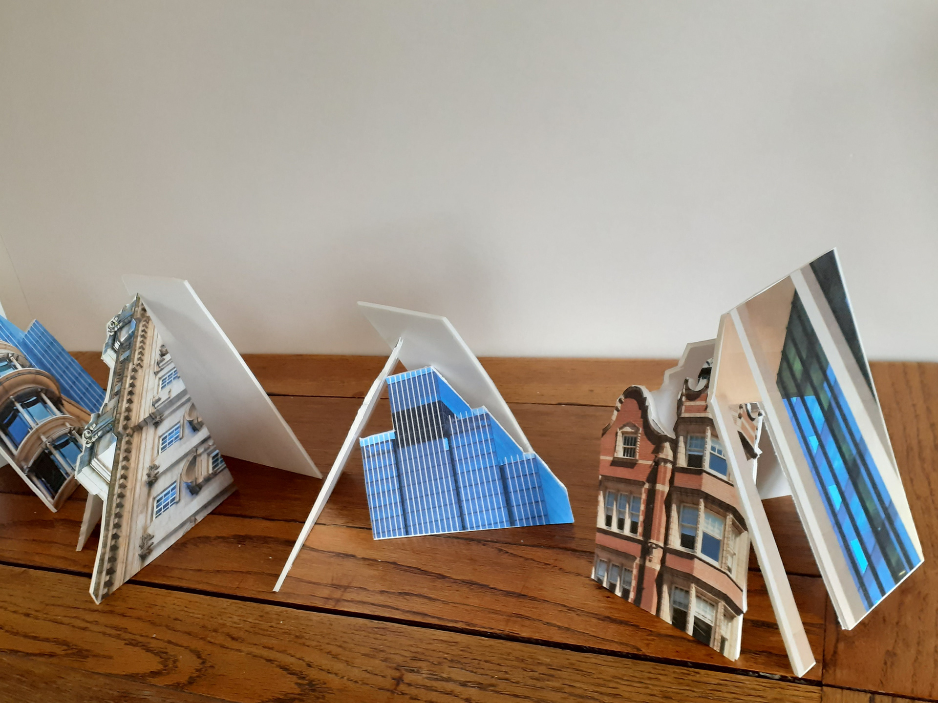
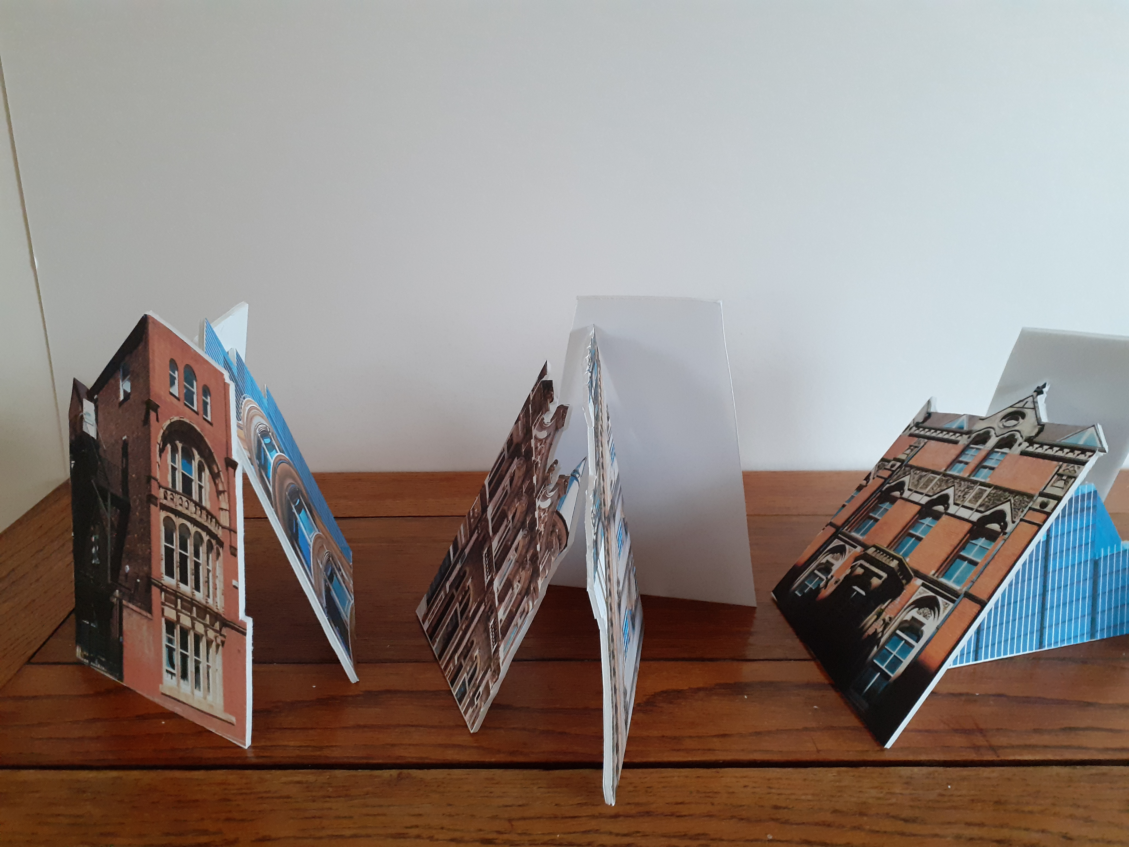
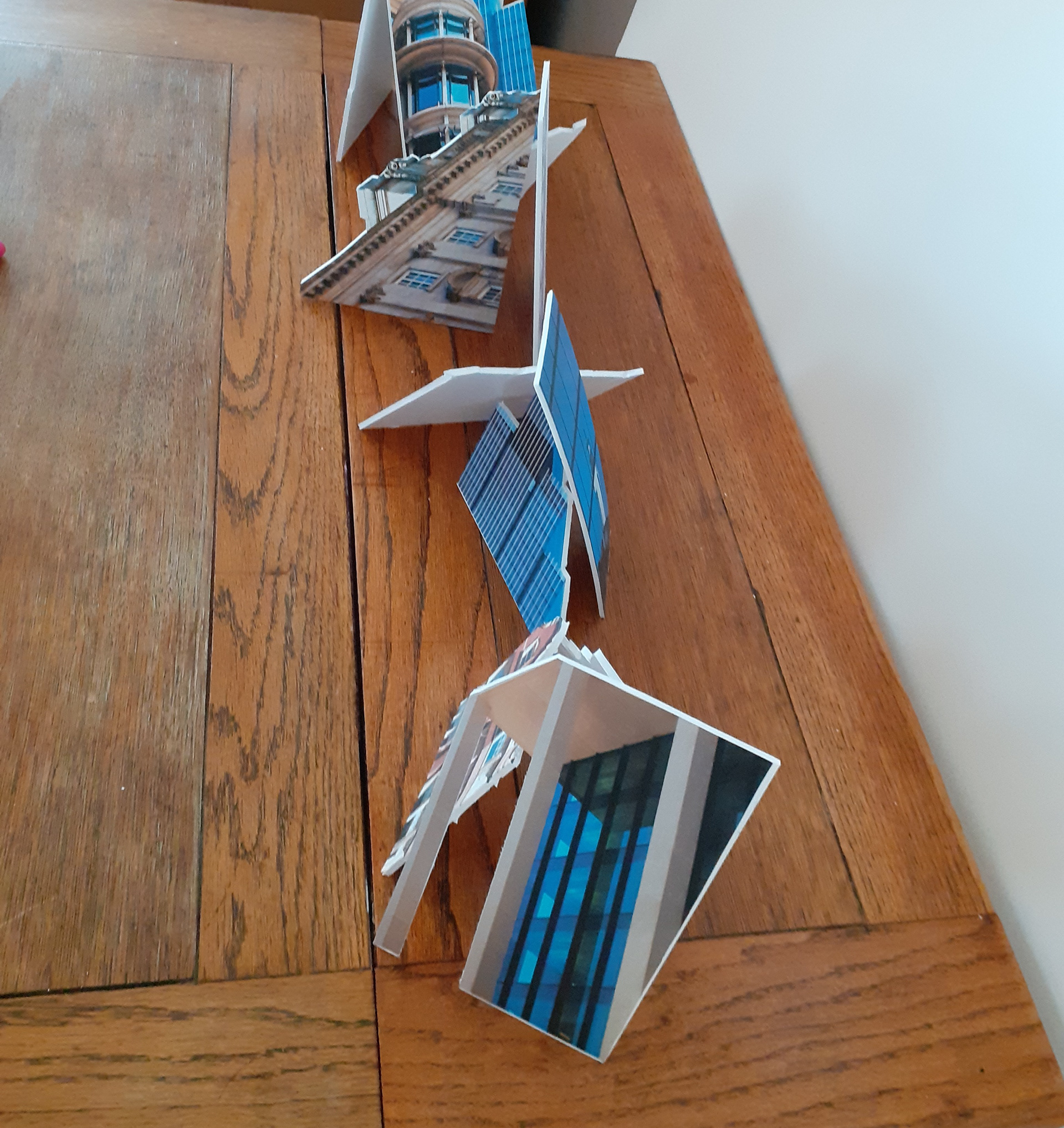
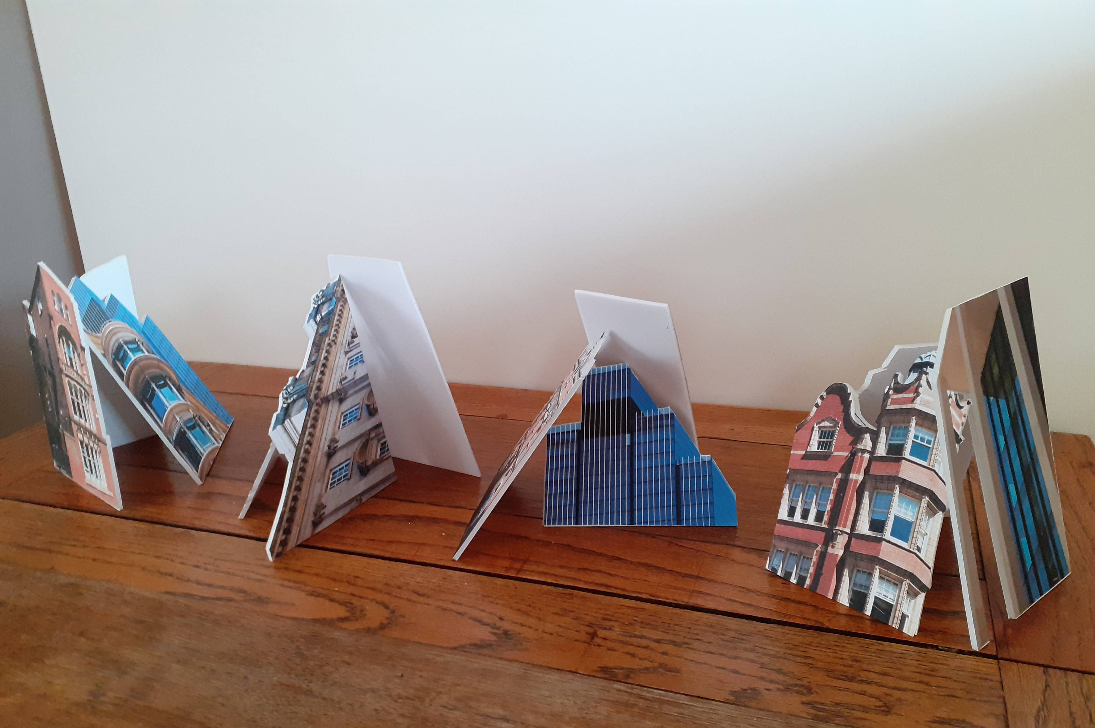
I like the way the image feels claustrophobic and slightly nauseating. The angles and density have a real effect, especially in contrast to the sky above and what our eye does as it tries to make sense of all the perspectives. I have also printed out the images onto foamboard as I was thinking about beer mats and having them printed onto a surface with more solidness and density than paper. I really liked the feel of the foamboard, so I cut around the images with the idea of possibly building something similar to this but in low relief. I kind of liked the strangeness of the foamboard before I cut it too (figure 42), as I was trying to conserve the surface area by sticking my pictures of the buildings in as closely together as I could in any direction. What I created was like an antigravity, anti perspective image. I then experimented with lining up the images against the wall, taking photographs as well as filming them as a pan shot. I also stacked the images into sort of playing card towers; I liked the idea of them balancing as though they could be knocked over at any point, illustrating a sort of precariousness which I thought was quite apt.

Figure 42. Building images on foamboard precutting.

Figure 43: Digital recordings of foamboard composition experiments
Coming back to the idea of creating a singular published item instead of a book, I experimented with creating printed coasters of my images of the city. I thought perhaps viewers could find or be given the coasters and have to find the destination, creating a walked experience that encouraged looking upwards. I went off to experience this myself and took my camera. Initially, I was thinking people could find the view and post on social media with some sort of tag, for example, #gazebrum or #brumview. It was difficult to find tags that did not already belong to individuals or companies but these 2 were available if I wanted to create an '@' tag on Instagram and twitter. I actually really liked the photos in their own right. I had been reading about Tourist Gaze and I liked the 'metagaze' function they created; a look at looking itself. Although I felt some of the images worked, they were extremely difficult to get right, as I had experienced before with my postcard/billboard trials and so I did wonder if this would be difficult to achieve quickly for someone else doing this as an activity. I was able to take my time and adjust my camera but as you can see from images below, getting the lighting right on the object as well as the background was difficult, also the depth of field and composition was very tricky too. 
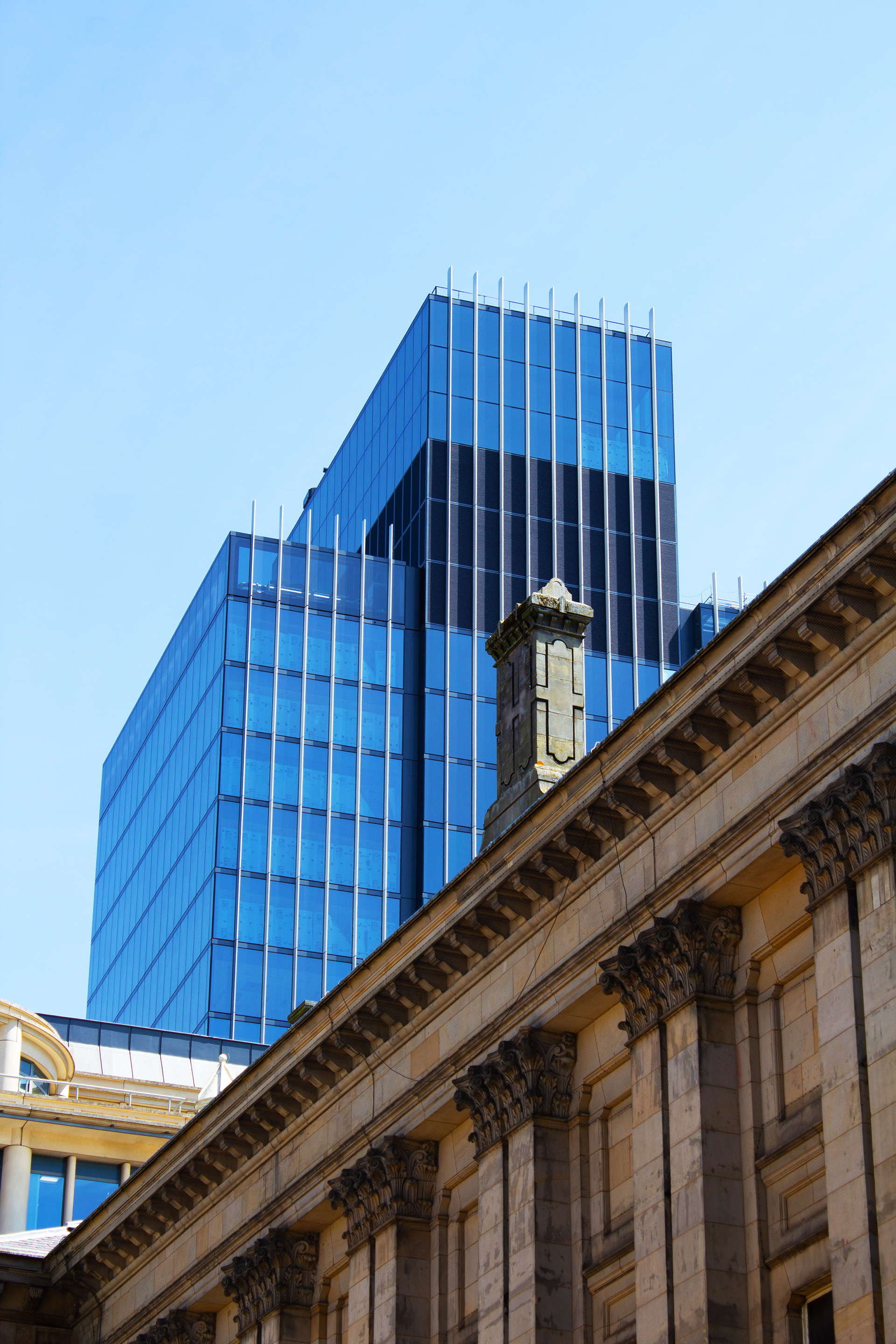
Figure 44: 'Beermat' experimental photography
Below are some of the images edited through adobe. I liked the idea of creating a square composition, alluding to a social media account, even if they are not posted online, on a gallery wall, for example. 
On reflection, I have decided that I may pursue this idea for my research in practice module further, so will be exploring other avenues for advanced practice for now. I need to remember my initial aims; creating anti-neo liberal/capitalist messaging using nature as imagery. I feel this methodology does not really critique my original subject matter appropriately and is slightly off piste. I have also made the decision to not work with an outside organisation such as a cafe as I feel, again, it wouldn't really be appropriate for my aims and objectives as there would might be a conflict of interests. 
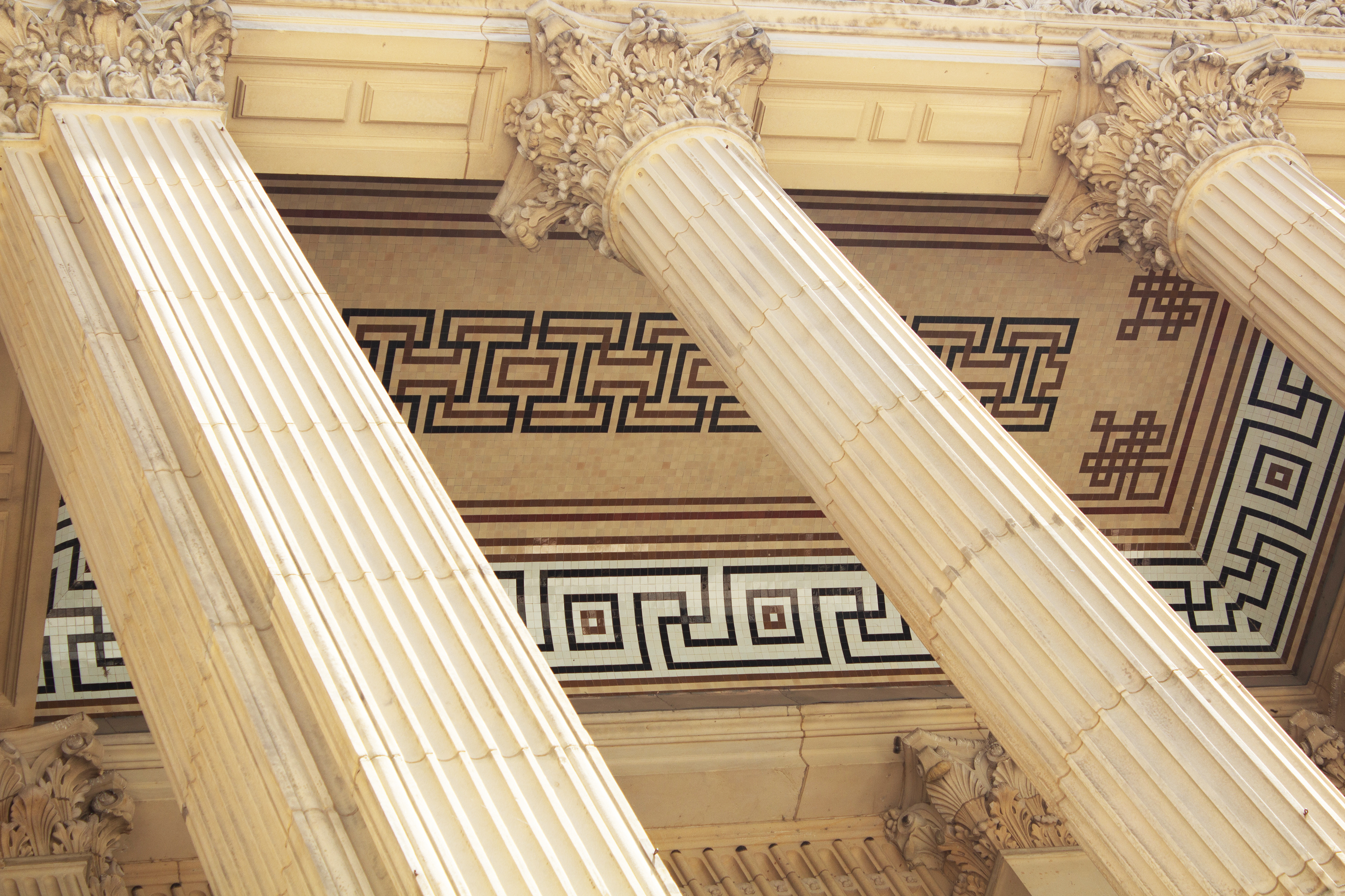
Figure 45: Beermat images enhanced with Photoshop
Thinking about my original proposal, which was to try to capture a contrast with or critique of capitalist culture and spaces, I have been thinking about how and where I create my work. The covid 19 crisis has created a conflict between the personal space of home and the 'working space' of the office, or institute/organisation; blurring boundaries and adding to unhealthy lifestyles. I thought it would be interesting to try and create my 'publication' using only resources available to me within my own domestic setting. I was really inspired by a piece of work by Cory Archangel called 'Simply simplify' (see figure 46). This piece of work involves the viewer and the artist in the making, as it is created via a simple set of instructions, the viewers own printer, a downloadable pdf file and a Post-it note. I love the idea of creating something which can be replicated at the home of the viewer as well as created in the home of the artist. For this reason, I have been experimenting with my own printer and paper, laying up and creating almost surrealist, abstract compositions. I also want to bring back visuals of nature as my other trials involving cityscapes will be explored further in my Research in Practice module.
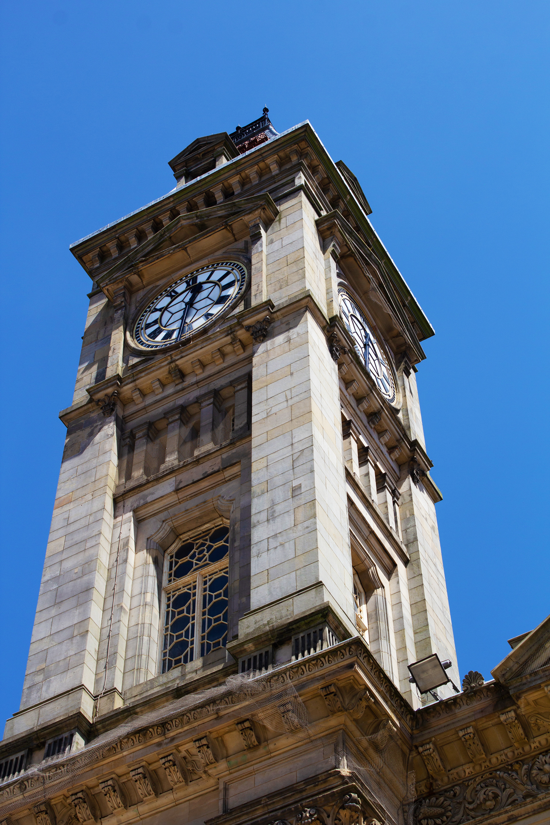
Figure 46: Simply Simplify by Cory Archangel, 2020

Figure 47: CU Boulder libraries video 'The Book's Undoing: Dieter Roth's Artist's Books'

I also looked into artist Dieter Roth's books. I absolutely love the 'undoing of a book'; the idea that a book can be reordered, piled up, layered and the viewer can create almost infinite possibilities with how they piece the book together as they read it or return it. This deterritorialisation of each page and the book overall is a good visual representation of Deleuze and Guattari's post modern philosophy of the Rhizome; the principle that histories and ideas of the self are not subjects which can be totally defined. Rhizome is a non linear way of conceptualising. We are a product of our environment and multiplicty which is constantly in flux and renegotiating itself. I like the idea of considering this approach to depicting the spaces I have been exploring. Could they be represented within new frames and layers. Combining Roth's techniques of presentation with the work of 'Simply Simplify' I have found an methodology I believe will work to capture what I am trying to do as an artist and satisfy creating a published outcome. I am now experimenting and enjoying the surprise element of the pieces I am creating as they come out of the printer; printing one image over another and then over another. I have also found some vintage box files and paper, which I think I would like to include in my publication presentation as they are a good cross-contamination of the birth of neo-liberalism in the 80s and 90s and the power of the 'self made man' of this era. I want to suggest the visual language of this era further; photocopying, faxing, carbon copying. The ideas of capitalism and neo liberalism came to the fore in 80s Britain following the deregulation of banks and the selling off of public services, thus 'liberating' the market to compete against itself. It still governs much of our lives and culture now in 2021, and has failed to solve problems such as inequality or financial markets collapsing. The idea of the 'trickle down' effect is a false narrative as wealth distribution has become more and more uneven.  Deluze and Guaattari similarly argued that capitalism 'steam rollered' subjectivity, replacing old meanings with new homogenous ones. I want to try and create a pushing through of nature as the images progress in my book or images, as the awesome and unmarketable force of nature begins to bite back in my imagined landscapes and spaces.

Figure 48: Layered prints on vintage paper

Figure 49: Layered print on vintage graph paper.

I particular like the dystopian imagery created in figures 48 and 49; as though shopping malls or billboards have been displaced by the natural elements. I am now looking at a way of integrating the images more successfully. I will be experimenting with Photoshop to see if I can make these imaginary landscapes a little more visually obvious.

Figure 50: Photocopy and vintage paper scanned and layered with digital image.

Figure 51: Photocopy and vintage paper scanned and layered with digital image.

Figure 52: Photocopy and vintage paper scanned and layered with multiple digital layers.

I love the combination of the mall and trees, especially the dusty, twiggy floor, so different to the clean, tiled ground in the shopping malls, however, it is difficult to create something realistic with my knowledge of Photoshop (see figure 52). I will be meeting with the specialist digital photography technician to see if I can improve the imagery. I will also need to go and take more photographs of the trees and paths as I want them to interact or echo the composition of my original archival mall pictures. I will also experiment with film of this environment as well as stills.

Figure 53: Footage from the park

I really liked the way film captured the natural environment so tried to layer this with my commercial still environments. I also really like the evocative nature of the soundscape.

Figure 54: Digital film collage using video and still photography

 In figure 54, I have composed a preliminary composition of imagined spaces which merge nature with capitalist spaces. I feel this is the most successful outcome for my objective so far as the imagined spaces work better on film than paper, as I had been doing previously. I also experienced for myself first hand the term of 'punctum', which Barthes talks of in Camera Lucida. Barthes argues that his interest in photography could broadly be broken into 2 experiences as a viewer. The 'studium'; the experience perceived through a gaze which has undergone 'training'. For example, the ability to extract from an image the possible setting, the composition and its effect, the mood created by the colours and possible conscious decisions by the photographer. The second element Barthes describes as 'breaking' through this layer; the punctum. The punctum experience of a gaze, 'the sting, the speck, the cut, the little hole' which 'pricks' us when we look, pierces right through the studium, to a raw emotional experience as a viewer and we forget we are looking at a photograph for a moment. As I watched my images in figure 54 for the first time, I felt a stomach drop of anxiety. I felt I was looking at ghosts or horrors of our anthropological impact on our planet right before my eyes. What have we done to our natural world? For this reason, I have decided to continue with film, refining the compositions and video clips moving forwards as I feel it is the most appropriate vehicle for my message and hopefully delivers a 'punctum' to the audience. I plan to make a projection to go in a gallery space at Margaret Street along with my layered publication. I liked the title 'Growth' as I feel it has connotations of nature, finance and a sinister overtone of cancer, which could represent (in the words of Donna Harraway) 'the Capitaloscene' of the industrial relationship man has had with the earth for the last 100 years or so. I have used a flat image for the modern spaces and moving film and sound for the nature layer, creating a sense of the latter having more depth and worth. I wanted to place nature in a more powerful position to show the tentacular thinking we must start to adopt moving forwards as a society, as we move away from the century of the Self and 'pleasure principle' coined by Freud, away from ideas of 'meritocracy' and patriarchy, towards a phenomenology of 'being', with care for each other and the environment at its heart. I will also be trialling my use of words with my final cuts; could they be narrated over the film or just accompany the projection in printed form within an exhibition flyer?

Figure 55: Nasher Prize 2017 video: Pierre Huyghe

I feel I have come full circle in some ways as these final decisions on my ultimate methodologies are interested in the idea of fiction and reality blurring. Pierre Huyghe is an artist who does this very successfully using similar mediums to the ones I hope to use myself; film, installation and the blending of natural and manmade elements. There is a deliciousness to the visual language of science fiction and shared imaginations that he uses. I was also recently intrigued by the film Dark Matter; A History of the Afrofuture. This film also explored how science fiction can feed our imagination and sense of wonder. The film explores how repressed black groups such as African Americans in the 1980s used fiction to imagine and take control of their own worlds and hopes for the future. I think much could be learnt for us going forwards from these experiences of dark pasts and uncertain presents; that hope is possible and imagination is key and everything is in flux. As Audre Lorde said, 'I feel therefore I can be free', we can find freedom in our dreams and imaginings. 'The Master's Tools will never dismantle the Master's House'; it is up to us to imagine a different future and way of being that is free from personal 'desires' and 'pleasures' pushed on us by neo liberal cultures and spaces over the last century.

Figure 56: Quick video collage on billboard photographs

I edited some of my layered footage back into commercial spaces of billboards (figure 56). I didn't really like the outcome, despite the dimensions being wrong, if I changed them I felt they still wouldn't work. I felt the videos were quite powerful in themselves and by situating them within my billboard photographs they lost some of their immersive power. I am planning to create a projection in a gallery space instead. Originally, I thought I could project them into a billboard sized area, as a projector would easily allow for massive enlargement. However, as I have researched billboard dimensions, they will be quite restrictive, as it is a very long, narrow space, much skinnier than a film, so having done some mock ups on Rush, I do not think it will work compositionally. However, even if I do not use billboard dimensions, I feel commercial spaces are still present in my films; there are posters, neon shop signs and advertisements submerged in the forests within my images and I think therefore they can still be present but in a more subtle way.
I have also decided against using narration. I had written some poetry to accompany my final outcomes (figure 57) but I think again, it complicates the outcome. I want the viewer to be able to get slightly lost in the images as they watch, and I think the voice of a person would not only block attention away from the birdsong and river flowing soundscapes but also be a very obvious break in the illusion of the immersion. I also want the images to perhaps predate our time or be posthuman, so again, language would add a date stamp to the experience of the film.
When the glass houses of civilization begin to shatter, what will we be able to say we learned from our brief pocket of pandemic time? 
We grew. 
We grew roots. 
We reconnected with the earth. 
We photosynthesized and learnt to be still, to take one moment at at time. 
We learnt to breathe and watch the sky. 
We learnt the answers weren't always online. 
We waited, we prayed.
We ate and thought about the seeds that we consumed.
We cried and held on.
We knew we weren't alone because someone, somewhere, was dying alone, and we still had life for company.
Why are we waiting for the glass to fall when the cracks are there? We can push through and not be torn or cut. Demand your daily walk, demand your equality. Demand honesty and integrity and humanity. Demand a home economy.
A new day starts with a beam of light through the haze. We cannot go back. We cannot, we cannot breathe there.
We must move upwards, we must move outwards, we grow through the splinters and cracks towards something new, better, more real.
Real life, real change, real growth.

Figure 57: Experimental Poetry
I have begun to reconsider how my film will be linked to my publication. I am thinking about developing an accompanying leaflet for a 'virtual exhibition' where my film is shown in a gallery, rather than a multiple layered, 'print at home' book. I am now playing around with fonts which could visually echo the 80s and 90s; the time period of neoliberalism's birth. 

Figure 58: Text experimentation for publication
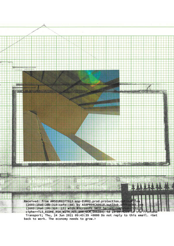
I particularly like the fonts which remind me of early computing or printing, such as Lucida Sans Typewriter, Source Code and OCR A Standard. I am now playing around with compiling some of my 'serendipitous' layered computer images with the layout of an A5 exhibition booklet. Figure 59 shows some double page spreads from a pdf I have developed in InDesign.
Figure 59: Sample PDF pages with code and keywords
I used coding from a random email interspersed with some lines of poetry on the above trial, once again, playing around with the visual language of different technological eras. I then used my full poem as I felt the words needed more emphasis as they were too hidden (figure 60)
Figure 60: Sample PDF pages with poem extracts.
At this stage, I began to worry I was once more, overegging the project with ideas and lacking the refinement I needed for my final piece. As my feedback had said on the last assignment, I only needed one strong image, I did not have to produce a whole body of work. With this in mind, I decided to keep the handout simple and I worked on refining my film, which I will discuss in more detail later. I decided to keep the leaflet one folded, simple A4 guide to the film, with some 'imagined' 2 dimensional pieces supporting the film in the virtual exhibition. I developed a QR Code for the back to link to my portfolio, or 'list of works' in the exhibition, and printed the final piece on vintage 80s graph paper, to add the element of eras crossing. I also really liked the idea of the pulp of the paper, the trees that were harvested many years ago, being present in the gallery in the form of the paper, as well as nature being 'virtually' present. I took the idea of writing about the exhibition even further by 'fictionalising' when the exhibition would take place. I set the exhibition in the future on an impossible date. This way I was incorporating the past, the present, the future and the imagined into my work. Below are many compositions I played around with as well as paper types until I was happy with the overall aesthetics for my publication (figure 62 and 63). I researched by looking at many different exhibition guides in A4 format including one for Pierre Huyghe's work to help plan a professional looking guide. Below is a board I compiled on Pinterest to help with the designing of my publication too. I also printed out Ikon guides as, being a familiar visitor, I wanted to look at how they used information on their simple, single handouts. All this research helped me to design something, I feel, is realistic 'evidence' of my virtual exhibition.
https://pin.it/7h2zh5b

Figure 61: Gallery handout research

Figure 62: I created numerous different exhibition guide compositions before deciding on the final layout

Figure 63: Experimental prints on different vintage papers

Figure 64: Final exhibition guide (printed content) front and back including portfolio QR code

Figure 65: Final exhibition guide (printed content) middle pages.

Figure 66: Final exhibition guide as intended (printed on vintage graph paper and available to take away)

In the final design, I have tried to maximise white space to give the leaflet a professional feel. I have included some information on myself and the artwork as an access point for visitors, and also to contextualise my work into its main themes and ideas. I also really like the aesthetics of the vintage graph paper; its natural colour and feel, and the subtle presence of the graph lines inside as well as the presence of trees and wood in another form (the paper).
I am really happy with my supporting publication and finally feel a sense of peace after grappling for so long with what form I wanted my publication to take. In the end, using the item as a practical guide as well as a piece of 'fiction' and a relic of tree material helped me to draw out my themes on time and counterculture further and actually use the publication as a tool or methodology for my original idea. 
As mentioned above, I have also been refining my film. As well as refining the compositions, I have experimented with adding a vintage slideshow noise between my layered images, again, linking to a past era of media and ways of looking as well as creating a disorientation in time. I have experimented with different compositions of images, as well as more layers and new video and sound. The film editing process culminated in me creating my own visual effects for a slideshow projector transition (figure 67). I built this from scratch by building layers of blur, vignette and movement of a black slug screen with a feathered edge. I coordinated my effects with a sound I liked from an audio effect website of a vintage kodak projector. This effect has been built between all my images to create the consistent experience of a slideshow.

Figure 67. Premiere project workspace plus close up and diagram of the visual effect I created of a vintage slide transition

My next and final stage, is to set it up in Margaret Street and film, in situ, my projection as though it is in an exhibition. After tutorials with the film technician, I have been informed there may need to be further post production editing as filming film can be problematic so I need to leave time to resolve that.
Whilst I wait to film, I have been experimenting with photographing white spaces at the school of Art to 'hang' my 2 dimensional work, using Photoshop to create my imagined curation of the images (figure 68). I have been experimenting with frames; could they be posters? Again, echoing advertisement space, or could they be in box files to suggest their archival nature? I have also purchased some commercial A4 lightboxes which I think could be enlarged digitally to suggest big electronic billboards in the gallery (the new technology of advertising which seems to be slowly taken over from original flat posters by companies such as Clear Channel and JCDecaux.) I hope to be able to resolve this additional element if there is time as I feel it would go nicely together with the film and guide.

Figure 68: Photoshop edited box file frames in gallery space at Margaret Street

Figure 69: Digital visualisations of posters

Below are some test shots for projection of my film (figure 70). As you can see, the first 2 studios were too light but I think the final studio would work well for the presentation of the projection. The refresh rate difference between the camera and projector can be seen here, creating visual noise problems. As mentioned earlier, those will be resolved post production. This is apparently industry standard as a process (all video of artwork projections galleries post online has been through this process post filming). I will also need to make sure my film is in focus and the sound quality is improved for the final filming. It was also very important for me to practice the health and safety of using electronics at Margaret Street as projection was the cause of the fire at Glasgow School of Art in  2018. As you can see from figure 74, wires can be an issue. When I filmed with just myself in the studio, I just needed to keep my workspace tidy and be aware of the wires, but if I was to create an immersive film projection for an actual exhibition, the wires would have to be grouped together where ever possible and concealed, possibly in a built unit with the equipment, which would then need ventilation for the projector fan which can over heat (the cause of the Glasgow fire). It is also important wires are not wound up as this also generates heat, so the wires would have to be an appropriate length. Then, the wire to the extension power source would be concealed under a special kind of tape across the floor to the wall, as would the speaker wires to the relative corners of the room (although they could be concealed around the room edge and therefore less of a hazard).  Figure 71 shows a diagram of how my set up could be done. I can feel the project finally falling into place now and it was very rewarding to experience the immersive qualities of the work in a gallery space first hand.

Figure 70: test shots around School of Art of my projection

Figure 71: exhibition proposal for audio visual set up

Figure 72 shows a selection of clips of the final day of filming. I experimented with shutter rates, sound combinations and colour balance. In the end, a shot with a white balance, the camera microphone with surround speakers made for the best shot to use. I will now be applying layers in post production to create something more crisp for the final film submission of the work in situ. This will involve using masked layers and adjusting the brightness and contrast to make the film more seamless between slides and organic to the human eye.

Figure 72: recording a range of takes for post production

Figure 73: Projection from a different angle.

Figure 74: Behind the scenes; studio set up with SLR camera on tripod with external mic, surround speakers, projector and media player.

Figure 75: Close up of Premiere project of projection visualisation

My project is now ready for submission, as is my virtual exhibition, which can be found in the 'Growth' section of my website. I used Premiere to make minute adjustments to the final film, as shown on the timeline above in figure 75. The layered videos did create some rather obviously inauthentic moments, so the original studio film was used in some places instead of masking. In particular, the black of the title screen was very unsatisfactory when layered, as pure black, through a projector lens, is not pure black on the wall. After trying to resolve this with opacity and contrast, I used the original wall projection, which does have some flickering effect due to the refresh rate, however, I decided to keep this as it fitted quite well with my overall aesthetic and the machine noises on my audio. I also adjusted individual clips' contrast and brightness levels in places to create more consistency, as the studio changed colour and tone frequently depending on the image projected, as well as freeze framing them to minimise flicker. After much toiling with the audio, I decided the final film in situ sounded best through headphones for assessment, as the studio audio was not particularly satisfactory through computer speakers, but quite a lot more sensual and subtle through this outlet.
 Overall, I am really pleased with my film. I think it has an interesting and intriguing effect on the audience and the ambience of the scale and sound of the projection outcome adds to this. It has been quite a long journey to get to this point, and I have gone into detail about this in my critical evaluation but to summarise, I can see my work is changing and becoming much more refined, compared to my last module. I am becoming more ambitious about what I am capable of; holding myself to account and pushing everything as far as I can in terms of quality and detail. I am also learning to be more focused in my pursuit of my ideas, as well as how this does equal a better, more in depth outcome and investigation.
Back to Top