My initial interest for this module was in portraiture and the triangular relationship between artist, sitter and viewer. My first trials above where simply exploring whether a portrait of someone could be created without using their facial identity. Looking to the philosophy of Lacan on identity and the idea that 'we will never be fully understood, nor will we ever fully understand one another', I began to capture the inside of mouths. Can aspects of a person's identity and life experience be revealed by their mouth? The condition and positioning of their teeth, oral hygiene, the colour of their cheeks and tongue: can a viewer tell their gender or age? This also represents visually the impossibility of 'knowing' each other fully both inside and out, as the mouth is an internal world which is usually only glimpsed in everyday life and conversations. Lacan stated our use and understanding of language is the closest tool we have to communicating what and who we are to others. Language is also formed mainly in the mouth; when we open our mouths fully, we can no longer speak; we are bound by the physical features our genes have bestowed upon us.
Following this idea further, I wanted to work with individuals beyond my own family and friends. I began to form a group of volunteers through some social media requests to the public. I wanted to form a group of people who would be unknown to each other and who might represent different sections of society beyond my own. I wanted to use this group to experiment with ideas to do with identity, both individually and as an informal art group.
After several weeks of messaging and forming clearer, more effective lines of communication, I set up a group of 12 participants as a weekly online art group. I have a range of ages, ethnicities and backgrounds (some artistic and some not). Initially, I asked them to create an online art pseudonym so the group could know them by this name. I am now in the process of allowing work (weekly tasks based on their identity) to accumulate while I explore other avenues of enquiry during my studio time on the MA, as I am eager to make, and do for this 'practices and processes' module. To follow how my art group is progressing click here
Meanwhile, considering my own practice, I began to consider the mouth images further. I began to investigate Hannah Hoch and Dadaism. I felt the mouths had a surreal quality to them and I emphasised this further by layering negative space in them and around them using Photoshop (Fig 1 and 2). The more I looked into the origins of Dadaism, the more I discovered parallels with today. The Dada movement was born in a club called Cabaret Voltaire in Switzerland. As World War One raged around them, a group of artists coined the term Dada (hobby horse in French) and created music, art and dance which was completely avant-garde at the club, which was their headquarters.

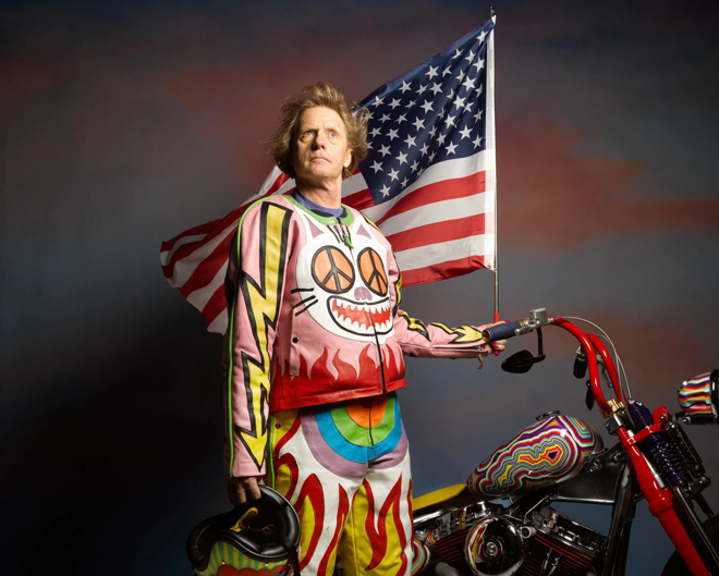
Fig.1 Digitally edited photograph

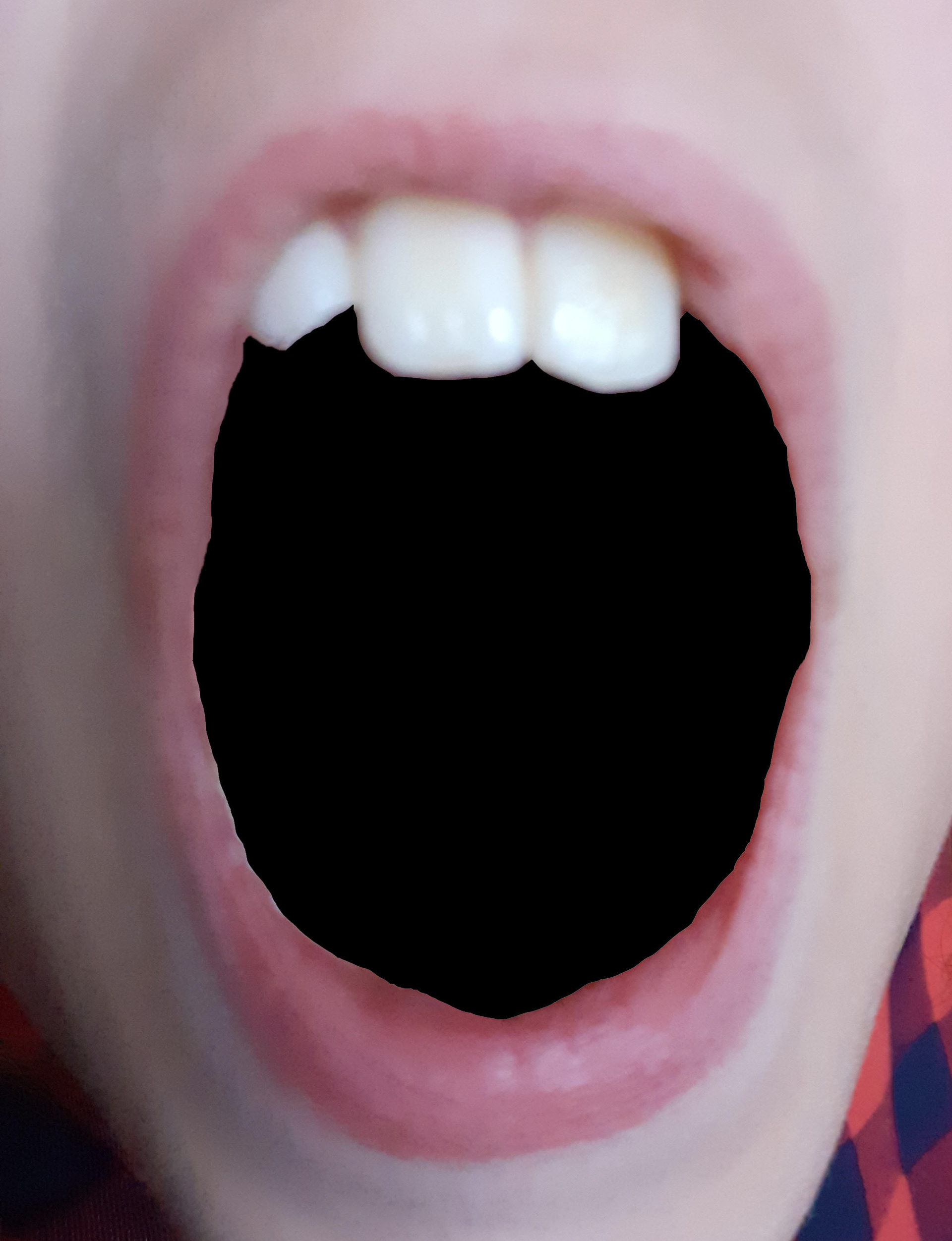
Fig 2. Digitally edited photograph

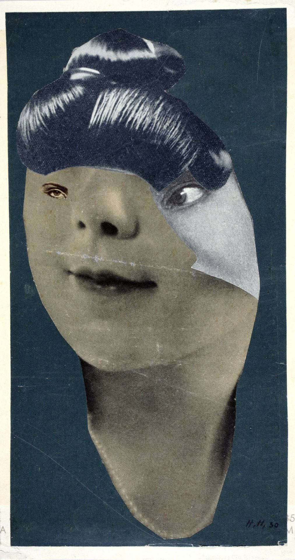
Hannah Hoch, Deutsches Mädchen (1930)

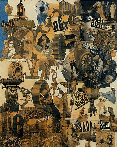
Hannah Hoch, Cut with the Kitchen Knife (1919)

Dadaism was a reaction to the barbarism and anarchy WW1 was creating in Europe. The art movement celebrated luck over logic and the irrational over intent. I felt this was a very topical sentiment as Covid 19 has created an anarchic state in Europe today. 
“It was the Dada position that bourgeois art, bourgeois order and bourgeois rationalism had been implicated in the death of millions; that bourgeois culture was no more than a mask of civilization laid over a deeper barbarism.”
Art in Theory; Rationalization and Transformation by Charles Harrison & Paul Wood
I am a teacher, my husband is a doctor and my sister works in public health. We all experienced a complete sense of anarchy over the peak of the crisis in March and April 2020. Schools, hospitals and local authorities had to think on their feet as the situation changed rapidly and it was evident that leadership from government was not only slow in materialising but also naive as to how systems functioned. Local leadership, keyworkers and systems were amazing in their step up to the crisis, but as the situation unfolded, government led systematic practices were expected to help manage the situation long term. They either failed to appear, or if they did, they were so massively ineffective that local level management could have been far more effective, if provided with funding and authority. Consequently, aspects of Covid management are now being assisted by local leaders and public health experts; something that could have been facilitated originally. Huge amounts of money have been curtailed towards companies in the meantime, with little or no experience of this type of crisis, instead of using this local expertise, and the response from the private sector has been chaotic and ineffective; the companies responsible have also been completely unaccountable. This sense of disappointment in our liberal, democratic system led me to feel a connection with the Dada movement. Logic and reason does not play a role in our systems of power under a mainly capitalist, market driven society; it is luck and the irrational. The arts were also degraded and defunded during WW1 in Europe, just as our arts have been hugely hit by COVID restrictions today. Capitalism, once again, had failed to provide the security and stability western political systems have promised.

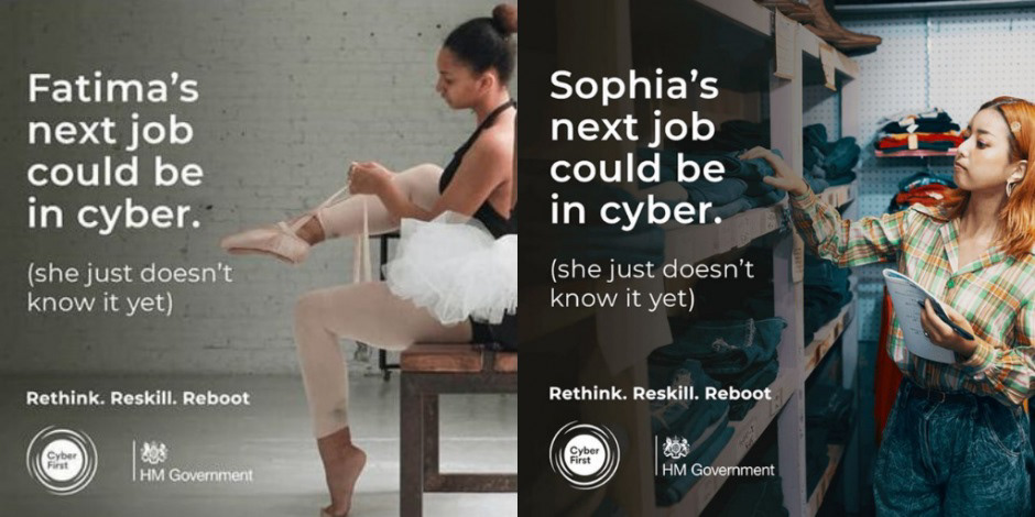
Government advertisement, September 2020

I began to trial digitally editing mouths, and also sketching them shouting, disembodied (Fig 3). I felt this was a good visual representation of not only the sentiment of how myself and others have felt over the governing of lockdown but also to visually show political discourse has become so polarized and fractious. How do we begin to communicate with each other if there is so much anger and emotion behind our beliefs? I also began to question perhaps where myself and my fellow 'liberal elites' might be going wrong with how we put forward counterarguments to Brexit or the current Conservative government (who won the last election with a large majority despite 10 years of austerity and creating the most divisive country in living memory). A recent episode of Grayson Perry's Big American Road trip asked this precise question to a group of liberal, educated, middle class Americans (but in relation to Trump's success) and it was not a warmly received question. Perhaps this smug attitude of automatic correctness is one of the barriers to changing the system. In contrast, Thinking Allowed on Radio 4 recently discussed the problems with 'Elites' and how they have been wrongly blamed for societies problems when 'economic' elites are very different to the elites which exist within science, arts, institutes and education. The latter are elevated to the elite level through their own achievements of excellence in their field, largely promoted and recognized by their peers as the 'experts'. Outsiders can view this system as 'unfair' as it is, by its own nature, exclusive to all but its own community. You can listen by clicking the link below.

Promotional Image from 'Grayson Perry's Big American Road Trip', Channel 4 September 2020

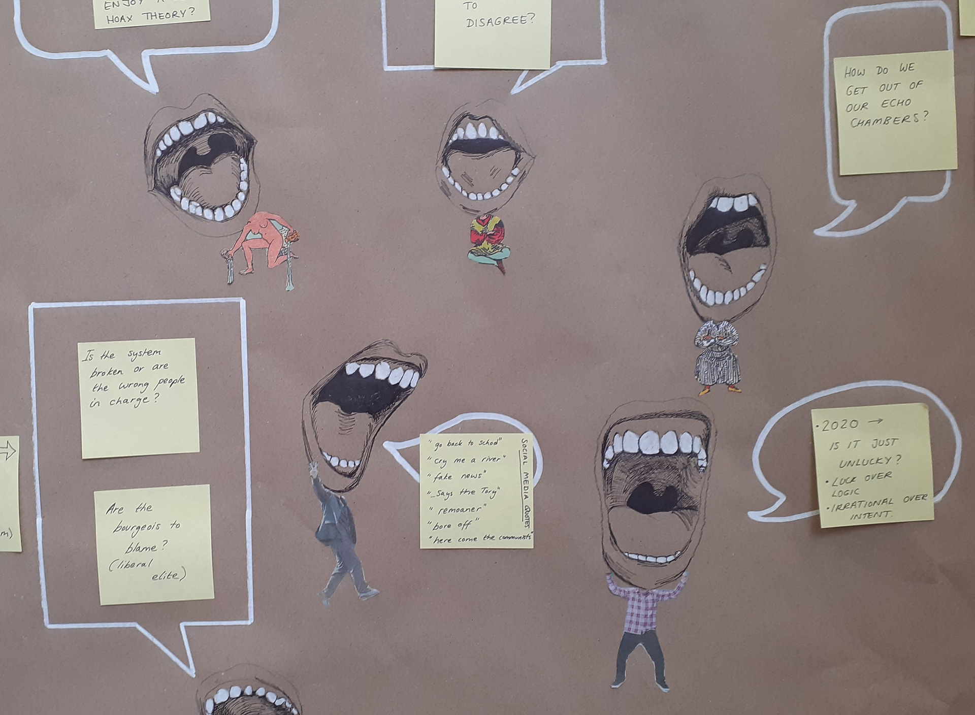
Fig 3. Section from my studio visual brainstorm.

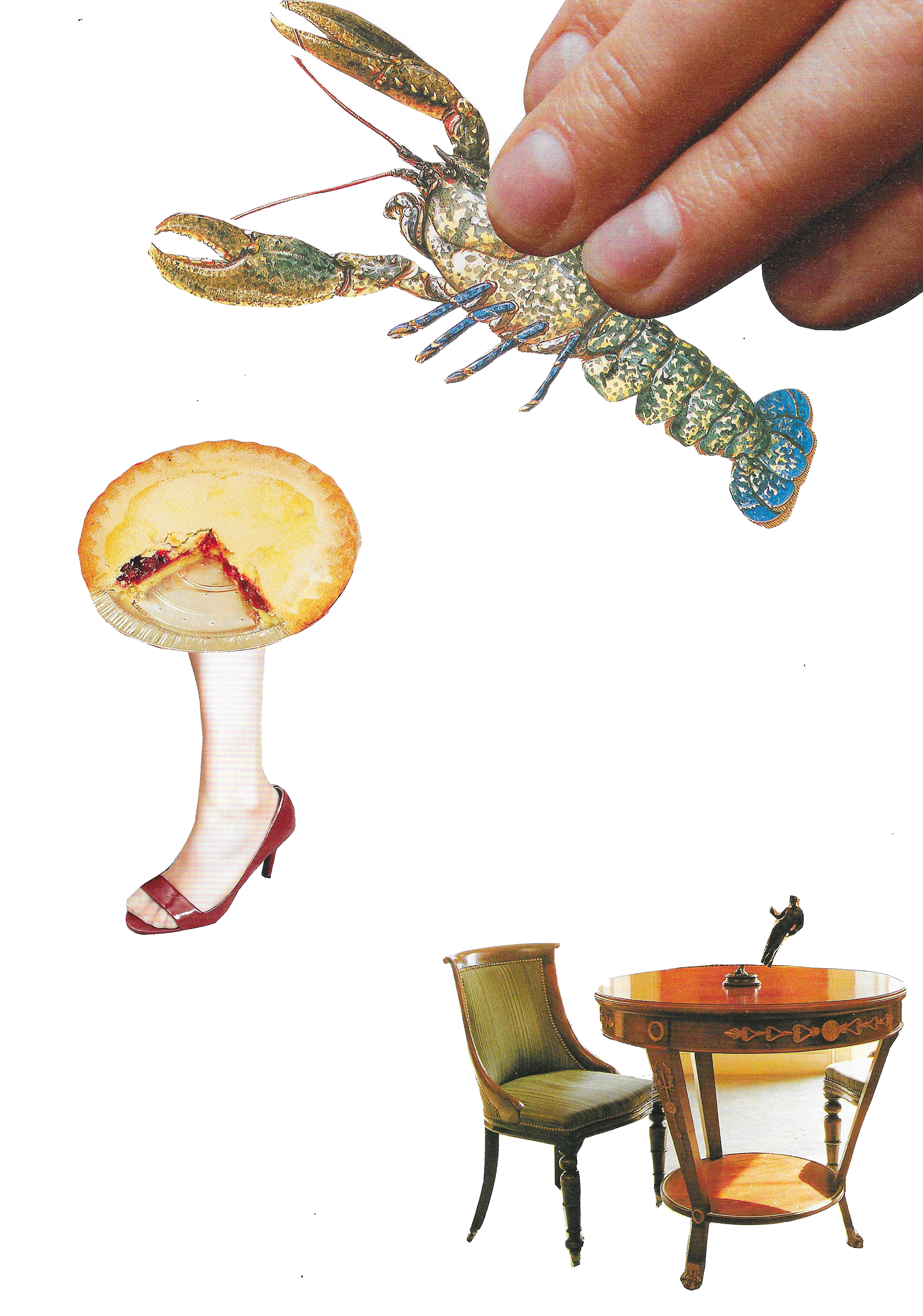
Fig 4. Free association photomontage

I created some collages myself, using Hoch's technique of letting luck and free association guide the composition. I really like the image with lots of negative space in (Fig 4) as I feel the space represents the void of meaning and possibility around the objects. This image appears to float in the negative space around it (I used a PNG format); there is no context, forcing the viewer to interpret the meaning of the objects more directly, unlike the scenes with a setting (Fig 5 and 6) where we might be distracted from them, or persuaded into a specific representation and therefore meaning.

Fig 5. Free association collage

Fig 6. Free association collage

Another line of enquiry I have begun to explore is tarot cards. I used to sometimes do readings of tarot at parties for entertainment. I have a pack of Ryder Waite cards and the designs, by the largely unrecognized talent of Pamela Coleman Smith, have always intrigued me. I recently read an article that business owners were turning to psychics and tarot readings to help them make decisions about the future of their business in a post COVID world. Something I learnt from doing tarot (which I do not personally believe in as a 'mystical power') was that people were able to feel a connection to the 'truth' in the cards and the reading without the reader (myself) having to do a great deal. The power was in the stories told by the random connection between the images. Without any embellishment or detail, people felt they could see something 'true' about their lives or their personality. This also reinforces my projects interests in 'luck' over 'logic' and our ability to find our 'identity' through language and interactions with others. Lacan believed part of the identities we form of others around us, for example, our partners, is through an ability to 'peg our ideas' onto our partners. The process may also happen when tarot clients peg their ideas of themselves and their lives onto a tarot reading and the interplay between characters on the cards (as well as the reader reinforcing this). 
I think there are also interesting parallels with turning to the mystical and times past, that also resonate today. One of the driving forces behind Brexit was a belief that we should return to a simpler time, when we governed ourselves and take back our 'sovereignty'. Sovereignty meaning a state able to govern itself; supreme authority moving from Brussels to back to Westminster. The tarot cards operate within a sovereign system too; God like forces such as Death, the Moon and the Sun (the Major Arcana) are associated with the major aspects of the Querant's life that they have no control over; their destiny or fate. The Major Arcana cards reign above the rest; the Minor Arcada. These include the court cards (King, Queen, Knight and Page) and the numerical cards (ace to 10) of which there are four suits (swords, coins, wands and cups). The Minor Arcana represent the everyday context of the Querant's life (events, experiences, people).

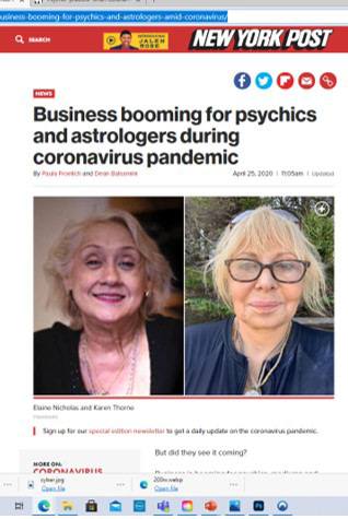
Section from a New York Post article April 2020

I wanted to try my hand at animation using collage; taking Hannah Hoch's technique, modernising the imagery used, as well as making them come to life. This idea reminded me of the work of Terry Gilliam on Monty Python animations in the 70s and 80s. I have fond memories of these artworks growing up, and the work would definitely be described as surreal or dadaist. The other strength to Gilliam's work is that it uses humour to gently challenge archaic systems, beliefs and critique 'high art'. I managed to find a video which showed the viewer exactly how Gilliam creates his films and I used this knowledge to create my first version of a simple animation using an SLR camera and software I had at home (Fig 7).

Fig 7. Free association stop frame animation

I was able to refine this technique further by digitalising it (instead of using a manual stop frame process) using Photoshop and Premiere Pro to create movements to individual layers (Fig 8). I used tarot card images as ready-mades to create movements I felt the cards led themselves to; using the process of 'luck' to dictate what would happen in the frames.

Fig 8. Tarot animation using Premier Pro

Screenshot of the Photoshop process

I also used photoshop to create a Tarot typography so I could write my own captions on a reworked set of tarot cards. Using a 'meme' style approach to the tarot, I tried to create some satirical illustrations; placing contemporary problems in the medieval context of the tarot world (Fig 9-12). I liked the idea of placing modern problems in an historic, anthropological context; revealing perhaps universal human truths.

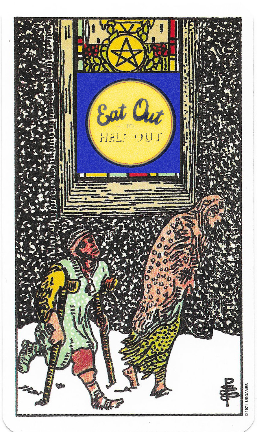
Fig 9. 'Eat out to Help out' digital meme

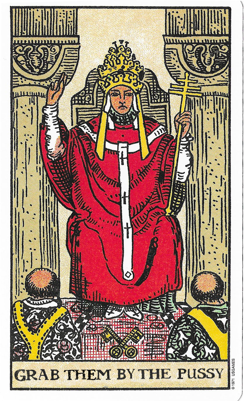
Fig 10. 'Grab Them by the Pussy' digital meme

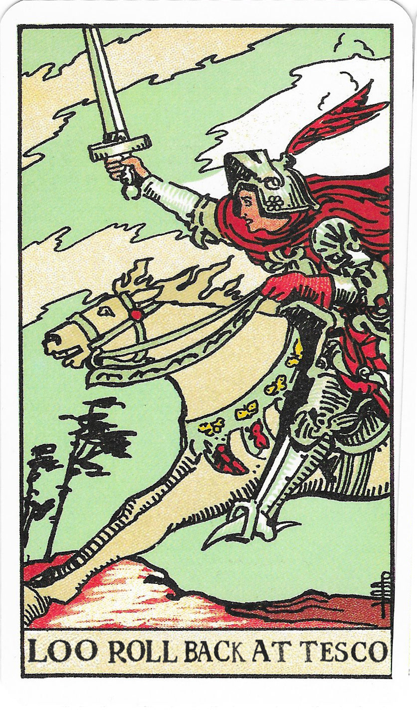
Fig 11. 'Loo roll back at Tesco' digital meme

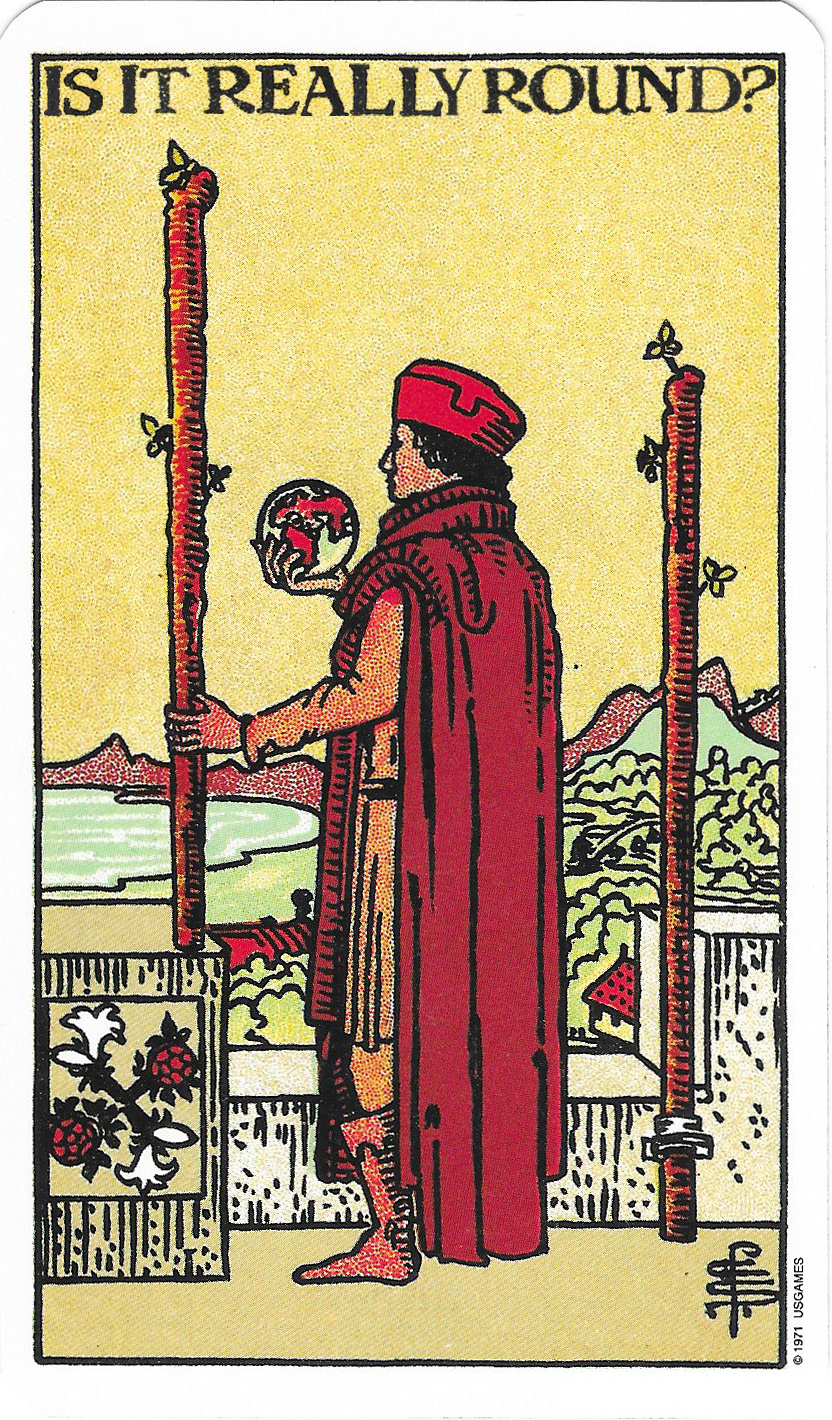
Fig 12. 'Is it really round?' digital meme

I revisited animation with the Tarot cards and worked on a longer animation. My biggest problem with the first attempt was that video has to be landscape, and my first trial looked compositional wrong as it was portrait, as the Tarot cards are compositionally. I have tried to overcome this problem by having 3 cards interacting on the same spread, as you might have for a reading. This also enables me to have a bit more of a story. With the trial here (Fig. 13) I created French and British characters to represent the UK and the EU. I wanted to create comical elements, such as ridiculous accents as well as stereotypes about both nations.

Fig. 13, Premiere animation trial with 3 Tarot

Whilst I have enjoyed using the tarot cards and I could see the images were strong and effective, I was unsure if I should be using another artist's images, especially as I know Coleman Smith died penniless despite the huge success of her designs. The feminist in me wanted to honour her imagery but not rehashing it but by using it as inspiration and making my own, so I began to look for other illustrative inspiration. I researched John Tenniel. John Tenniel is most famous for illustrating Alice in Wonderland, but before he did that, he was commissioned to design the images for 'Happy Families', a popular card game published by John Jacques in 1851. Both of these works by Tenniel are distinctively synonymous with playing card imagery and so I attempted to draw contemporary leaders in this style. I used ink pen to develop the caricatures of both Boris Johnson and Donald Trump (Fig 14 and 15), depicting them as Humpty Dumpty and the Mad Hatter to add a satirical edge to the images. I was quite pleased with how they turned out as I have never done caricature art before. Boris's hands are slightly lost in the tonal work around his egg outline but I am thinking I may now use traditional etching processes to refine them further to create my own playing cards. Again, I like the idea of taking modern political ideas and placing them in a 'past' visual language; placing the current trend of the glorification of the 'Great British Empire' back into the past where it belongs and should stay.

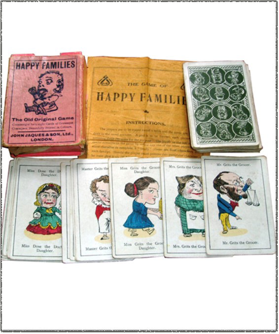
The original Happy Families game illustrated by John Tenniel

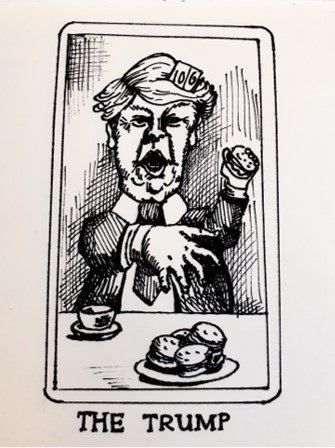
Fig 14. The Trump, ink drawing on paper

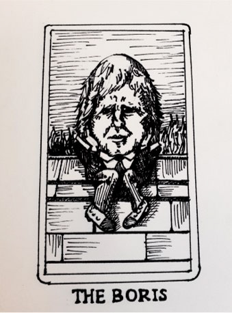
Fig 15. The Boris, ink drawing on paper

I decided to explore etching and printing as a means to refine the quality of line on my caricature cards. I loved the nature of the bleeding ink from the pen on the cartridge paper on my original's above, and this also shares some characteristics of the tarot card line work, but it was difficult to refine areas of tonal graduation or difference with full control. So I developed a study of Dominic Cummings in the Rose garden, using elements of Tenniel's work to suggest the Mad Hatter, but I reproduced it on an acetate etching print with water based ink to resolve these issues. I was really pleased with the results of etching, a first for me, but would like to refine this process further in the print workshop. I also managed to forget about reversing the text as Cummings 'get out of jail free card' in his hat is backwards! As I was drawing the image, I decided not to squash his arm in, which I accidentally left little room for. I made the conscious decision for it to jump out of the frame. I feel this is a good representation of his rule breaking (visiting Barnard Castle and travelling 206 miles whilst being infected with Covid 19). Some commentators have said this moment was one which significantly undermined the Government's 'Stay at Home' message and ultimately would have cost lives, as people took more risk in following suit. I also really like the idea of a set of playing cards which are not all the same shape; having unusual outlines and appendages, not only drawing attention to the fact they are not all of the same value, but that they would be very difficult to handle. Playing with them effectively during a card game would be difficult as players would begin to recognise certain cards.

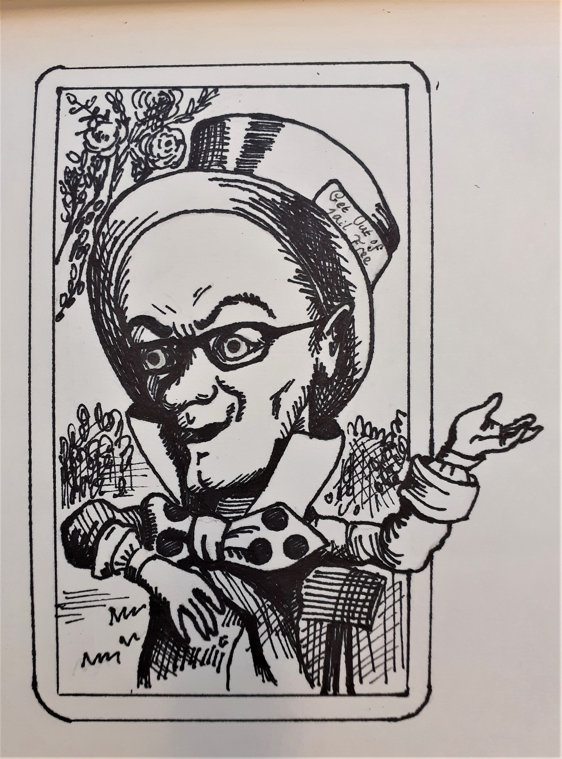
Fig 16: Cummings in the Rose Garden, ink drawing on paper

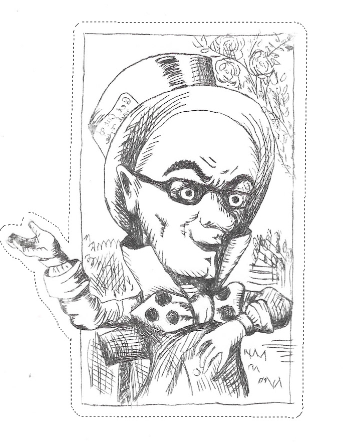
Fig 17: Same illustration using acetate drypoint print with water based ink

I wanted to find a more contemporary reference also so began to look at examples of activism as a source of how I could explore satire as a tool for social justice. Monty Python used their humour to explore notions of class and hierarchy in their programmes and films from the 1970s and 80s but I wondered if I could find a more current satirical group. The Yes Men are a group of activists who raise awareness of political and societal problems through humourous stunts. In this Movie, the duo of men try to raise awareness of the global imbalance in power at the WTO. The WTO stands as a force for global development and good, yet it uses power and influence from its larger state members to bully smaller countries into making trade agreements that are not in their best interests; reinforcing global inequality. The Yes Men planned and staged public spectacles such a speech and television interview presenting themselves as representatives of the WTO in a shockingly honest way (exposing their extreme Capitalist/imperialistic views). The most disturbing element is that they go largely unchallenged and their shocking rhetoric is taken as acceptable, exposing the problems we face as a society; our apathy and complacency towards exploitation of fellow human beings and cultures. I really like the way the Yes Men utilize humour; that is something I very much want in my work so it is not too bleak. Humour is also a good tool for making viewers consider political perspectives different to their own, without it becoming too confrontational.  

Fig. 18 Trump mouth in clay

As well as developing playing cards and animation, I began to think about what I could physically create in 3 dimensions that might link the political/satirical and the mouths I used as a starting point. I originally thought about casting mouths as a complimentary 3 dimensional element to my images but Covid 19 meant there would be many problems with working in this way, as I would not be able to do the casting with the technician. I thought I could perhaps sculpt a mouth and so I trialed working with clay on a flat tile. I wanted the mouth I sculpted to seem disembodied. So I created a slab and made a hole. I then built the mouth around it as though it was raising out of the surface; not only looking surreal, but becoming a meaningless voice. I really wanted to satirize Trump, so looking at many images of his mouth in the same position from many angles I created the sculpture below. I wanted the mouth to look aggressive; representing the idea of the echo chamber of our current political landscape. The mouth is mid speech, but makes no sound; again, demonstrating our inability to hear each other or listen effectively. Although I very much enjoyed this process, I did feel I wanted to return to illustration as it seemed a more appropriate method for satire and humour.

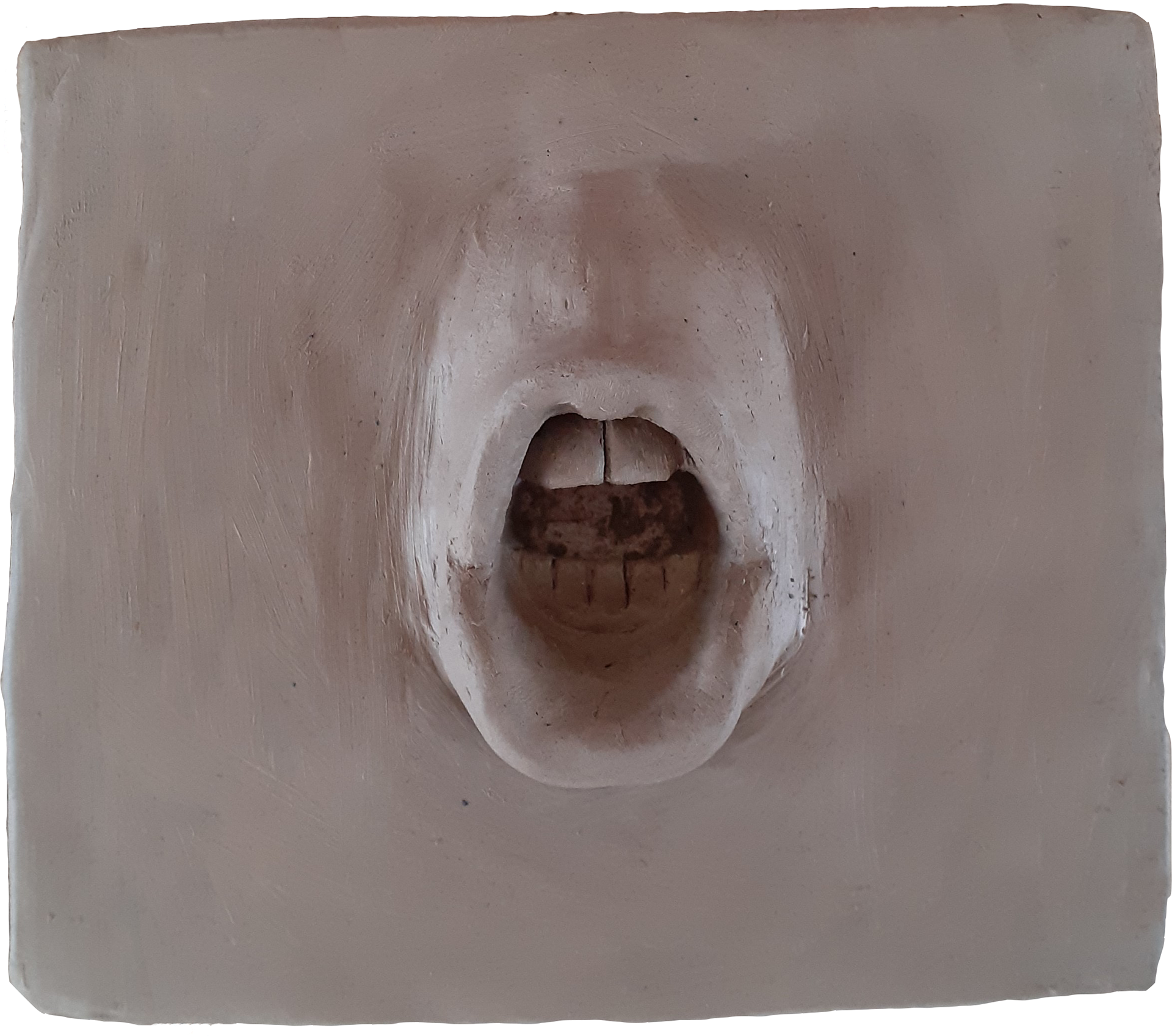
Fig 19. Trump mouth from above

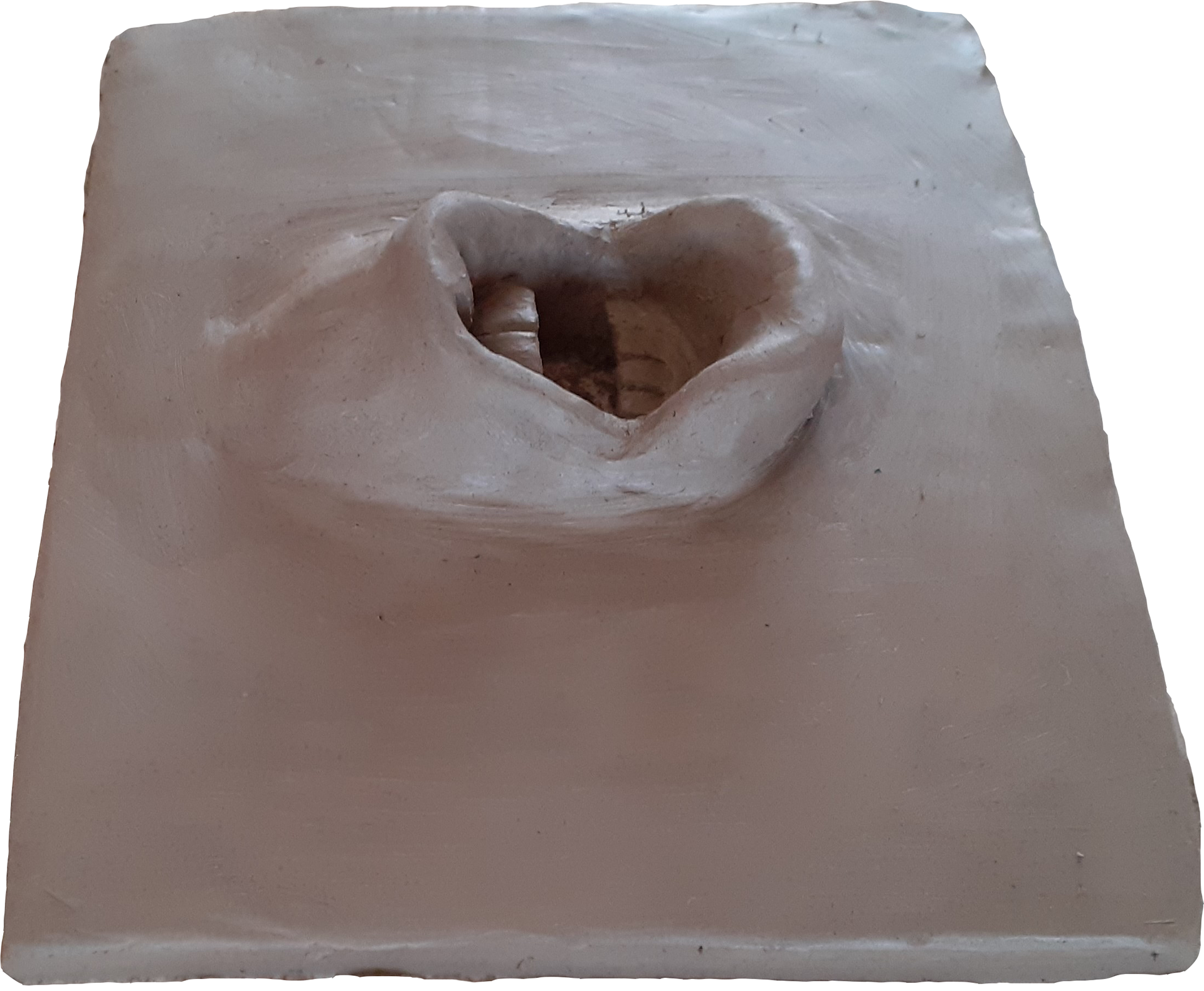
Fig. 20 Trump mouth from the side

Since my last digital sketchbook entry, lots of relevant, political news has occurred. Two of my 'muses' have experienced a significant power shift. On the 3rd November, Joe Biden beat Trump in the US election. Although Trump is not fully conceding yet, this means that in January 2021 he will likely be leaving the White House. Also, Dominic Cummings has quit his job as Chief Advisor to Boris Johnson. Although both this pieces of news are music to my (politically left of centre) ears, I did feel a slightly shameful disappointment as my passion for these outrageous figures has been a very useful feeling to subliminate into my artwork. It has made me realise how very temporary our intended Art's meaning is, as social and political contexts are constantly shifting. For example, when I made my Trump mouth (Fig.17), it symbolised my anger and sense of fear and powerlessness at the presence of racism and nationalism being a very present and real threat. I now look at this piece in a different way. The threat of Trump is lessened, but his mouthpiece of arguing for the 'greatness of America' and 'building a wall' will take some time to heal from. The sculpture has now become a relic of the past; it will always be there. Will this sculpture help me and others remember the danger of these messages when we face them from political leaders again or not? With the jubilation of a restored faith in the good of humanity, comes the fear that many people still hold these views.
I have been practicing printing processes in a more refined way to hopefully develop something more professional as an outcome. I have created a Dominic Cummings print in oil based ink using fine 300msg art paper (Fig. 21). I really liked the feel of the prints cut out, as playing cards have a heavily weighted paper feel, and this weight felt authentic. I have also been trialing cutting out methods including scalpel, scissors and I need to found out about laser cutting too so the cards can appear more manufactured (Fig. 24). I am in the process of creating copper etching plates to refine the print quality too as you can see all the imperfections on the acetate drypoint print below.

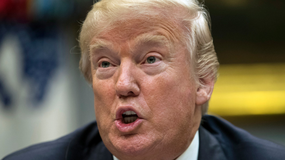
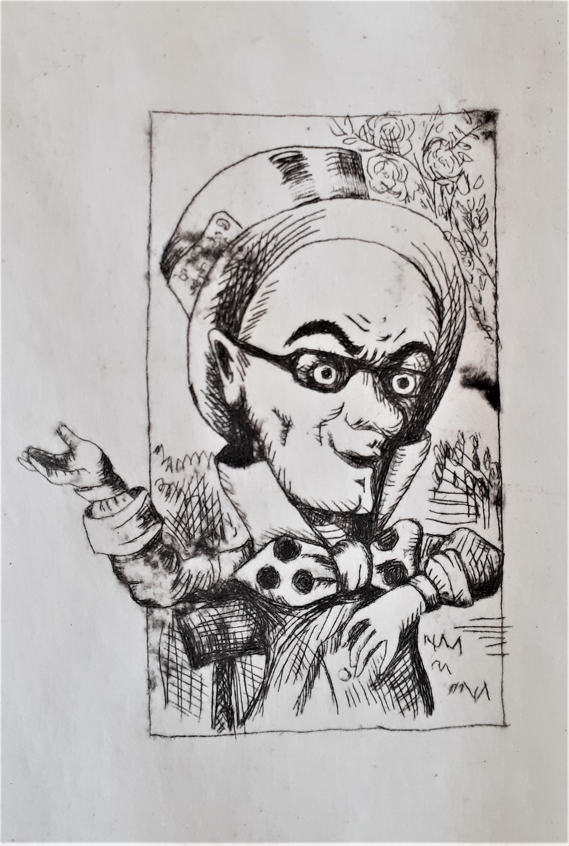
Fig. 21. Acetate intaglio print with water based ink 

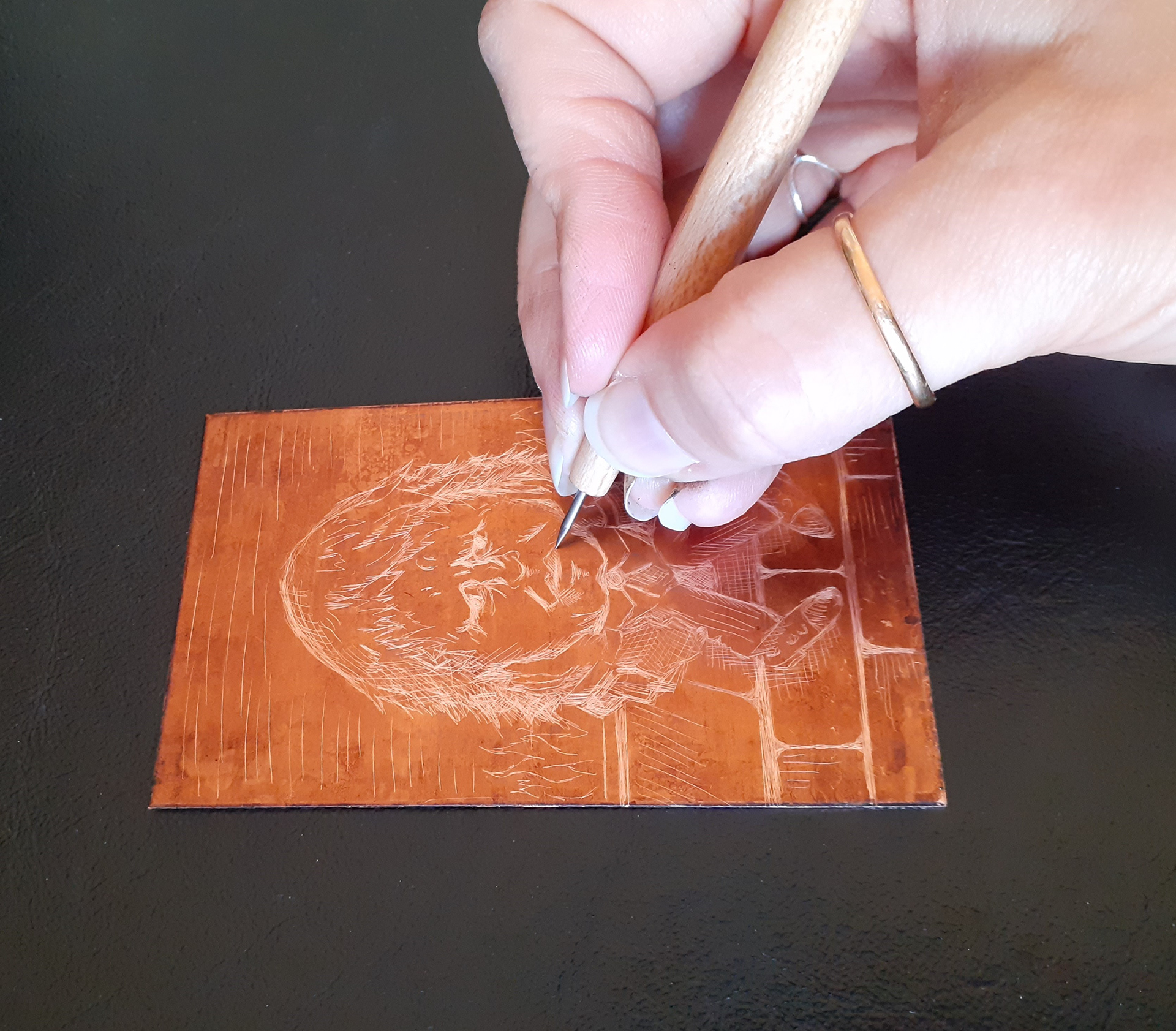
Fig. 22. Copper etching process

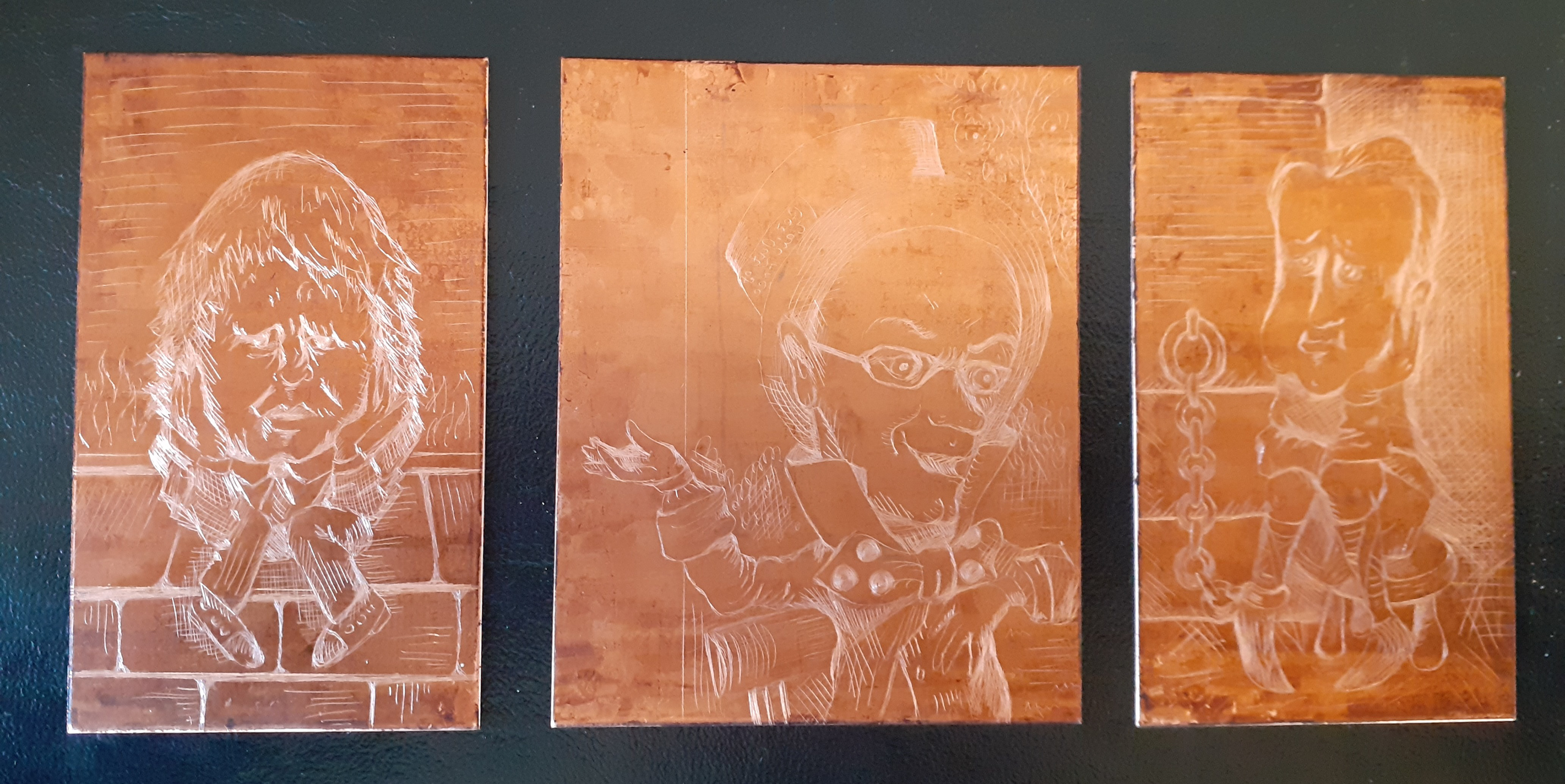
Fig. 23. Copper etched plates ready to print with (after acid bath)

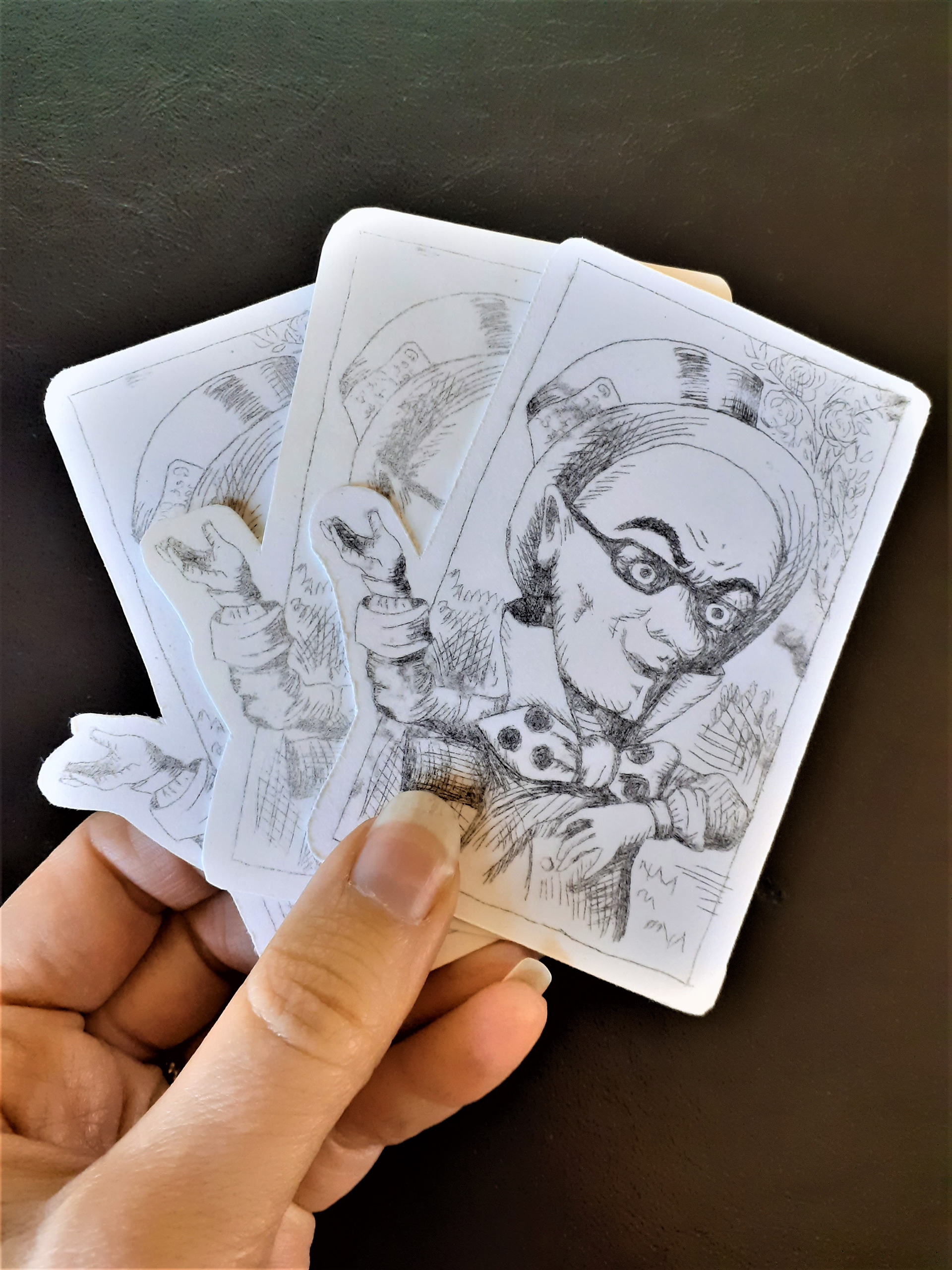
Fig 24. Water based acetate prints cut out by hand (scalpel below, combination in middle and scissors on top)

Below I have been trialing what my playing cards might look like on Photoshop. I wanted them to appear similar to traditional Victorian playing cards but I actually really like the Tarot palette I used on the last one (Fig.27). I did wonder if this would make it less obvious as a card though. I am starting to consider how I can use my images to create some sort of a game as an experience or installation as a depiction of our current political landscape.

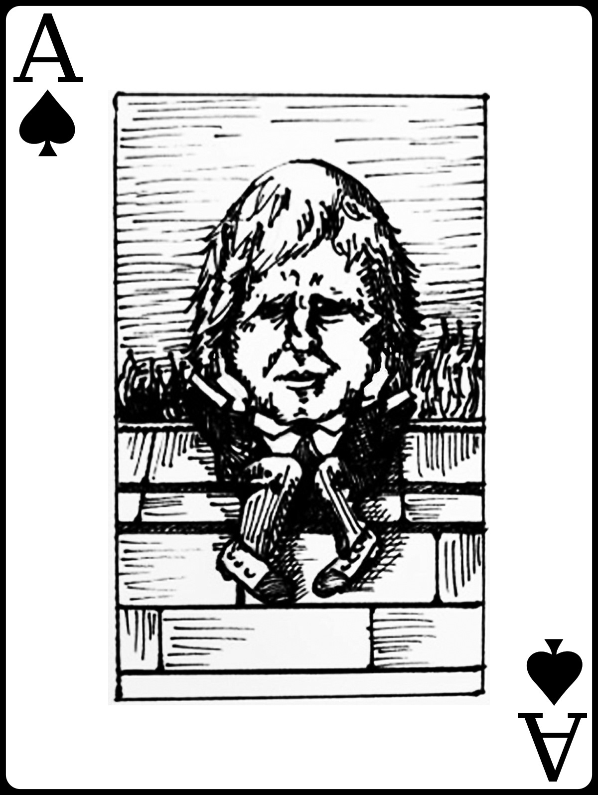
Fig. 24. Boris illustration with Photoshop text

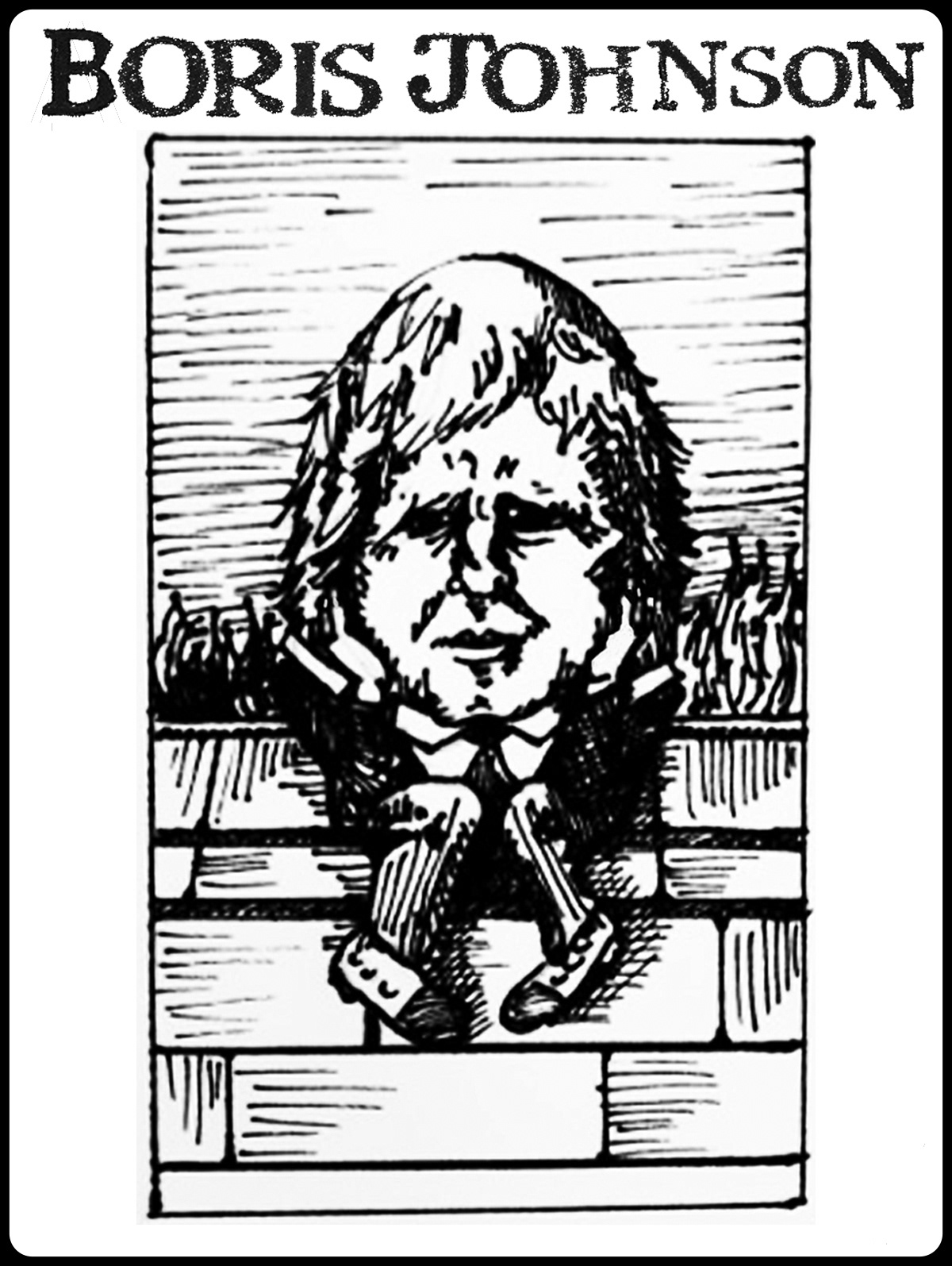
Fig 25. Boris illustration with Tarot typography on Photoshop

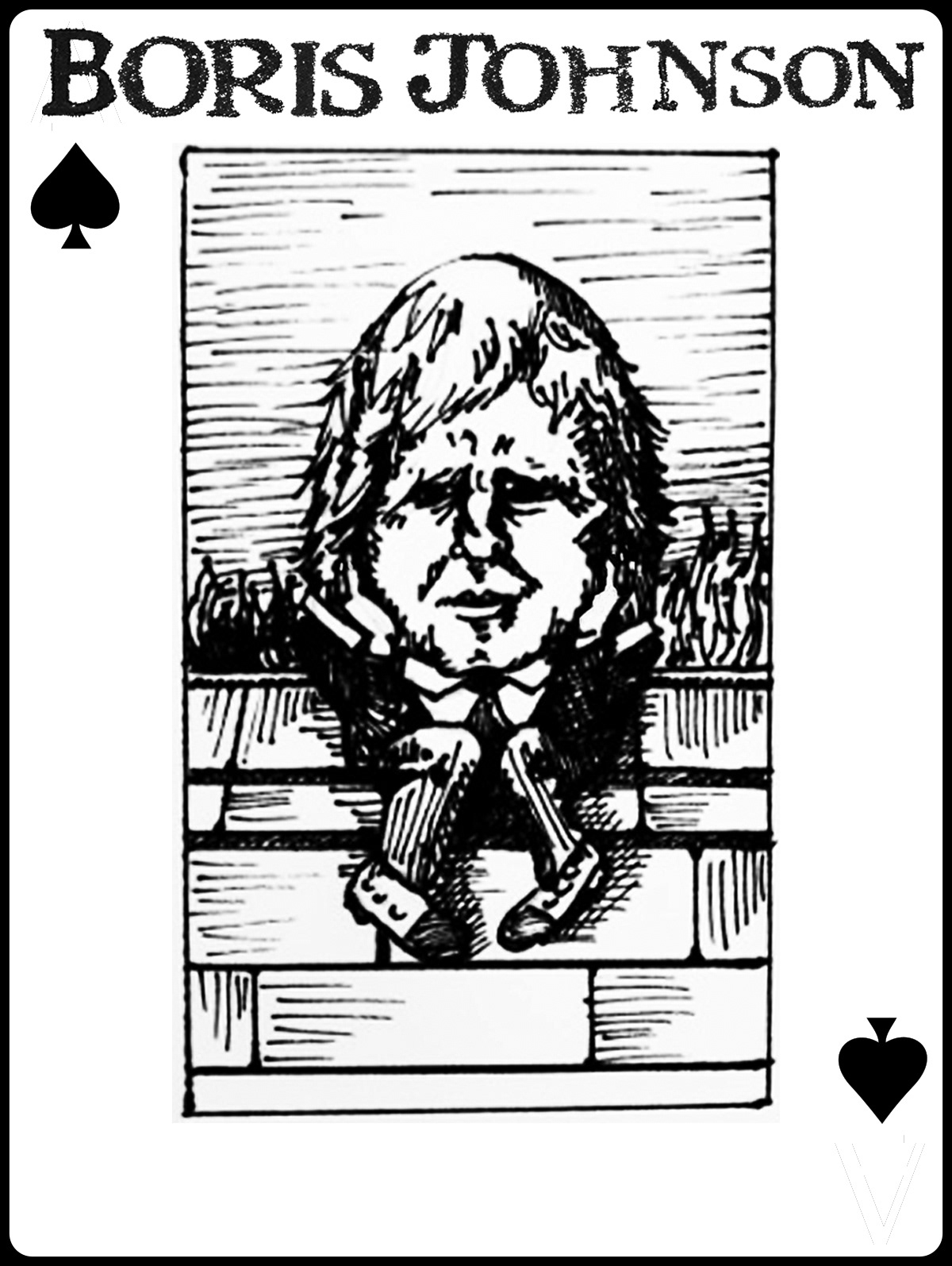
Fig 26. Boris illustration with Tarot typography and Photoshop symbols

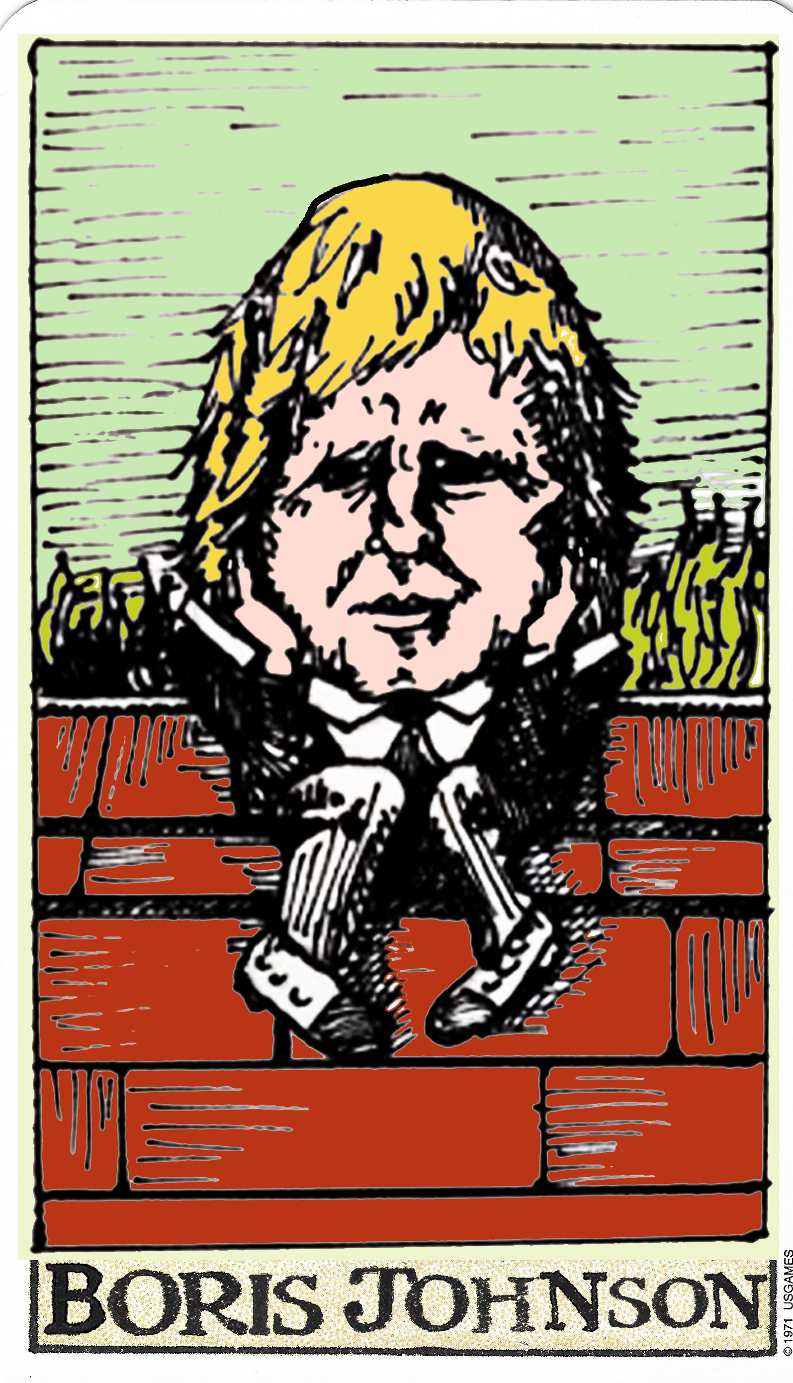
Fig. 27. Boris illustration with Tarot typography and photoshop artificial colour fill.

Fig. 28, below, shows my prints using original Victorian processes, such as Tenniel would have used (from my copper plates). The plates are created using etching followed by an acid bath to enhance the groves for the ink to sit in; intaglio prints. This method is a traditional method and as you can see from the images it gives a high quality line with a real vintage aesthetic, perfect for my theme of politics and perhaps looking to the past for answers, as many Tory policies do (Brexit, taking back Sovereignty).
Fig. 28. Oil based intaglio prints using copper etched plates. 
The draw back to this method is it would leave an indentation on the cards. I could easily cut the cards out using a laser cutter but I am considering developing my ideas beyond cards and possibly into something which might make the viewer interact a little more with the artwork. Also I do not want to intrude on the visual space on a card with numbers or labels, so perhaps there may be something else which would enable me to have drawings and symbols together with a playful nature
I like the idea of play counteracting the grime reality of politics and social structures. I listened to Jennifer Light's analysis of States of Play; a new book in Architecture podcast. The podcast explains that in the late 19th and early 20th centuries in the US, miniature towns and social structures were created for children in special summer camps. The children not only excelled when given the responsibilities of running their own Republics but also enjoyed it immensely and the Republics were successful in their own right. I love this idea that children can actually have a positive and proactive participation in how systems of governance could be run; with joy and imagination too. The podcast can be heard here:
 https://newbooksnetwork.com/jennifer-s-light-states-of-childhood-from-the-junior-republic-to-the-american-republic-1895-1945-mit-press-2020
I have also read recently the book The Lucifer Effect. As a stark contrast, this book explains the social dynamics that can occur to drive 'good' people or people with no history of abusive natures into 'evil' behaviours. The two materials together have got me thinking about social interactions and perhaps how these could be used as an art form. Could I create a game where players experience 'happiness' or 'sadness' through the imaginative use of 'being' someone else?

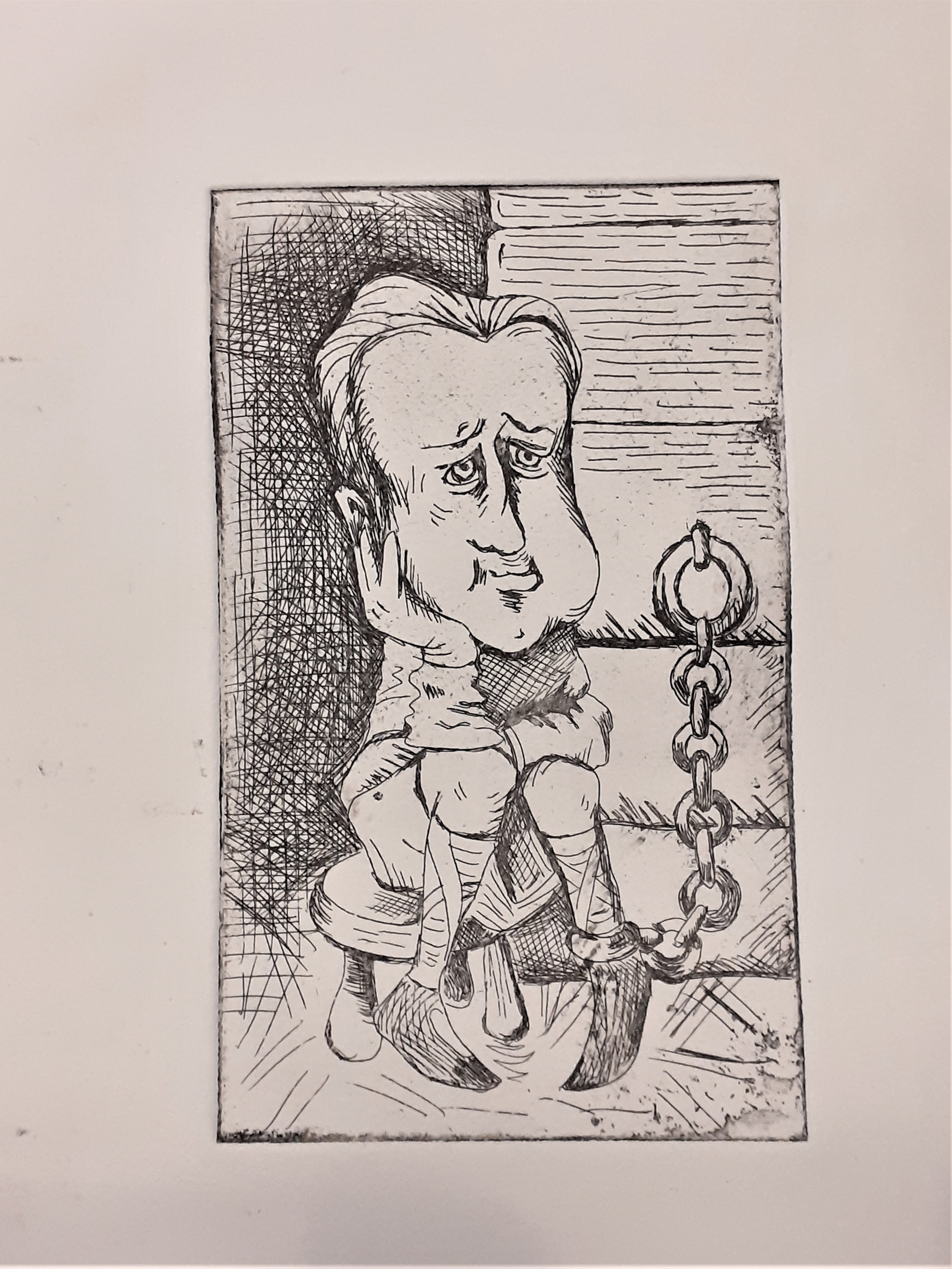
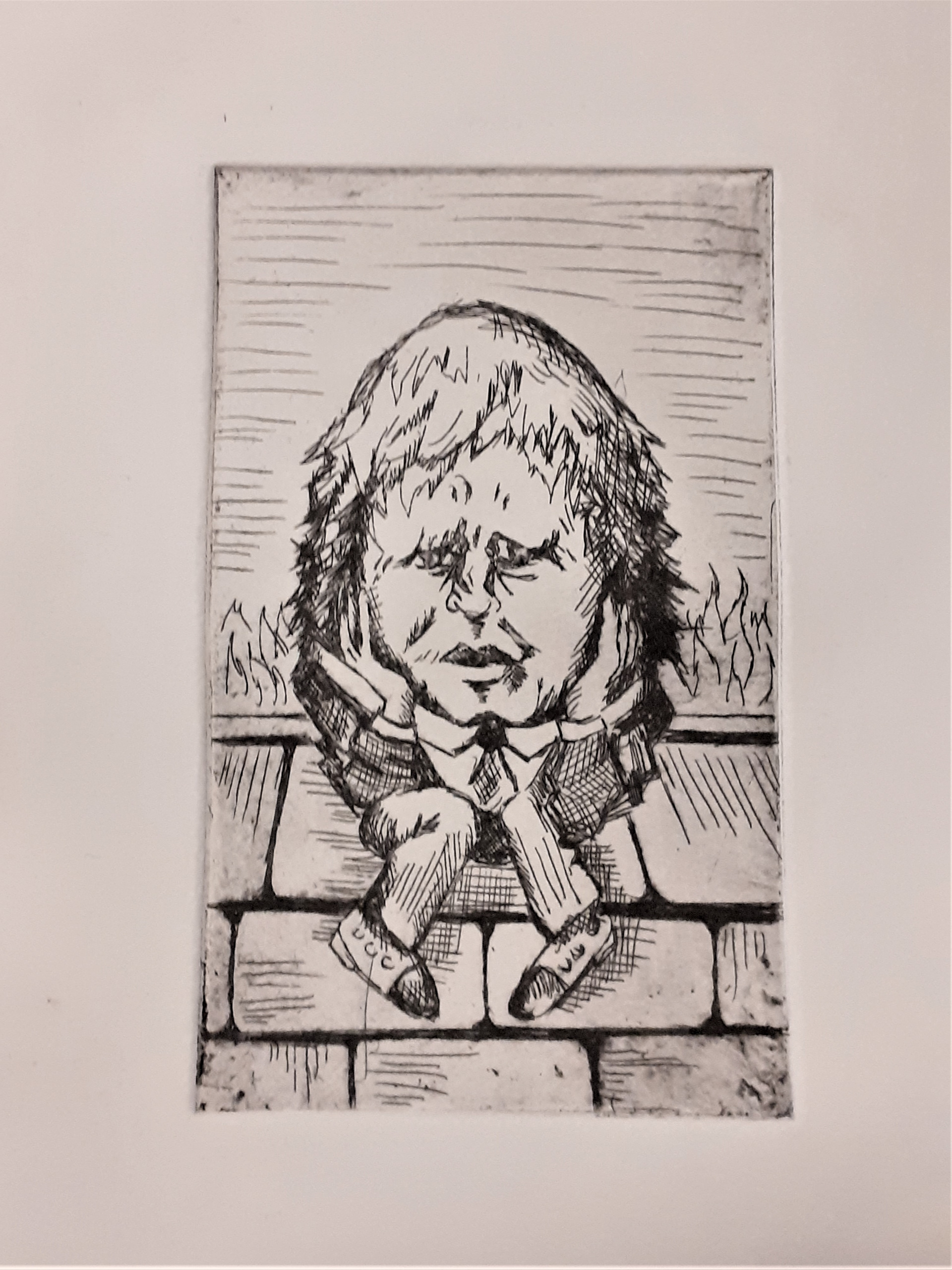
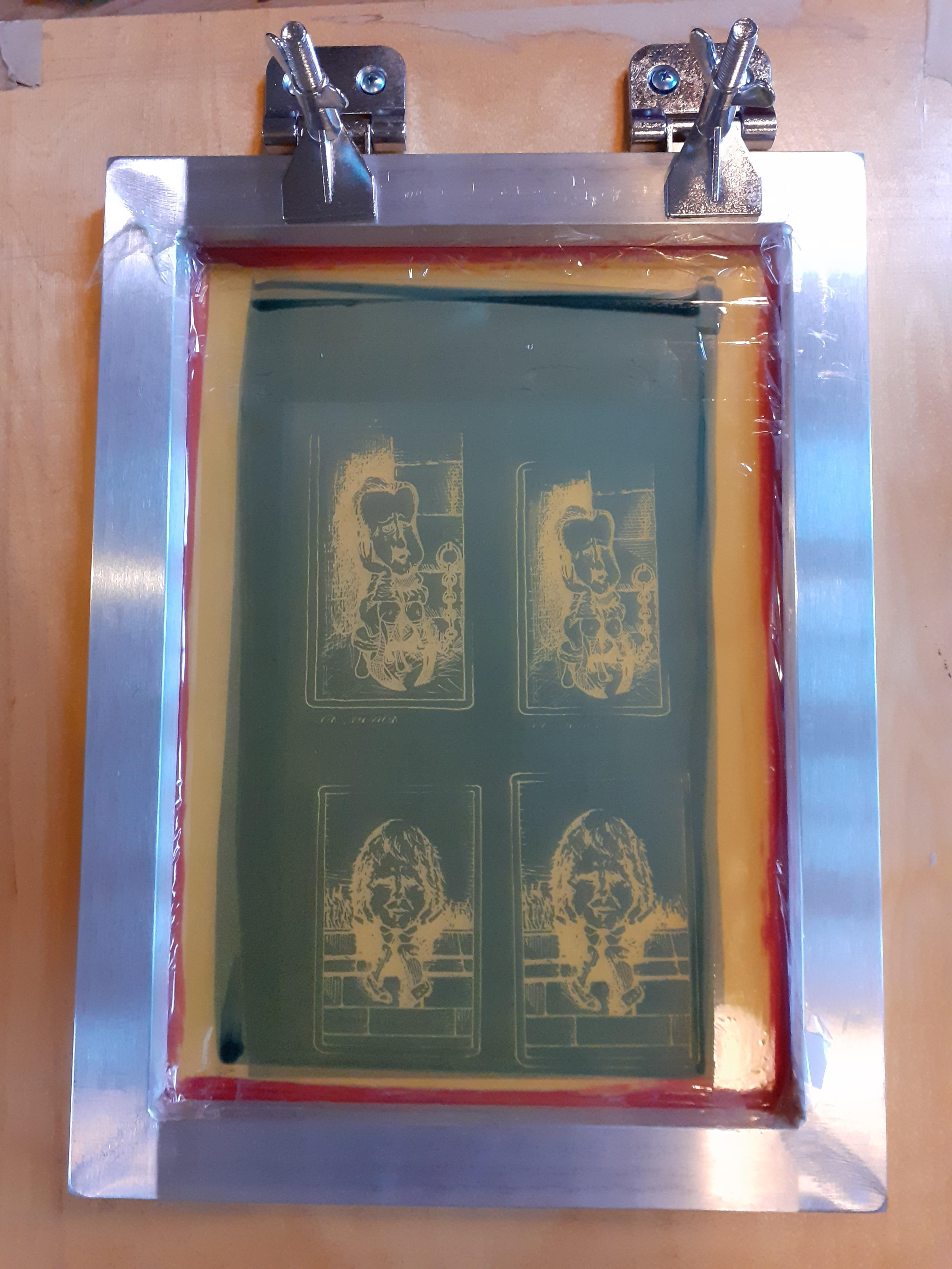
Fig. 29. Silk screen with emulsion exposure from card designs (2 designs, 2 sizes)

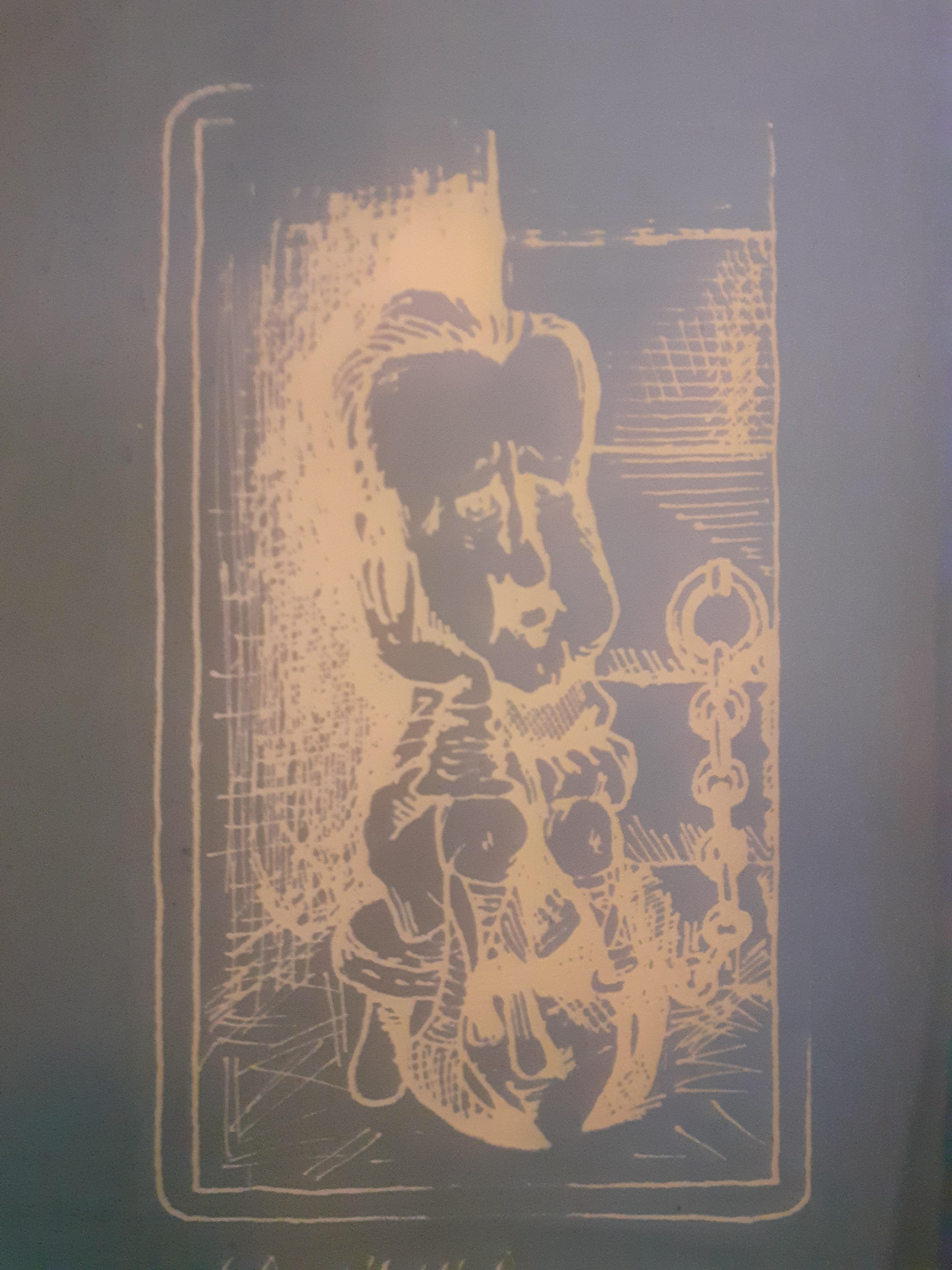
Fig. 30. Close up of exposure of silk screen, David Cameron card

As we entered Lockdown 3 (January 2021), I began to order equipment I foresaw being useful at home as access to University would be unavailable. I purchased a table top silkscreen printing kit as I knew whatever form my project was going to head towards, printing would probably be involved. I began to think about making cards for a board game and so used my existing designs to trial this method. Using the winter sun as my exposure lamp, I exposed some acetates of my Boris cards (Fig. 29). Unfortunately, the acetate slipped down the screen on my journey to the sunny spot in the garden (hence the low composition). I used this screen to trial printing on paper as well as ready made cards ordered online. When I trialled ready made playing cards with intaglio print using my copper plates, they were no good as the soaking stage made the cards curl. But the silkscreen printing worked really well and eliminated this problem, and it was good to know I could use cards already cut to size as aligning a laser cutter would have been tricky (Fig. 31).

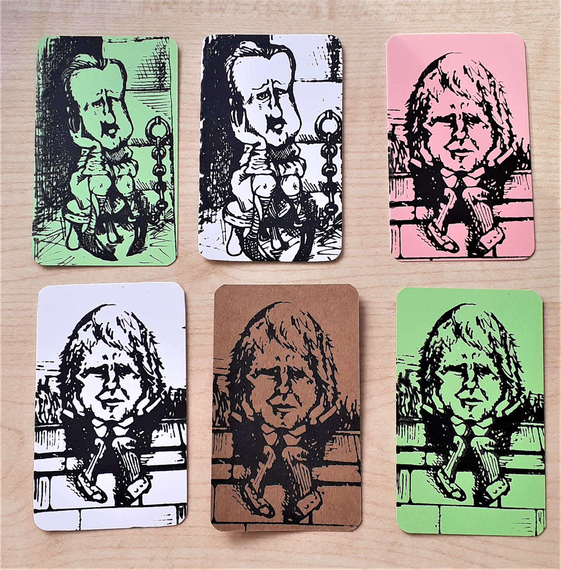
Fig. 31. Screen prints onto readymade playing cards

I am interested in creating a board game for a final outcome so I began to research how politics and ideology had been depicted through play. Board games have a history of being used to educate children in the late 19th century. I was fascinated to discover a game called 'Suffragetto'. The games was produced by supporters of the Suffragette movement and the aim of the game was to spread the support and awareness of the Suffragettes by getting people to actually play as a suffragette. The aim of the game was to reach the House of Commons to protest and get through the police, staying out of hospital. It was played in a similar manner to a draughts game. I really liked the idea of using games as a means to educate but also to have fun when thinking about different politics or ideologies. I began to think about The Game of Life as a game I could somehow critique and build ideas from. In the Game of Life (2016 edition), you travel around the board deciding whether to go to University, get married, have children and where to 'invest' before you retire. There are rarely any obstacles to these paths and also winning is determined by the accumulation of money and assets by the end. Achievements such as winning baking competitions (arrived at via picking up 'life cards') are also given a 'value' in terms of money. I think the game is a good analogy of Conservative Britain. We are constantly reminded of 'the economy' and political decision being about 'fiscal responsibility'. I also worry that children growing up in a post covid world, especially those without a middle class upbringing, will have little choice in their lives. Playing board games is quite a white, middle class hobby,  which is the narrative this game plays into, so by playing with more obstacles built right from the start, it might make the game seem more realistically like a diverse, real 2020 experience of life. Game of Life seems to assume that buying a house, going to University and having children are still options open to everyone. I want to construct a game which has obstacles to these presumptions about the ease with which this can happen in 2020. I think it would also be interesting to track the different blockades different age groups face in 2020 too. For example, older year groups could have more health threats (from covid), middle age groups could have challenges of divorce or infertility because of later progressions in their 20s towards homeownership and fiscal independence from their parents. I now want to research the Game of Life and history of board games to inform my final design of how it will play and look.

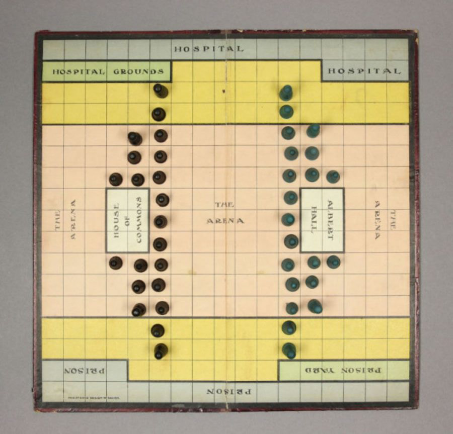
The game of 'Suffragetto'

Playing the original Game of Life, 'The Checkered Life'

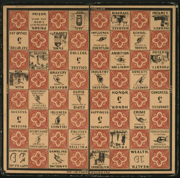
The original 'Checkered Life' board, including suicide square.

After some research I discovered that The Game of Life was originally published in 1866 by a Milton Bradley and was called Checkered Life. It took a very different form to the game I am familiar with but struck a real cord during the then, American Civil War. I was able to download and play with the original rules and it played in a very interesting way to the game I know of today. Firstly, the game is set out like a chess board. Moves are determined by a teetotum (a spinner placed over a pencil or pen, as dice were associated with gambling and so were frowned upon). The player has a choice of moves; either they can move diagonally, or straight, either 1 or 2 spaces depending on the roll. They must make their way to 'Happy Old Age' when they have successfully raised over 50 points. I really like the way points were not necessarily representative of money, and also that as you played, getting to happy old age was very unpredictable and non linear. There were times during play when if you wanted to pick the closest route, you maybe had to land on 'gambling' or 'ruin'. Also you could be very close to the finish and then be sent far away again, a bit like snakes and ladders. I liked the way life was depicted as unpredictable and not realistically without vice along the way, even if you intend to be virtuous. I also really liked the illustrations; the board has great pointing hands (very Pythonesque). It is also interesting that the suicide square was edited out after a few years. Many of these boards were produced in a travel size for Civil war soldiers so it is thought perhaps this detail was a little too grim for public appetite during a very difficult time. The square was not replaced, just a ghostly image was left, maybe making this square open to interpretation by the player.
Having done further reading on games, I have discovered many games go on to be reinterpreted or get changed and edited by players unintentionally over time. For example, chess originated in India and had Elephant playing pieces as well as 4 armies at war. As it travelled around the world via trade routes, Persian influence adapted it to 2 armies battling and then Christian Europe added the Queen and Bishop, replacing some of the other military based pieces. Monopoly also began life as a game called the Land Lord's Game, designed by Elizabeth Magie in the US in 1902 as a way to show to people the damage of monopolisation of land ownership. It soon became a hit but for all the wrong reasons; copies were made, adapted and shared amongst students at universities who enjoyed swindling money out of each other. It was officially published in its known form in 1933 by a Charles Darrow, who unashamedly stole the final version off a friend who had entertained him with it at his home at a dinner party.

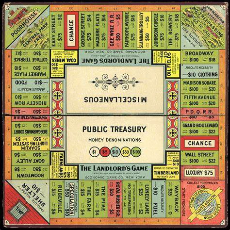
Original 'Land Lord's game' by Elizabeth Magie, 1902.

In 'It's all a game' by Tristan Donovan, I discovered that a modernized, conceptual version of Game of Life already existed. Chris Pender, is an American folk artist who developed a version called The Real Game of Life in  1998 which he originally sold at a Saturday craft market in Oregon. It became a cult hit and he has sold a steady stream of copies since at the market as well as over the internet via word of mouth. I contacted him to order a copy and he informed me people regularly have ideas for versions as it is ripe for parody. In Pender's version, players have several brushes with death, including at the start (avoiding abortion). The game has become quite a successful tool for drug and alcohol rehabilitation and education as it demonstrates that individuals have power over their own fate through choice (players have choices to do with drugs, sex and responsibilities). We have agreed to share copies as Pender was very interested to see a version made by a contemporary British woman as he developed his in a post Vietnam US in the 70s and 80s. Where other 'official' updates to The Game of Life in recent years have not been commercially successful, it is really nice to hear of an individual making a success of an interpretation of their own and again demonstrates that much like Art, games can evolve, change and be interpreted in different times by different cultures and social groups.

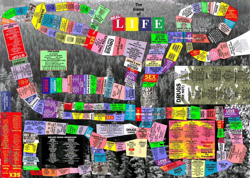
The Real Game of life by Chris Pender, 1998.

I love the chaotic nature of the board as I think this is like a realistic interpretation of 'Life' versus the meandering, suburban 'drive' of the original. I cannot wait to play it! 
Meanwhile, back in the studio, I began to sketch out a version of my game. I played the game several times to make adjustments to the mechanisms of play (Fig. 32); for example, how to demonstrate the difficulty of the housing crisis. How to show that poverty and privilege can impact outcomes of individuals. I also thought carefully about the playing pieces. I didn't want to use a car with pegs as this assumes most people have access to a car, which they might not. I thought about using a sofa with pegs but couldn't find playing pieces that were compatible. I really wanted to use model people from model villages as I think they are very 'British' and quite old fashioned, linking to my contextual themes. Model making is associated with the older, white, male population and there is a degree of control at work I imagine when collectors make their enormous miniature worlds. I thought this makes an interesting reflection of the ruling class in the UK in government and how we are their little model people; they make the rules and set the tone of play. I still need to resolve how to place families together as I am using blue tack as an emergency measure for now.

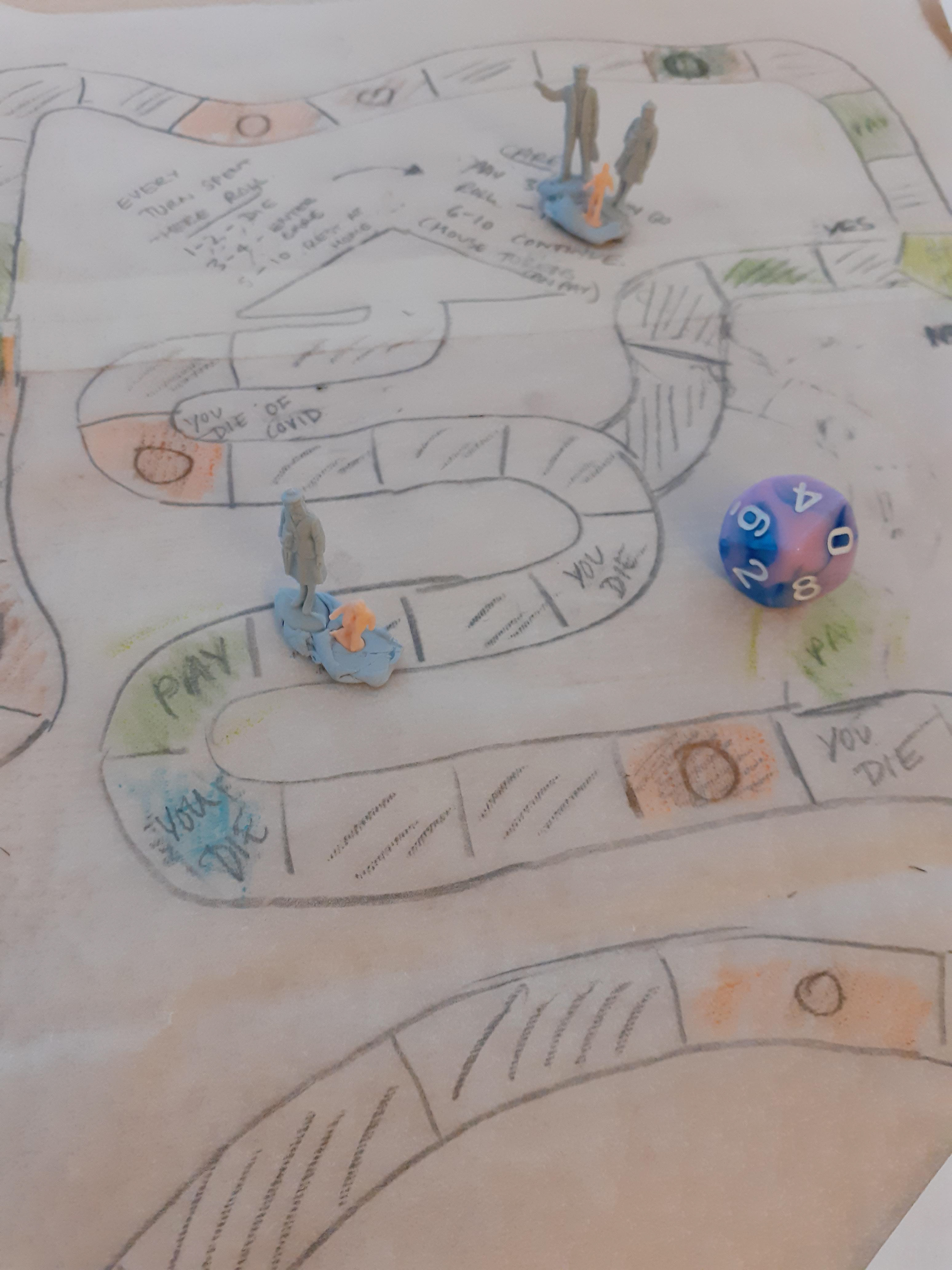
Fig 32. Mock up of potential game mechanics. (This image has many 'You die' spaces as it is at the very end of the game)

Initially, I tried to create my game design on Photoshop (Fig. 33 and 34) but I soon realised it would be very time consuming and also I did not have the control I would have with Illustrator. After having a meeting on zoom and tutorial with Matt Parr, an architecture friend, I made the leap to Illustrator (Fig. 39).

Fig. 33. Video of some original trialling of my board on Photoshop

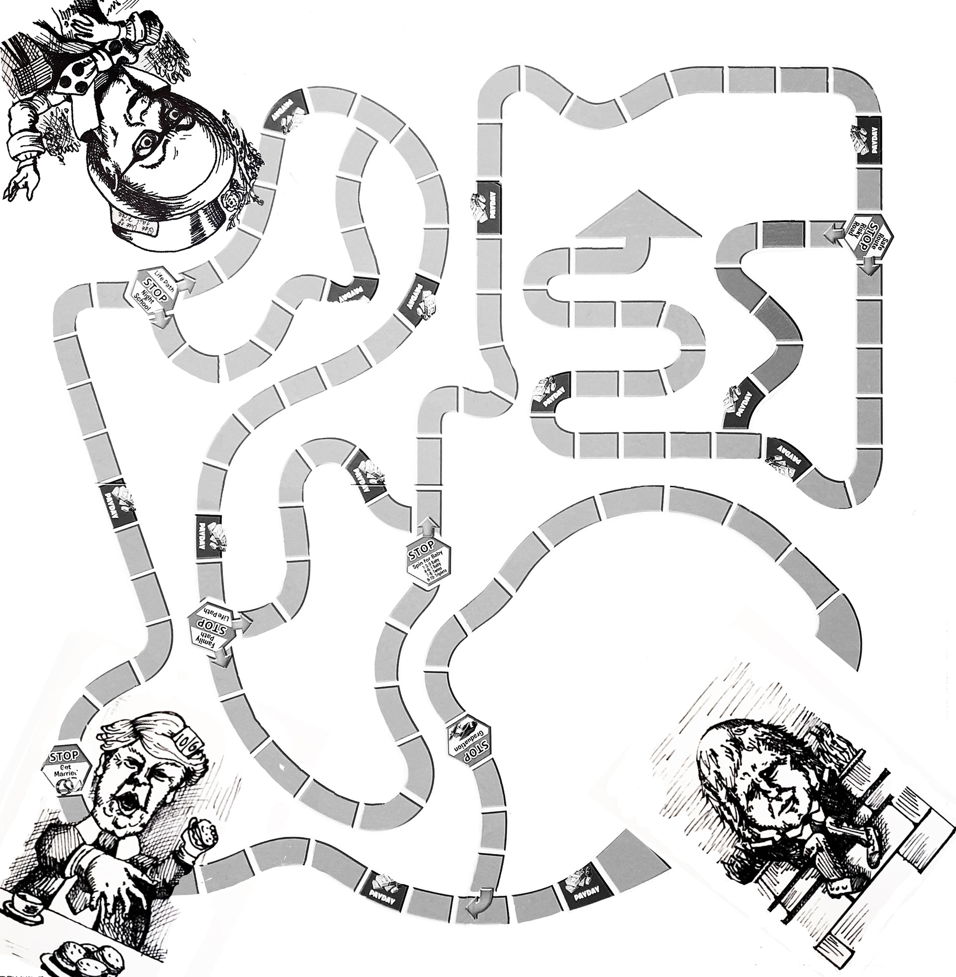
Fig. 34. Early stage of piecing the board together using a scan of the original Game of Life track as a compositional resource.

Vintage Board Games by Adrian Seville

Fig. 35. My Pinterest board of Victorian illustration and drawing techniques for iconology.

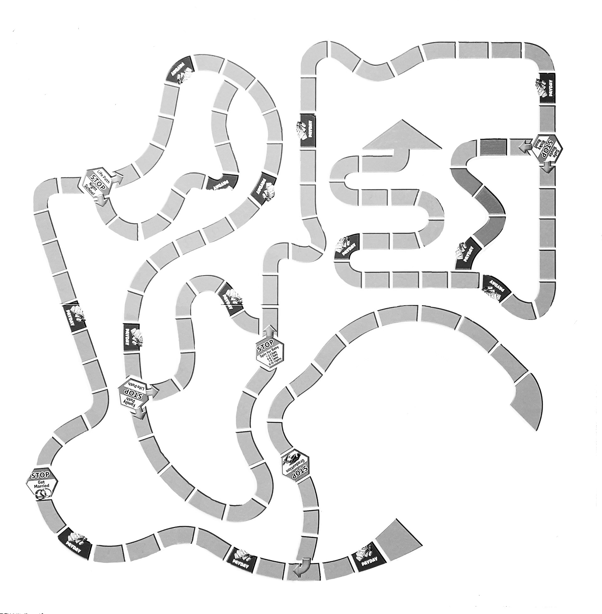
Fig. 36. Original pathway mechanism from Game of Life on Photoshop

Fig. 37. My hand drawn ink pen design for the game icon for Relationships

Fig. 38. My hand drawn ink study for the board design

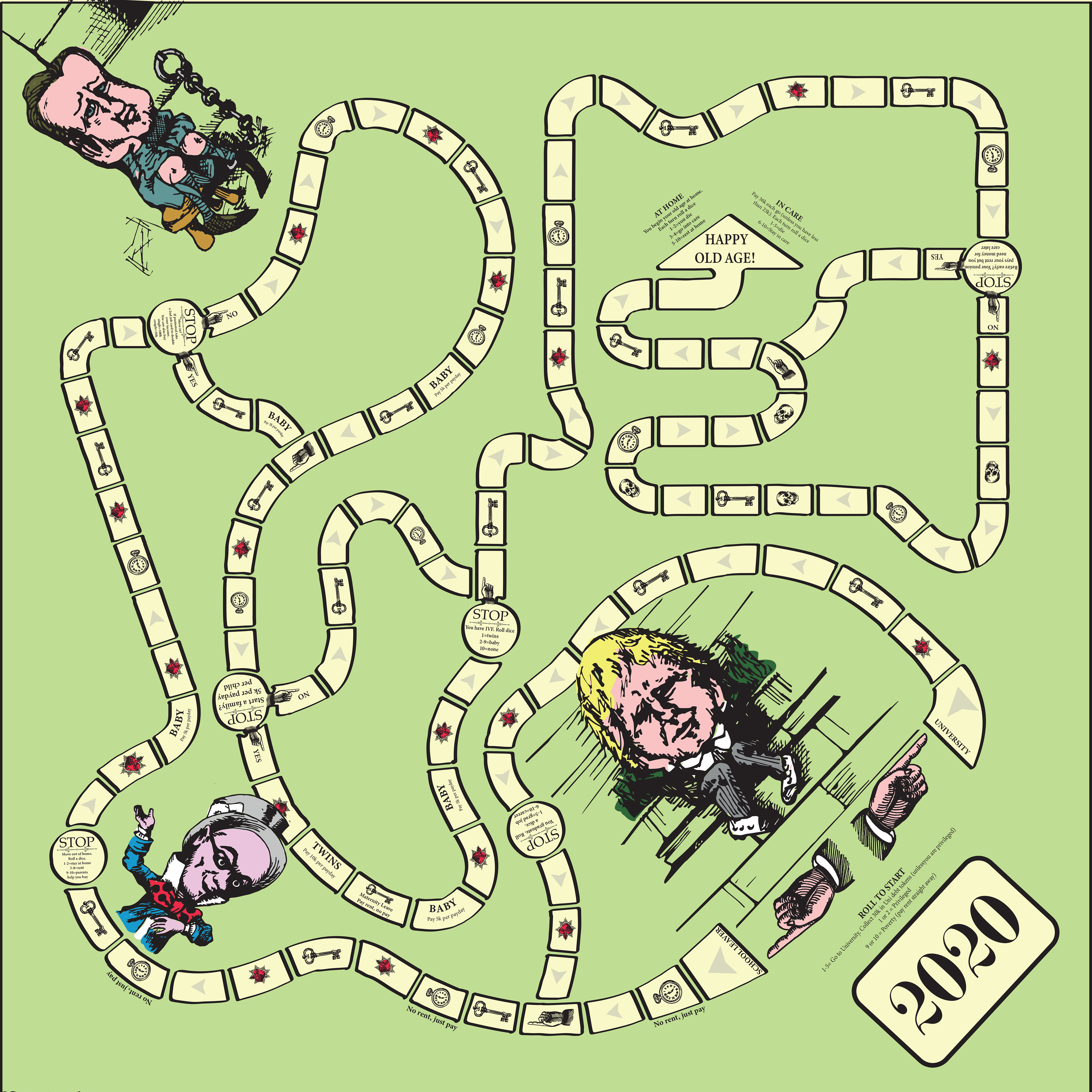
Fig. 39. My design drawn up on Illustrator; beginning to add game mechanisms and symbols as well as consider composition.

'Eurogames'

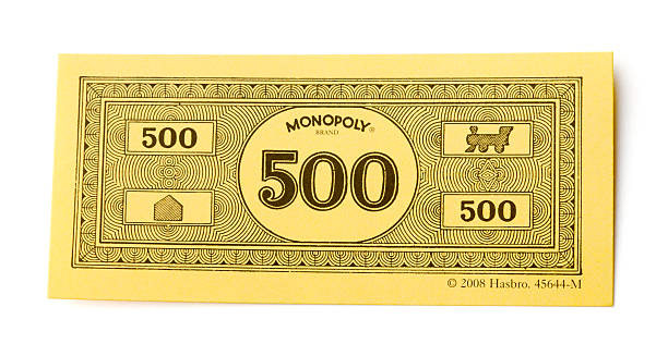
Monopoly money design with train logo.

Fig. 40. My money design using illustrator. The money will have different colours for different values, much like Monopoly.

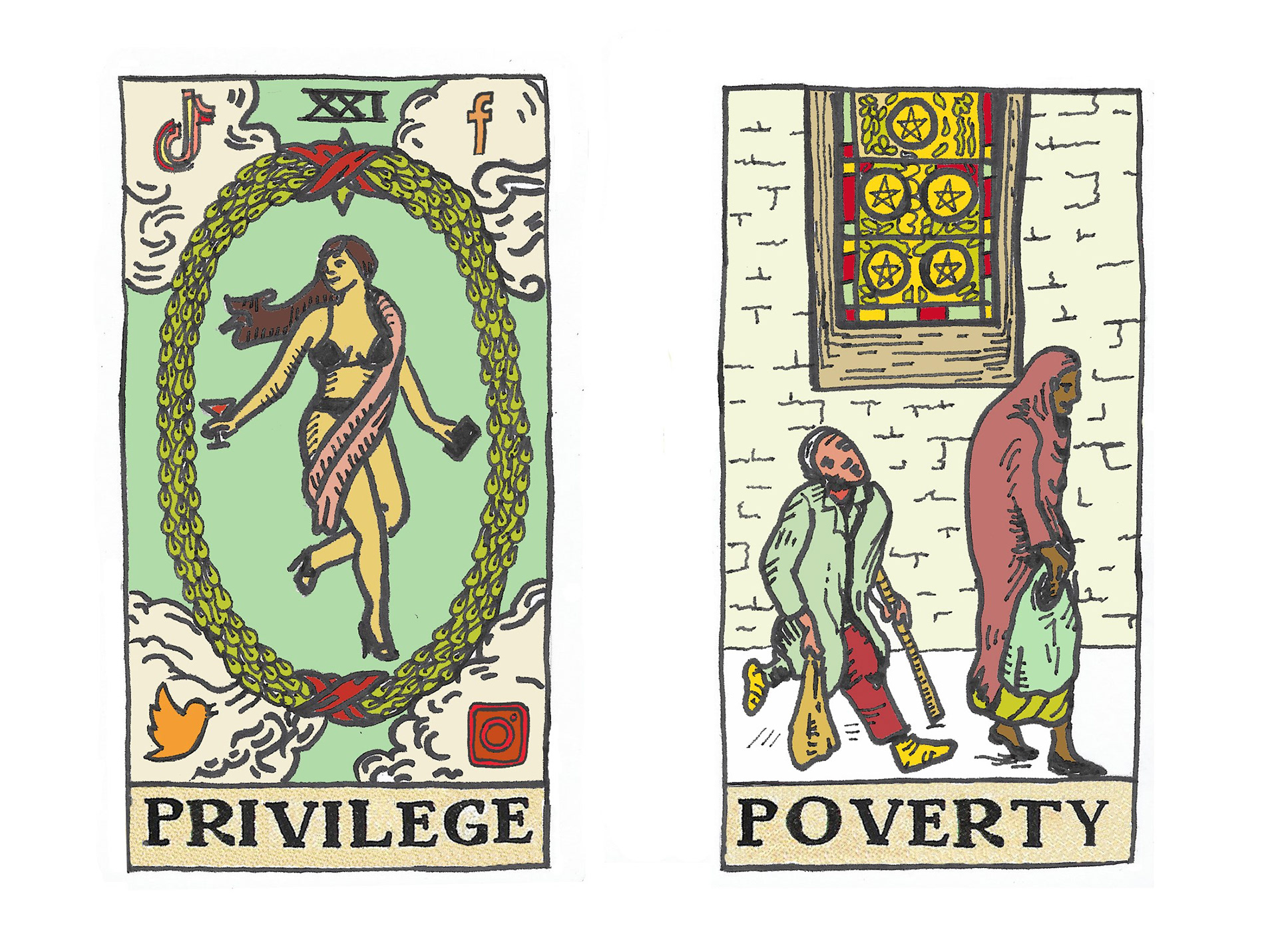
Fig. 41. My designs for the 'Privilege and 'Poverty' cards for my game (using scanned hand drawn images manipulated on photoshop)

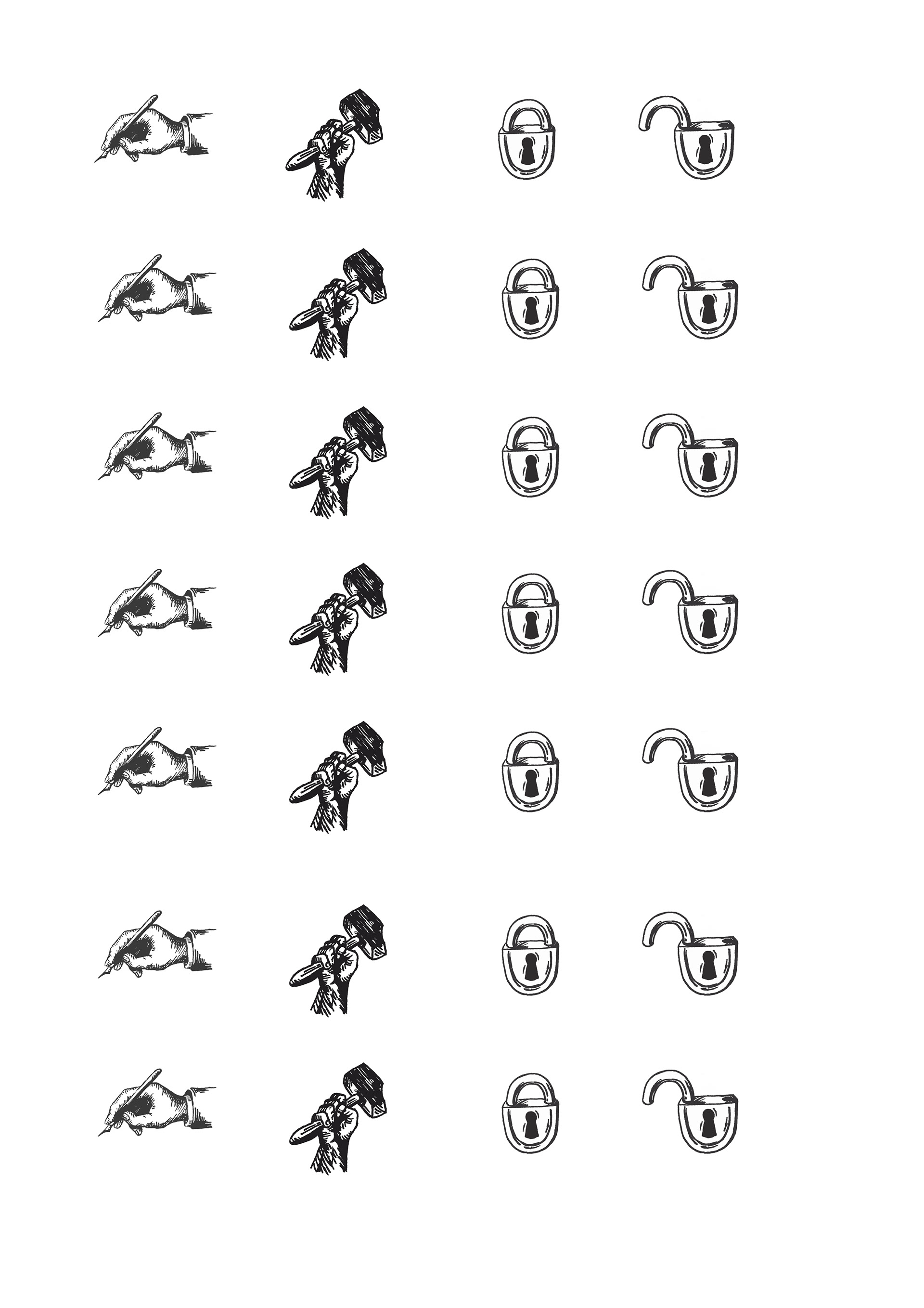
Fig 42. Hand drawn pen and ink logos for my cards (scaled, refined and repeated digitally on photoshop)

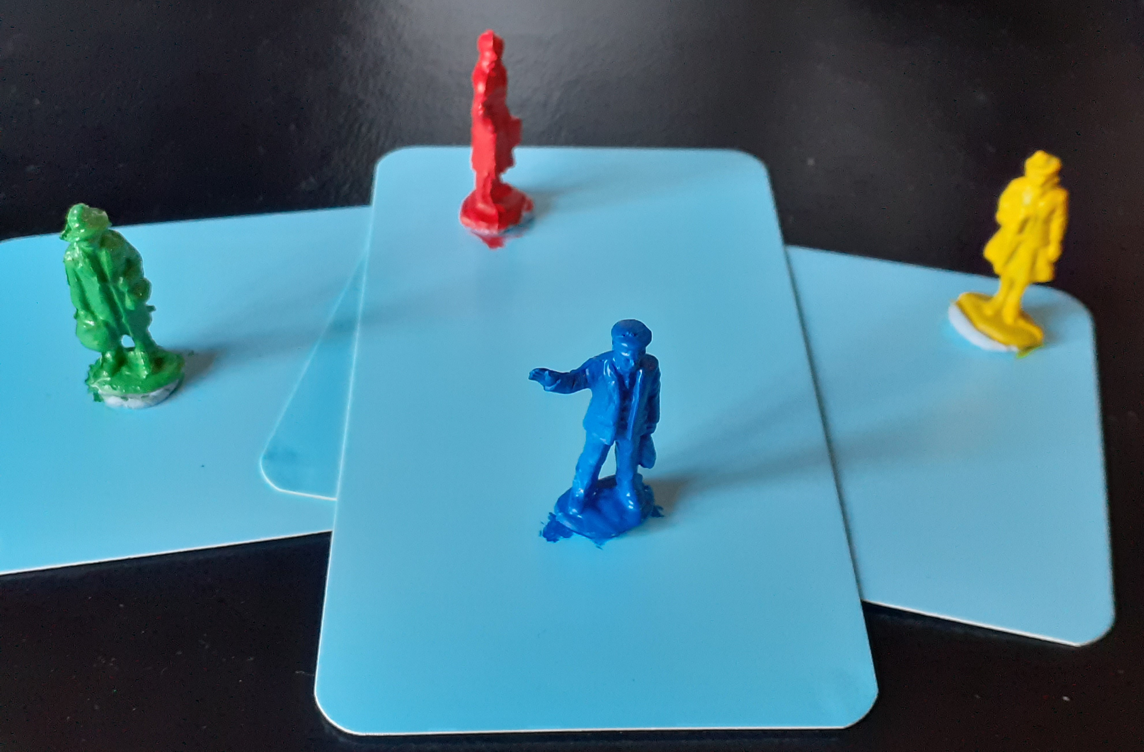
Fig. 43. Final game playing pieces (hand painted model pieces)

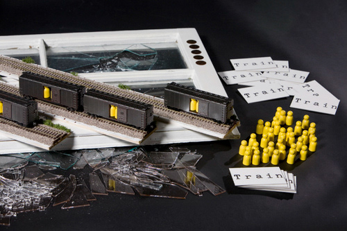
Fig. 44. 'Train' by Brenda Romero

The image above is called 'Train' and is by a game designer (and unintentional concept artist) called Brenda Romero. She developed the game after an experience she had playing with her daughter. I was fascinated by this research.
 Brenda's daughter had returned from school one day talking about how she had learnt about the 'Middle passage'. The Middle passage is the name given to the historical round up of slaves from Africa onto British ships, which then headed to America to trade them. Romero felt her daughter hadn't truly understood what her school had been educating her about as she relaid the information as though the 'nice Black people' went on a cruise to America, so Romero, who works as a game developer, grabbed a handful of playing pieces and asked her daughter to paint them into families (with matching colours). She then developed a basic game, and told her daughter that some of the people would go (not all) and that they would need to get across the ocean using a certain number of rolls of the dice to get there safely. Romero's daughter soon realised that the people on the ship were not going to make it as she was rolling very low. So Romero said, perhaps some could go in the water so the ship can make it. Her daughter and Romero were both so moved when they both fully appreciated that this actually happened; with people, not counters. People were separated from families, they were forced onto ships taking dangerous journeys, thrown overboard if provisions ran out and then they were traded for money. Romero realised a game could teach more to a child, or indeed an adult, than perhaps an abstract history lesson ever could. She then developed Train. Train is all about the Holocaust, however, players are not told that. They become aware as they play. I love the concept of this game as it works on so many levels. Players are put in the position of SS officers at a train station loading people onto trains; they have to make a choice. They can play and feel terrible (or oblivious), they can sabotage, or they can walk away; its only a game. It perhaps gives a small glance into the reality of the experience of these officers in Nazi Germany. Romero also built devices into the game to make it evoke feelings. The pieces do not go onto the train easily; they have to be forced. The rules are collected from an SS typewriter; a faceless device in the room. The yellow represents the Jewish star of Nazi Germany but it is not obvious at the start. I love the idea of a game being not necessarily 'fun'. I also really like the idea that players may see different interpretations of the board and pieces and that the 'rules' can be interpreted differently too, or not at all. It makes me want to develop areas of freedom and interpretation for my players, as well as physical experiences with the board and pieces that might evoke feelings and thoughts in the individual players. 

Fig. 45. Lockdown cards with hand printed logo

Fig. 46. Career cards with hand finished logo and colour fill

The playing cards for the game presented me with a challenge and in some ways has been the hardest step in terms of process. I already had learnt that intaglio would be no good for my cards because of indentation and also curling issues. Luckily, I then was able to access a die cutter despite lockdown. This also had a drawing feature which I thought might solve my problems as it could draw from an image on screen. I was able to design the cut shape exactly as I wanted on Illustrator, instead of using ready made cards, but the drawing caused problems. The problem was the die cutter was very difficult to align, so drawing and then cutting with it was very difficult to get exactly right. In the end, the process was done largely by my computer printer for my graphics, and then trial and error with the print outs die cut out of card. Most would cut in the right place but many were discarded as they were not aligned. The logos on the back were also very tricky. It was virtually impossible to align 3 variables (first side printed, second side printed and then the cutting out). For this reason, I decided to develop a handstamp. I looked into ordering rubber ones but they were very expensive. I then remembered a technique Ranald Sheriffs, a tutor I had years ago, had shown me. It basically turns any photocopy into a print be using the chemical ACTISOL. The chemical is designed to clean photocopy ink off machines so it dissolves dry ink back to wet again. I even had to refine this process too though. Too little spray and the ink was too thin, too much and the card would discolour. Also, you have to rub to transfer and I learnt that too much pressure would warp the flatness of the card. I am really pleased with my cards. I decided to hand cut my Tarot cards with a scalpel though as the drawing and framing of the cut were too unforgiving (the pictures were very large compared to the text on these ones). I only needed 2 also, and it was quite easy to cut 2 cards precisely, whereas these cards I needed about 50. 

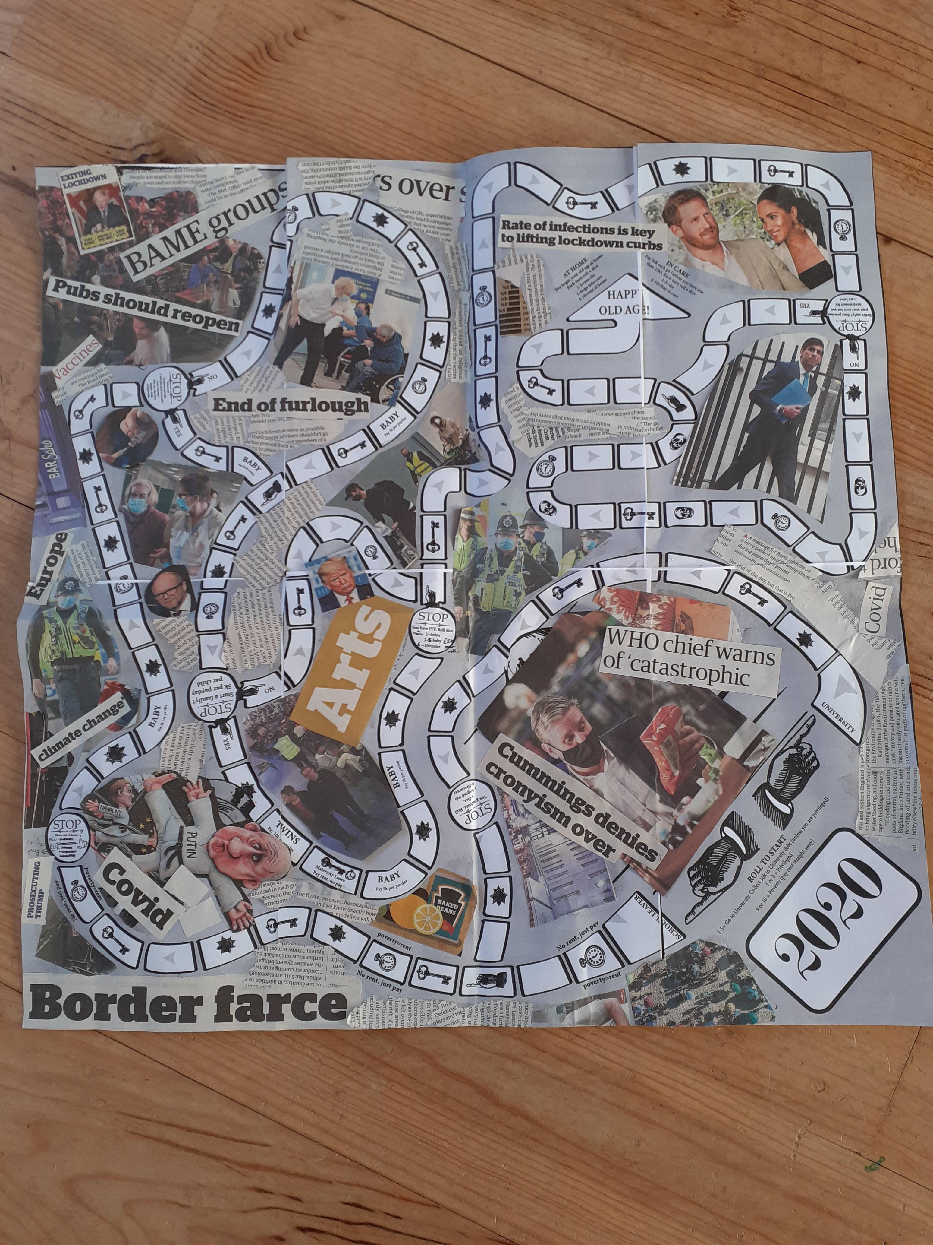
Fig. 47. Illustrator printout of board design with collage from that day's newspaper.

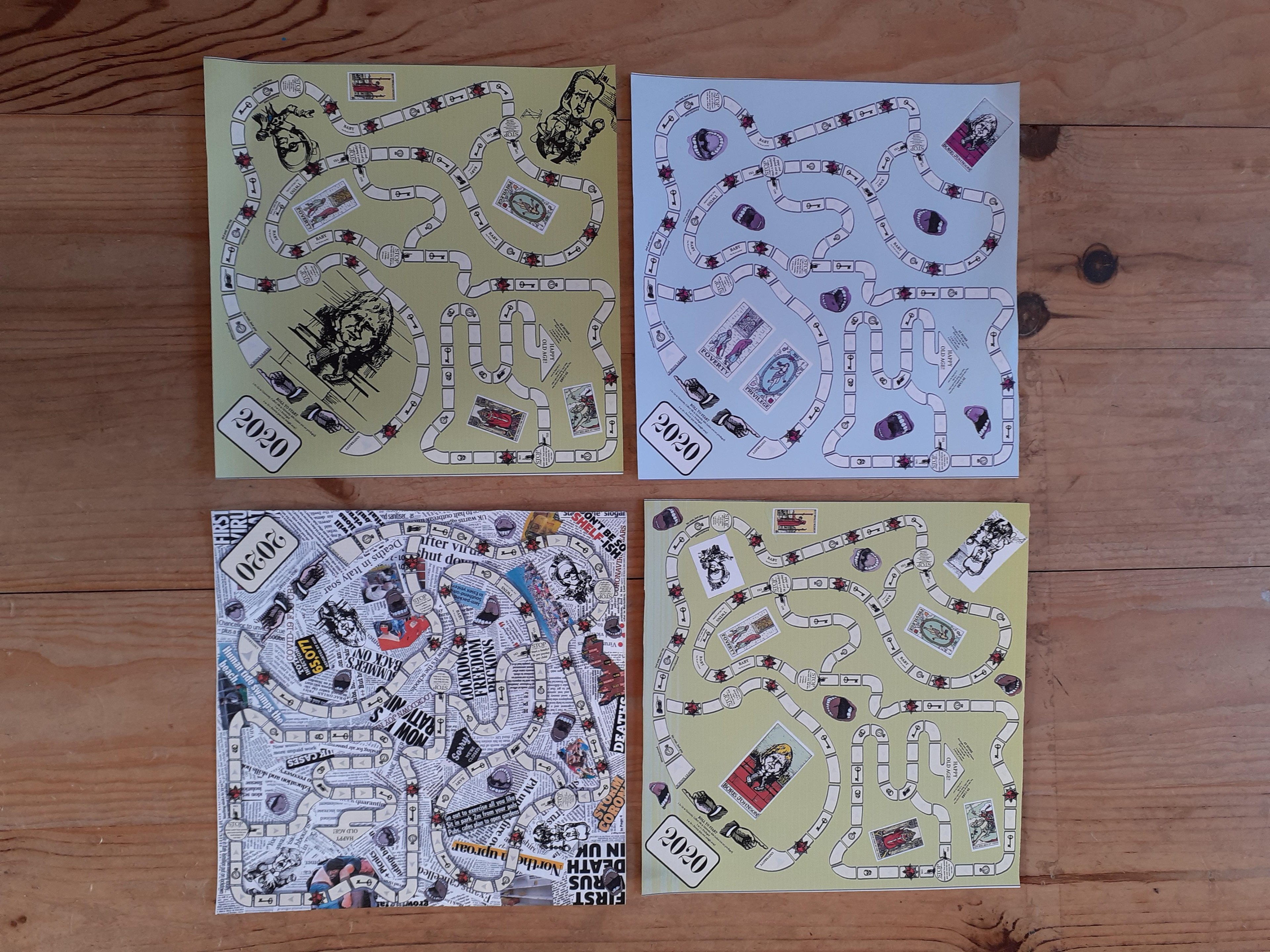
Fig. 48. Alternatives for board design

I began to wonder if there was a way to make my board more Dada. Dadaism felt a little at odds with my work as a game requires such logic and working mechanisms and the Dada movement was about precisely the opposite. Other than the historical referencing through the style of my work, I felt I could incorporate Dadaism more through visual chaos or surrealism. I could not seem to decide on a design on my computer, as I wanted the design to echo the sentiments of the game and 2020 too . In Fig. 47, I experimented with creating random newspaper collage from a daily newspaper directly onto a printout of the board, thinking about Hoch's original methods. Although I did not like the aesthetic of it, I really liked the idea of the players being surrounded by media noise on their journey around the board, as this felt very much of our time. I recreated the effect on Illustrator using online resources of newspaper headlines from the last year. It felt a bit too monotone, so I added my mouths and hid my politician caricatures within the clippings, symbolising their actions behind the curtains of democracy. I really liked this design above something visually more empty or plain (Fig. 48). It also helped camouflage some of the game instructions too which tied in with the idea of confusing players or players discovering things (or not) as the game progressed. 

Fig. 49. Game pieces with takeout boxes

Romero had really inspired me to begin to 'deconstruct' my precious game mechanisms too that I had obsessively spent days tweaking as well as thinking of ways of creating 'an experience'. I began to look at moving away from being concerned about whether the game worked as a 'board game' into thinking how I could get players to feel or experience something about authoritarianism. I also wanted the game to be confusing, frustrating, annoying, like living through covid has been.  So, I took positive 2020 cards out of the pile and replaced them with Tory soundbites, covid slogans and blank cards, I also stripped back the written rules to the very bare bones. The blank cards I put in to symbolise the lack of direction we had from the government at times; the 2020 cards seemed like a good place to play around with government messaging. I was also interested to see how players would interpret them as inevitably play would not happen completely how I could presume it would. Instead of storing my counters in plain boxes, I also had the idea of storing them on the board, in the way, and in take away boxes. This would allude to the constant presence of brands surviving covid due to their financially robust systems and also that everyone, rich or poor, had been eating takeaways. I am hoping to see how people will bring their own interpretations and experiences to the board and that this will be wide ranging and intriguing. My next stage is to test the game with real players!

Fig. 50. Video of rules

I asked 5 people I knew to play my game; I found this stage very difficult and was surprised by my own apprehension. It felt very exposing; opening myself up to criticism but it was definitely one of the most worthwhile parts of my project. Games, after all, are usually played with others and it was time to unleash mine into the world! The first test player was my husband. This was the easiest of the trial plays and he helped me develop some of the rules into something that would work and play out quite well. After playing with him, I realised that it played out quite successfully, but nothing interesting really happened. All players get to the end relatively easily, even those in poverty. For this reason, I made the game much more severe in terms of inequality; rents went higher, pay for precariat players dropped or was more insecure. I also began to make the game slightly confusing too, by stripping back instructions to basics; I hoped this would make playing more interesting and unpredictable.​​​​​​​
I then tested the game on another couple. I provided the second players with the board, pieces and the basic rules as well as the brief, which was to make notes on how they felt during play: thoughts, feelings and discussions on the game play. Players 2 and 3's main response was that they did not enjoy playing it and said they had approached it as an' ordinary' game. Because of this, I think their experience was one of disappointment. They wanted more clear, restrictive rules and this surprised me, as I already felt there were perhaps too many rules and restrictions. There was a long list of suggestions for further rules and questions they wanted clarifying as their main response. For example, when they picked up the 'clap for carers' card, they said nothing happened. As players they wanted these cards to have a directive. As they played on, they began to add some of their own rules, which were generally to do with economic outcomes. On reflection, after reading my blog after play, player 2 said that she realised their confused experience was intentional, and therefore it had been an interesting experience. She said they had approached it logically as they had focused in on scrutinizing the mechanics of the game and exposing the gaps in instruction. I think the frustration they experienced was, for myself as an artist, quite interesting, as I had intended some level of confusion and lack of clarity, but perhaps had pushed that element too far. Players 2 and 3 exposed an interesting element that I feel has been topical with governance during 2020 as people had craved clarity from leadership. Player 2 also noted that there was no mention of mental well being of players. Again, a very interesting thought as governance and policy often struggles with this area. How do you measure mental health and how can you help people to prioritise it above economic factors in a capitalist culture? Other thoughts noted were 'why would anyone have children in this game?' and 'what you have achieved should make a difference'. As a player myself, I felt the hearts were the only 'human' factor in the game; representing relationships. Players 2 and 3 had been confused by the hearts, so again, this may be why the game felt not enjoyable as they experienced it solely through economic measures. The feedback from their trial was very useful to me, I learnt to try to make the game perhaps slightly less confusing, but I did not want to lose this element entirely, as it was an important part of the experience. I was also quite pleased that being reduced to 'economic' players had made the volunteers feel disconnected as this for me is a large part of our government's approach to matters and an important discussion point for life in 2020, as we are all told to 'get back to work' and 'get the economy moving again'. ​​​​​​​

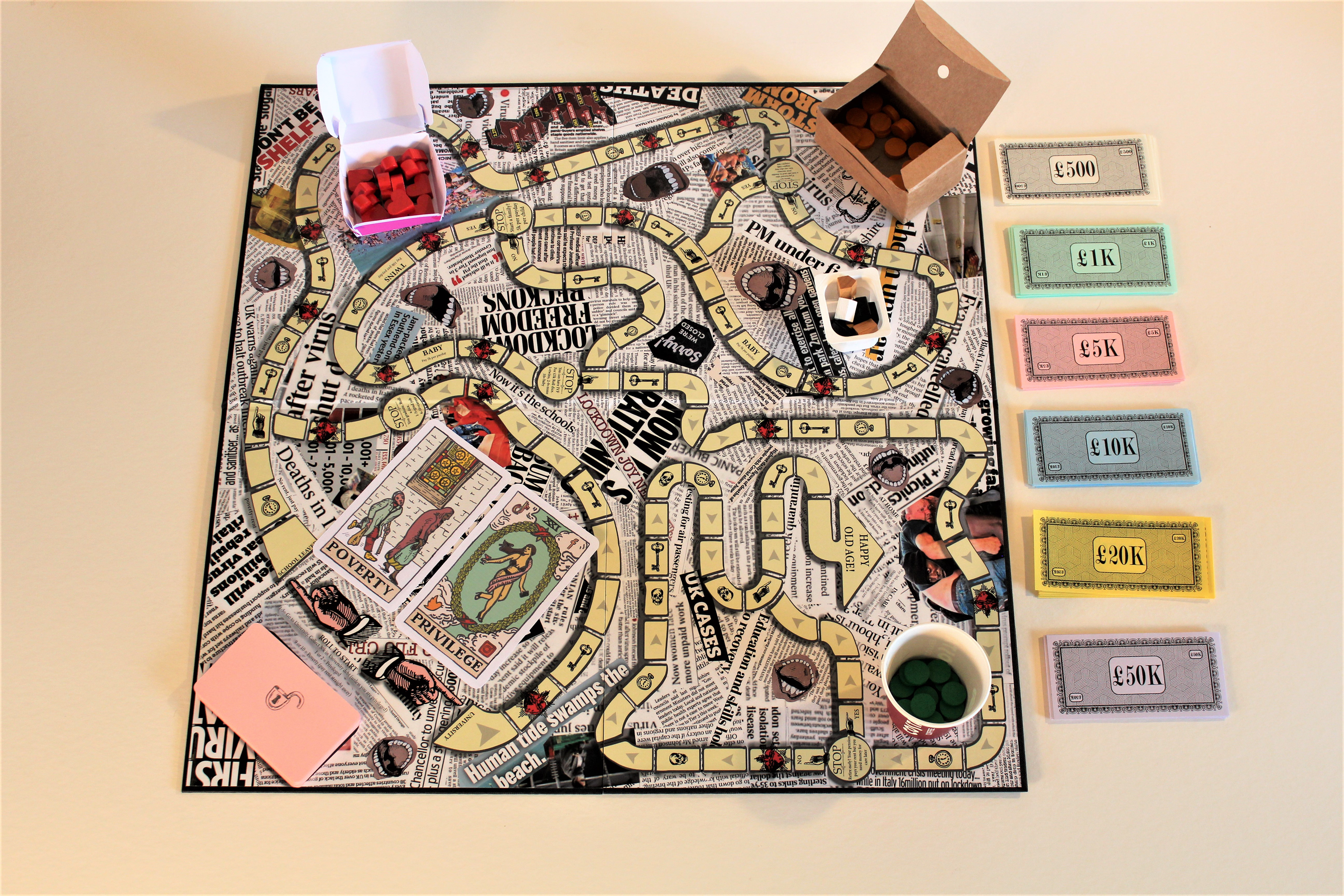
Fig. 51 Final 2020 game, professionally printed in the US on a folding board

​​​​​​​For players 4 and 5, I made a few changes. I read the rules out on a video with clearer instructions of what things were and where they were on the board. I really liked the video, as it almost seemed like a party political broadcast, so I may play around with that further. I also told the players there was no right or wrong way to play as I think players 2 and 3 thought there was a definite 'right' way to play. Players 4 and 5 enjoyed the game and noted it was very much like an experience of 2020 (a bit confusing.... took a while getting used to rules). They experienced a lot in terms of inequality as one player was privileged and one was in poverty. The player in poverty felt 'very much up against it', whereas the privileged player glided through life with ease. The player in poverty felt relieved to get into a relationship, and chose a man with the most wealth as she wanted to have a family. An interesting, and depressing conversation happened about how many women have to do this in order to have the life they wish for. Gender pay gaps (which are built into the game) exaggerate this problem for women. Players 4 and 5 wanted to play true to themselves so the player in poverty went down the family route despite being poor. She felt relieved to not get twins, but very sad when she failed to attain a baby at all. This, for her, was the 'most invested' part of her play of the game. The political cards made the players 'roll their eyes' and laugh, which I was glad about as some of the humour managed to come across. The player in poverty ended up dying single and alone and 'she felt sorry for her little player', so clearly empathised with her worker piece. 'Brilliant game for conversations about the past year'. They also ordered a Mcdonald's, which gave me mixed feelings as I had inadvertently advertised products, which my players then bought, making my game an unintentional pawn in the capitalist game!

Fig. 52 Final Video

I have been considering how to make my work more outward facing, for example, in a gallery, and I think the board game idea would be very difficult to share in a meaningful way. Viewers or players can only partake 3 or 4 at a time, and play takes an hour at least. This is a very slow way to disseminate my ideas and outcomes as an artist. My experience with players has also shown me that there is a huge disparity as to how people would experience my game too, so I am now thinking about ways I can create a similar feeling but within an art space with numerous spectators/viewers.
Originally, I thought about presenting the game mid-play in a gallery, however, there is so much in the playing that it would then become a sculpture and as a sculpture, it does not really work. I looked back through my trials and revisited my Boris cards. I felt these were a very strong image that perhaps I could use. As I mentioned earlier, although the Tarot are also strong images, they are not my images, and as a female artist, I feel by using them I am exploiting Coleman Smith further, as Ryder Waite did. I respect the genius behind her beautiful designs; but they are not my designs to reproduce. Could there be a way to create something with a game like quality that reflects on the woeful political status quo using my Boris cards?

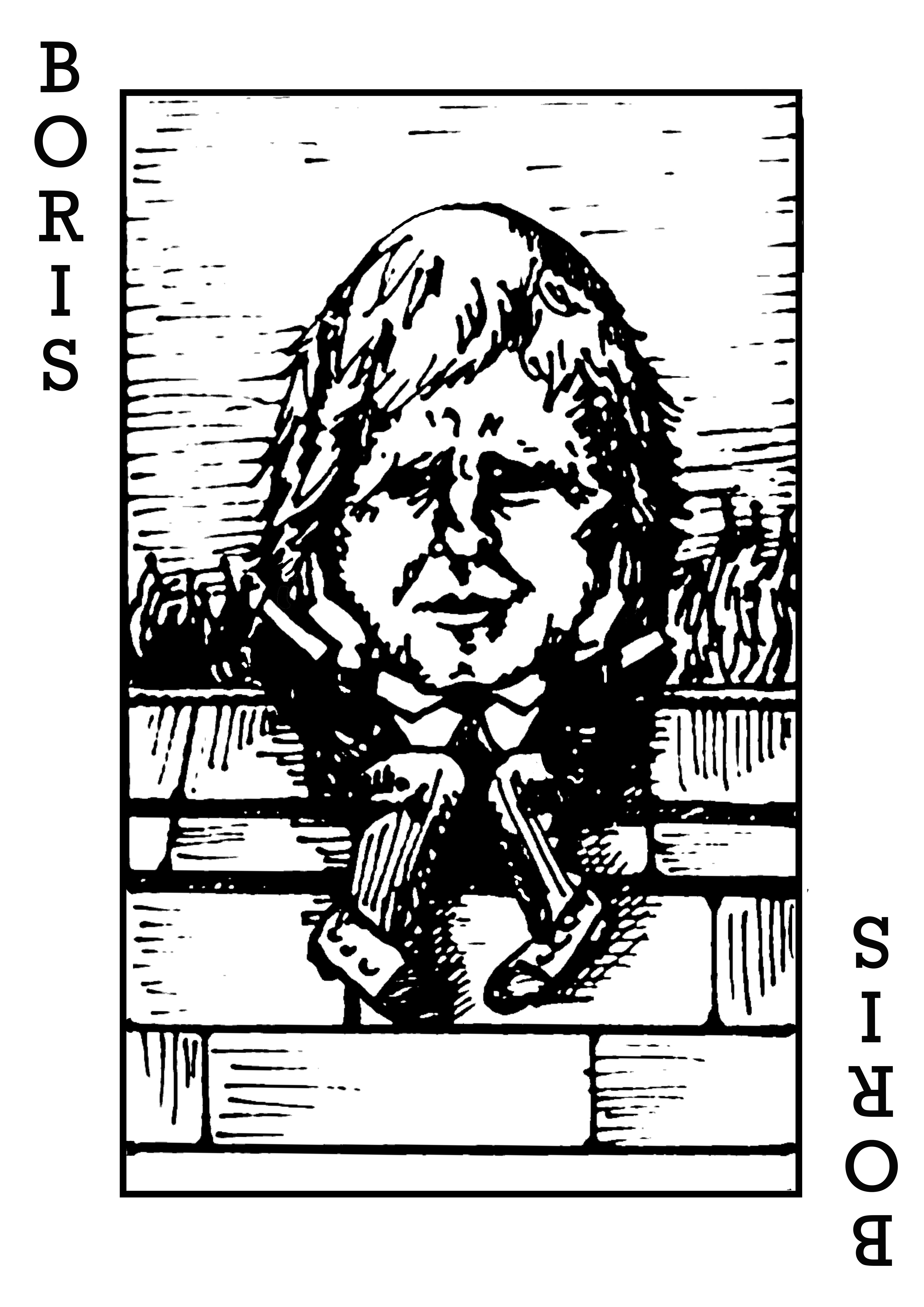
Fig 53. Photoshop jpeg with text

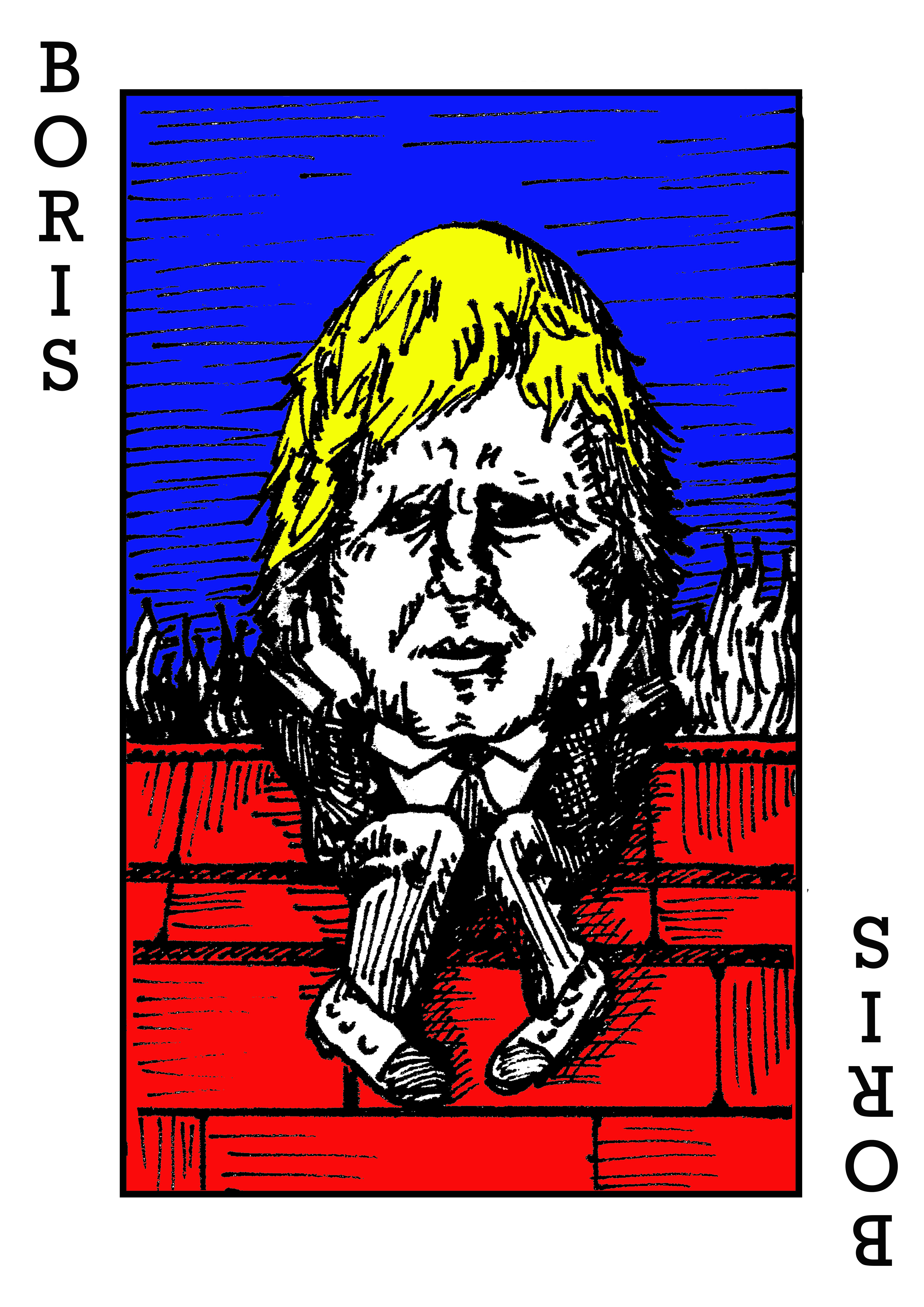
Fig 54. Photoshop with colour swatches

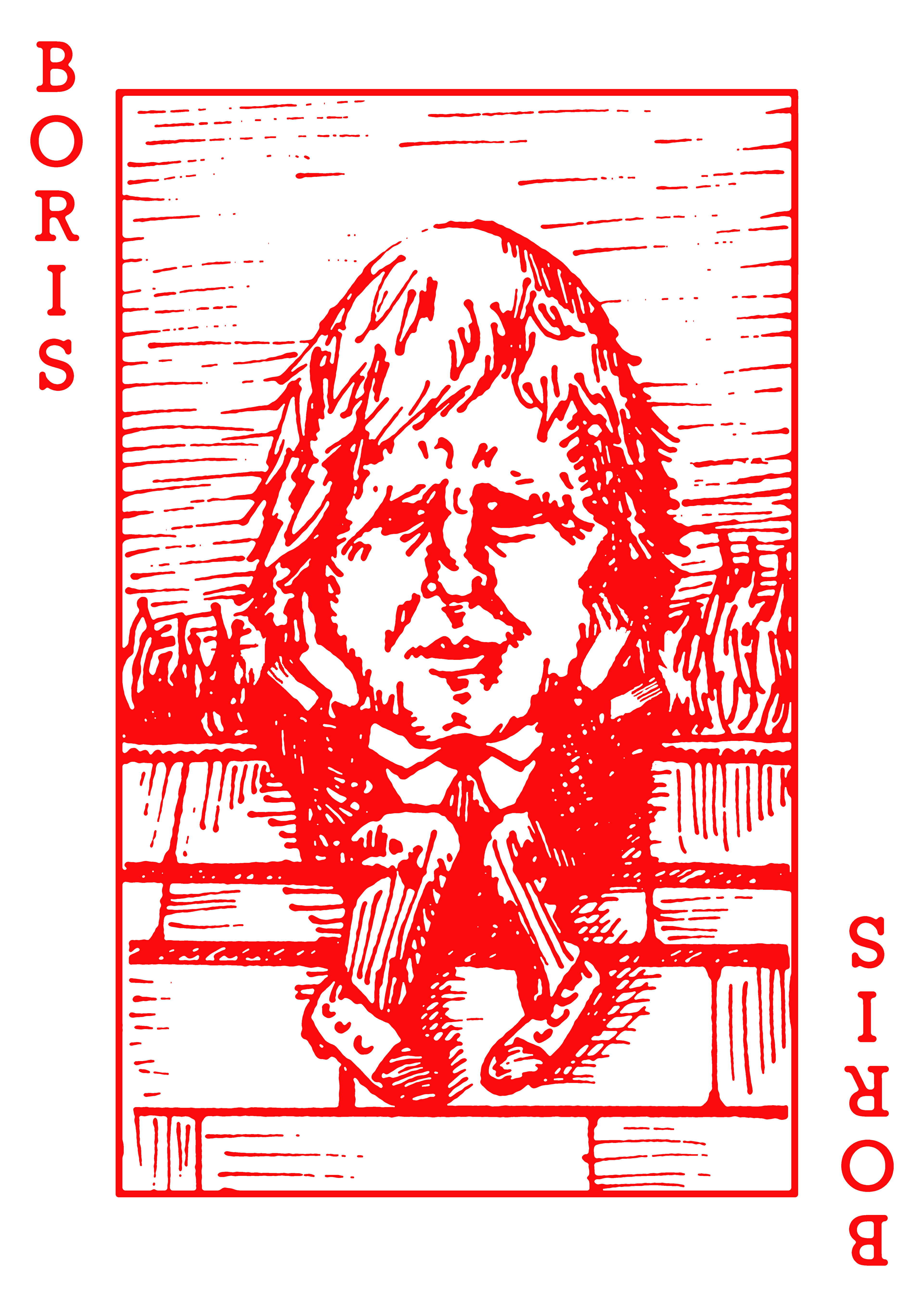
Fig. 55. Boris in red, screenprint visualisation using Photoshop

Fig. 56. A reverse design in royal blue

I developed my Boris design further as I wanted a set of playing cards which were unplayable, harking back to my Dominic Cummings idea from earlier in the project. I liked the idea of only one card available; Boris Johnson, to represent the limited political choice the UK now face. I wanted traditional playing card colours (black and red) as these also symbolise money and gambling; being in the red or black. This was something I had also touched on with my game as there were credit and debit tokens players collected. I tried to make my Boris card a little like the joker too; the joker card in a pack has the same font down the side and a single image in the middle. Blue is a very traditional colour for card backs and I think this will help lift my final piece further. I then had to think about how I could present my cards in a gallery space.

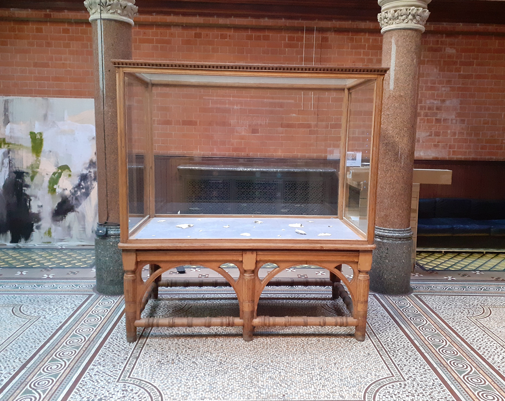
Fig. 57. Margaret street Vitrine

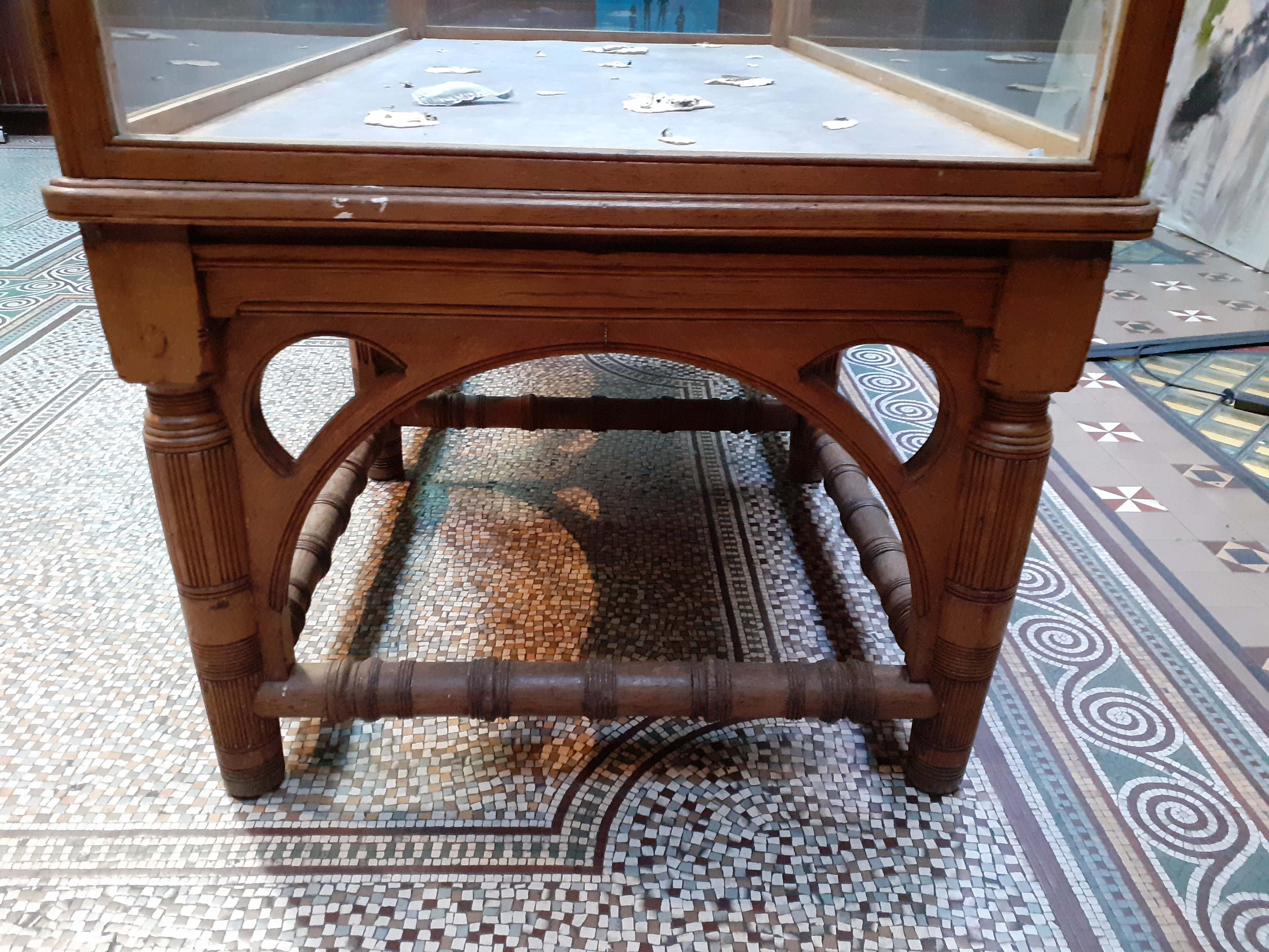
Fig. 58. Details on the foyer floor and the vitrine woodwork

 I think I have found the perfect location for my work. The foyer and vitrine at Margaret Street School of Art is about the right size for one piece of work and the surroundings are classically Victorian as are the style of my illustrations (Tenniel, playing cards, the art nouveau backing on the cards).

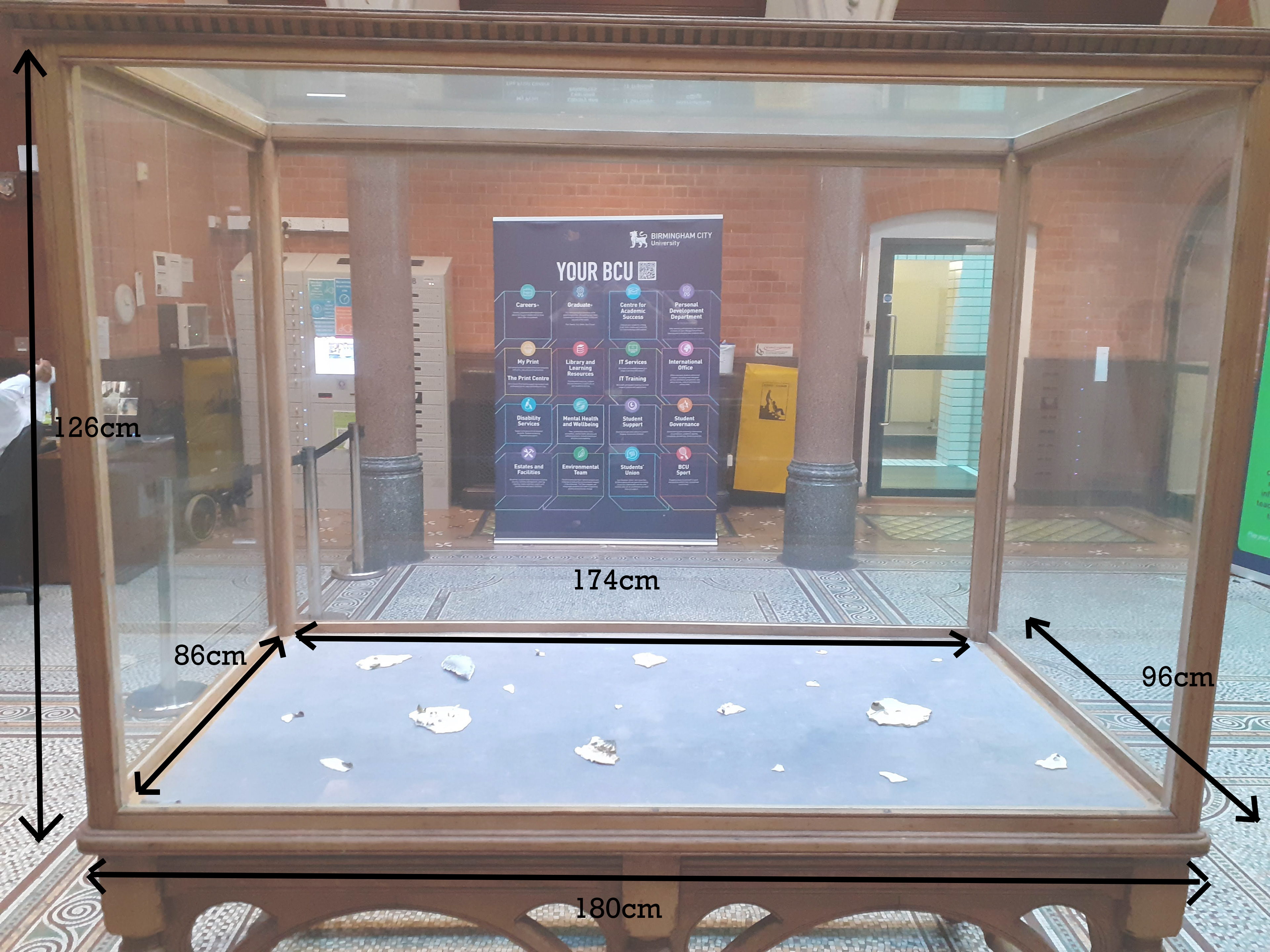
Fig. 59. Measurements of the space

In terms of health and safety the space should be quite straight forward to use. I am not using any electricity and the work will be contained so will not be a trip hazard, however, I have noticed the glass is very thin and the table is a weak structure, so whatever I produce will need to be light and easy to lift into place inside via the two glass doors either side of the vitrine.
I have measured out a similar space at home on a table in which to play around with compositions. I am thinking of creating a tower of cards but in a satirical way; could they be balancing precariously? Collapsing? Really huge or massively floppy?

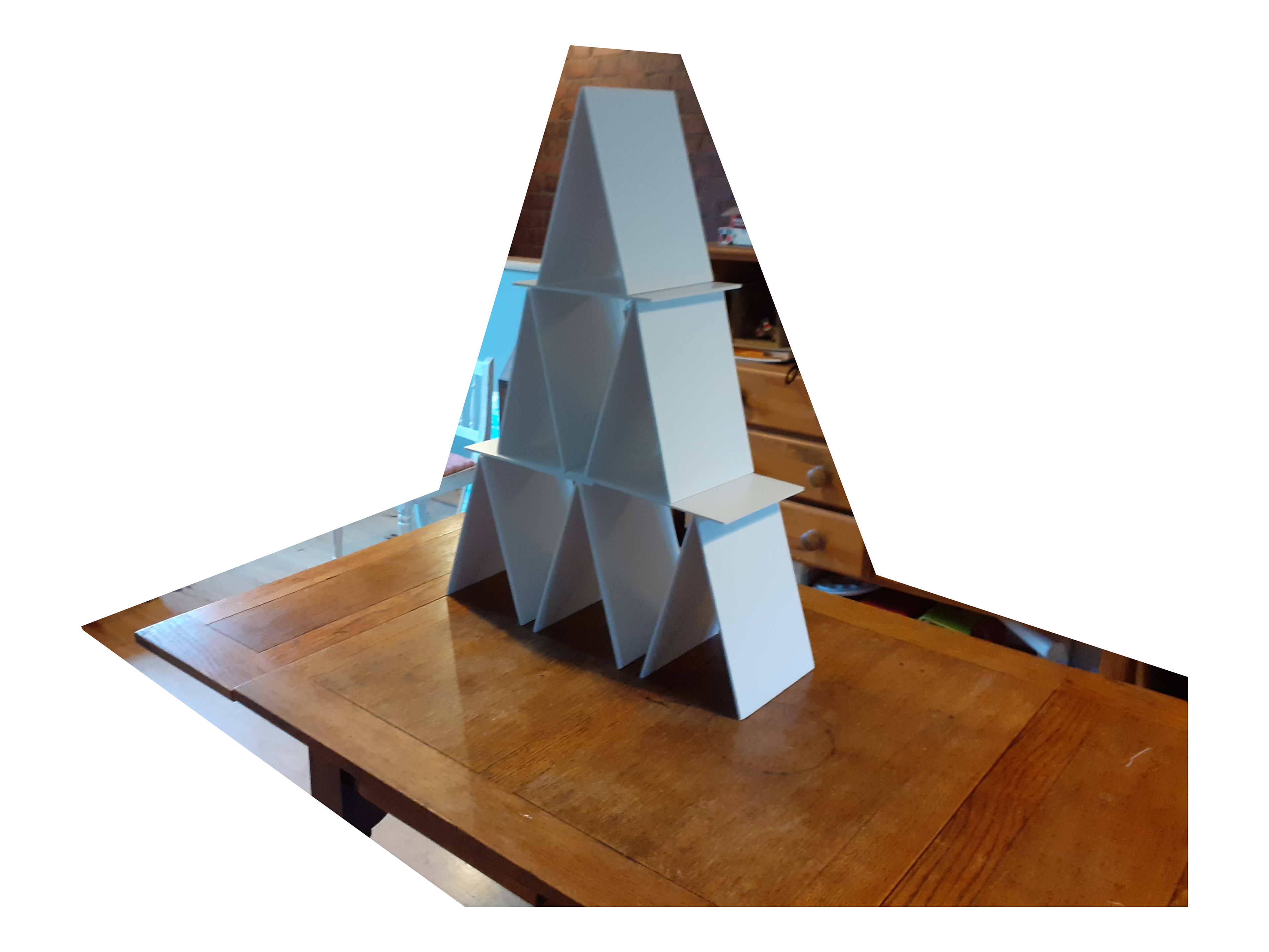
Fig. 60. A4 size card maquette

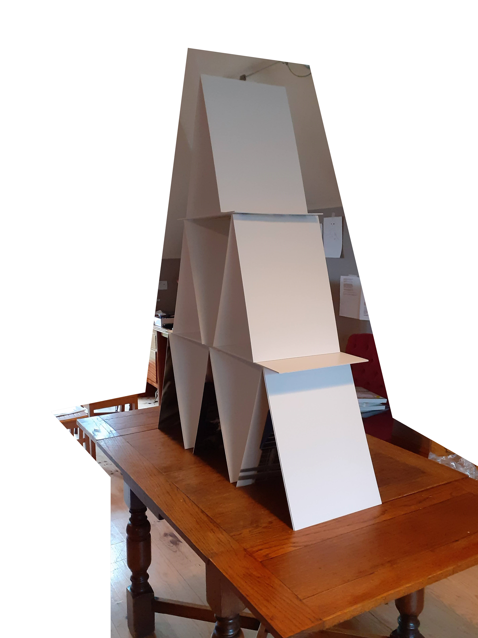
Fig. 61. A3 size card maquette

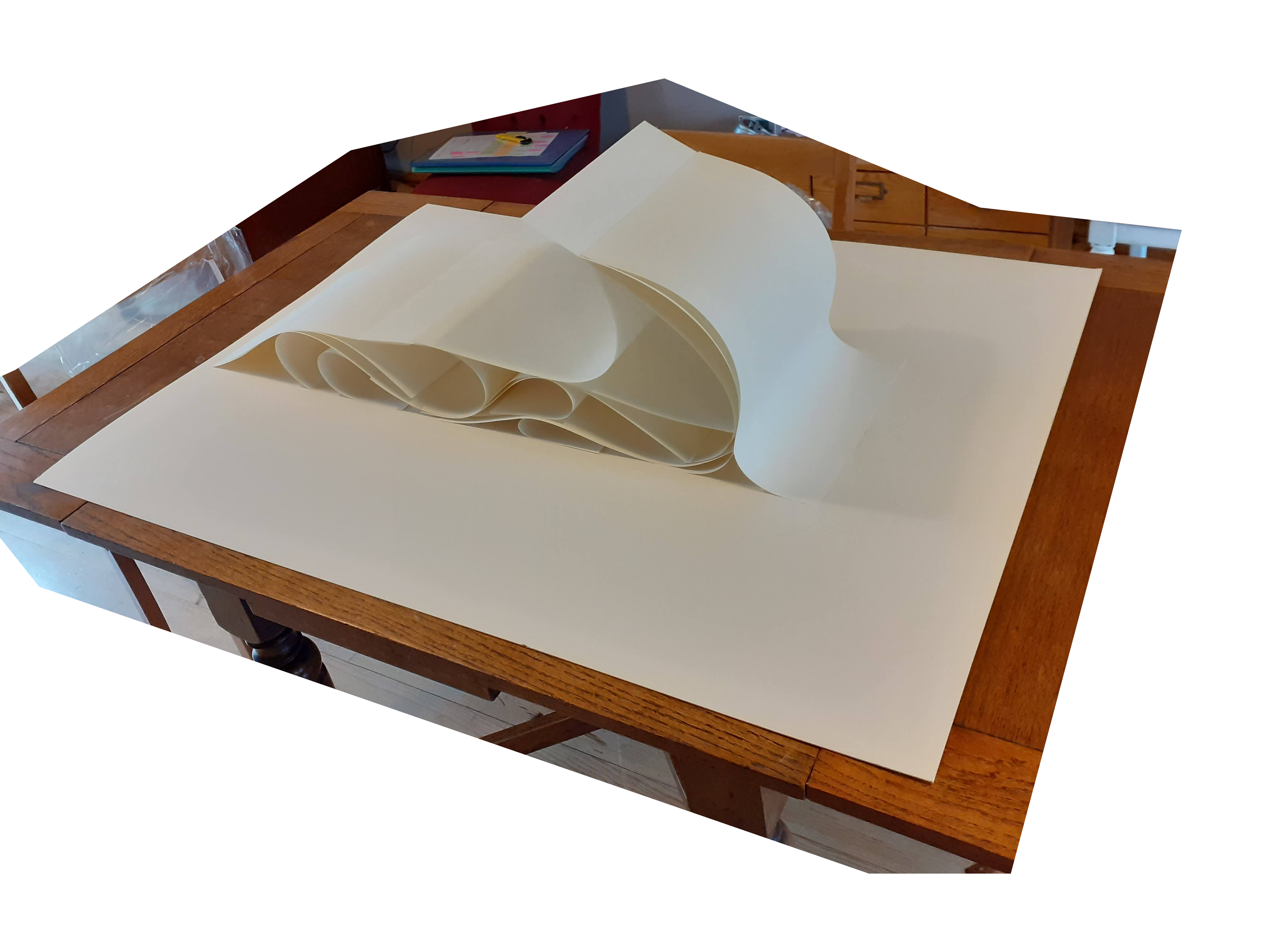
Fig. 62. The same structure in 130gsm paper (collapses under its own weight)

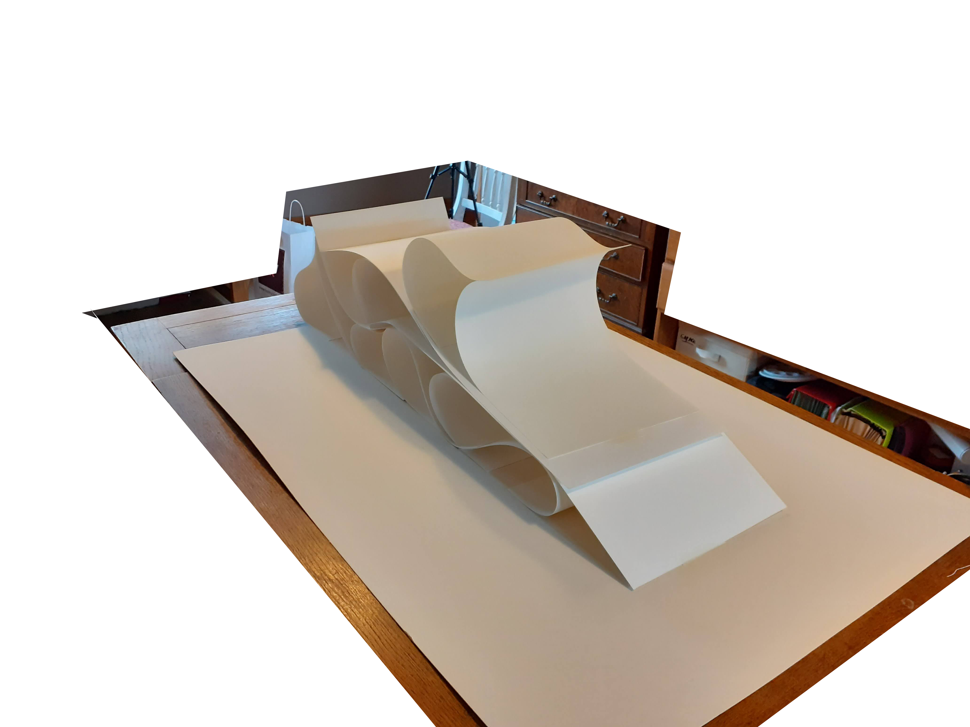
Fig. 63. The same tower in 220 gsm paper

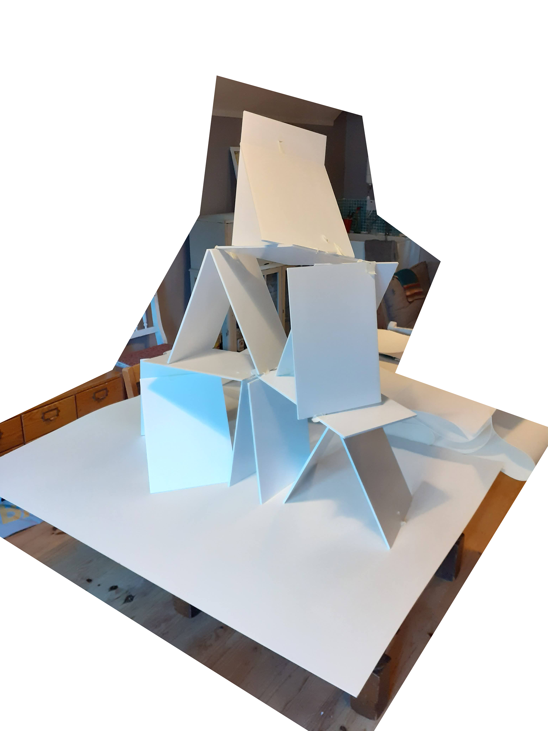
Fig. 64. Foamboard A4 'collapsing' shape

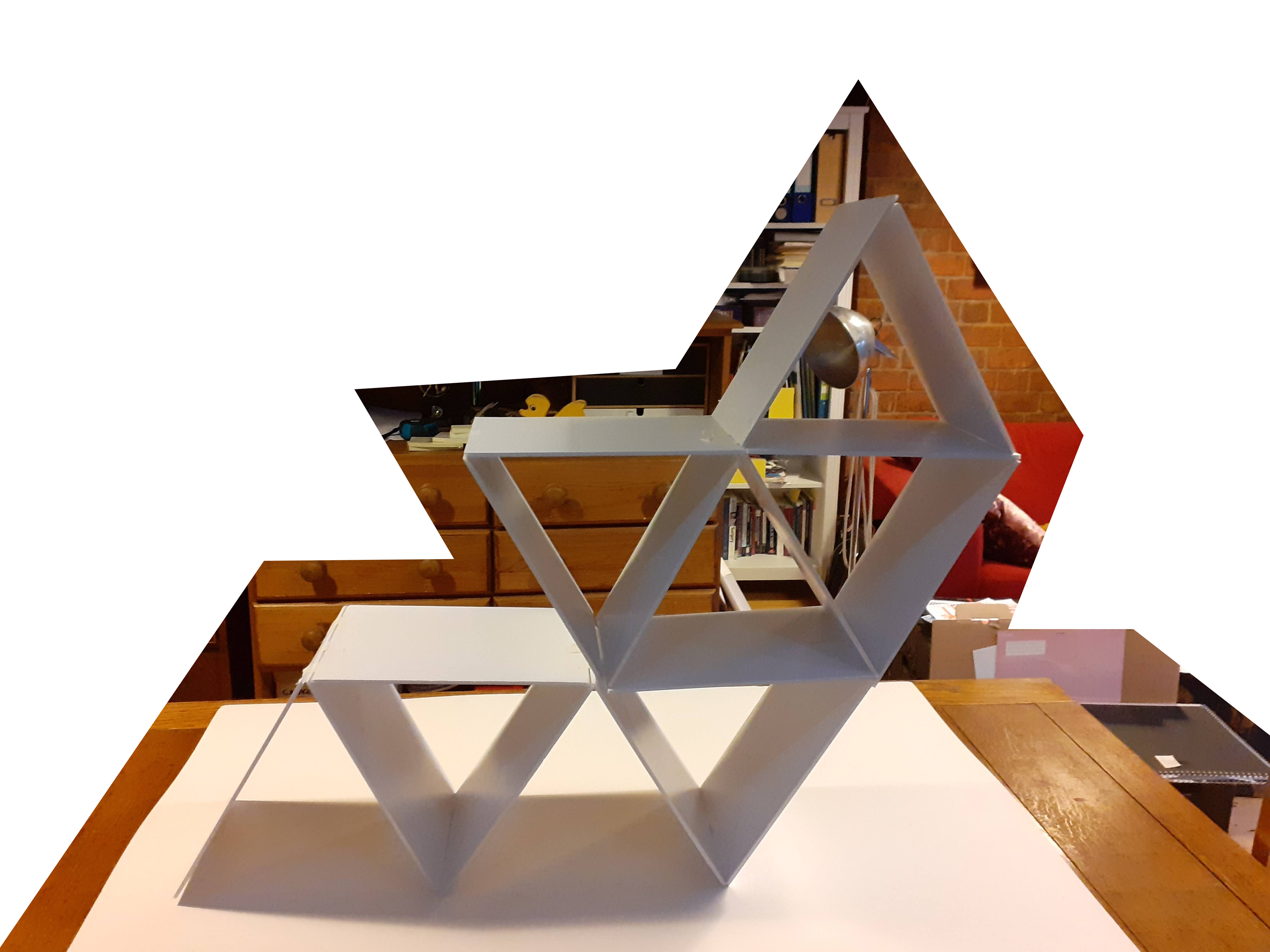
Fig. 65. 'Impossible' structure in foamboard, A4.

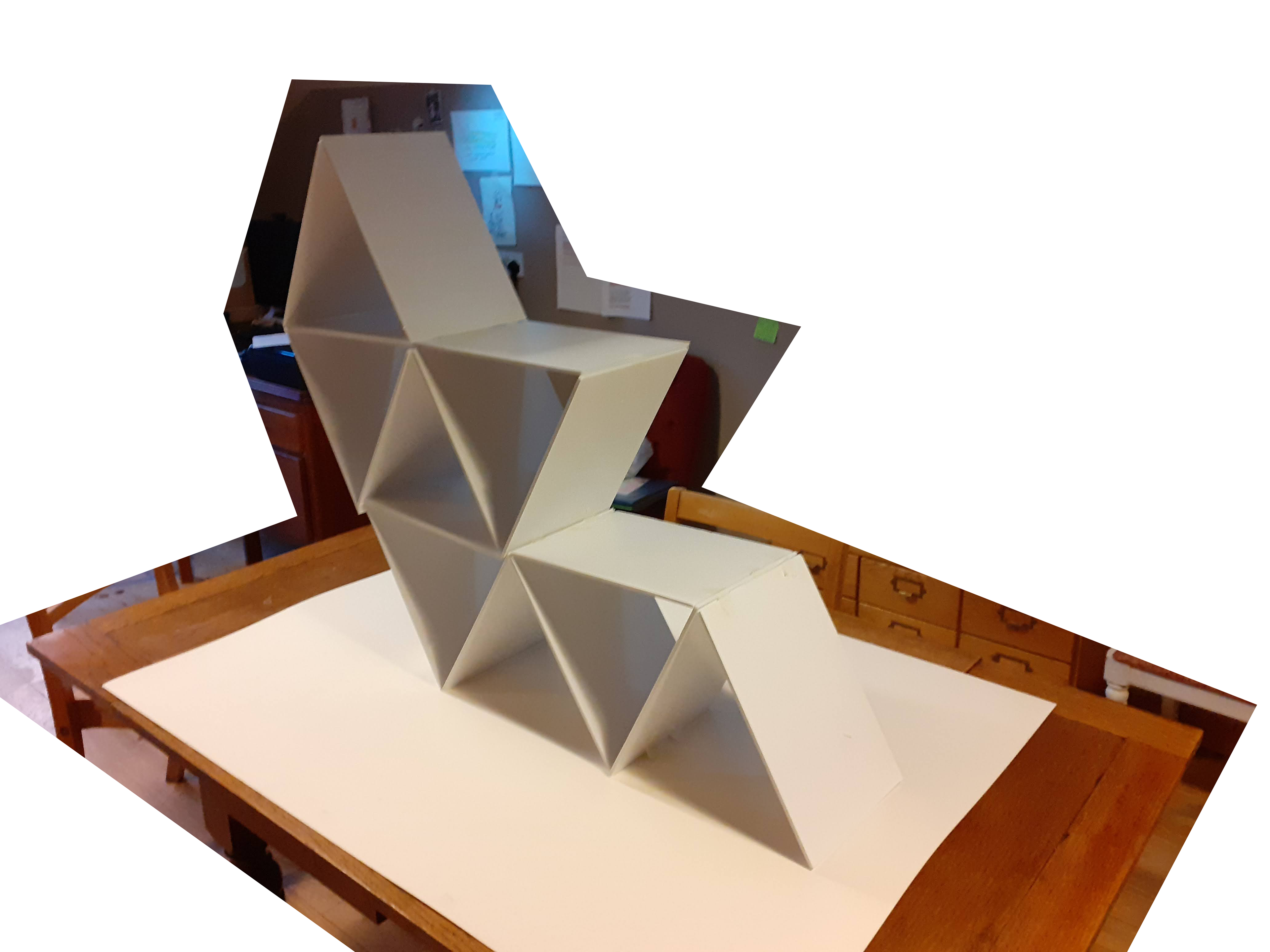
Fig, 66. Final structure design.

I have decided to create an 'impossible' card tower as I think this reflects my feelings on the current politics in the UK quite accurately. Boris Johnson somehow is still a favourite in the polls despite his governance holding  some of the worst statistics in Europe in terms of mental health, inequality and COVID death rates. Somehow our society holds itself together despite his lack of competency. I now need to look into creating the joins on the structure as I had used masking tape on this model but I will need something less visible on my final outcome. I am thinking wire and super glue within the foam layers would be a good construction but will need to test it.

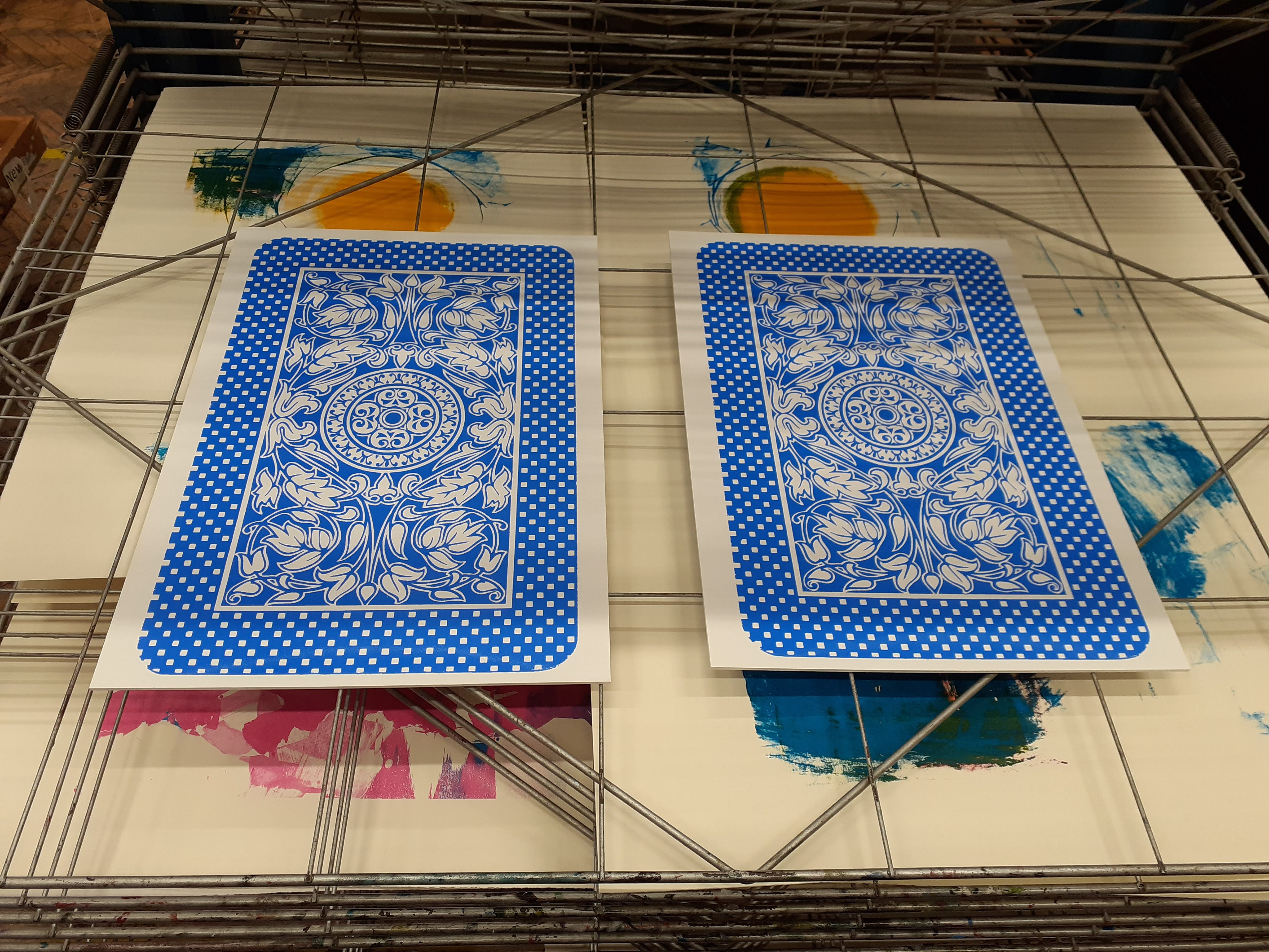
Fig. 67 Screenprints drying

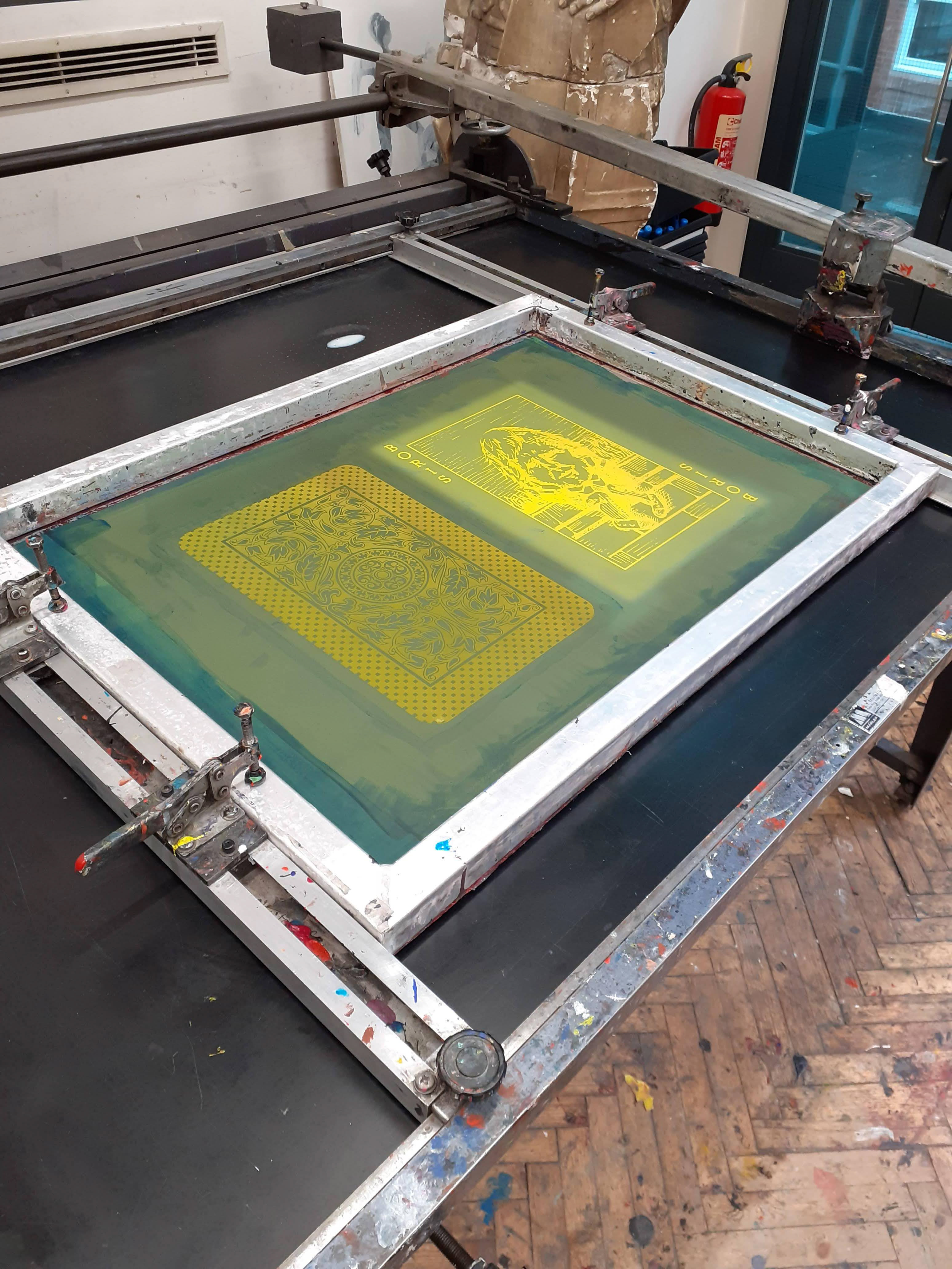
Fig. 68 Screenprint frame ready for ink

Figures 67 and 68 show the printing process in the print studio at SOA. I had decided after close measuring and visualisation at home with maquettes that A3 would be the best size for the tower. I wanted it to look quite oversized in the vitrine to echo the surrealism of Alice in Wonderland, which is also evident through the Tenniel style of my image. I think the print came out beautifully, especially the blue backing. I have decided to stack the tower with Boris slightly obscured, showing only his face within the structure to suggest his power and influence is not always evident but is nonetheless there and the route of how a system of power operates under the influence of a leader. I did investigate getting the corners of my cards laser cut to be round but unfortunately the member of staff I needed was on leave. I think the sharp edges may make the construction slightly easier though as it will be more straight forward to disguise my joins without the curves.

Fig. 69 The gluing process involving 6 hours of careful placement of metal rods, paper struts and superglue.

 Once my 15 cards are double printed I then had to construct my tower. I knew from experience with my maquette at home where the weakest points were so had to make sure those were reinforced with wire within the sculpture. The construction took 6 hours in total. I first assembled some pieces at home in readymade triangles. I then had to glue and wait for each layer in the foyer to create the height. It was not always smooth running as I ran out of superglue halfway through. The new glue then started to melt the foam within the card but luckily I spotted it before too much damaged had been done. The foam then became like a drippy leaking chemical. If you look at the structure closely, you can see some of the missing inner foam but luckily it still held and I was able to stop the substance from getting on the floor of the foyer as i had put paper down. The sculpture was very precarious though and I felt this was quite ironic as the artist, I genuinely felt it could collapse at any moment, like our system. I came into University 3 days in a row to make sure it had not collapsed  over night. 

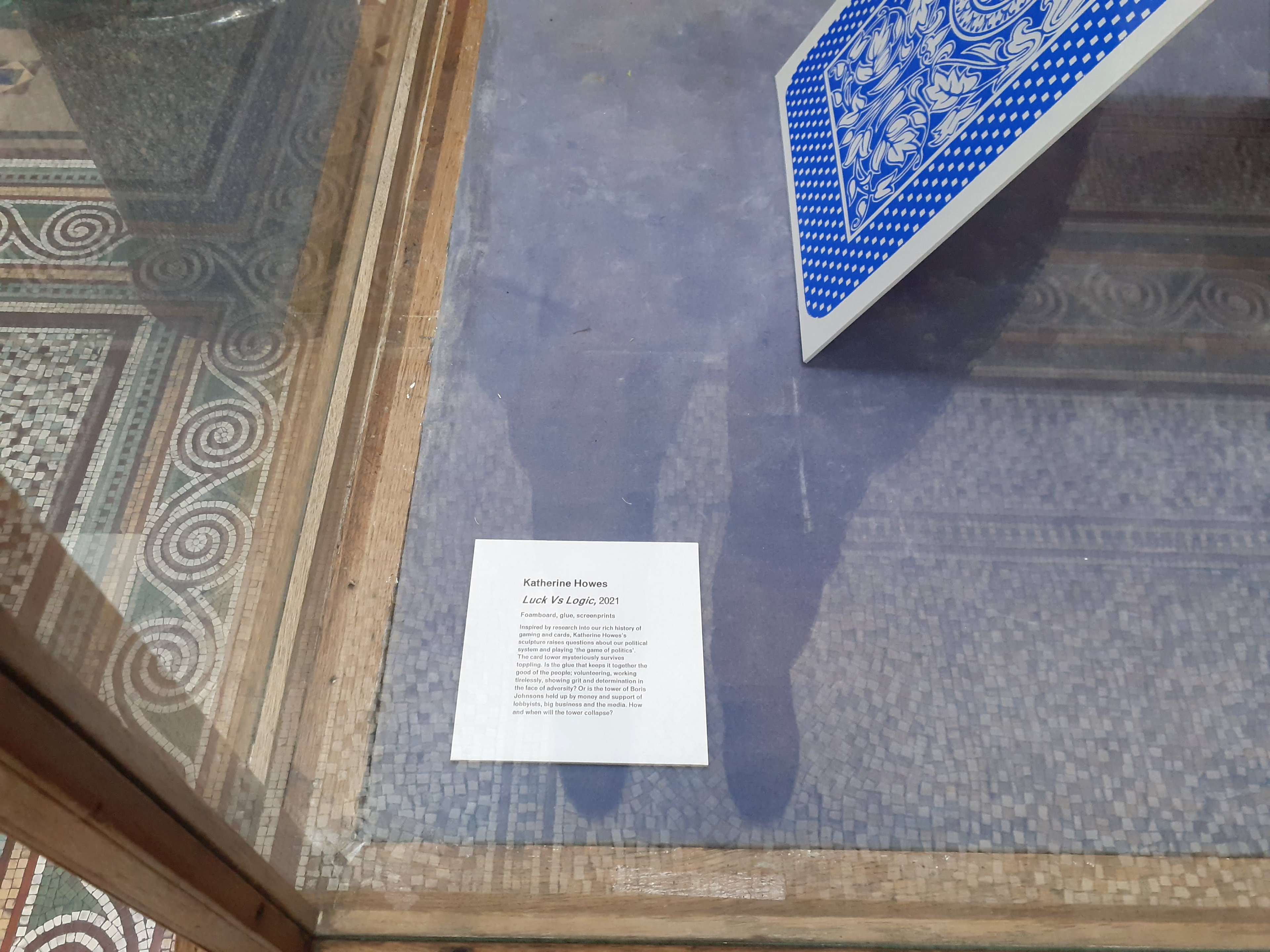
Fig. 70 Professional labelling and displaying

"Katherine Howes
Luck Vs Logic, 2021
Foamboard, glue, screenprints
Inspired by research into our rich history of gaming and cards, Katherine Howes’s sculpture raises questions about our political system and playing ‘the game of politics’. The card tower mysteriously survives toppling. Is the glue that keeps it together the good of the people; volunteering, working tirelessly, showing grit and determination in the face of adversity? Or is the tower of Boris Johnsons held up by money and support of lobbyists, big business and the media. How and when will the tower collapse?"

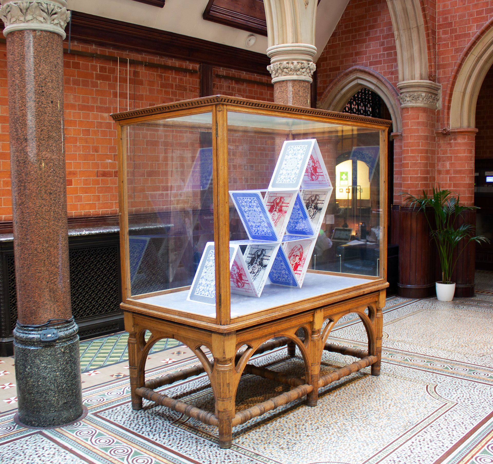
Fig. 71 The final piece in situ.

I am quite pleased with my end result and feel it represents something quite Dadaist of our time; a rejection of capitalism and the bourgeois. The visual language I have used of that era was a useful tool to ridicule populist movements that are current, highlighting the absurdity and humour in looking backwards. The precarity of our capitalist society is revealed through a pandemic, I hope that my sculpture shows the illogical nature of this way of structuring ourselves; equality is skewed, we are unbalanced, we should act now to address this. 
I have tried to incorporate my ideas into the sculpture’s materiality as well as the imagery as much as possible, echoing some of the political rhetoric I am critiquing. The screen prints are repetitive and become meaningless on close inspection, as they are all the same card with the same value, in either black or red, symbolising economics; a principle at the heart of government policy. Like Boris’s repetitive soundbites and endless optimism in the face of the seriousness of a pandemic, it is not logical or useful, and yet society survives. The tower is held up but the viewer is not sure how. In fact, I was unsure the tower would stay up too and thought about if it did collapse how I could document that. As the artist, the tension was very real, and hopefully it can be felt when viewed. This precarity represents our current status well. The nurses, cleaners, doctors, medical researchers, carers and other key workers keep our society together. The weight is skewed yet the tower does not fall. Perhaps the votes of Boris’s supporters are the mystery glue to the structure, if only we could understand why they vote for him and how he is able to still hold onto power despite numerous breaches of regulation and rule. Although my artefacts are cards, they would be very difficult to play with and the game would not be fun; the cards are too big, they are cheap and plastic, and it would be impossible to play meaningfully with only one type of card. As Romero’s Train and Magie’s Landlord’s Game tried to show through game based learning, is this a game you would want to play? And yet we do. I hope the sculpture entertains and mystifies with its impossible balance, but also gets viewers to think “how did we get into this fixed state?” and more importantly “how do we begin to dismantle it?”


Back to Top